Relationship Diagram
Arc Diagram
Arc Diagram is suitable for expressing the relationships between data, as well as the importance of these relationships. 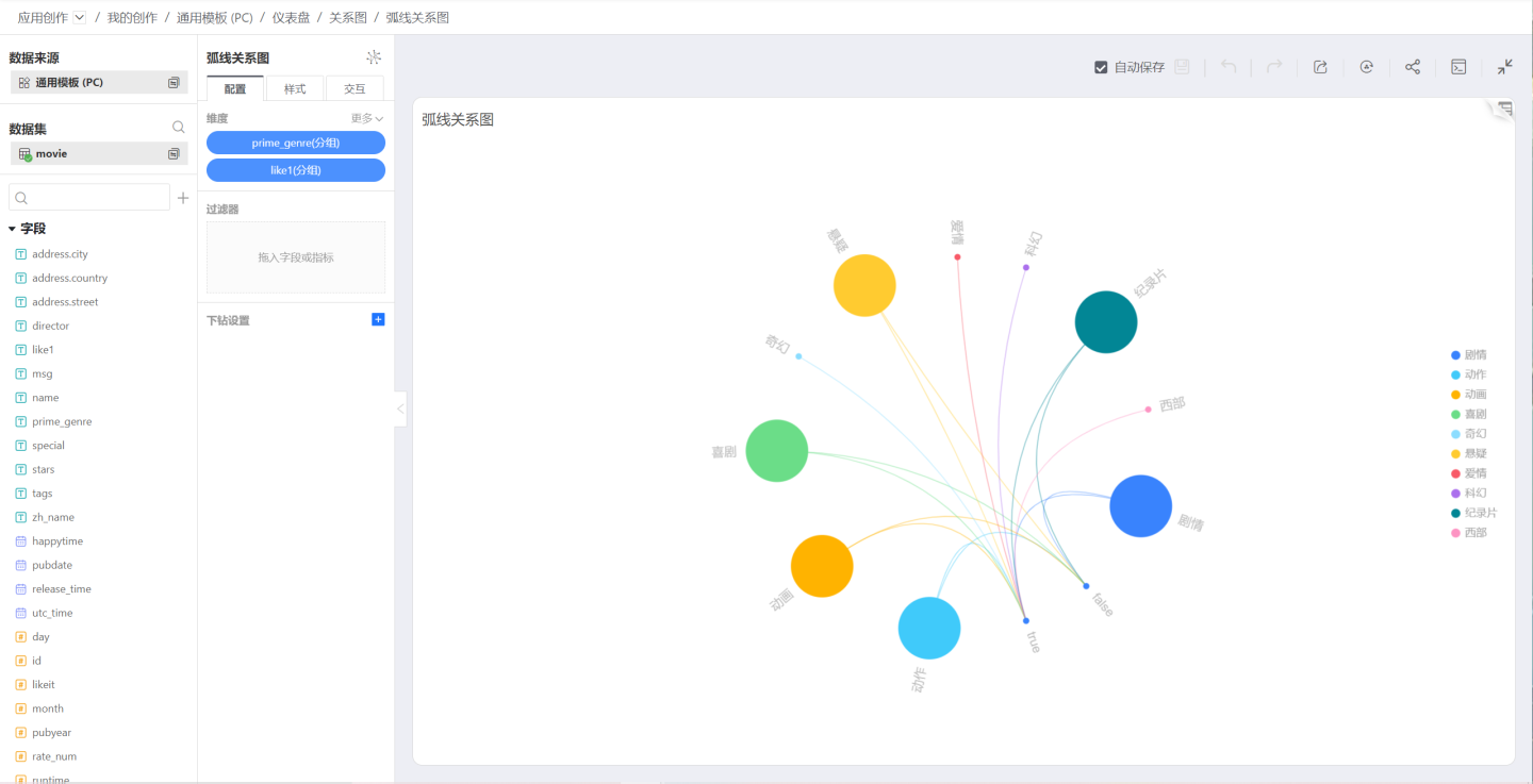
Funnel Chart
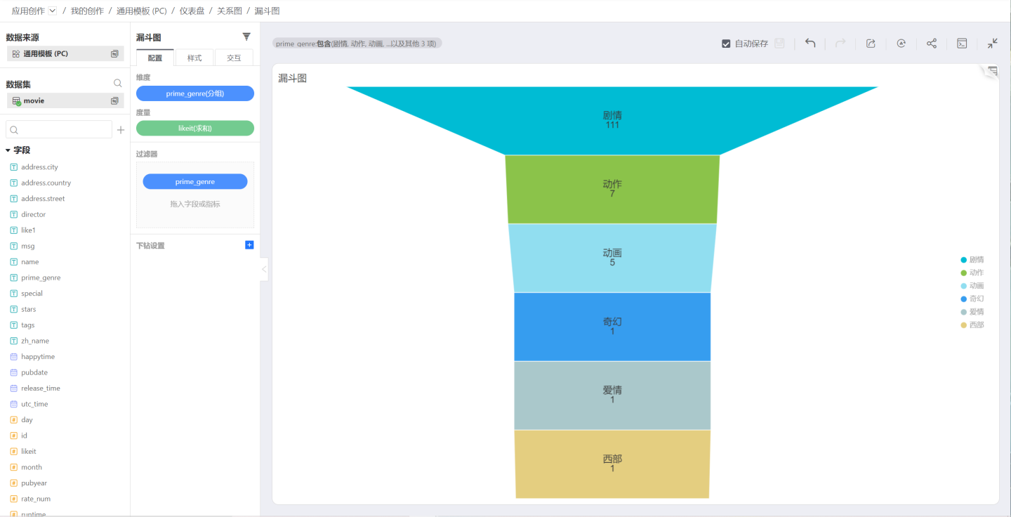
Funnel charts are suitable for single-flow, unidirectional analysis of standardized, long-cycle, and multi-stage business processes. By comparing business data at each stage of the funnel, issues can be intuitively identified and explained, leading to informed decisions. Funnel charts use the trapezoidal area to represent the difference in business volume between a certain stage and the previous one. Funnel charts, from top to bottom, have a logical sequence, illustrating the progress of business objectives as the process advances.
Funnel charts are not suitable for data without logical relationships, meaning that if the data does not form a "process," then a funnel chart cannot be used.
Heat Map
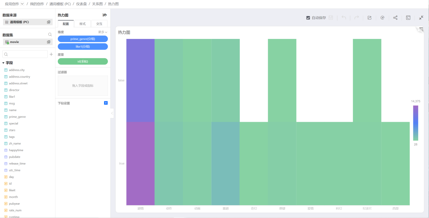
Through two-dimensional rectangular color blocks determined by two dimensions, combined with color coding, the distribution of a metric across two dimensions is represented.
By determining a rectangular box through two discrete classifications, it can be applied to cluster analysis.
Additionally, some heatmaps require continuous distribution values, allowing for smoothing in display, often used in conjunction with maps. In this context, the term "block chart" specifically refers to discrete distributions, while "heatmap" specifically refers to continuous distributions.
Radar Chart
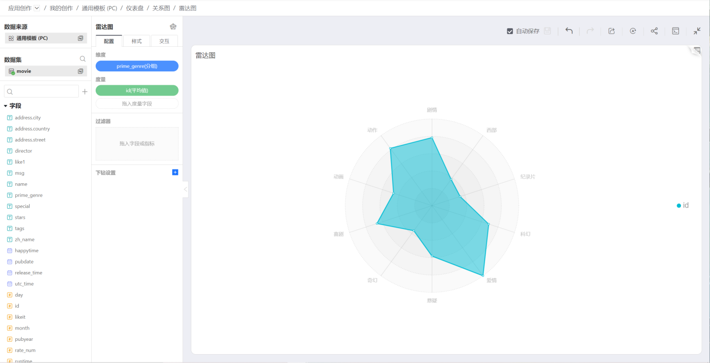
Showcase the comparison of indicators across multiple dimensions within a group, for the convenience of comparison, the measurement of indicators will be unified. It is only suitable for situations with a relatively small number of dimensions.
Sankey Diagram
Sankey Diagram is a specific type of flow diagram used to describe the flow from one set of values to another. It is commonly applied in the visualization analysis of data such as energy, material composition, finance, etc. 
Chord Diagram
Chord Diagram is a visualization method that displays the interrelationships between data in a matrix. Node data is arranged radially along the circumference of a circle, with weighted (width-varying) arcs linking the nodes.
Chord diagrams are used to explore the relationships between entity groups. They are widely used in the biological science community to visualize gene data and are also known as infographics in publications such as Wired, The New York Times, and American Scientist. 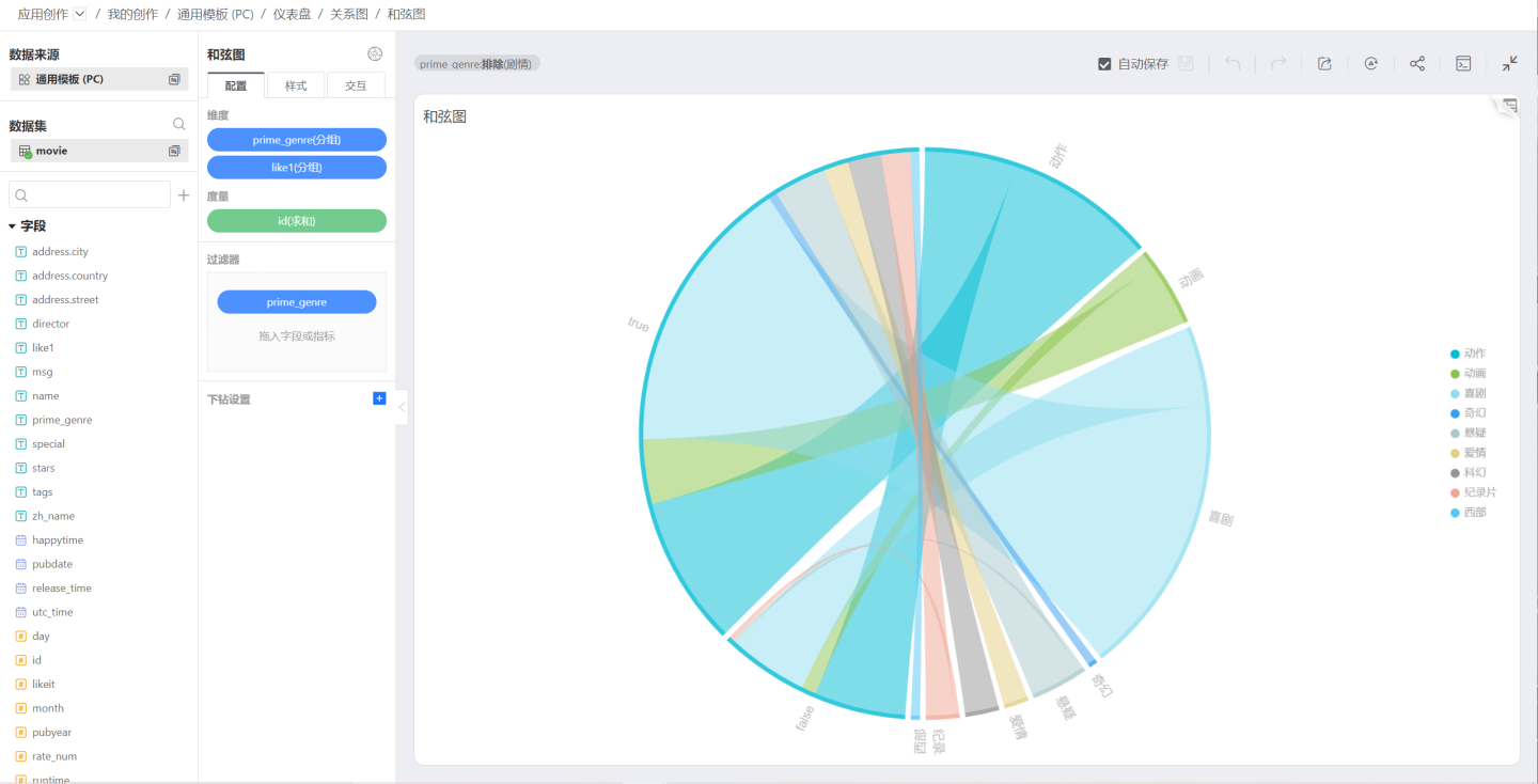
Scatter Plot
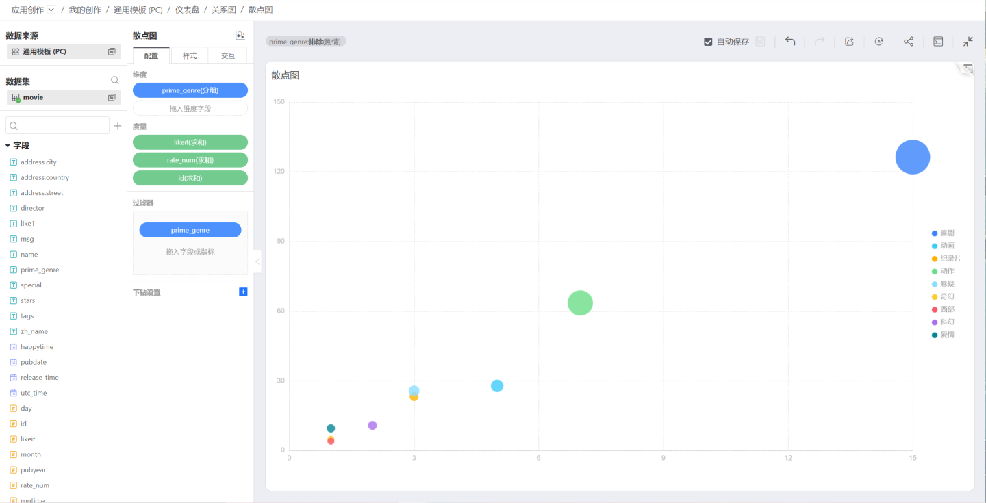
Scatter plots are special in that they only use one dimension for classification (or grouping), but can represent three measures, respectively on the x-axis, y-axis, and size, where size is optional. Therefore, they are very suitable for expressing something similar to Gartner's competitive quadrant.
