App Paginator
In HENGSHI SENSE 3.3 and earlier, the pager only supported the traditional numeric pager mode. The numeric pager could meet the basic functions of "Dashboard Quantity Display" and "Dashboard Page Jump," but it could not clearly show the exact information such as the "Page X" dashboard name and content, which had significant limitations in practical use scenarios.
In version 3.4, we optimized the pager configuration, added menu mode and PPT mode pagers, allowing users to select and configure the appropriate mode of pager according to the actual scenario.
Pager Instructions
When the number of visible dashboards within the app exceeds 1, a numeric page turner will be displayed at the bottom of the preview window by default, used for switching between dashboards.
Note: The visible dashboards refer to the dashboards that are not hidden within the application. If a dashboard is hidden, it will not be displayed in the published or preview state.
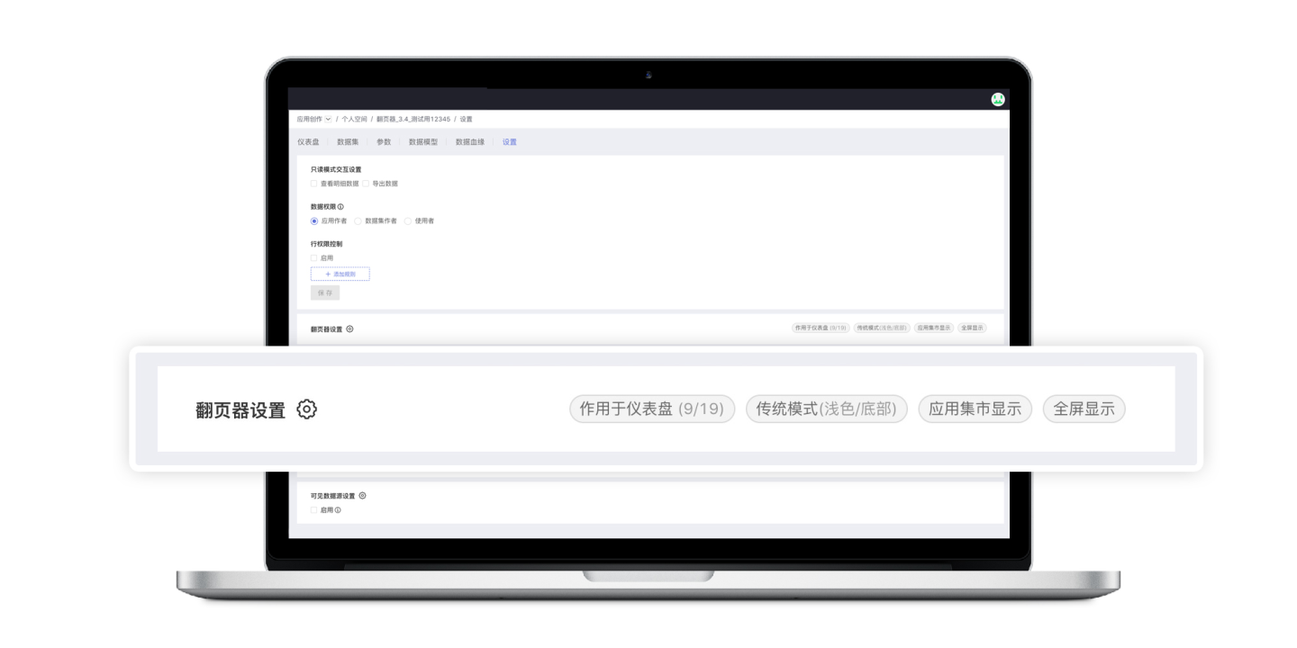
Paginator Settings
In "App Creation > App > Settings > Pager Settings", click the "Settings icon" on the right side of "Pager Settings" to enter the color values of the pager.
Content description of the "Pager Label" on the settings page
Affects Dashboards (9/19): This app has a total of 19 dashboards, and the paginator affects 9 of them.
Traditional Mode (Light/Bottom): The paginator mode is traditional, the color mode is light, and the effect position is at the bottom.
App Market Display: After the app is published, the paginator will be displayed when previewing in the app market; if not checked, this tag will not be displayed here, and the paginator will also not be displayed in the app market.
Full Screen Display: The paginator can be used in full screen mode (originally unable to paginate in full screen); if not checked, this tag will not be displayed here, and the paginator will also not be usable in full screen.
Dashboards with Paginator Functionality
The dashboard on which the pager acts refers to which dashboards the pager is configured to affect, allowing for flexible configuration based on requirements. For example, in App A, if there are 10 dashboards and the pager is set to be used on dashboards 1, 3, and 5, the pager will only appear on those dashboards, while the remaining dashboards will not display the pager.
Click [Set X/X] to select the dashboard you want to use the pager in the pop-up window, and it will take effect after saving.
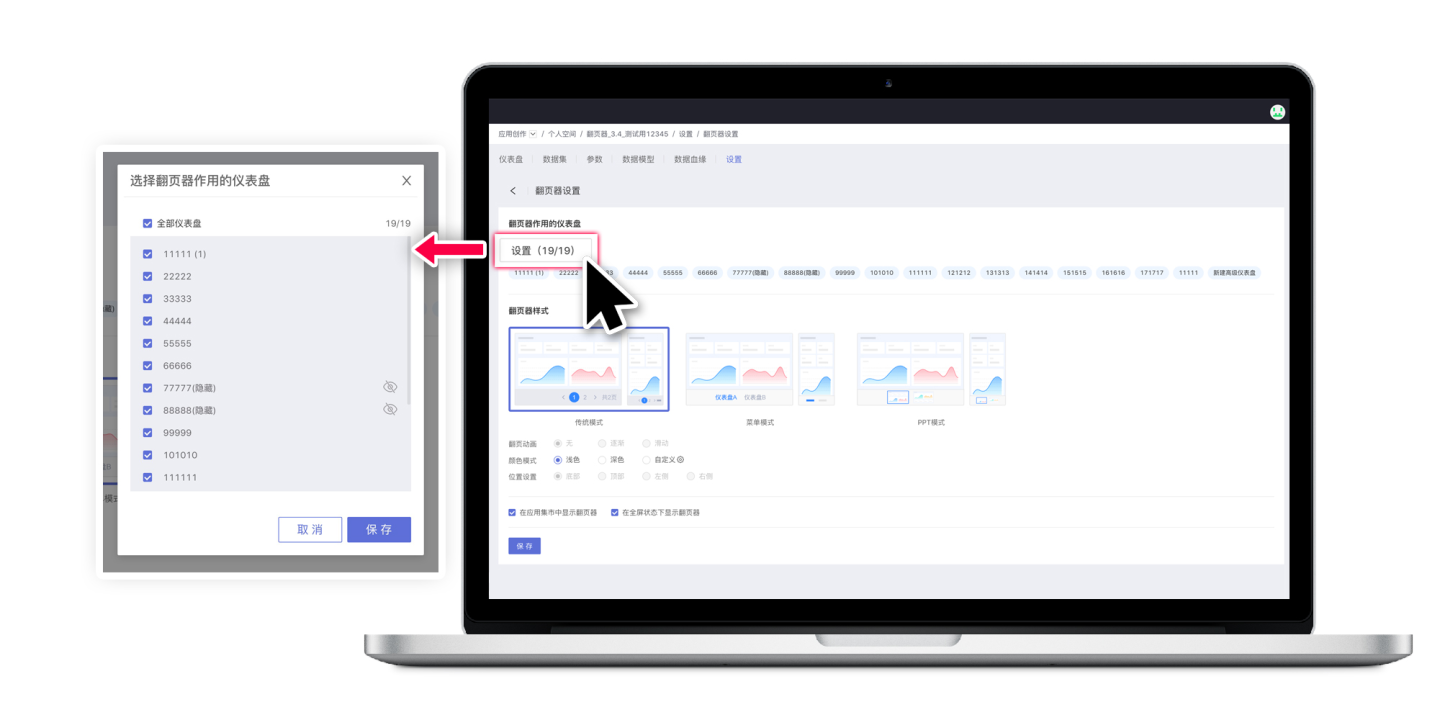
Paginator Style
3.4 version introduces two new forms of page turner modes on top of the traditional digital page turner: Menu mode and PPT mode. Below is a detailed introduction to the three modes of page turners.
Traditional Mode Paginator
Traditional mode pager and digital pager.
Currently, the pager supports the following configurations.
Pager Animation
This feature will be supported in future versions.
Color Mode Supports light, dark, and custom color configurations.
- Light: System built-in color. This color can be selected when the dashboard configuration is light-oriented.
- Dark: System built-in color. This color can be selected when the dashboard configuration is dark-oriented.
- Custom Color: Users can set a more matching pager color according to their dashboard's color scheme. After selecting "Custom," click the settings icon on the right to set the pager color in the pop-up window.

Position Settings
Traditional mode paginator only supports the bottom.
Menu Mode
Menu mode is new in version 3.4. The menu paginator will display dashboard names as tabs, and according to the user's settings, the paginator in menu mode can serve as a navigation menu for dashboards within the app.
Pager Animation
This feature will be supported in future versions.
Color Mode
Supports light, dark, and custom color configurations.
- Light: System built-in color. This color can be selected when the dashboard configuration is light-oriented.
- Dark: System built-in color. This color can be selected when the dashboard configuration is dark-oriented.
- Custom Color: Users can set a more matching pager color according to their dashboard's color scheme. After selecting "Custom," click the settings icon on the right to set the pager color in the pop-up window.
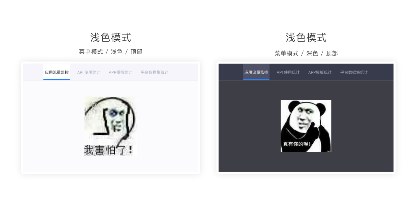
Position Settings
Supports setting at multiple positions such as bottom, top, left, and right. Users can choose according to their needs.
Note: Top/Left is commonly used for page navigation. Bottom: Often used for mobile simulation menus. Right: Often used for users accustomed to right-side navigation.
Mobile Collapse
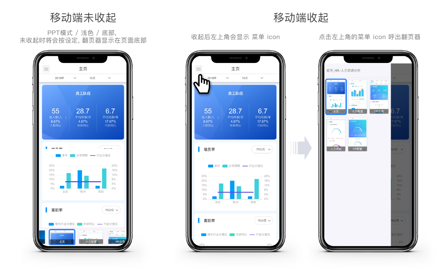
Considering the limited screen space on mobile devices, the paginator has been adapted accordingly for mobile use. It supports the collapse function of the paginator, which collapses all paginators into an icon in the upper left corner, without squeezing the screen content. When needed, click the icon to call out the paginator, which will then float without squeezing the screen content, more in line with mobile operating habits. This option is not checked by default, and users can check it according to their needs on mobile devices.
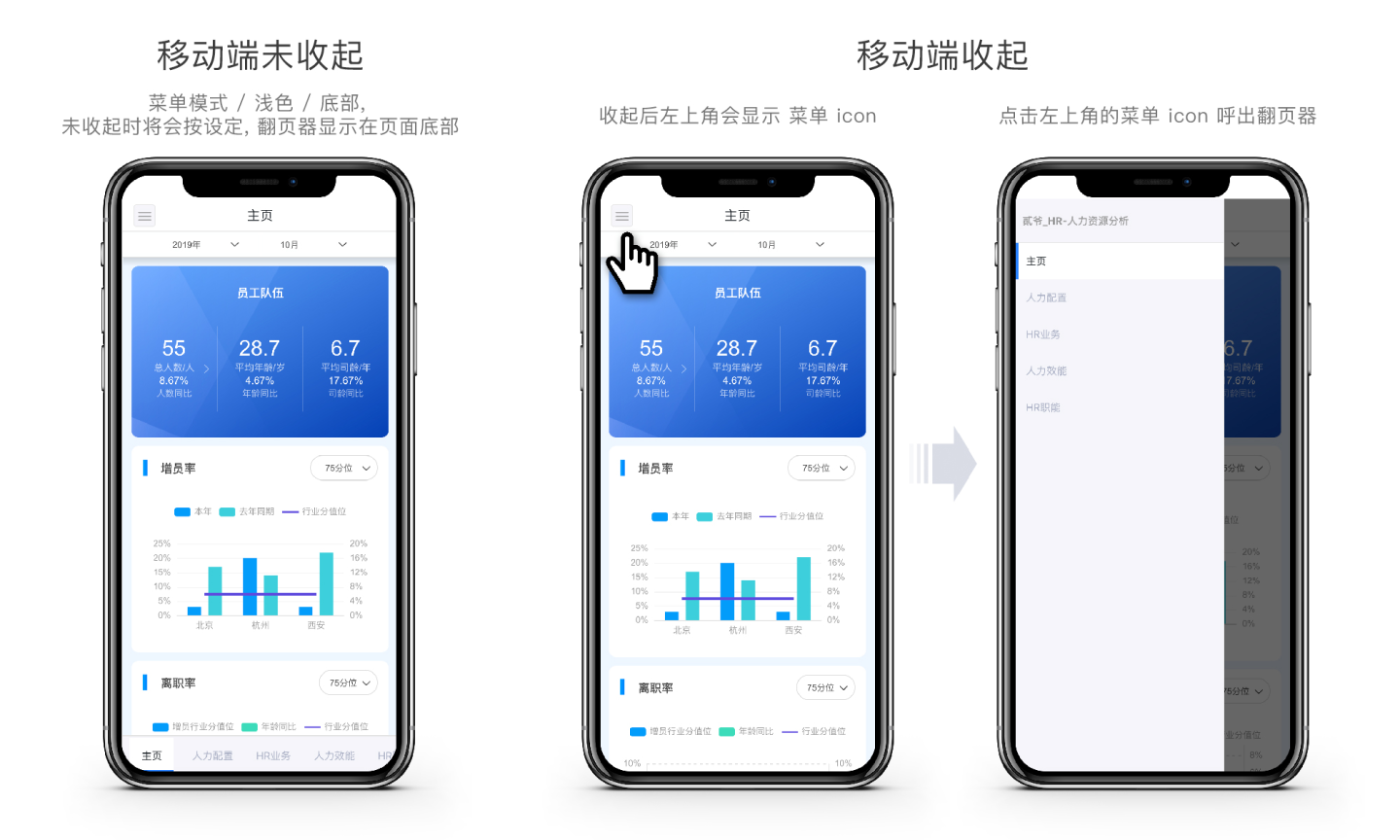
PPT Mode Page Turner
3.4 Newly opened paginator style, the PPT mode paginator will display the dashboard thumbnail & name in the form of a PPT thumbnail, and the PPT mode paginator can be used for reporting and other scenarios.
Pager Animation
This feature will be supported in future versions.
Color Mode Supports light, dark, and custom color configurations.
- Light: System-built color. This color can be selected when the dashboard configuration leans towards light colors.
- Dark: System-built color. This color can be selected when the dashboard configuration leans towards dark colors.
- Custom Color: Users can set a pager color that better matches their dashboard's color scheme. After selecting "Custom," click the settings icon on the right to set the pager color in the pop-up window.
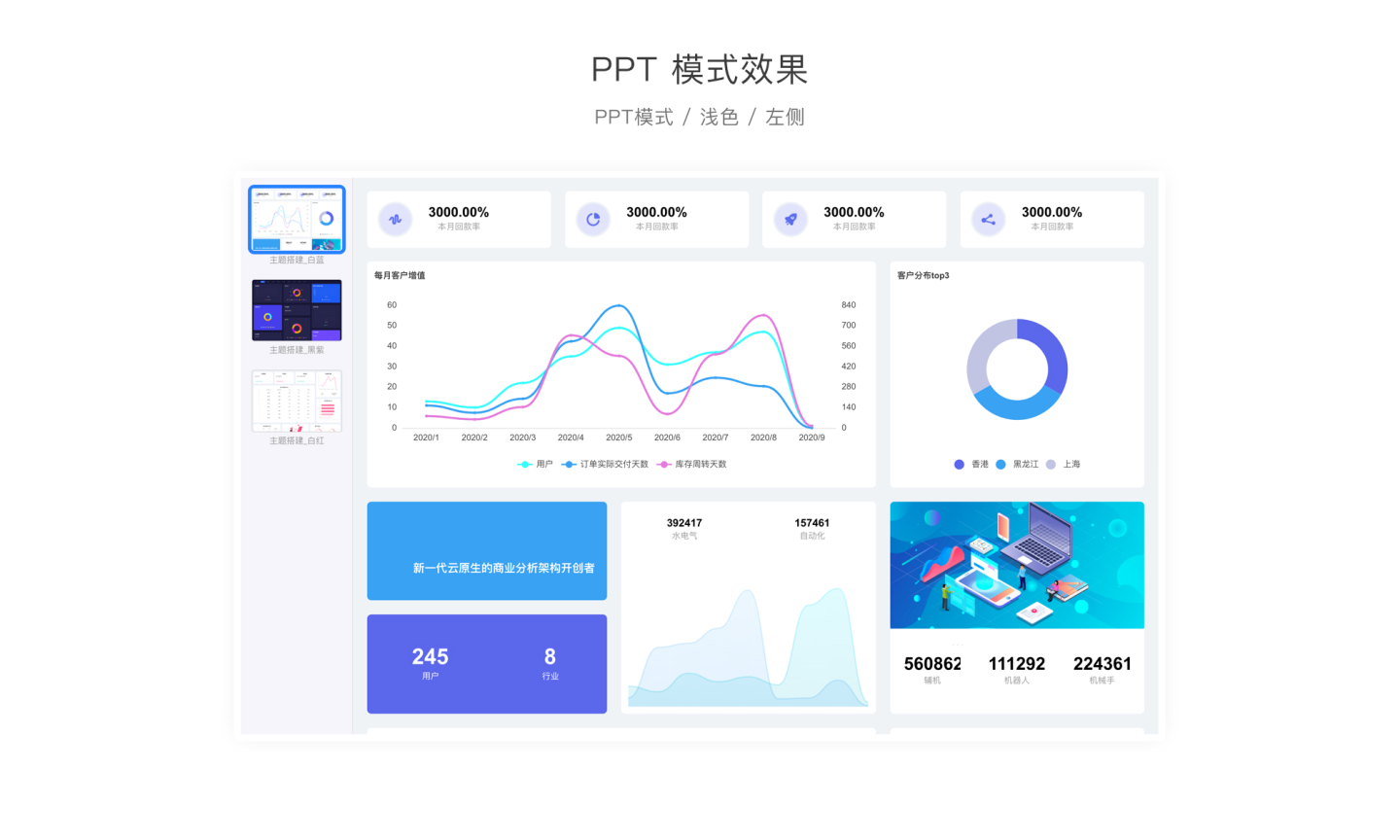
Position Settings
Supports setting at multiple positions such as bottom, top, left, and right. Users can choose according to their needs.
Mobile Collapse
This option is not checked by default. Users can check it according to their needs for mobile devices. The display effect when the mobile version is collapsed is shown in the image below.
Display Paginator in App Market
Default is checked. When checked, the application published to the App Market by the user uses the pager function. If the user wishes to create an application that, after being published to the App Market, does not use the pager, they can uncheck it.
Display Paginator in Full Screen Mode
Default is checked. When checked, users can call up and use the pager in full-screen mode. The rules are as follows:
- When the mouse is moved to the setting position in full-screen mode, a paging control pop-up button will appear. Clicking the pop-up button will bring up the paging control.
- When the mouse is moved away from the paging control, the paging control will disappear, ensuring an unobstructed preview in full-screen mode.
Example: If the pager is set to "Bottom", then after entering full-screen mode, you need to move the mouse to the bottom to bring up the pager. If the pager is set to "Left", then after entering full-screen mode, you need to move the mouse to the left to bring up the pager.
When this option is unchecked, the pager cannot be called up in full-screen mode. At this time, you can use the ← key and → key on the keyboard for sequential paging, but you cannot jump precisely through the pager.