Graphics & Icon Library
In HENGSHI SENSE 3.3 and earlier, the addition and use of images were implemented in regular dashboards. With the widespread use of regular dashboards, the demand for graphics has also increased. In version 3.4, we added the Icon Library feature to regular dashboards.
Version 3.4 introduces an online icon library, initially featuring 174 icons, grouped into 87 sets. Users can directly reference these icons, saving time on searching for images and improving the efficiency of chart creation.
![]()
The Icon Library has the following features:
- The icon styles are rich and diverse.
- Icon search is convenient, supporting multiple search methods in both Chinese and English.
- Icon styles are adjustable, supporting settings for size, color, and border.
- Icons are versatile, suitable for various icon scenarios.
Common icon library usage preview. ![]()
Reference to Graphics & Icon Library
In regular dashboards, support is provided for five types: square, triangle, arrow, circle, and icon library.
On the creation page, click the "Graphics" icon at the top to add a graphics control and configure it.
![]()
Graphics controls support the following configurations during the referencing process.
![]() Change Graphics Click to change the current graphic to one of the other types of graphics.
Change Graphics Click to change the current graphic to one of the other types of graphics.
Proportion
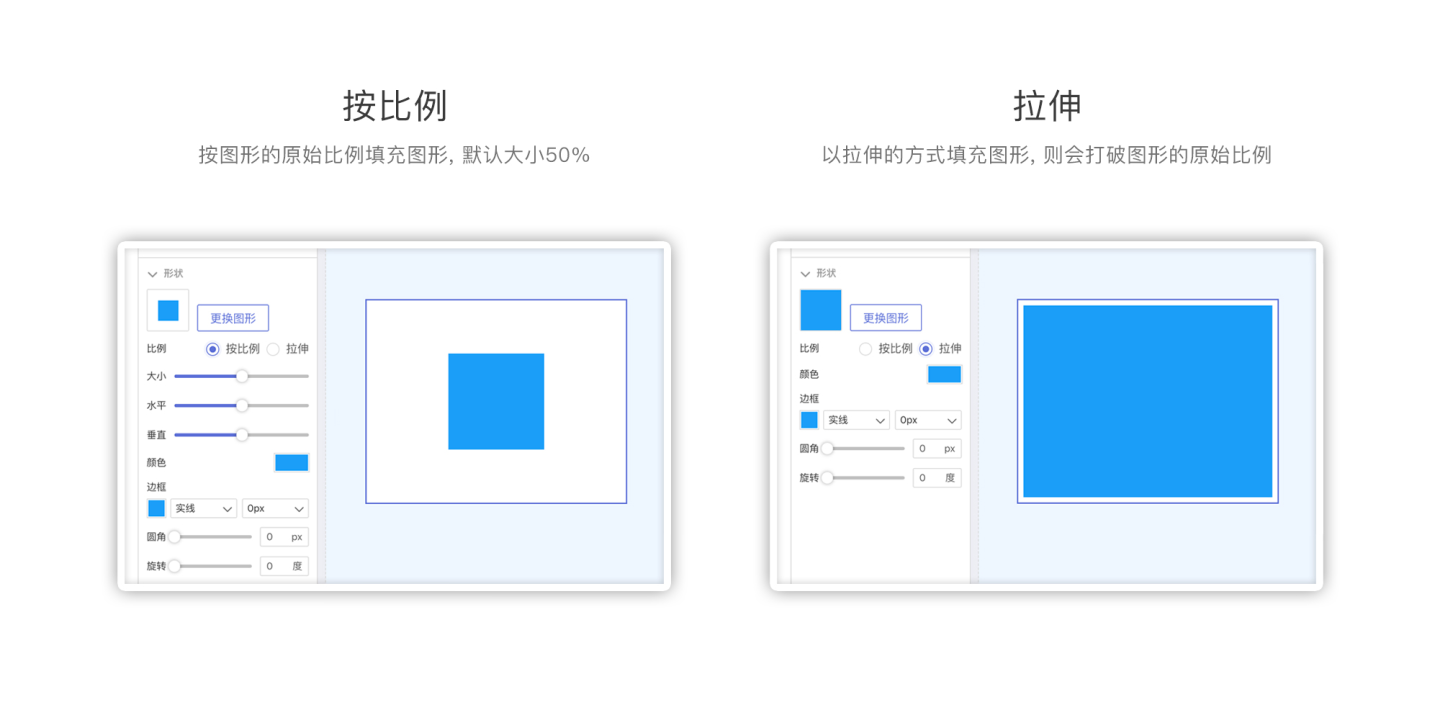
The icon library supports filling or stretching according to the graphic's proportion.
- Proportional Refers to filling the graphic according to its original proportion.
- Size: The default size is 50%, with a size setting range of 0%-100%.
- Horizontal: The horizontal position proportion, defaulting to (0,0). The X-axis horizontal position setting range is -100~0~100, corresponding to 0%-100%.
- Vertical: The vertical position proportion, defaulting to (0,0). The Y-axis vertical position setting range is -100~0~100, corresponding to 0%-100%.
- Stretch Fills the graphic by stretching, which breaks the original graphic proportion. When "Stretch" is selected, there are no settings for size, horizontal, or vertical.

Color Supports setting the graphic color, including single color and dual color gradient.
Border Supports setting the border color, line type, and line thickness.
Rounded Corners Supports setting the rounded corners for squares.
This feature only supports squares; other graphics are not supported.
Rotation Allows setting the graphic angle.
This feature only supports squares, triangles, and arrows.
Line Thickness Sets the line thickness.
This feature applies to circles and arrows.
Endpoint and Endpoint Size Settings For arrow graphics, you can set the shape and size of both endpoints.
Next, create a square graphics control and configure it.
Click "New Shape Control" and select the square to add a square graphics control to the dashboard. After adding the square graphics control, click the control to bring up the graphic style settings.
Using the default proportion, size, horizontal, and vertical remain unchanged. The color is the system color, the border is the system default, and there are no rounded corners or rotation. The final graphic is shown below. ![]()
Shape Control Interaction Operations
Shape Control Supports Click Events
Shape controls support interaction operations with dashboards and other charts, supporting the following interaction operations:
- Execute JS Code Executes specified JS code operations when the control is clicked. For setup methods, refer to Related Link.
- No Response Refers to no response when the control is clicked.
- Jump Jumps to the set dashboard or URL when the control is clicked. For jump-related settings, refer to the Jump section of the control settings.
- Scroll To Scrolls to the specified control when the control is clicked.
- Control Container Switches to the specified container tab when the control is clicked. If a container has multiple tabs, the graphics control can control the corresponding tab.
Tip
Button Controls also support scrolling to and controlling containers. Unlike graphics controls, the same button can simultaneously implement both scrolling to and controlling containers, while graphics controls can only perform one of these interaction operations.
Shape Control Supports Hover Events
Shape controls also support setting hover event interactions, allowing a popup to open when the mouse hovers over the icon. The popup content can be customized as an in-app dashboard or another URL. ![]()
Hover to open a popup scenario example: When a data analyst wants to provide global annotation explanations for the entire dashboard or a group of charts, this interaction can be used, as shown below. ![]()
Tip
The hover event and click event configuration items for shape controls are mutually exclusive. After setting the hover event, the corresponding popup content still needs to be clicked on mobile devices to view it.