Form Creation
This chapter explains how to create forms and design form content in data filling. Users can follow the instructions to complete form creation and prepare for data collection.
Create Form
The data filling module allows form creation through drag-and-drop. Please refer to the following steps to create a form.
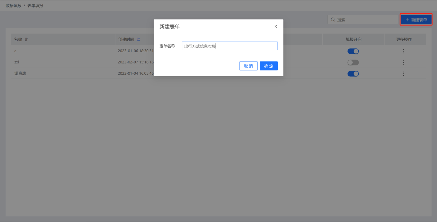
Click "New Form" in the data filling module, fill in the form name, and click "OK" to create a new blank form.
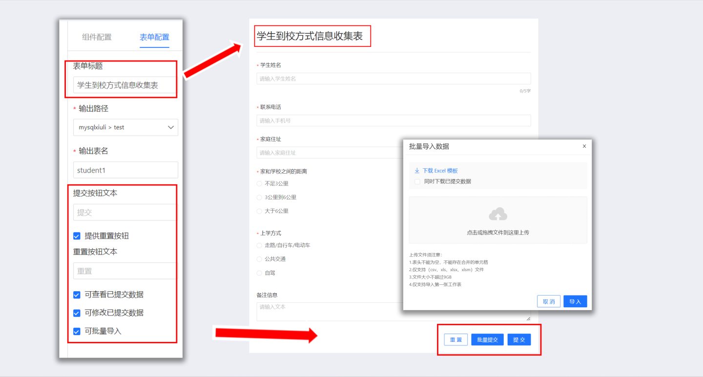
Open the blank form and build the form. First, configure the form by setting the form title, output path, output table name, etc. Detailed explanations of each configuration item can be found in Form Configuration.

Add components to the form for data collection. Drag components from the component library to the canvas area and configure them in the right-side component configuration area. For example, drag a single-line text component to collect student names.
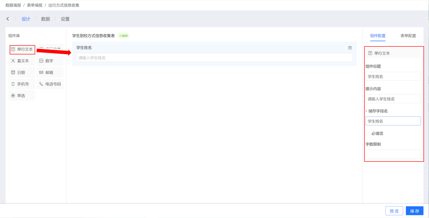
Add components to the form one by one until all components are added. There are many types of components, and their functions and related configurations are detailed in the Components section.
Preview the form to check if it meets the requirements. If not, return to the canvas to make modifications until it meets the requirements.
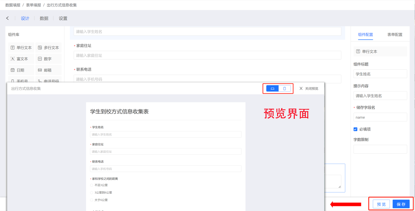
Save the form.
From the above steps, it can be seen that the form creation process is relatively simple, with the main focus being the use of components within the form. The following sections provide detailed introductions to form components.
Form Configuration
Form configuration refers to the settings during form creation that affect the form's appearance and data storage. Form appearance configurations include:
Form Title: The title displayed on the form submission page. The form title is not the same as the form name during creation. The form name is not displayed during submission.
Submit Button: When clicked, the data entered in the form is uploaded and stored in the database.
Reset Button: When a lot of content needs to be re-entered, the reset button can be used to clear all items in the form and start over.
View Submitted Data: This configuration currently only takes effect during bulk import.
Modify Submitted Data: This configuration currently only takes effect during bulk import.
Bulk Import: Supports bulk import of data during form submission.
- The bulk import file must meet the following conditions:
- The import file header cannot be empty, cannot contain merged cells, and does not support adding or modifying field names. It is recommended to download the template, fill in the data using the template, and then import it.
- Supports csv, xls, xlsx, xlsm file types.
- File size does not exceed 9GB.
- Only the first worksheet in the file is imported.
- Bulk import supports viewing and modifying submitted data.
- If "View Submitted Data" is checked, you can download and view the submitted data.
- If both "View Submitted Data" and "Modify Submitted Data" are checked, you can download and modify the submitted data, and then re-import to complete the modification.
- The bulk import file must meet the following conditions:
Data storage configurations include:
- Output Path: Stores the data collected by the form in the specified database path.
- Output Table Name: Stores the data collected by the form in the specified table. A new table is created based on the table name during storage. If a table with the same name already exists in the specified path, a configuration error will be prompted.
Tip
Currently, only some data sources support the data filling function, and the corresponding data connection needs to be checked with the "Support Operations on Connected Database" option.
Supported Data Source List
| Data Source Name |
|---|
| mysql |
| doris |
| atomData |
| mongodb |
| tidb |
| tdsqlmysql |
| oracle |
| postgresl |
| greenplum |
| hologres |
| maxcompute |
| tdsql |
| sqlserver |
| dameng |
| redshift |
| clickhouse |
Components
Data filling provides 9 common components: single-line text, multi-line text, rich text, number, date, email, phone number, telephone number, and single-choice. Different components serve different purposes, and users should choose the appropriate component based on the type of information to be collected.
Component Introduction
Text Components
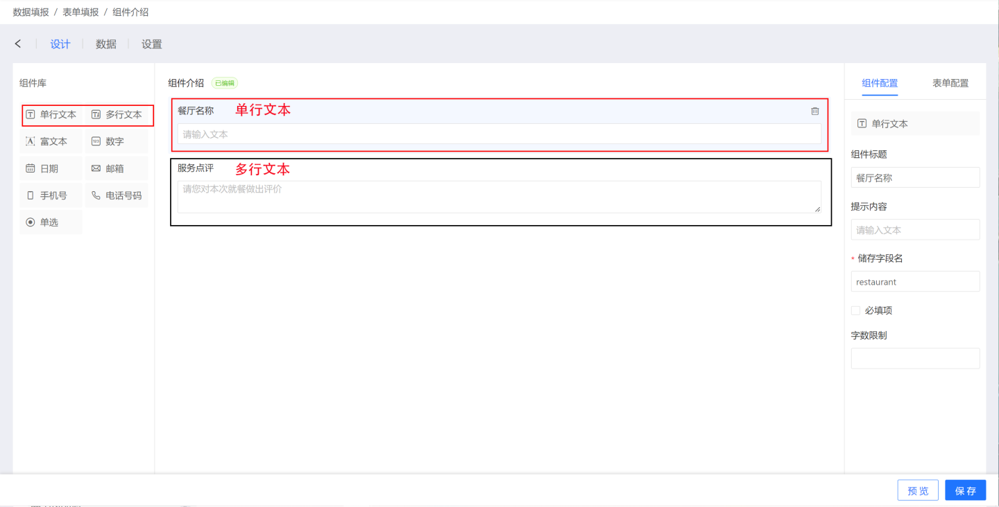
Text components include single-line text components and multi-line text components.
- Single-Line Text Component: Collects text information. All input content is displayed on one line and does not wrap.
- Multi-Line Text Component: Collects text information. When the input text exceeds the display width, it automatically wraps, and manual line breaks can also be used. On the PC, the multi-line text input box can be enlarged.
Text component configuration items include:
- Title: The title displayed by the component, defaulting to "Single-Line Text" or "Multi-Line Text".
- Prompt Content: The content that prompts the user to input, defaulting to "Please enter text".
- Storage Field Name: The field name in the database where the collected data is stored. After setting, it can be modified, and the last modification will be taken as the final result.
- Required: When checked, this field cannot be left blank when filling out the form.
- Character Limit: The limit on the number of characters that can be entered.
Number Component
The number component is used to collect numeric information, such as quantities, prices, grades, etc.
Number component configuration includes:
- Title: The title displayed by the component, defaulting to "Number".
- Prompt Content: The content that prompts the user to input, defaulting to "Please enter a number".
- Storage Field Name: The field name in the database where the collected data is stored. After setting, it can be modified, and the last modification will be taken as the final result.
- Required: When checked, this field cannot be left blank when filling out the form.
- Integer Only: The data type supports integers and decimals. When checked, only integers can be entered during form filling.
- Minimum Value: After setting the minimum value limit, the number entered must be greater than or equal to the minimum value.
- Maximum Value: After setting the maximum value limit, the number entered must be less than or equal to the maximum value.

Date Component
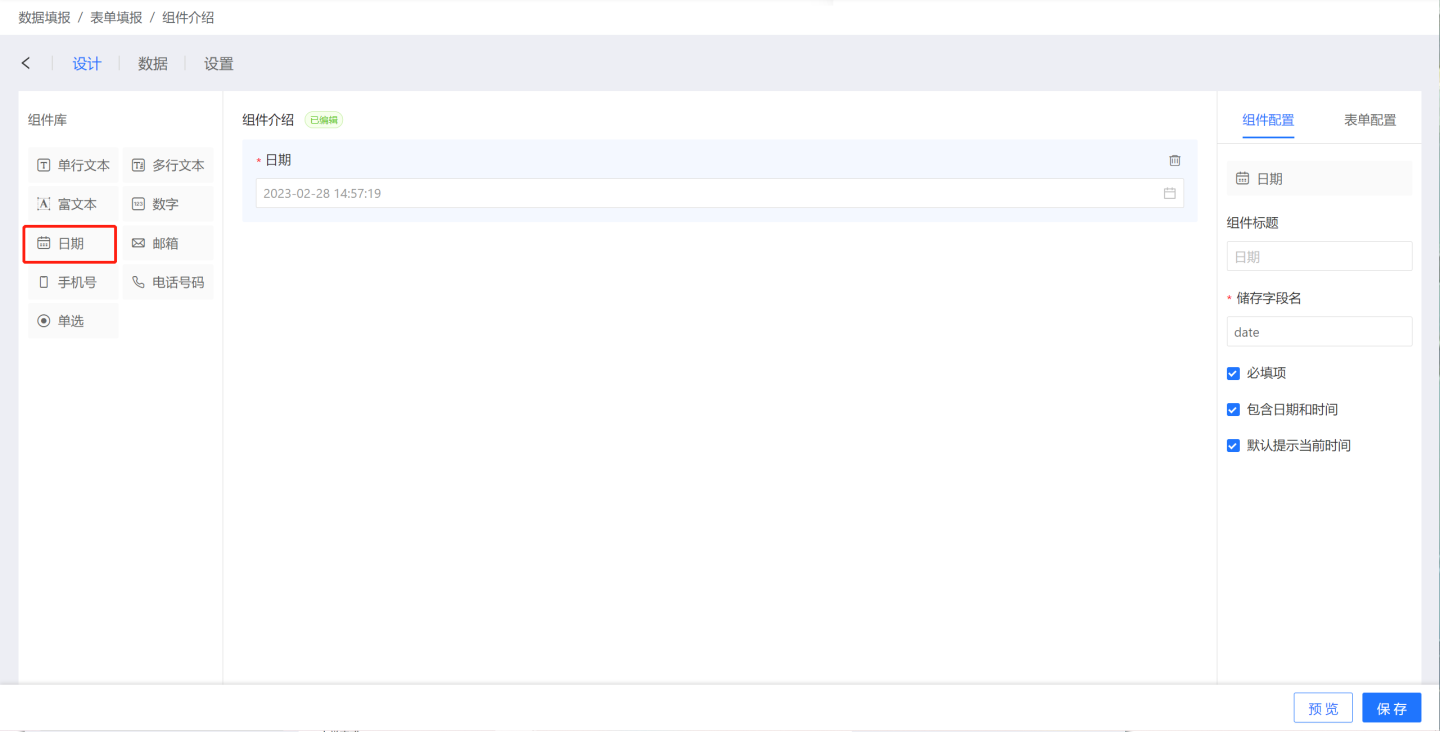
The date component is used to collect date information and supports date validation and default date setting.
Date component configuration includes:
- Title: The title displayed by the component, defaulting to "Date".
- Storage Field Name: The field name in the database where the collected data is stored. After setting, it can be modified, and the last modification will be taken as the final result.
- Required: When checked, this field cannot be left blank when filling out the form.
- Include Date and Time: This option affects the precision of the date. When checked, the date is precise to the second, with the display format "Year-Month-Day Hour:Minute:Second". When unchecked, the date display format is "Year-Month-Day".
- Default to Current Time: When checked, the current date is displayed by default.
Single-Choice Component
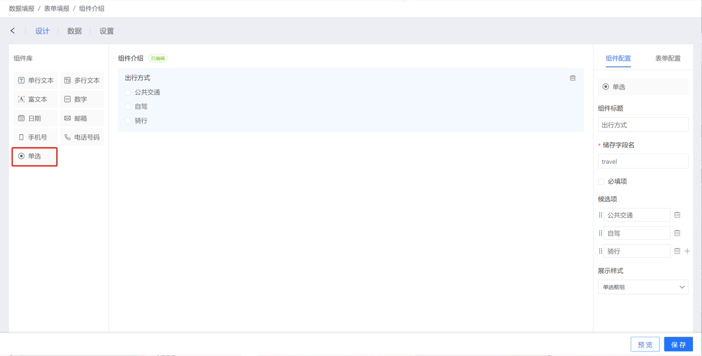
The single-choice component is used to collect selection-type data and only allows one option to be selected from the options.
Single-choice component configuration includes:
- Title: The title displayed by the component, defaulting to "Single-Choice".
- Storage Field Name: The field name in the database where the collected data is stored. After setting, it can be modified, and the last modification will be taken as the final result.
- Required: When checked, this field cannot be left blank when filling out the form.
- Options: The options for the single-choice component, which can be added manually.
- Display Style: Supports radio button groups and drop-down selectors.
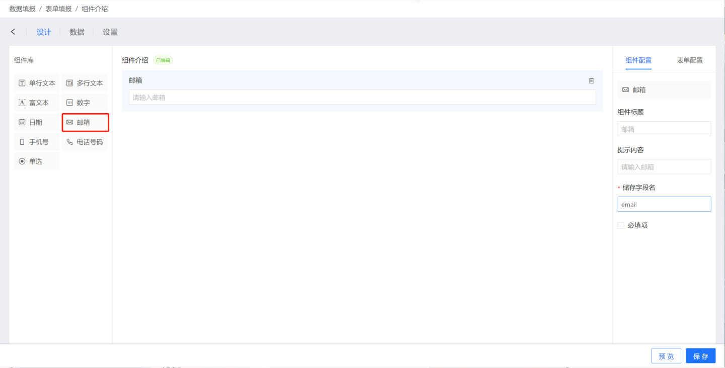
Email Component
The email component is used to collect email information and supports email format validation.
Email component configuration includes:
- Title: The title displayed by the component, defaulting to "Email".
- Prompt Content: The content that prompts the user to input, defaulting to "Please enter an email".
- Storage Field Name: The field name in the database where the collected data is stored. After setting, it can be modified, and the last modification will be taken as the final result.
- Required: When checked, this field cannot be left blank when filling out the form.
Phone Number Component
The phone number component is used to collect user mobile phone information and supports the following configurations:
- Title: The title displayed by the component, defaulting to "Phone Number".
- Prompt Content: The content that prompts the user to input, defaulting to "Please enter a phone number".
- Storage Field Name: The field name in the database where the collected data is stored. After setting, it can be modified, and the last modification will be taken as the final result.
- Required: When checked, this field cannot be left blank when filling out the form.

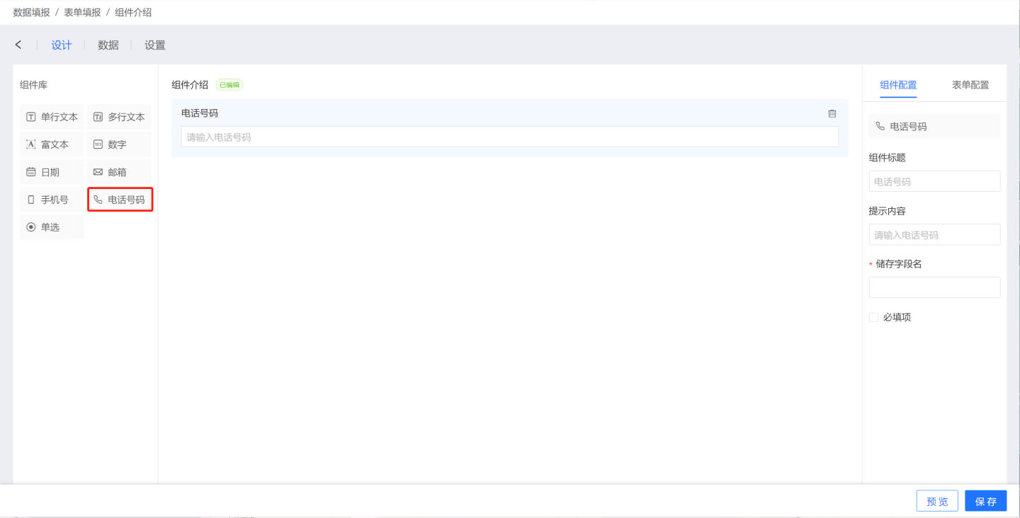
Telephone Number Component
The telephone number component is used to collect user fixed telephone numbers and supports the following configurations:
- Component Title: The title displayed by the component, defaulting to "Telephone Number".
- Prompt Content: The content that prompts the user to input, defaulting to "Please enter a phone number".
- Storage Field Name: The field name in the database where the collected data is stored. After setting, it can be modified, and the last modification will be taken as the final result.
- Required: When checked, this field cannot be left blank when filling out the form.
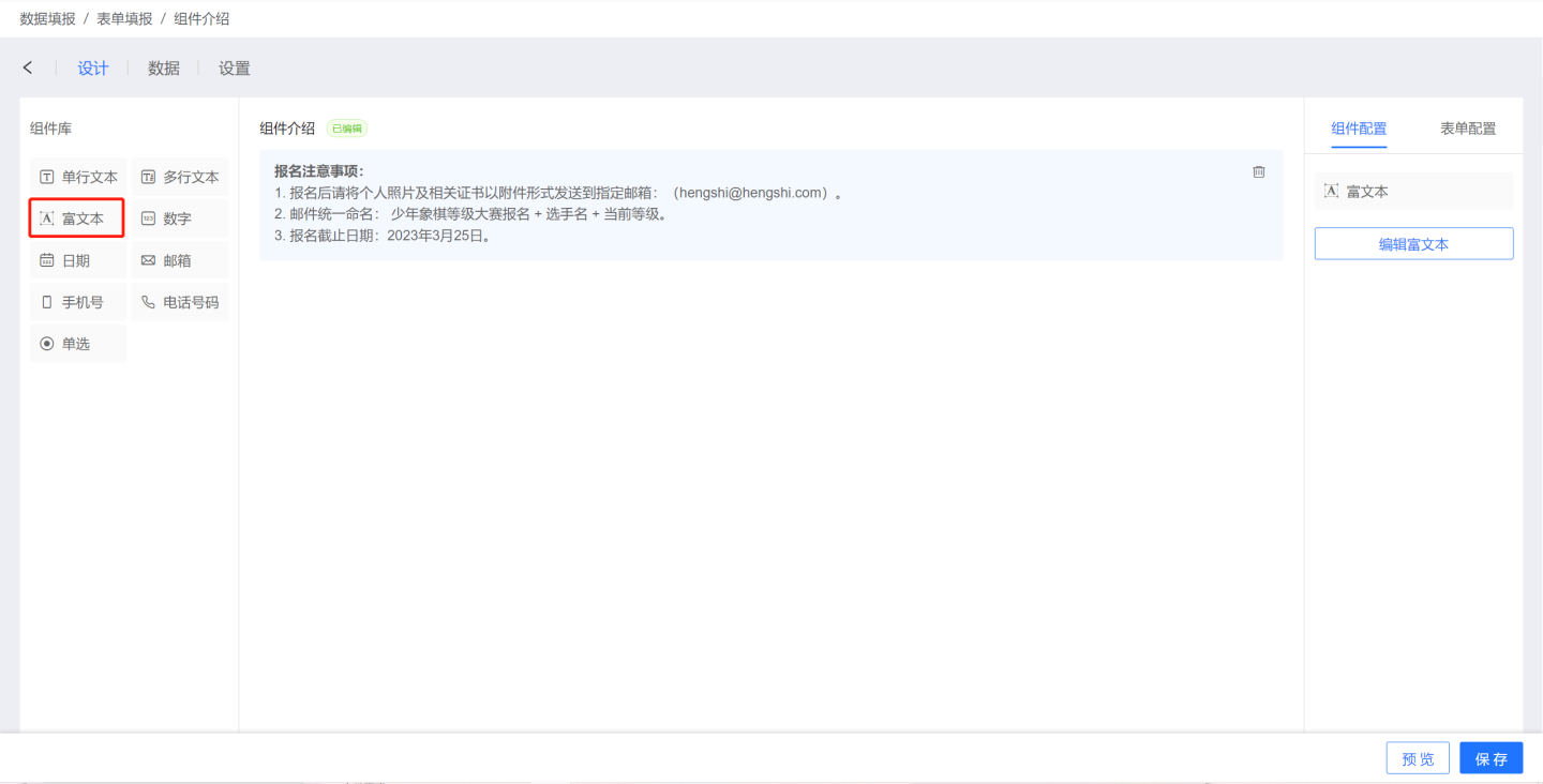
Rich Text Component
The rich text component is different from other components. This component only displays form-related information, such as prompts and notes, and does not collect data. The rich text component has no configuration items, only an edit button. Please click here to learn how to write rich text components.
Component Operations
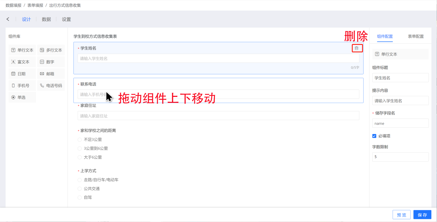
Components support deletion and movement operations.
