Container
A container refers to a chart container with independent layout capabilities. A container control can contain multiple container pages, and each container page can be freely laid out with the desired chart content.
Create a Container
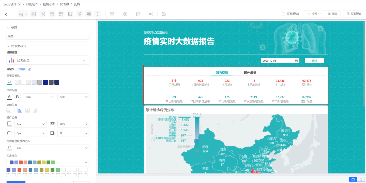
First, we have designed a brand-new icon specifically for the container control. In the dashboard editing state, click the "Container icon" in the top toolbar to add a container control to the dashboard.
Composition of the Container
Upon creation, the default state of the container is: displaying the container title; displaying a container tab; and displaying the container page content.
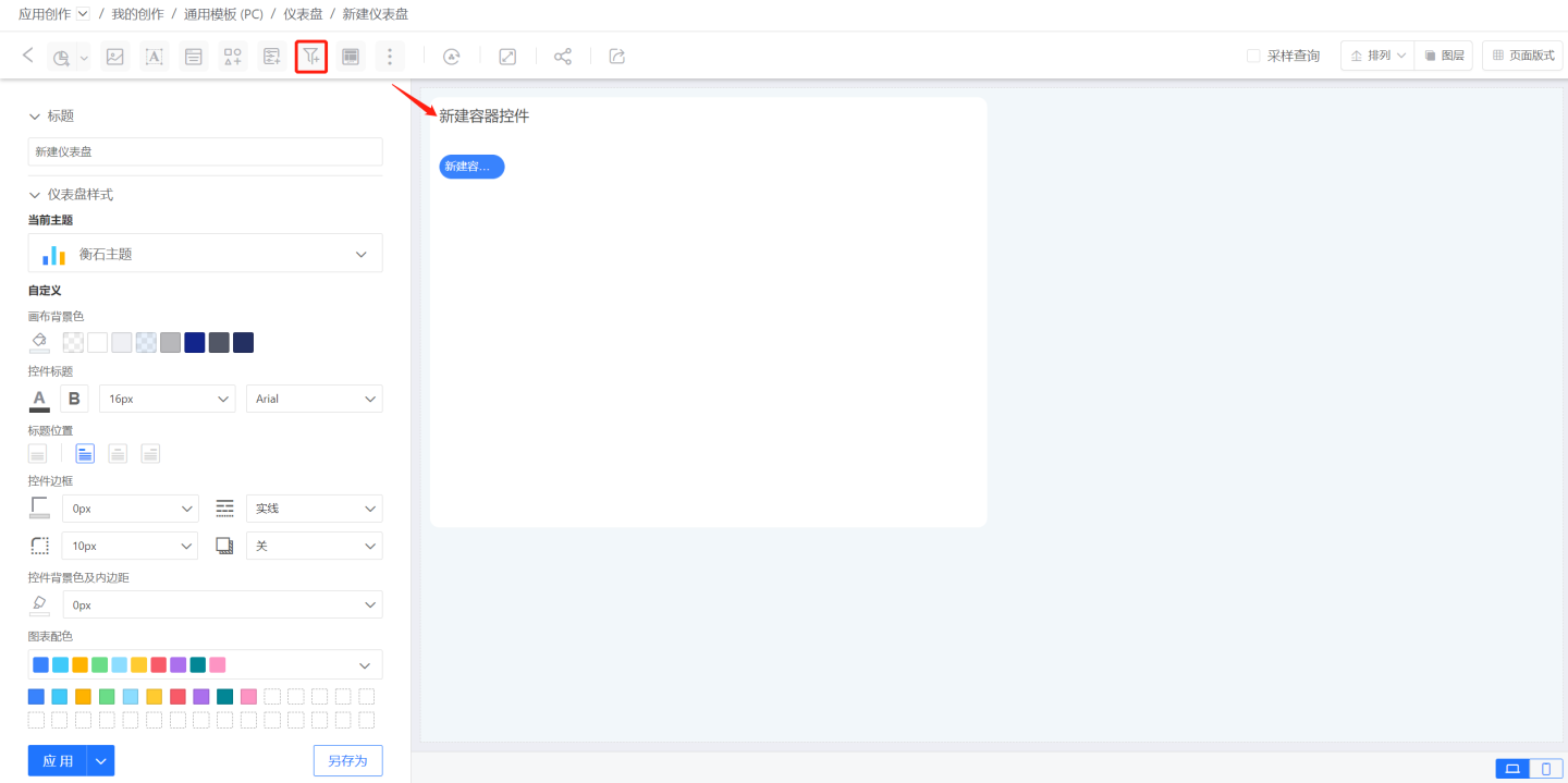
One "container page" corresponds to one "container tab." In the initial default state, the container will automatically create one container page for you, which will also generate one container tab.
Building Container Content
Through the 3-dot menu in the upper right corner of the control, select "Open" to enter the container. Inside the container, we can set the background color, background image, etc., of the container page individually. We can also add the required controls through the toolbar area at the top.
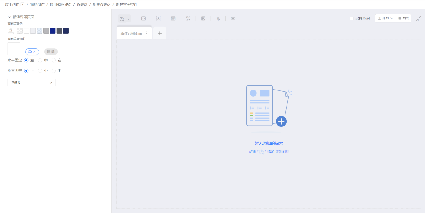
The method of adding and configuring charts within the container page content is consistent with the method of configuring charts in the dashboard.
After adding and configuring charts within the container page, the effect is as follows.
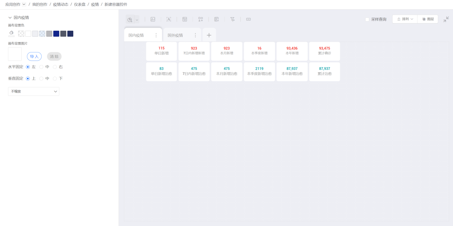
At this point, we can click the exit container icon in the upper right corner / or the dashboard name in the breadcrumb to return to the dashboard preview. The charts within the container control will be dragged along with the container as a whole.
Building and Switching Multiple Container Pages
Earlier, we learned how to create a container and how to create charts within the container. Now, how do we add multiple container pages within one container and how do we switch between pages?
Let's re-enter the container. At the top of the container page, there is a row of "Container Page Edit Tabs." Click the + icon on the right to add multiple container pages. You can switch between container pages by clicking different page tabs.

In the 3-dot menu on the right side of the tab, we can choose to "Rename," "Duplicate," or "Delete" the page.
- Duplicate: Copy the current page to create a new page. After duplication, it automatically switches to the new page and selects the corresponding tab.
- Rename: Display an input box at the tab to rename the page. Press "Enter" to confirm the input. The limit is 20 characters.
- Delete: Delete the corresponding page. After deletion, the page and its charts and controls will be deleted. Additionally, you can drag the tab with the mouse to adjust the order of the container pages.
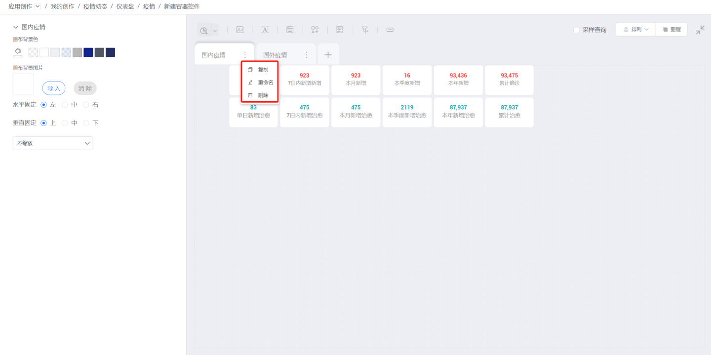
Now, let's return to the dashboard preview (as shown below). We can see that because we added a new container page, the container tabs have increased to two. We also renamed the page in the container's tab. Now we can click the tabs to switch between container pages.

Container Styles
Title
When a container is added, the title is displayed by default. You can choose to display or hide the title, as well as customize the title content.
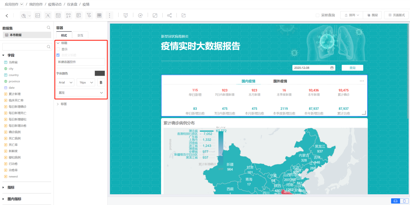
Tabs
You can set the container's tab style in the tab section of the container configuration style. Currently, you can choose from three styles: None / Use Tabs / Use Dot Indicators.
- None: Do not display tabs.
- Use Tabs: Use the tabs at the top of the container to display the number of pages and click to switch between container pages.
- Use Dot Indicators: Use the dot indicators at the bottom of the container to display the number of pages and click to switch between container pages.

Using Tabs
When using tabs, there are three tab styles available. Additionally, you can change the default tab colors, fonts, strokes, etc., in the "Unselected/Selected" settings below the tab style.
Spacing
You can set the spacing between tabs.
Tab Layout
You can set the alignment of the tabs.
Container Page Display
You can choose which pages to display in the container. By default, all pages are selected, meaning all container pages are displayed. You can also select the pages you want to display. Pages that are not selected will not be displayed in the container, nor will their tabs be shown, and they cannot be switched through tabs.
Container Interaction
Container interaction can be set for page-turning-related content.
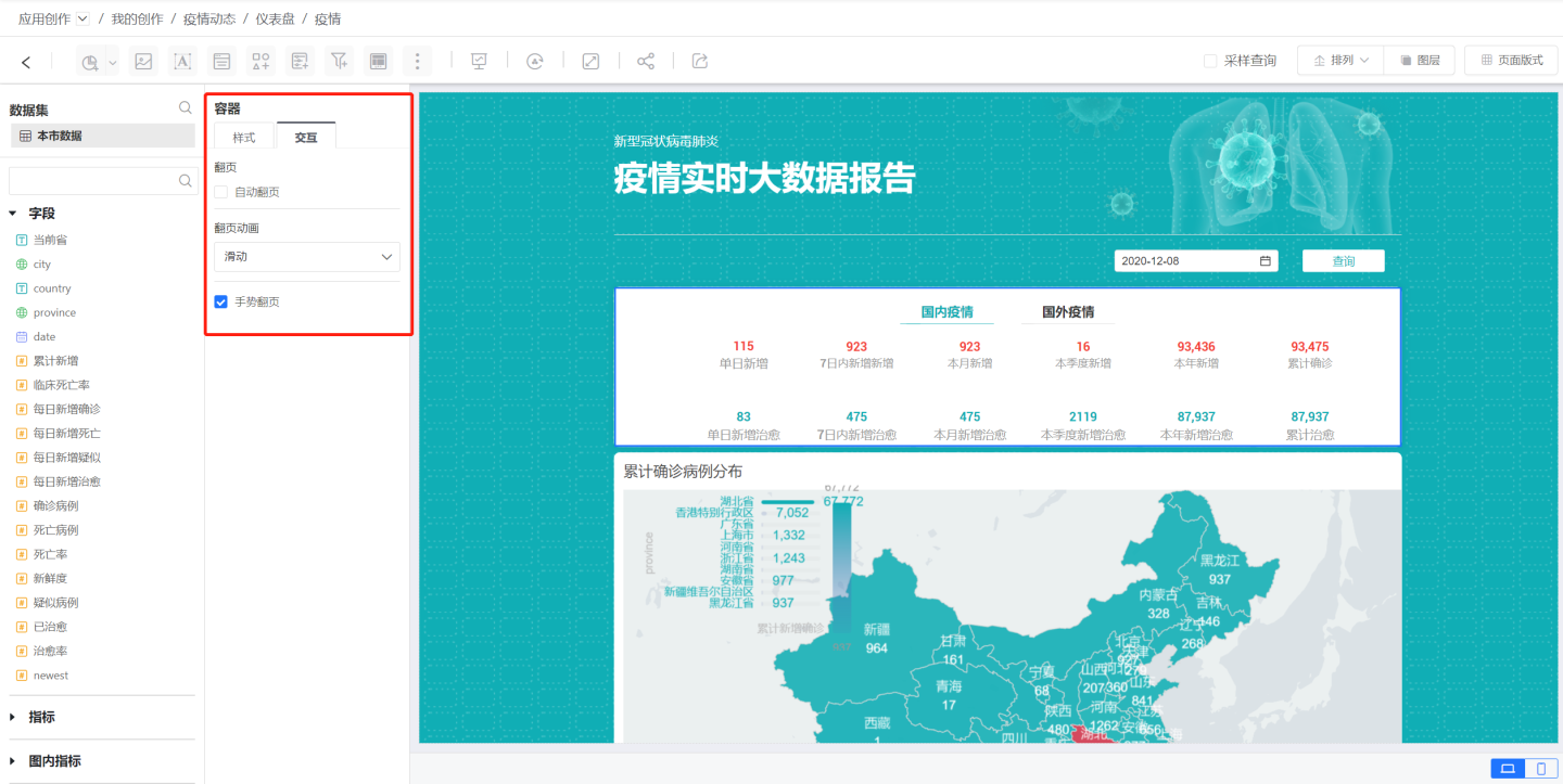
Container Page Switching Animation
Page-turning Animation: The animation effect when switching container pages. In the container configuration interaction, find the page-turning animation to choose the page-switching effect.
Automatic Page Switching in Container
Automatic Page-turning: Without clicking tabs or dots, set the container to automatically switch pages, cycling through the pages within the container. In the container configuration interaction, find the page-turning option to enable automatic page-turning. You can choose the time interval for automatic page-turning.
Gesture Page-turning
Gesture Page-turning: Without clicking tabs or dots, you can switch container pages by dragging the mouse on a PC or tapping and sliding on a mobile device. In the container configuration interaction, find the gesture page-turning option to turn it off or on as needed.
Container Function
It allows for the display of as much content as possible within a limited display area. It can also switch and display different datasets' visual chart content within the same dashboard based on business scenario requirements.
Other Applications of Containers
Containers can be used as cards, filling them with the required chart content to create a combined card format. They can also be used in large screen displays to add content that needs to be switched and scrolled within a certain area.
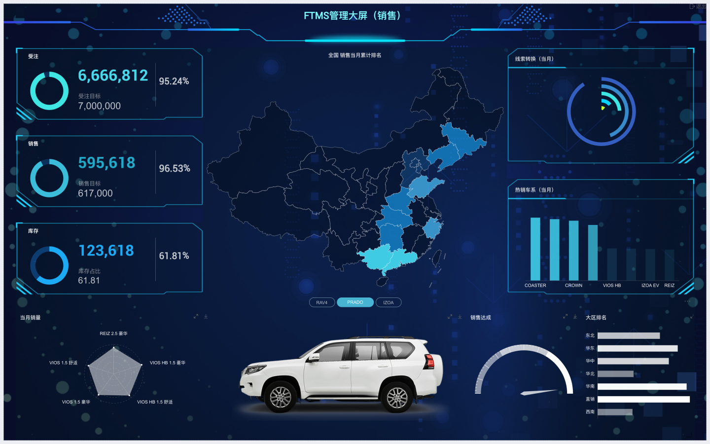
In summary, based on your needs, containers can provide a myriad of visual effects and excellent page interaction experiences. Use your creativity to experience the wonders of containers~