Nightingale Chart
The Nightingale Chart expresses the performance of a single metric across categories within a dimension, similar to a bar chart displayed in polar coordinates. When there are many categories, it is more intuitive than a pie chart. Due to the circular arrangement, comparisons are more pronounced (magnified). Due to the difficulty in identifying angles, it generally does not exceed 30 categories. 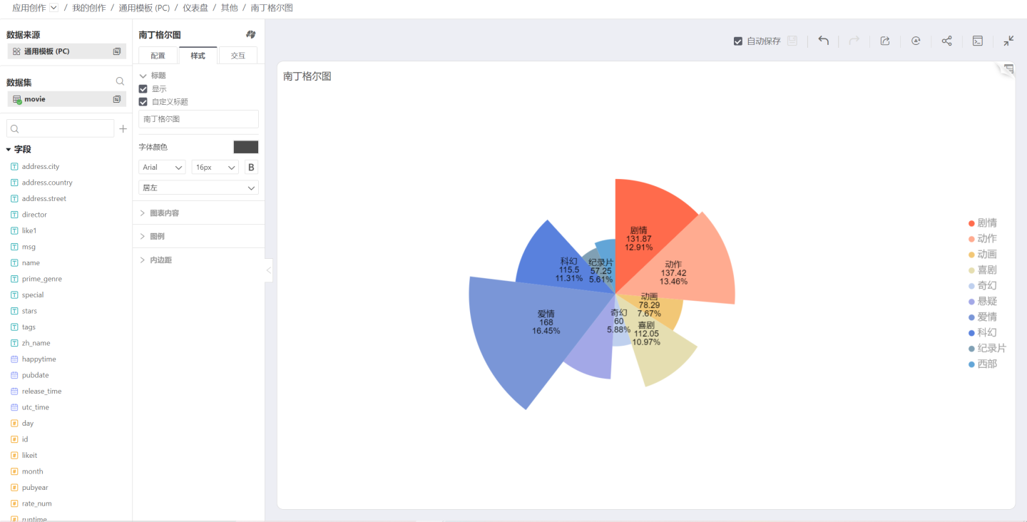
Sunburst Chart
The Sunburst Chart is a modern pie chart that surpasses traditional pie and donut charts by clearly expressing hierarchical and ownership relationships. It displays data composition in a parent-child hierarchy. In a Sunburst Chart, the closer to the center, the higher the level, and in adjacent layers, the inner layer contains the outer layer. 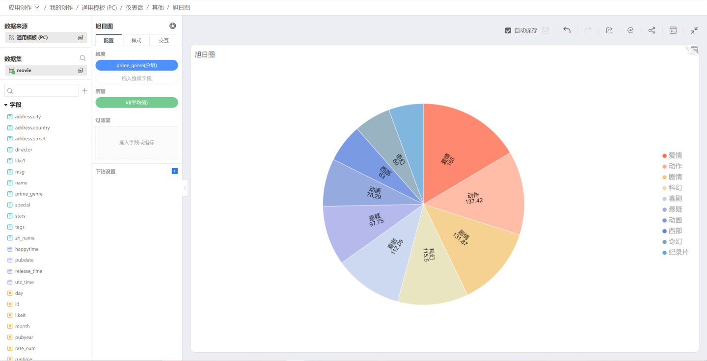
Process Chart
The Process Chart primarily displays the different states of equipment in a manner similar to a Gantt chart. 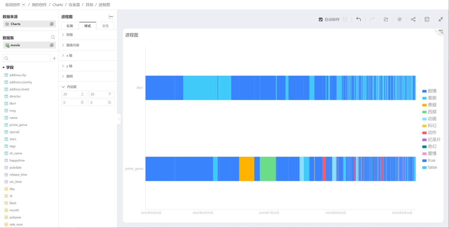
Tree Map
The Tree Map starts from a single project, expands into two or more branches, and then continues to expand from each branch, and so on. It has a trunk and multiple branches, resembling a tree. Tree Maps are typically used to gradually decompose major categories into increasingly detailed layers. 
Treemap
The Treemap was proposed by Professor Ben Shneiderman of the University of Maryland in the 1990s, initially to find an effective way to understand disk space usage. Treemaps are suitable for displaying hierarchical data and can intuitively compare levels. A tree structure is transformed into a rectangular space, like a map.
The Treemap divides the rectangular area according to the weight of the current child node based on the tree hierarchy, and then recursively divides the rectangles corresponding to the child nodes. The advantage of the Treemap is that, compared to traditional tree structure diagrams, it can more effectively utilize space and has the function of displaying proportions.
The disadvantage of the Treemap is that when the category proportion is too small, text placement becomes difficult. Compared to forked tree diagrams, the Treemap does not express the tree data structure as intuitively and explicitly. 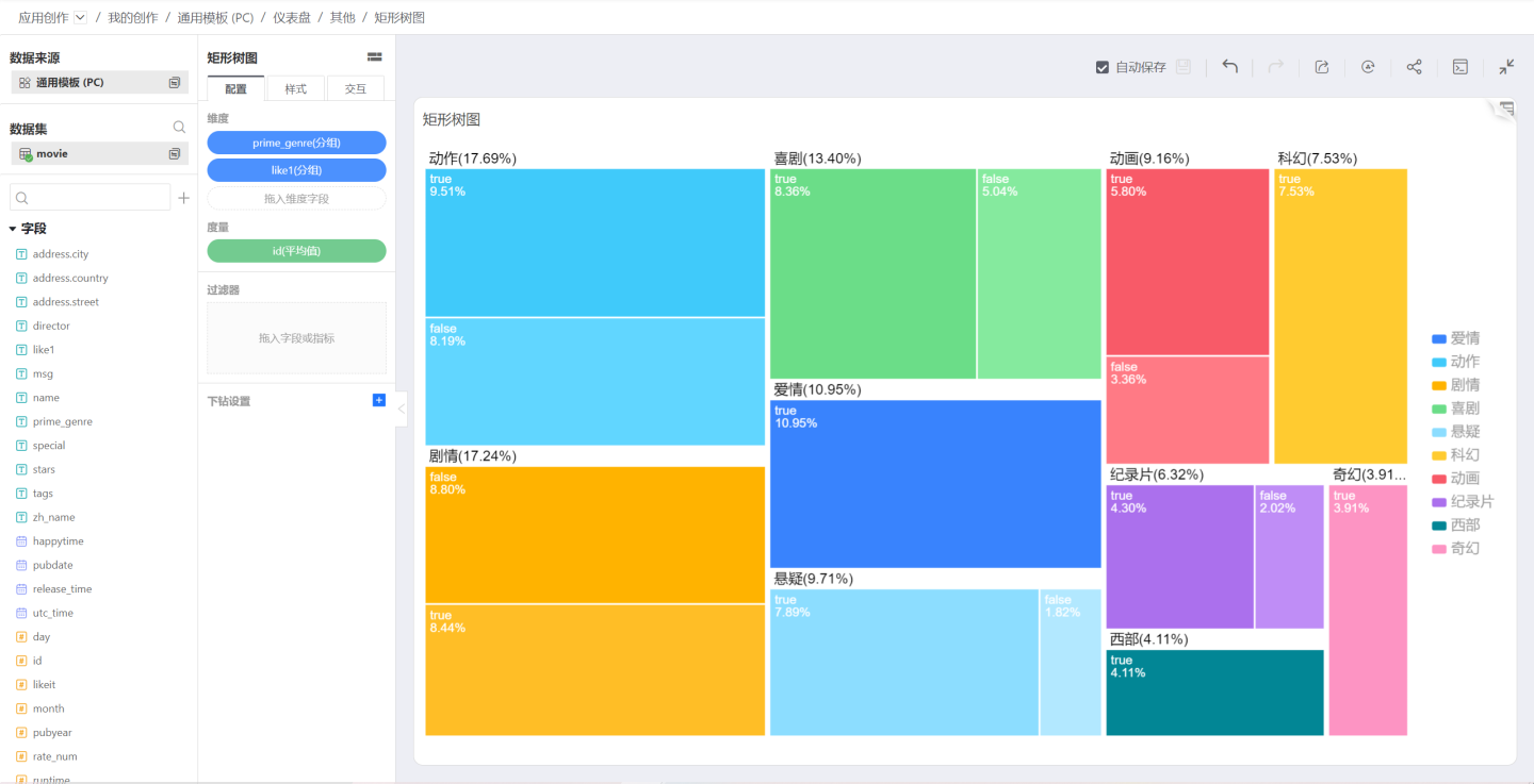
Waterfall Chart
The Waterfall Chart helps to understand the cumulative effect of sequentially introducing positive or negative values. Waterfall Charts are also known as flying bricks charts or Mario charts because they look like bricks hanging in the air.
Waterfall Charts are typically used to understand how an initial value is affected by a series of intermediate positive or negative values. 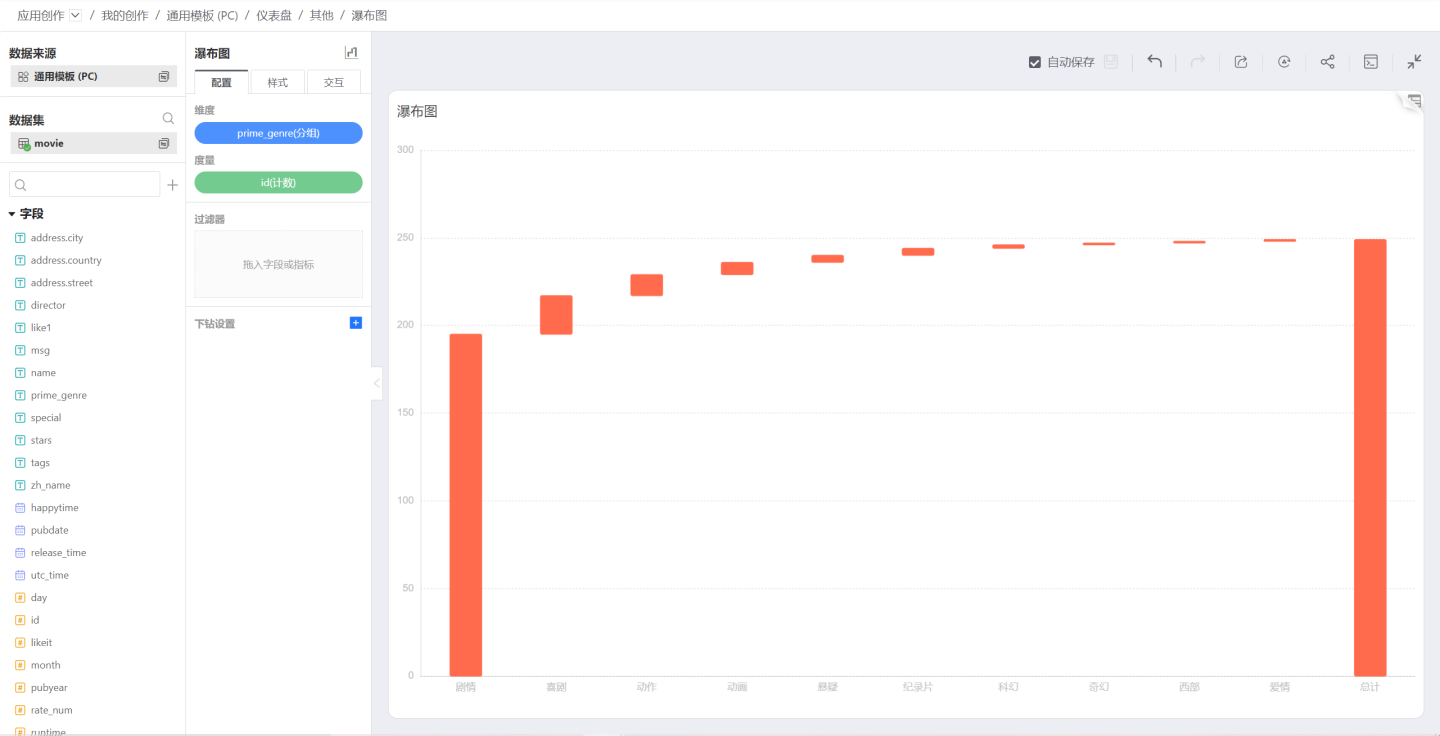
Box Plot
The Box Plot, also known as the box-and-whisker plot, is a method of graphically depicting groups of numerical data through their quartiles. It is used to display the distribution of data based on a five-number summary (minimum, first quartile, median, third quartile, and maximum). Box plot, also known as box-and-whisker plot, is a statistical chart used to display the distribution of a set of data.
Currently supported data sources for box plots include: Engine, Postgresql, GreenPlum, Oracle, StarRocks, Doris 2.0.
If a dataset contains a categorical variable and one or more continuous variables, you might want to know how the continuous variables change with the levels of the categorical variable. Box plots provide a method to visualize this, summarizing the distribution with just five numbers: the maximum, minimum, median, lower quartile, and upper quartile. Outliers in the dataset are typically plotted as individual points. Box plots are commonly used in numerical statistics. Although they are more primitive and simple compared to histograms and density curves, they do not require excessive canvas space, making them highly efficient for comparing the distributions of multiple datasets. As shown in the figure below: 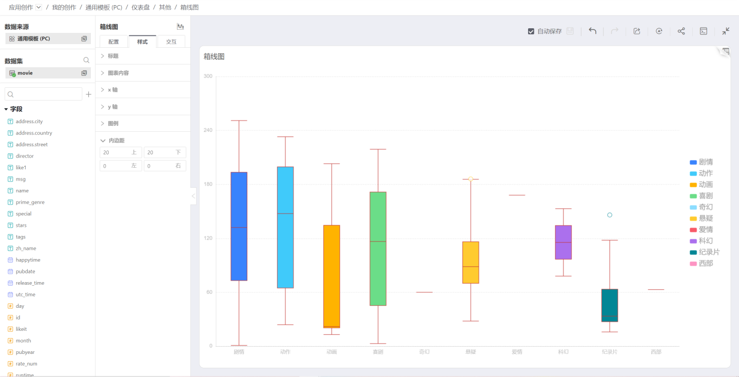
Pareto Chart
A Pareto chart arranges quality issues and quality improvement projects in order of importance. Named after the Italian economist V.Pareto, it is also known as a sorted chart, ABC chart, or priority chart. It is a histogram drawn in order of frequency of occurrence, showing how many results are caused by identified types or categories. 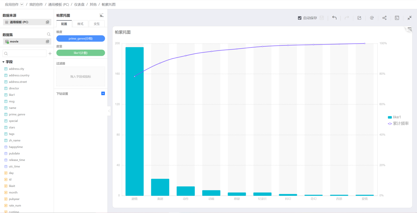
Bubble Chart
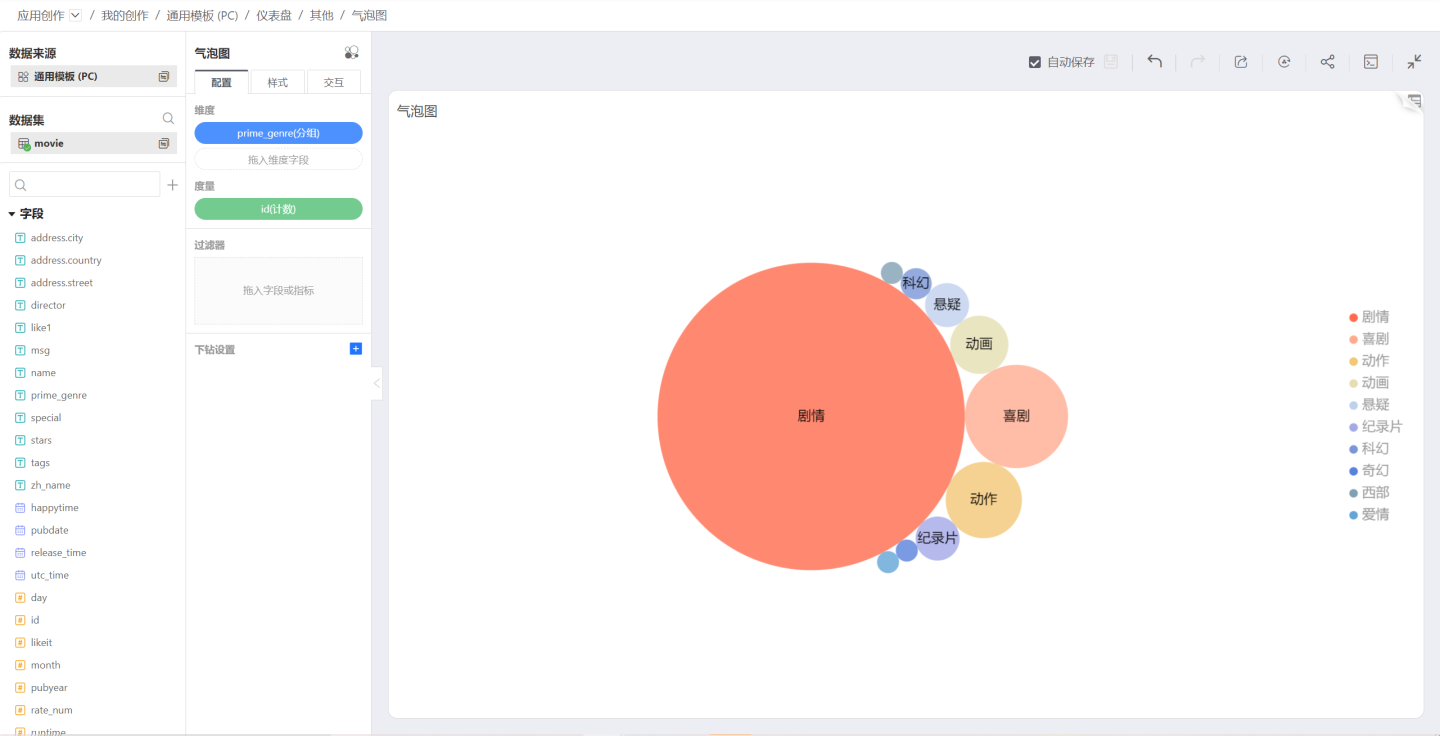
Similar to a treemap, a bubble chart can select multiple dimensions and one measure, with the measure reflected by the size of the bubbles. 