Bar Chart
A bar chart is a statistical graph used for discrete data. Each bar represents a category (dimension), and the length of the bar is the statistical value (measure) under that category. Bar charts provide a convenient sorting function, making it easy to see the maximum and minimum values. A typical bar chart is shown below: 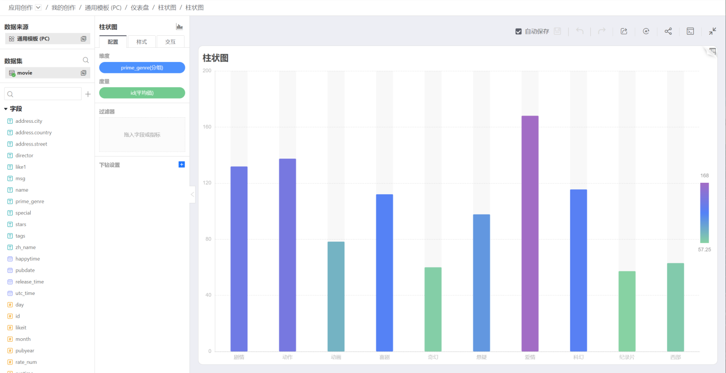
Clustered Bar Chart
A clustered bar chart allows multiple measures to be selected on the Y-axis, forming a comparative relationship. As shown below: 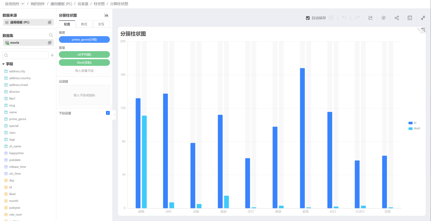
Grouped Clustered Bar Chart
Compared to a bar chart, a grouped clustered bar chart adds an additional layer of grouping, allowing the graphics of secondary grouping to be clustered together for comparison. As shown below: 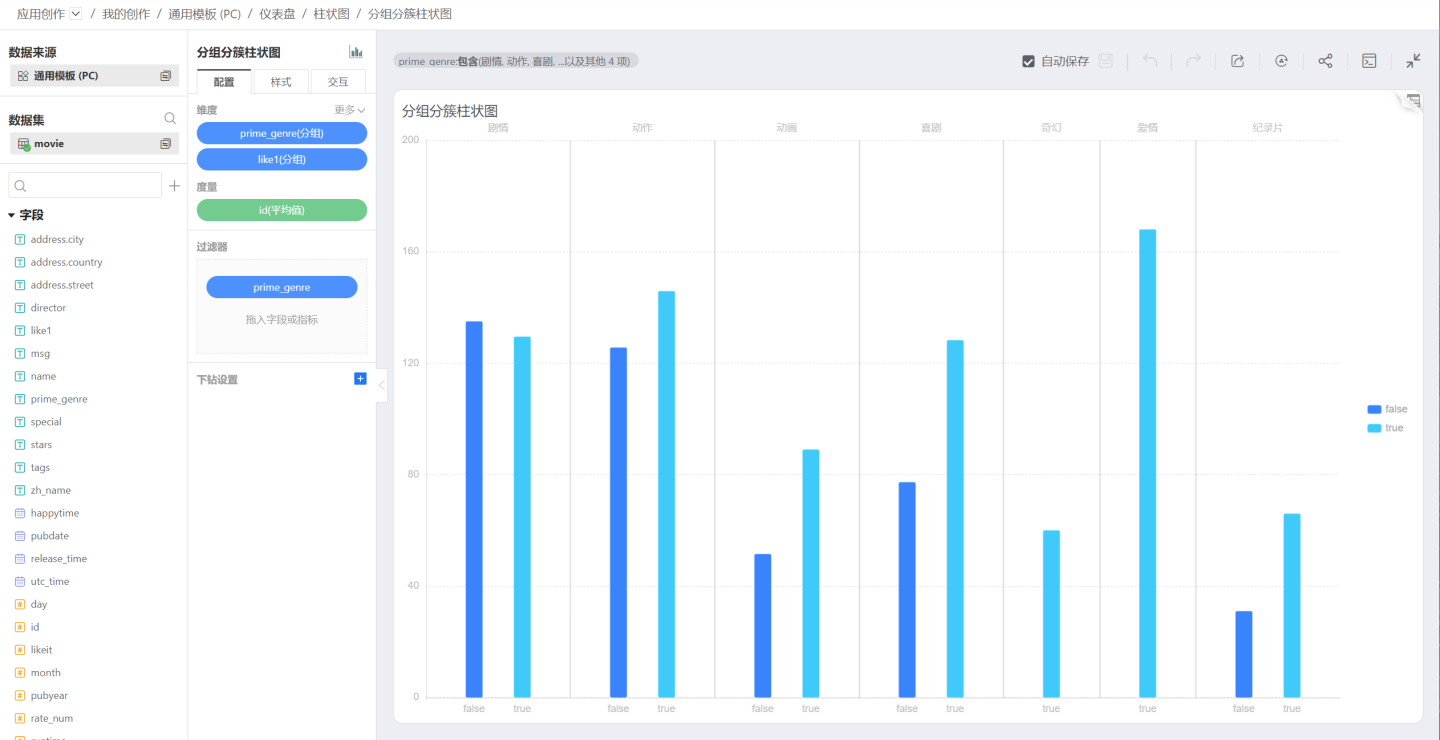
Stacked Bar Chart
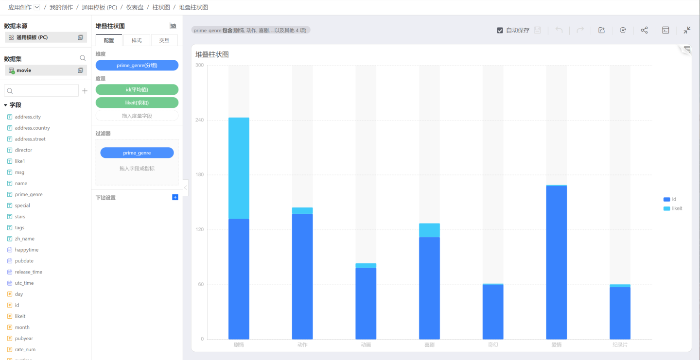
Unlike a grouped bar chart that displays categories side by side, a stacked bar chart divides each bar to show the size of each data under the same type.
Note
Each group of data must be all "positive" or "negative". If there are both positive and negative numbers, the column will not be displayed in the chart.
Percentage Stacked Bar Chart
Similar to a stacked bar chart, but each layer of the bar represents the percentage of the data in that category relative to the total data in the group. 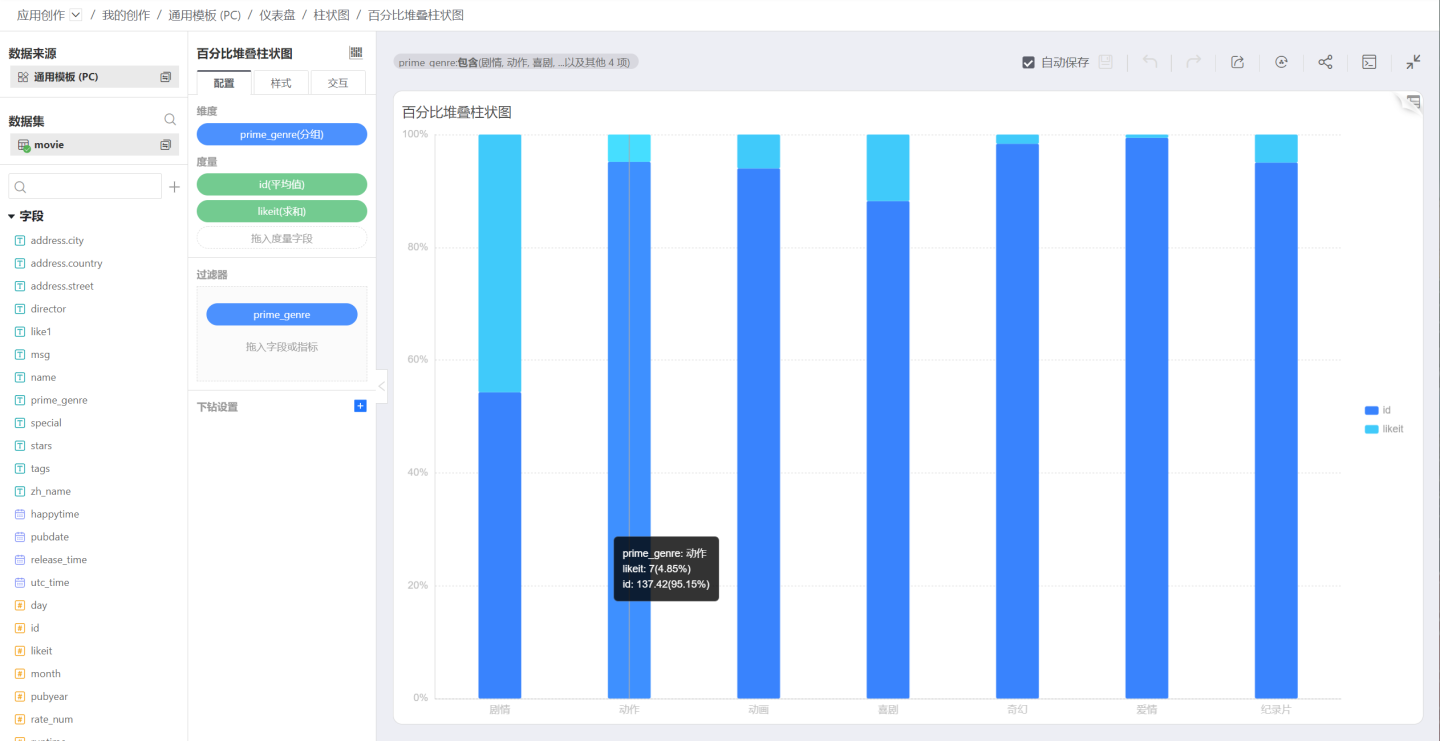
Grouped Stacked Bar Chart
Unlike a grouped bar chart that displays categories side by side, a grouped stacked bar chart divides each bar to show the size of each data under the same type. A grouped stacked bar chart can visually display the data of each small category contained in a large category, as well as the proportion of each small category, showing the relationship between individual items and the whole. 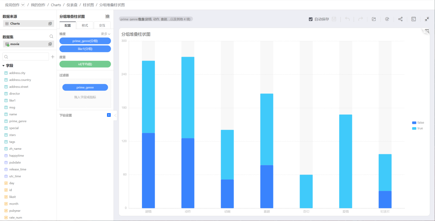
Percentage Grouped Stacked Bar Chart
Similar to a grouped stacked bar chart, but each layer of the bar represents the percentage of the data in that category relative to the total data in the group. 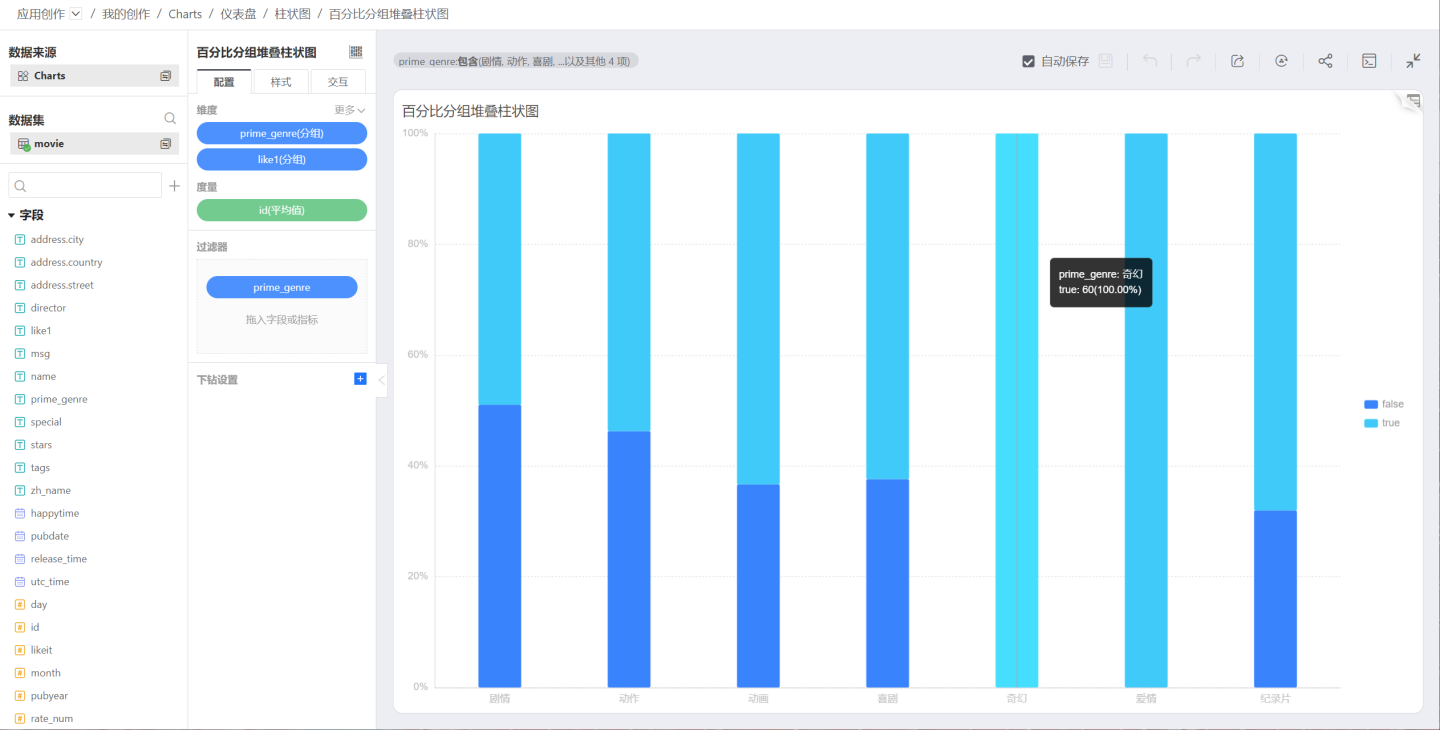
Horizontal Bar Chart
As the name suggests, a horizontal bar chart is formed by swapping the X and Y axes of a bar chart. 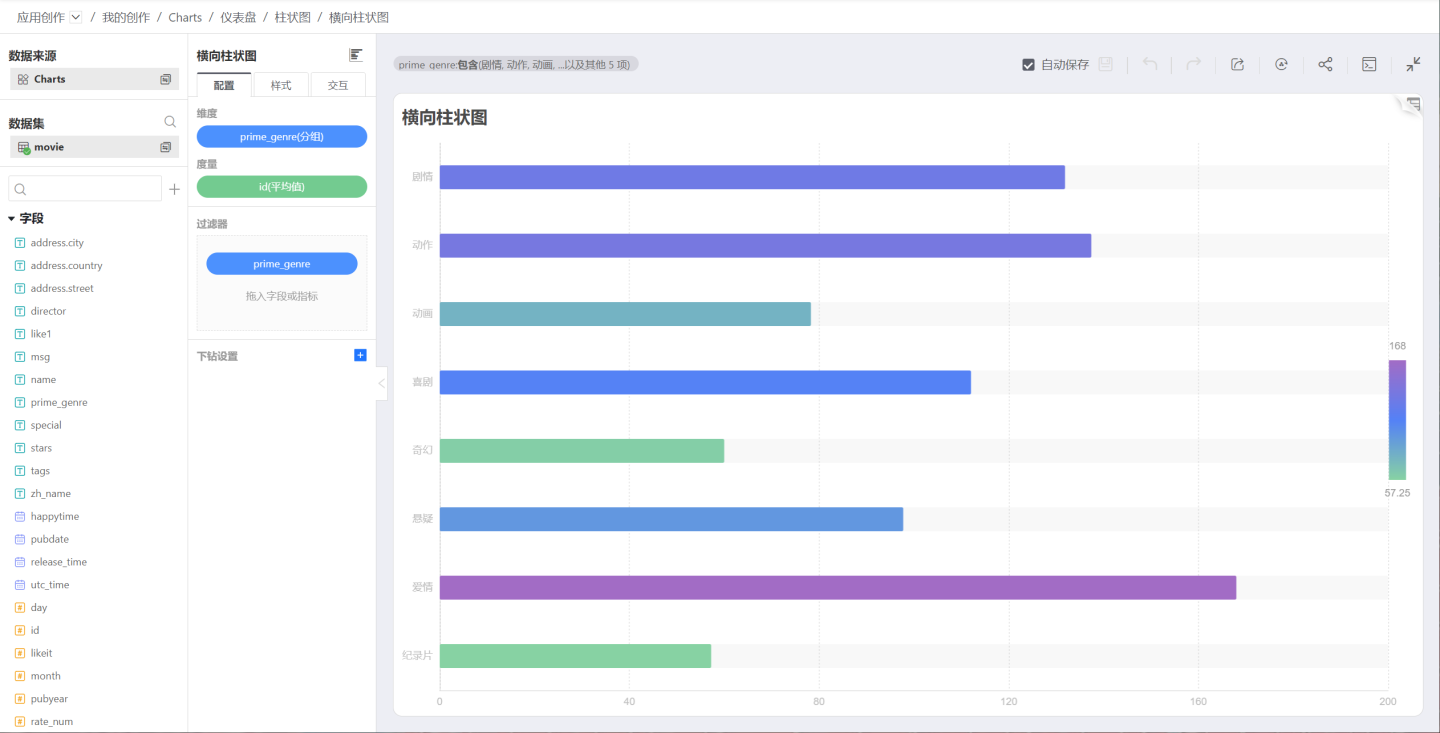
Horizontal Clustered Bar Chart
Multiple measures can be selected, and each measure under each category is displayed horizontally independently. 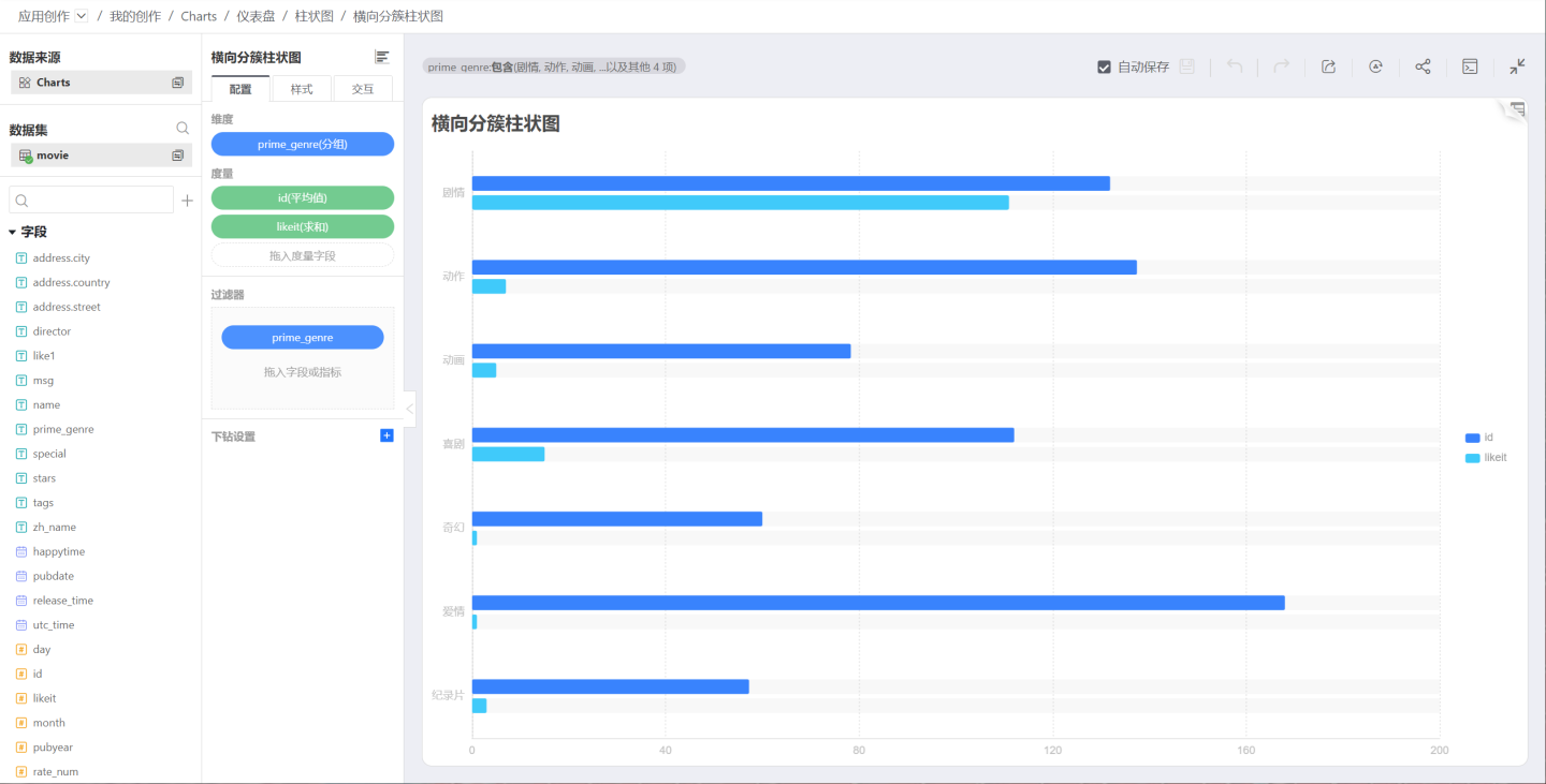
Horizontal Stacked Bar Chart
Multiple measures can be selected, and all measures under each category are displayed horizontally stacked. 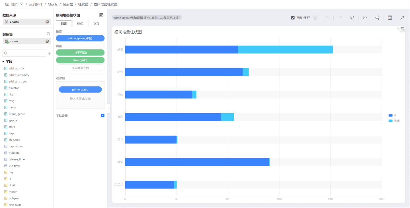
Horizontal Percentage Stacked Bar Chart
Multiple measures can be selected, and the proportion of each component under each dimension is displayed horizontally stacked. 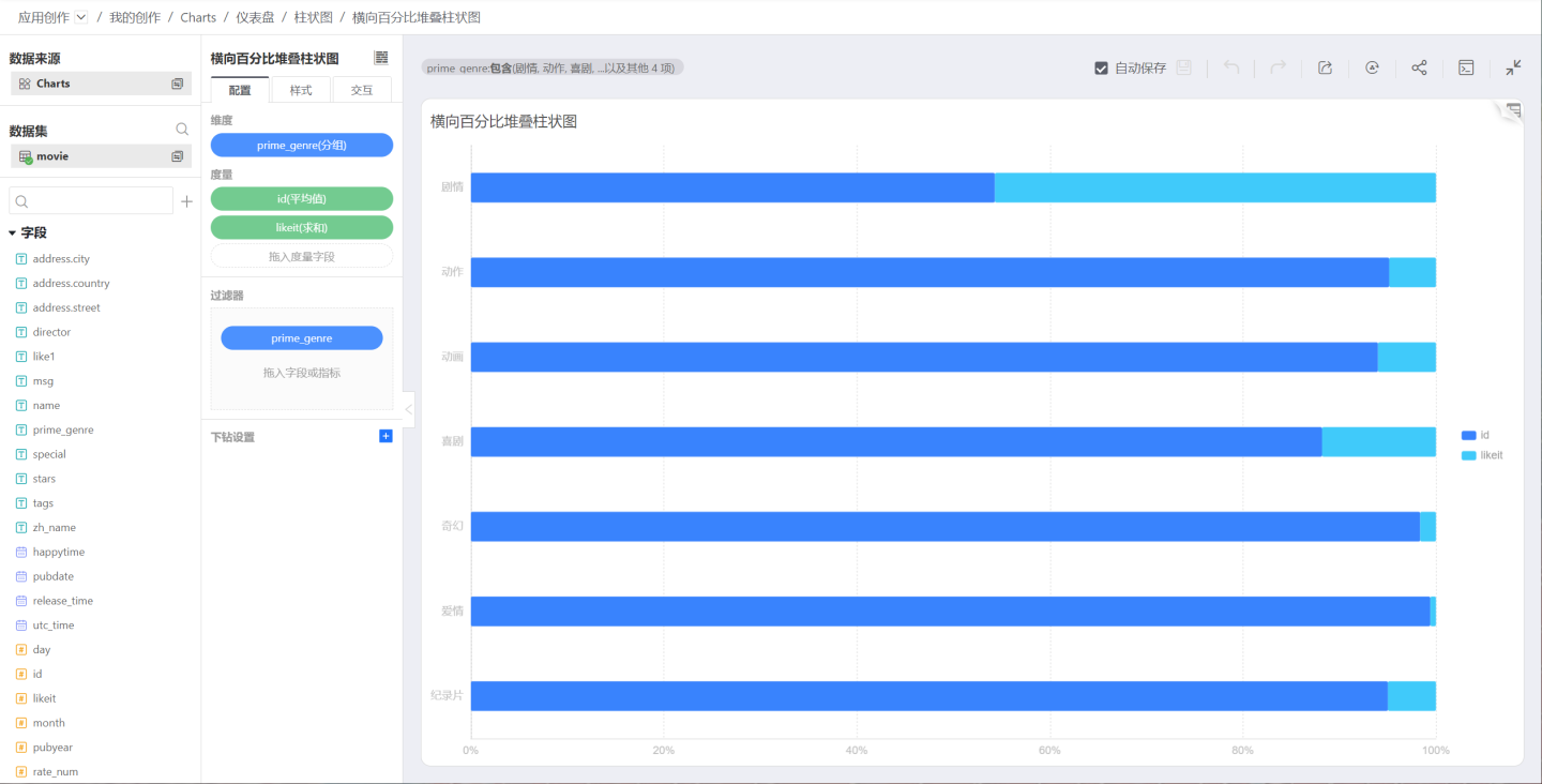
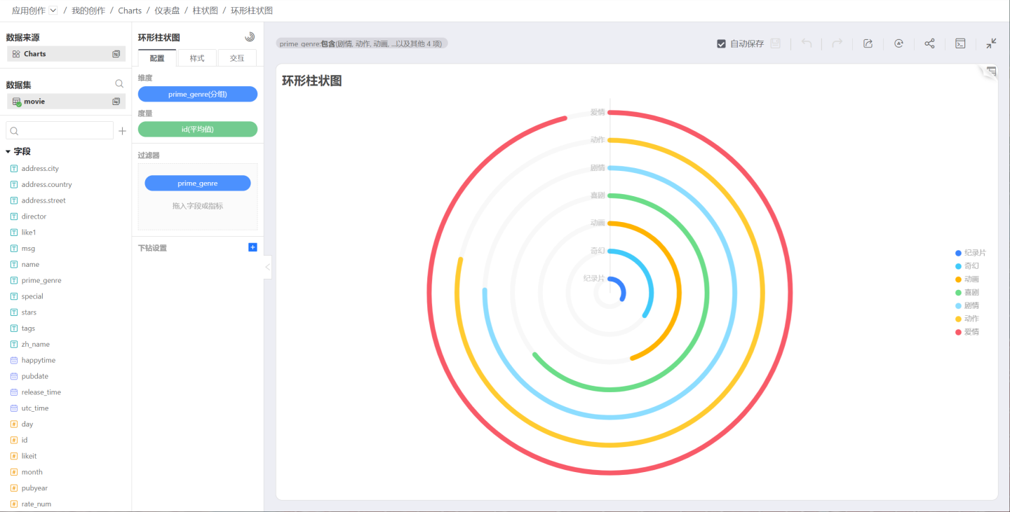
Ring Bar Chart
The difference between a ring bar chart and a bar chart is that the display style is changed to a ring mode. As shown below: 