Chart Overview
Chart widgets help data professionals explore and analyze data in real-time, uncovering hidden insights more efficiently. The system aggregates various types of charts, primarily categorized into Metric Charts, Histogram Charts, Line Charts, Relation Charts, Donut Charts, Area Charts, Maps, Tables, and Custom Charts.
Chart Examples
Below are examples of charts supported by the platform.
Metric Charts
Metric charts include KPIs and Dashboards.
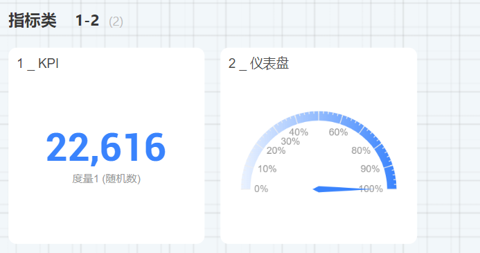
The Metric Trend Card allows viewing the total value of a metric while displaying its time trend.

Histogram Charts
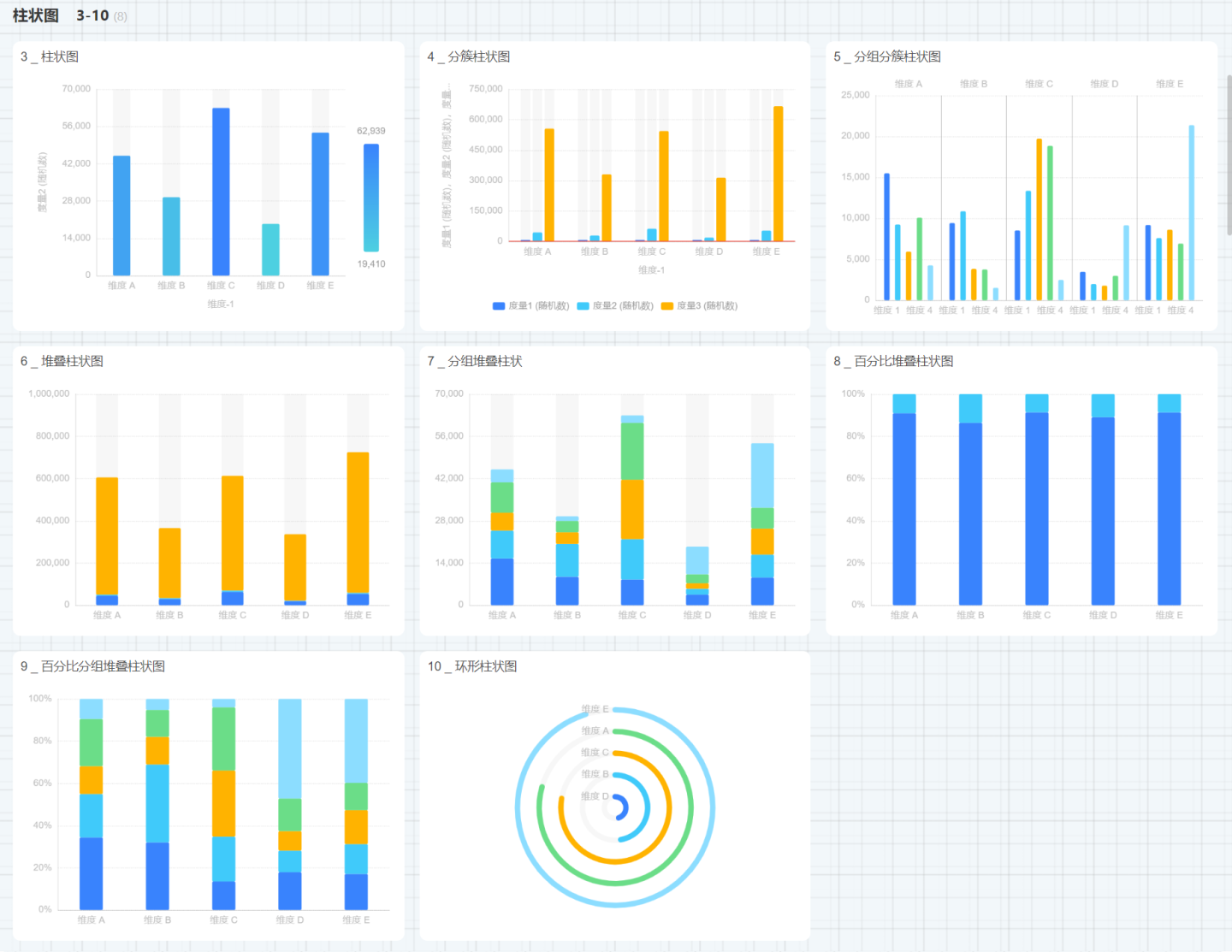
Histogram charts include Bar Charts, Clustered Bar Charts, Grouped Clustered Bar Charts, Stacked Bar Charts, Grouped Stacked Bar Charts, Percentage Stacked Bar Charts, Percentage Grouped Stacked Bar Charts, and Donut Bar Charts.
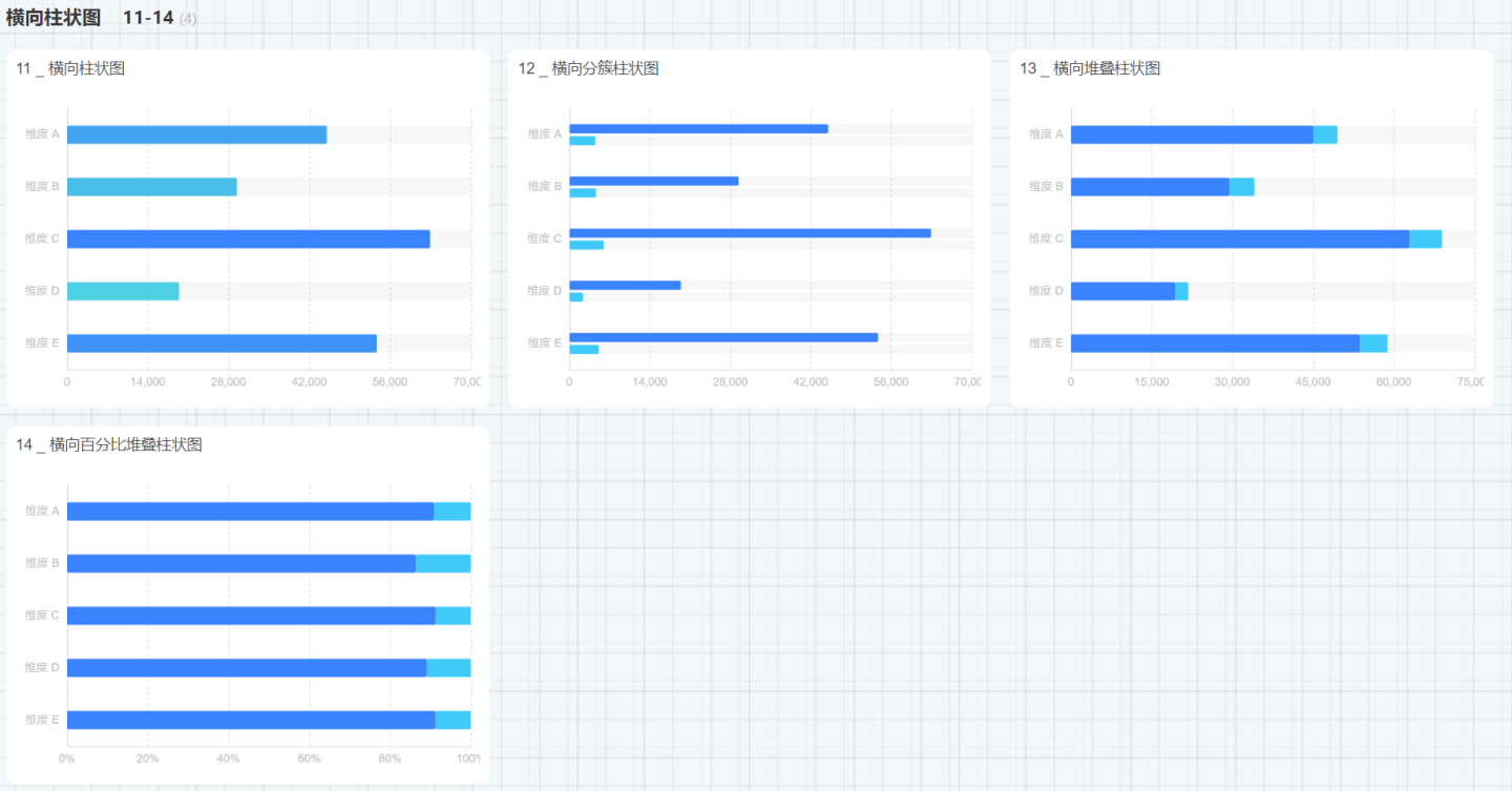
Additionally, there are Horizontal Bar Charts, Horizontal Clustered Bar Charts, Horizontal Stacked Bar Charts, and Horizontal Percentage Stacked Bar Charts.
Donut Charts
Donut charts include Donut Charts, Pie Charts, Nightingale Charts, and Sunburst Charts. 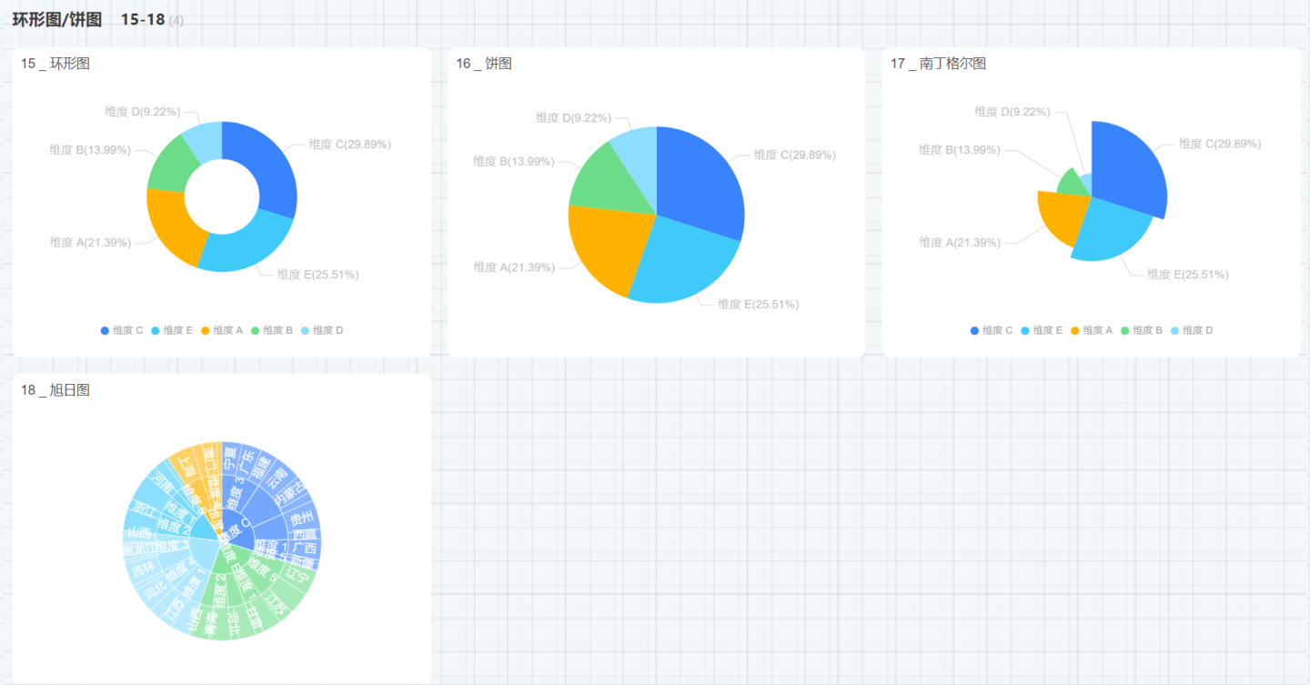
The labels for Donut Charts, Pie Charts, and Nightingale Charts support line breaks. The configuration is unchecked by default. When the chart's label information is extensive, this option can be enabled. 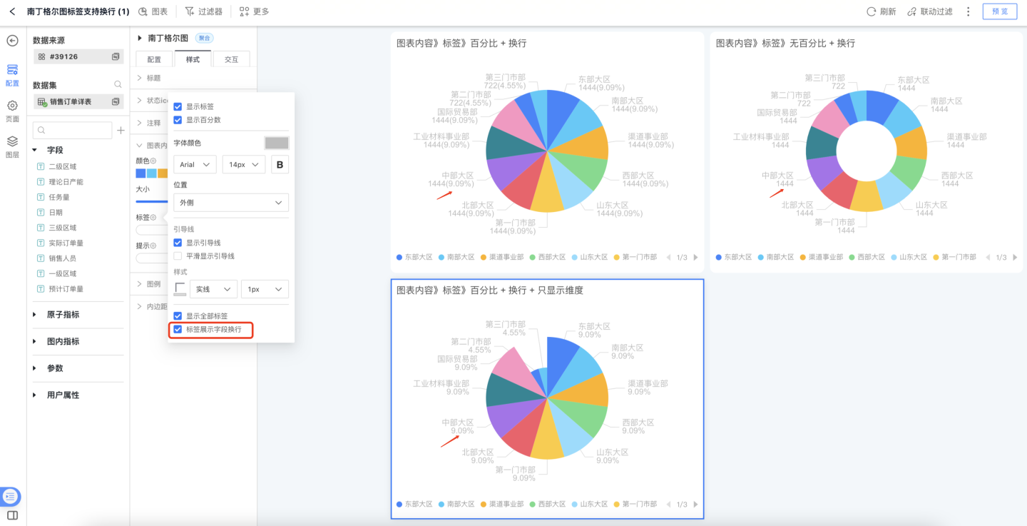
Line Area Charts
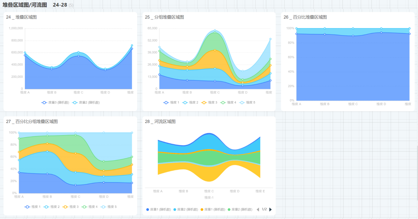
Line area charts include Line Charts, Line Histogram Charts, Grouped Line Charts, Area Charts, Grouped Area Charts, Stacked Area Charts, Grouped Stacked Area Charts, Percentage Stacked Area Charts, Percentage Grouped Stacked Area Charts, and River Area Charts. 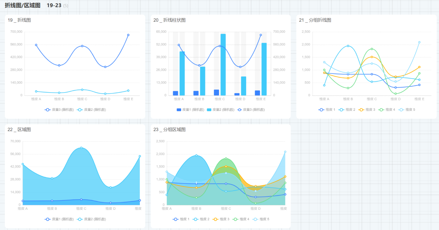
Relation Charts
Relation charts include Arc Relation Charts, Funnel Charts, Heat Maps, Radar Charts, Sankey Charts, Chord Charts, and Scatter Charts. 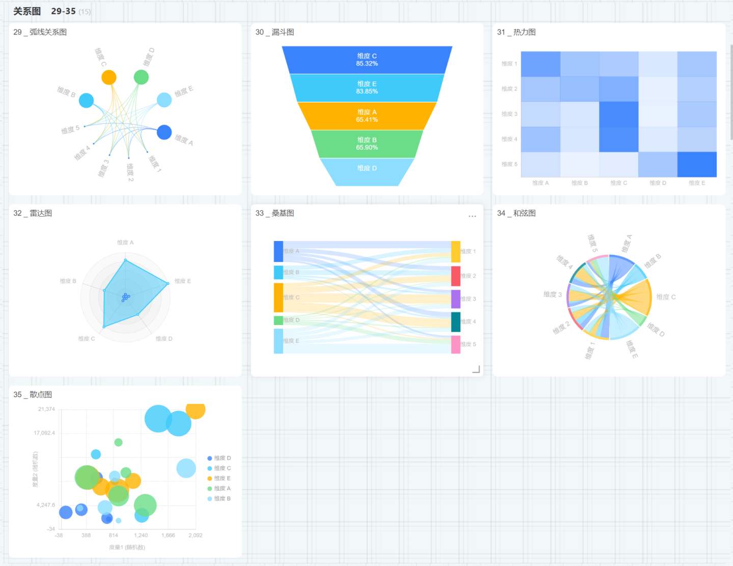
Other Charts
Other charts include Process Charts, Tree Charts, Treemap Charts, Waterfall Charts, Word Clouds, Box Plots, Pareto Charts, and Bubble Charts. 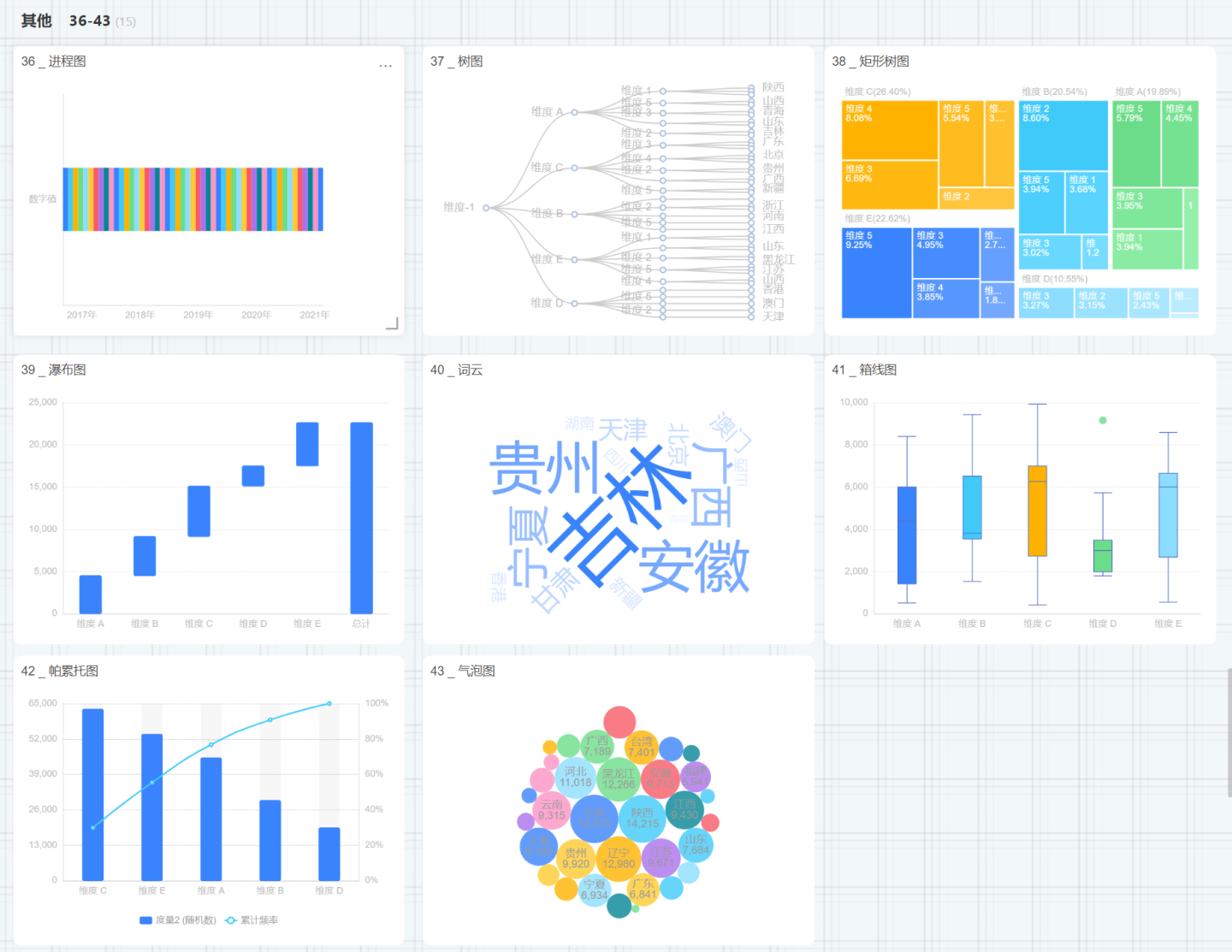
Maps
Map charts include Simple Maps and Hierarchical Maps. 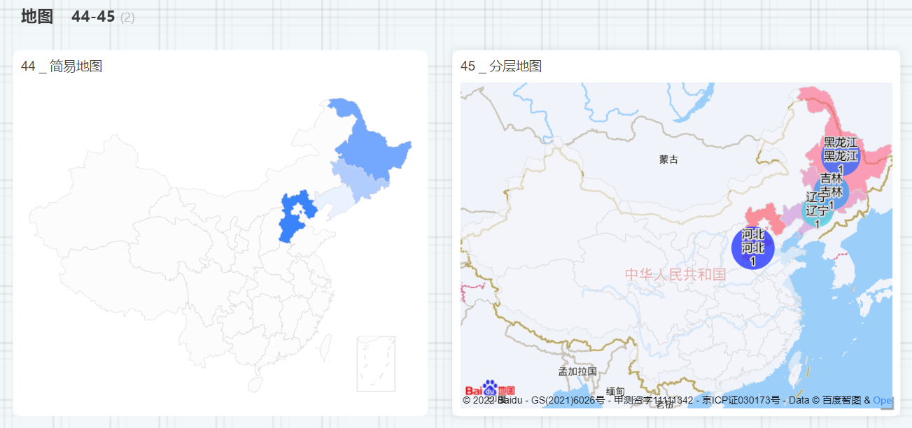
Tables
Table charts include Tables, Dataset Tables, and Crosstabs. 
Combined Charts
Combined charts can add any number of coordinate axes and multiple chart elements.
Custom Charts
Custom charts are implemented by writing JS code, unlike other charts. 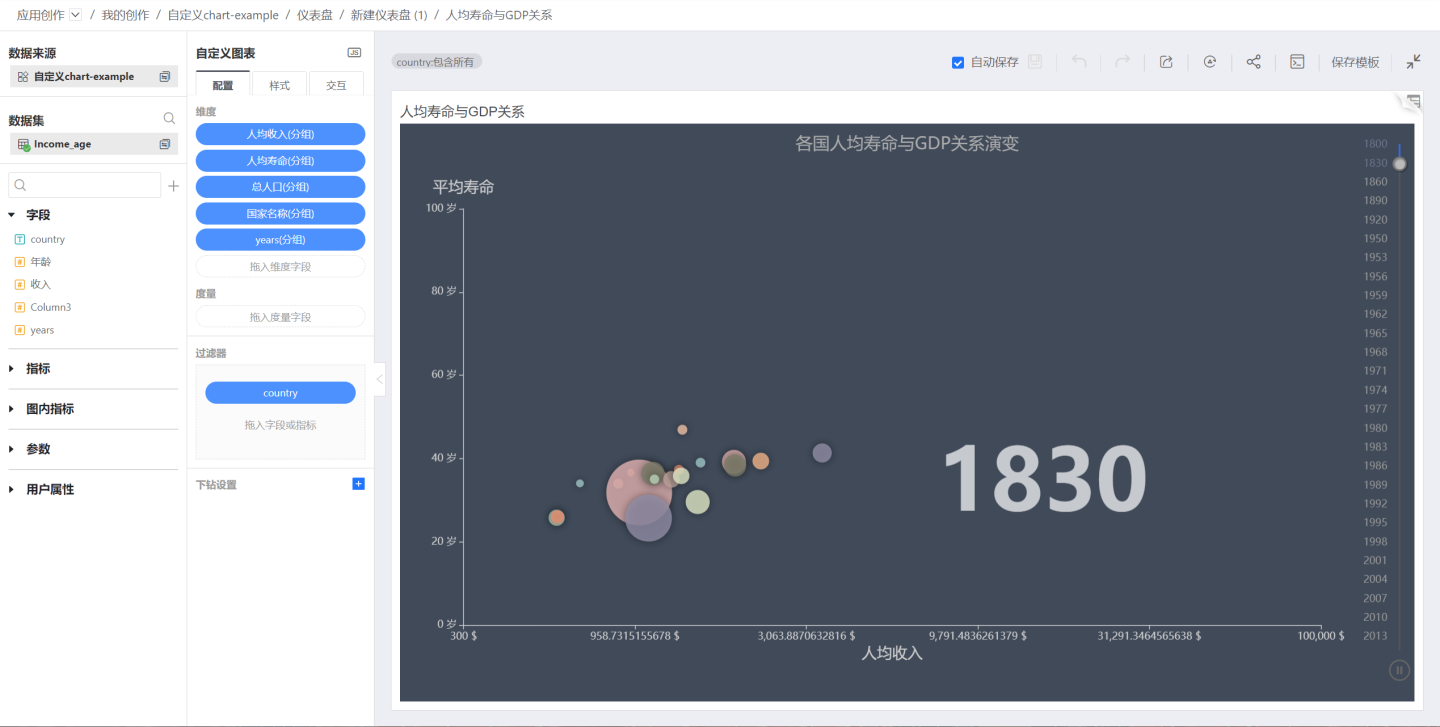
Chart Data
Chart Data Query Methods
Chart data supports two different query methods: aggregate query and detail query. For example, in a student score table, after dragging in student names and scores, an aggregate query can display student names and total scores. A detail query displays student names and detailed scores. 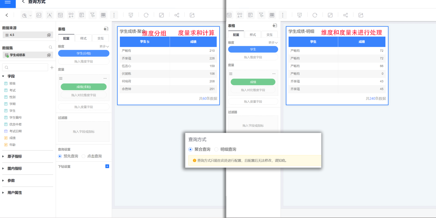
Aggregate Query: Data is displayed in an aggregated form in the chart, such as dimension fields automatically grouped, date dimension fields supporting year, month, day display, dimension fields supporting project merging and value setting, measure fields supporting various advanced calculations, etc.
Detail Query: Data is displayed in detail in the chart, with dimension fields not supporting grouping, and measure fields not supporting various calculations.
Note The query method is set when creating the chart, and each chart can only choose one query method, which cannot be modified after configuration.
Field Calculation Methods
Drag fields into the dimensions and measures of the chart to display relevant business information. In aggregate query mode, fields in the chart can be set using calculations and expression editing.
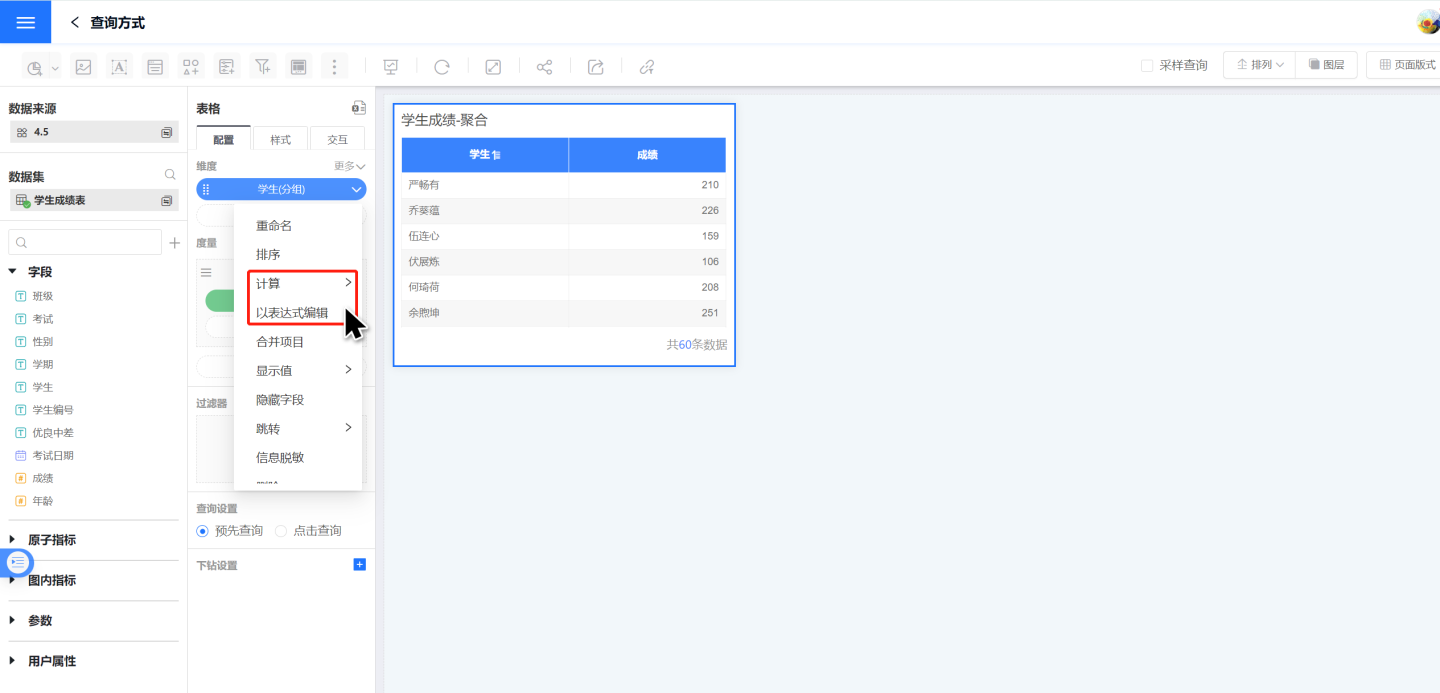
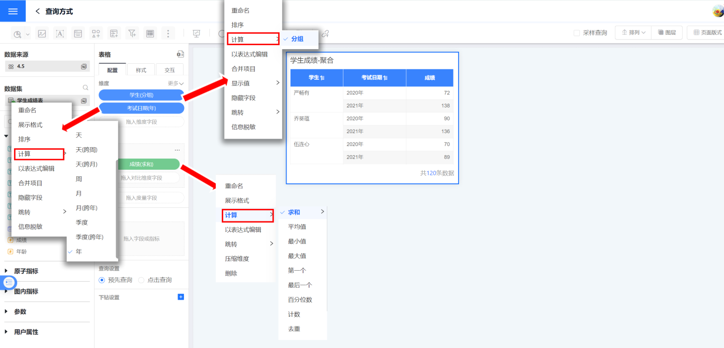
Field Calculation: Field calculation is the system's built-in processing method for dimensions and measures. For example, dimension fields are automatically grouped, date dimension fields support time display methods, and measure fields can choose calculation methods such as summation, year-over-year comparison, etc.
Field Expression Editing: When the system's built-in processing methods for dimensions and measures cannot meet user needs, users can use expressions to calculate fields. Click "Edit with Expression" to edit fields using functions in the interface.
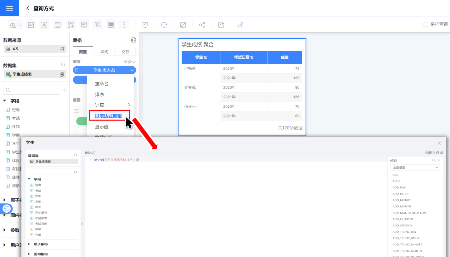
Chart Data Query Settings
When the chart data is large, loading time is long, and the dashboard display is affected by long rendering times. To address this, the chart adds a query setting function, allowing data loading only when needed.
- Pre-query: Load chart data directly when the dashboard is displayed.
- Click to Query: Do not load data when the dashboard is displayed, load data after clicking to enable.
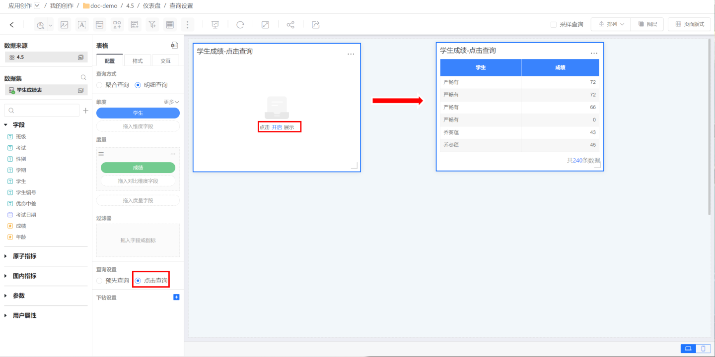
Chart Data Switching
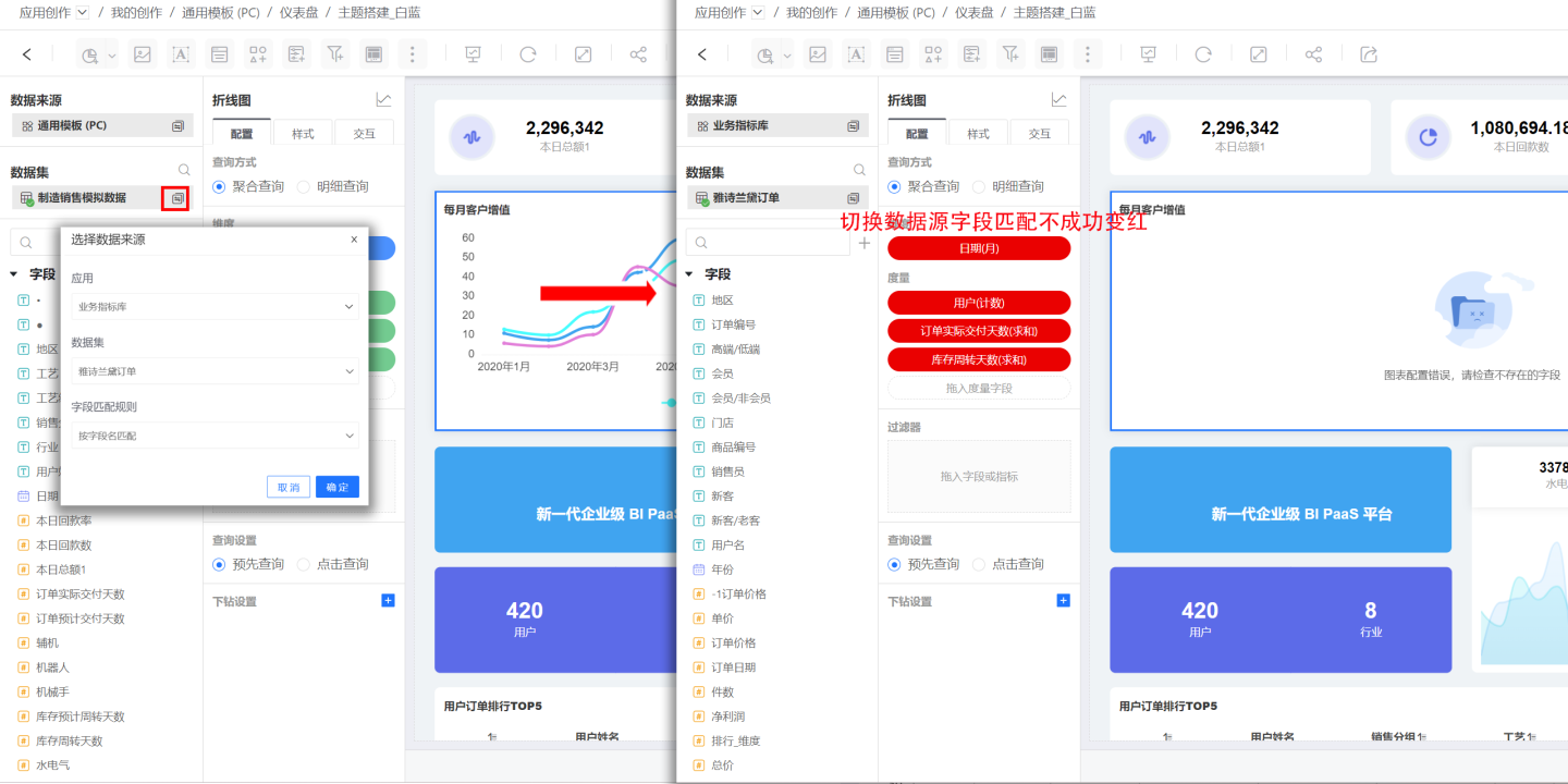
After chart generation, switching data sources is supported. If the new data source has the same fields, the chart can be generated directly. If not, the system fails to match, and the user needs to manually drag fields from the switched data source into the chart's dimensions and measures. After all required fields are dragged in, the chart is generated with the new data.
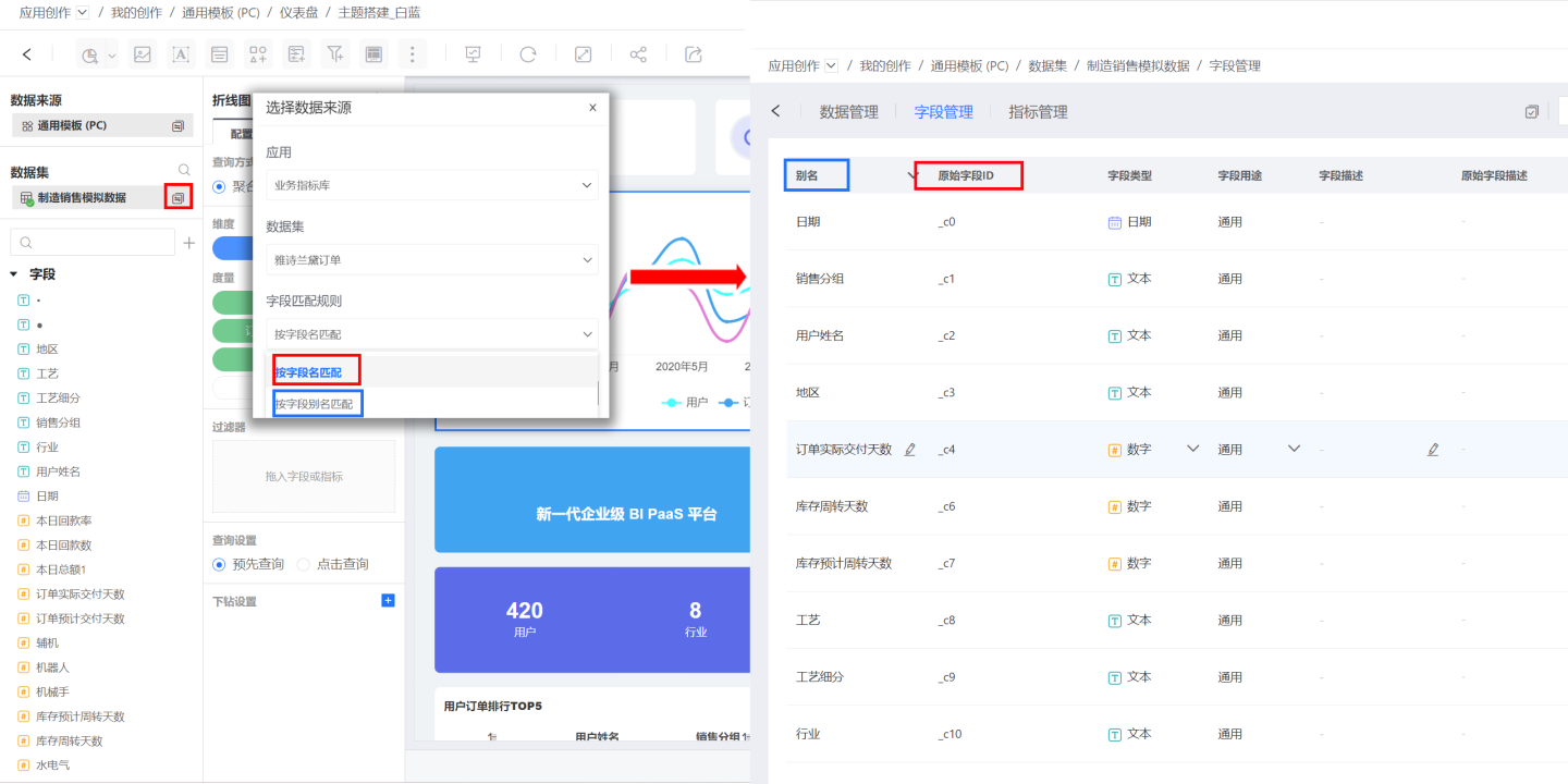
In addition to selecting data sources, chart data switching supports selecting field matching rules, using field names or aliases for matching, providing flexible matching methods and improving field matching rates.
The chart data switching process only replaces the data, with the original style settings and interaction settings remaining unchanged.
Common Chart Operations
Chart widgets differ from other widgets in that they support opening operations for interaction within the chart. Enter the chart from the three-dot menu button of the chart widget.
When a chart is open, it supports automatic saving, undo, redo, export, refresh, embedding, SQL debugging, and other functions.
Automatic Save
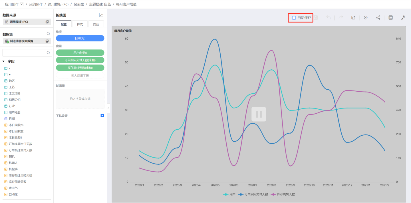
Automatic save refers to automatically saving chart operations. This function is checked by default. Automatic save ensures that user operations are retained and not lost.
In automatic save scenarios, each operation re-renders the chart. When the chart contains a large amount of data, rendering can be time-consuming. In such cases, enabling automatic save can cause chart creation to lag, so it is recommended to turn off automatic save. Manual save functions trigger chart rendering during the chart building process.
When automatic save is off, the following situations occur:
- A pause overlay appears on the chart interface.
- Users cannot edit fields/indicators.
- Ongoing drill-downs will be canceled.
- Already opened detailed data pop-ups will be closed.
Undo/Redo
When a chart is open, you can click the undo button to cancel chart operations, supporting multiple undo operations. Redo is also supported for undo operations.
Export
When a chart is open, you can export the chart in png, pdf formats, and also export the aggregated data of the chart.
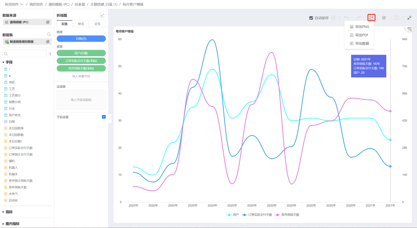
Refresh
Refresh the chart data directly without using cached data.
SQL Debugging
When designing charts, different data is needed, some simple and some complex. Sometimes, the backend response is slow when calculating this data. SQL debugging helps users understand the executed SQL and troubleshoot and optimize it.
SQL debugging provides the following two functions:
- View SQL code.
- View the execution plan's explain results.
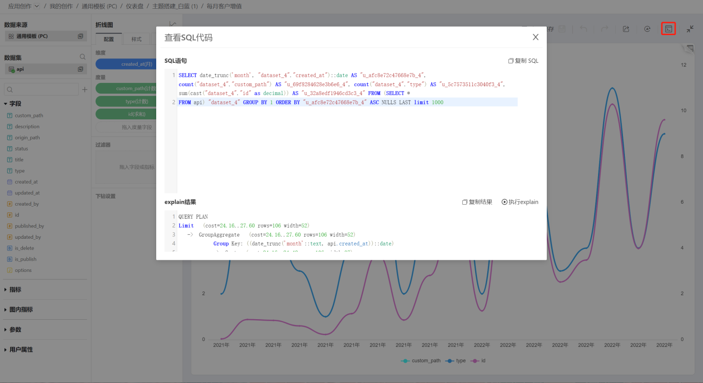
If a chart's execution performance is found to be unsatisfactory, first check whether the executed SQL code is reasonable and whether the calculation expressions for dimensions and measures can be adjusted. Then use the explain function to view the execution plan. If the execution plan shows that some operations take a long time, optimization work can be done accordingly. For example, if most of the time in the execution plan is spent on repeated table scans, consider creating some indexes on the relevant columns of the relevant tables to speed up chart execution.
View Detailed Data
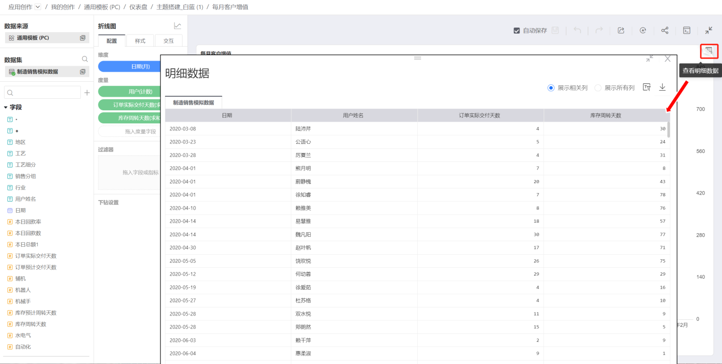
In the chart, you can view the user's original data, displaying data related to the chart's columns or all columns. Filtering and exporting data are supported. 