General Filter
General filters are the most common type of filters used, allowing users to query data information by filtering fields. This includes
This article introduces a general filter that is a local filter, which only has filtering effects on the charts within this dashboard and does not apply to charts in other dashboards within the app.
Text Filter
In the general filter, the filter that uses a text field to filter data is a text filter. An example is the sales of a product in shopping malls across the country. When viewing the sales situation in various cities and shopping malls, it is necessary to filter by city and shopping mall. The filters for city and store are text filters.
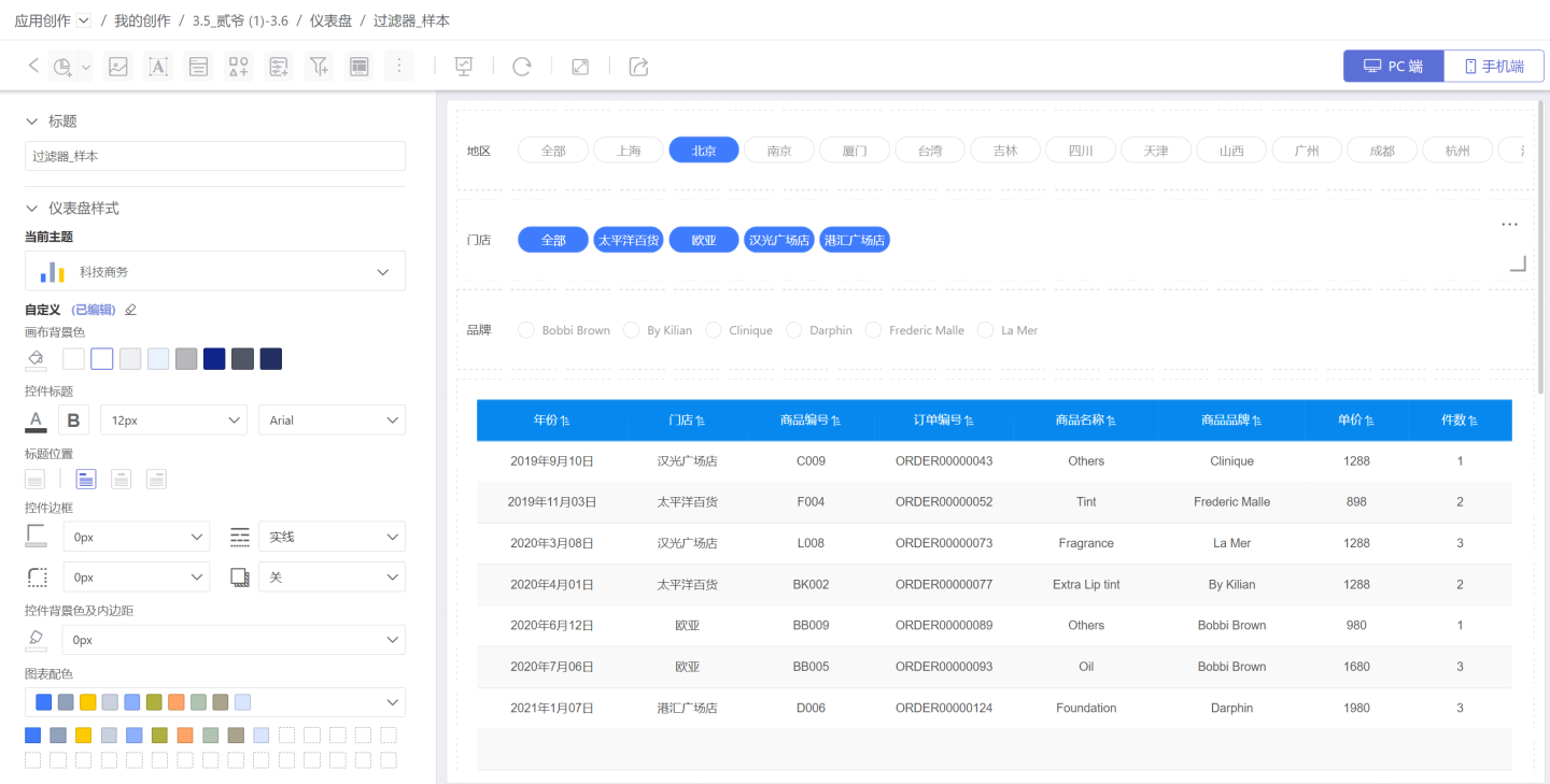
Text filters support one (single selection) or multiple filtering conditions (multiple selections). Below is a detailed introduction to text filters.
Add Text Filter
Follow the steps below to add a text filter to the dashboard.
Click New Filter -> Filter to create a new filter.

Select the data source for the filter, and drag the text field you want to filter into the newly created filter. In the example, the field "City" is dragged in.

Choose the corresponding filter type and set the default value for the filter. In the example, the single-select filter type is chosen, and the default value is set to "Beijing".
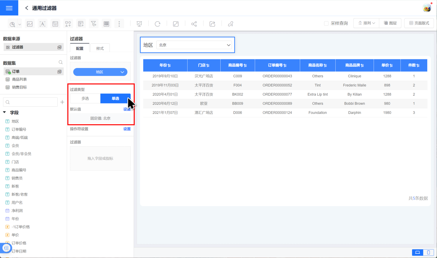
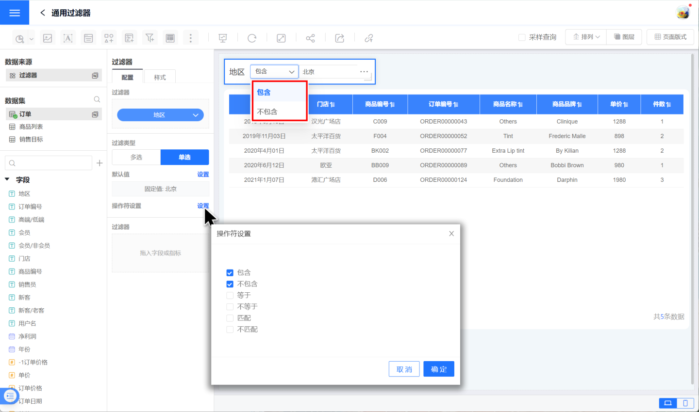
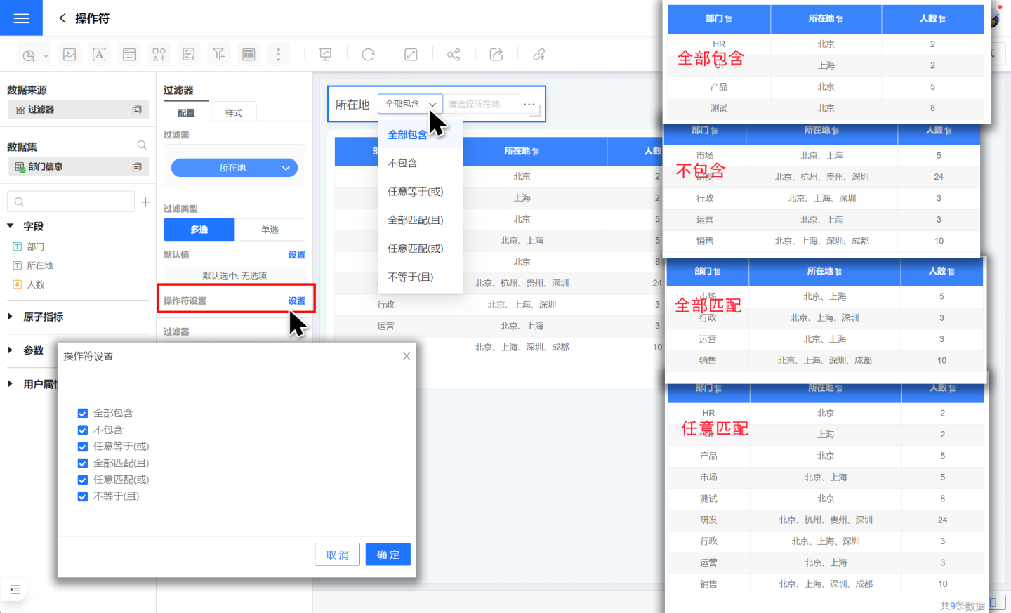
Set the filter operator, which is the operation method for the filter options. In the example, two filtering operations are set: "Contains" and "Does not contain".
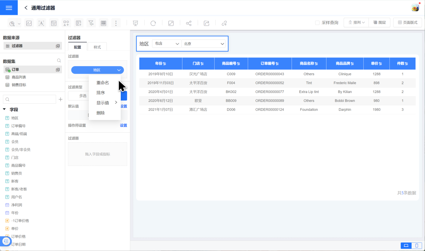
Click the down arrow next to the filter field to rename, sort, or set the display value for the filter field.
Through the above steps, the setup of the text filter has been completed. For the filter default values and operators mentioned in the example above, please refer to the detailed explanations below.
Configure Text Filter Default Value
After adding a text filter, you need to configure the filter's selection values based on the content displayed in the chart. Text filters are divided into single-select and multi-select based on their filtering types.
1. Configure Single-Select Text Filter
Single-select filter type indicates that data can only be filtered through one option. The default value configuration methods are:
- Dynamic Selection: Dynamically configure the default value of the filter, supporting four options: all, none, first, and Nth. The example demonstrates the display effect of the filter under dynamic selection.
- All: Refers to selecting the
Alloption, displaying all data. - None: Refers to the filter displaying without selecting any option, displaying all data.
- Custom Filter: Dynamically set the default value of the filter using expressions.
- First: Refers to selecting the first option in the list, filtering data through the first option, and displaying the filtered results.
- Nth: Refers to selecting the Nth option in the list, filtering data through the Nth option, and displaying the filtered results.
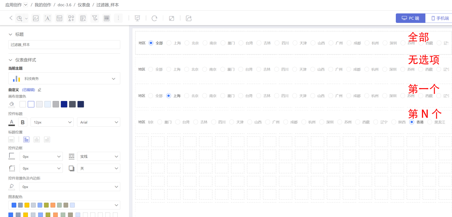
- All: Refers to selecting the
- Fixed Selection: Refers to selecting a specified option as the default value.
Filter Style Settings: You can set the title, display style, selected state, etc. in the style. Multiple styles such as dropdown and tile are supported.
After the filter is created, please test whether it meets the design requirements and meets the needs of the analysis work. 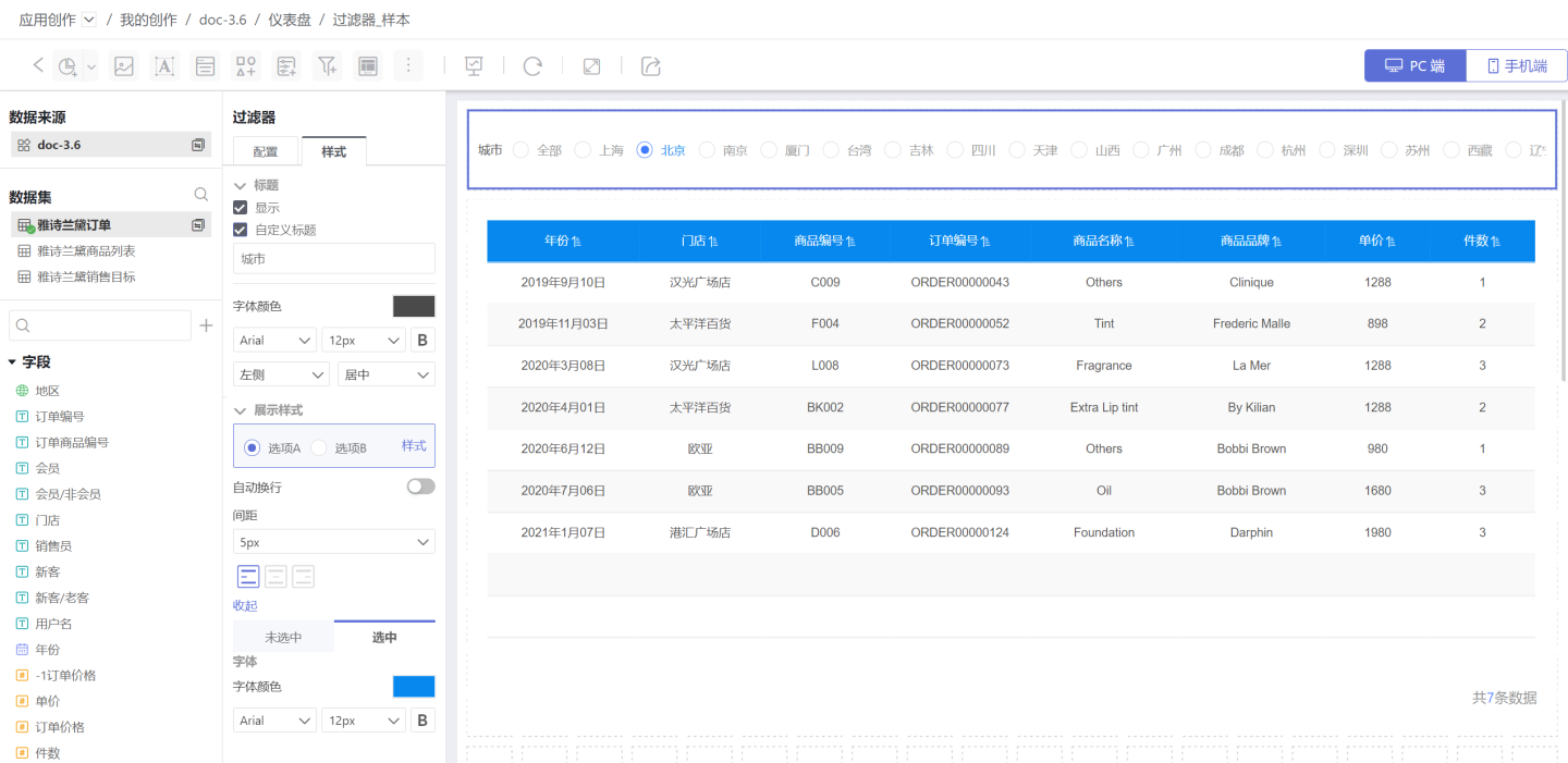
2. Configure Multi-Select Text Filter
Multi-select filter type indicates that data can be filtered through one or more options. The default value configuration methods are:
- Dynamic Selection: Dynamically configure the default value of the filter, supporting: All, No Options, Custom, First, Top N. The example demonstrates the display effect of the filter under dynamic selection.
- All: Refers to selecting all options, displaying all data.
- No Options: Refers to the filter displaying without selecting any options, displaying all data.
- Custom Filter: Dynamically set the default value of the filter using an expression.
- First: Refers to selecting the first option in the list, filtering data through the first option, and displaying the filtered results.
- Top N: Refers to selecting the top N options in the list, filtering data through the top N options, and displaying the filtered results.
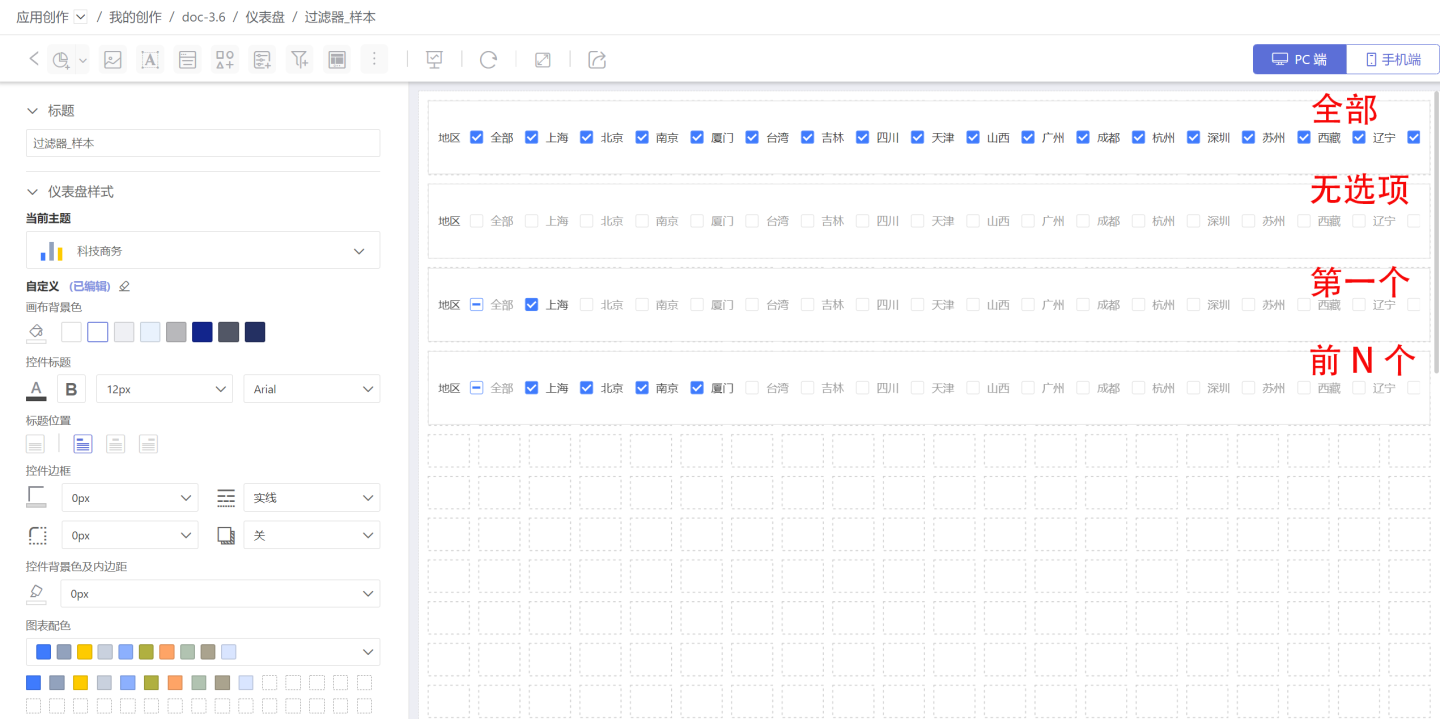
- Fixed Options: Select one or more fixed options as the default value for data filtering.
After configuring the information, you can set the title, display style, selected state, etc., in the style. Multiple styles such as dropdown and tile are supported. 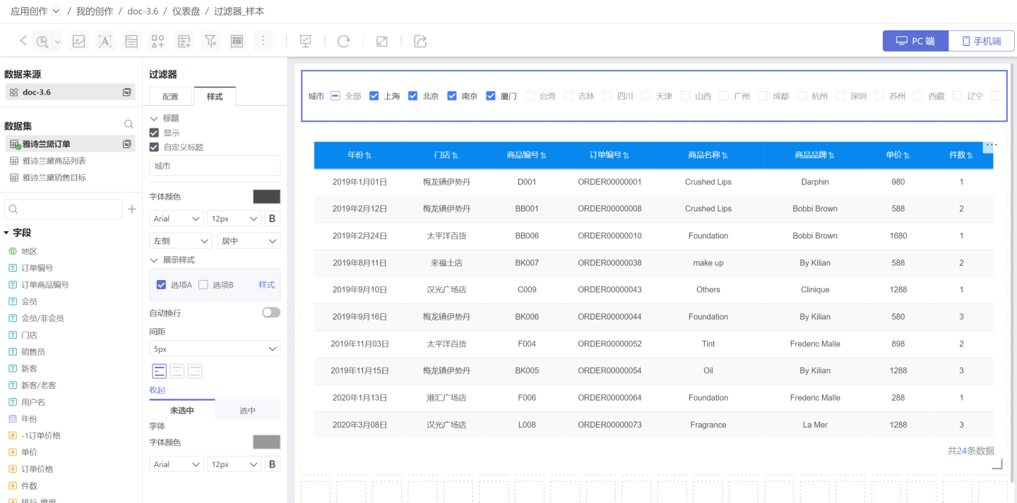
3. Instructions
Enable All Options: This option allows for quick toggling of theAlloption in the filter and supports custom text for theAlloption.- When the filter is set with a hierarchical relationship with others in the Global Settings, the default value of the child filter will change according to the options of the parent filter. Please refer to the relevant instructions in the Global Settings.
- The default value of the filter, once set, remains fixed.
Filter Operators
Filters support multiple operators for data filtering in different business scenarios.
Single-select type operators include six types: contains, does not contain, equals, does not equal, matches, and does not match.
- Contains: Indicates filtering the data information corresponding to the filter option. For example, "Location" contains "Shanghai", it will filter out the data information where "Location" = "Shanghai".
- Does not contain: Indicates excluding the data information corresponding to the filter option. For example, "Location" does not contain "Shanghai", it will filter out the data information where "Location" is not equal to "Shanghai".
- Matches: Indicates filtering the data information that can match the filter option. For example, "Location" matches "Shanghai", it will filter out the data information where "Location" can match "Shanghai", such as "Location" = "Shanghai" or "Location" = "Beijing, Shanghai".
- Does not match: Indicates filtering the data information that does not match the filter option. For example, "Location" does not match "Shanghai", it will filter out the data information where "Location" does not match "Shanghai", such as excluding "Location" = "Shanghai" or "Location" = "Beijing, Shanghai".
- The "Equals" operator functions the same as the "Contains" operator.
- The "Not Equals" operator functions the same as the "Does not contain" operator.

Multi-select type operators include: Contains All, Does Not Contain, Matches All (AND), Matches Any (OR), Equals Any (OR), and Not Equals (AND).
- Include All: Indicates that all data information corresponding to the filtering options is included. For example, if "Location" includes "Shanghai" and "Beijing", it will filter out data where "Location" is "Shanghai" and "Location" is "Beijing".
- Exclude All: Indicates that all data information corresponding to the filtering options is excluded. For example, if "Location" does not include "Shanghai" and "Beijing", it will filter out data where "Location" is not "Shanghai" and "Location" is not "Beijing".
- Match All (AND): Indicates that data information that matches all filtering options is filtered out. For example, if "Location" matches all "Shanghai" and "Beijing", it will filter out data where "Location" matches both "Shanghai" and "Beijing".
- Match Any (OR): Indicates that data information that partially matches the filtering options is filtered out. For example, if "Location" matches all "Shanghai" and "Beijing", it will filter out data where "Location" matches "Shanghai" or "Beijing".
- Any Equal (OR) has the same function as the Include All operator.
- Not Equal (AND) has the same function as the Exclude All operator.
Time Filter
In the general filter, the filter that uses a time field to screen data is a time filter. An example is the sales situation of a certain product in shopping malls across the country. When viewing the sales situation in 2019, a time filter needs to be added to achieve this.
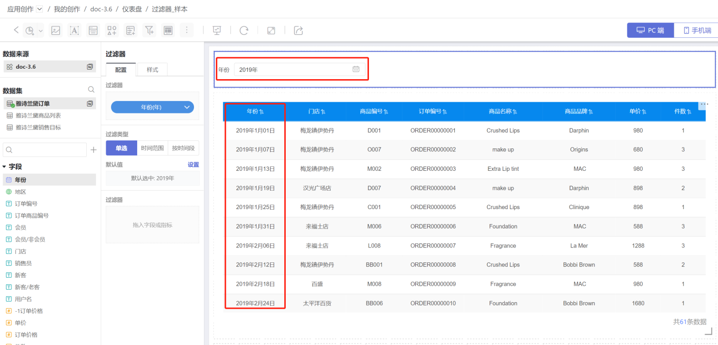
Time filters can be used to filter information by time point, time range, and time period. Below is a detailed introduction to time filters.
Add Time Filter
Add a time filter in the dashboard.
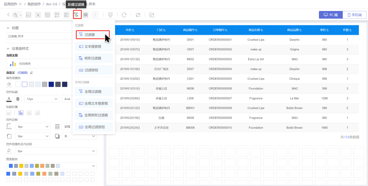
- Click New Filter -> Filter to create a new filter, and adjust its size and position.
- Select the dataset where the filtering field is located, and drag the time field you need to filter into the newly created filter.
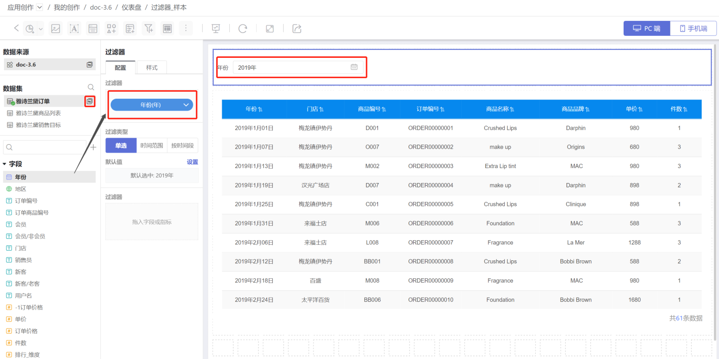
- Adjust the filtering unit of the time filter according to the actual situation, such as year, month, day, etc., and you can also adjust the time display format.
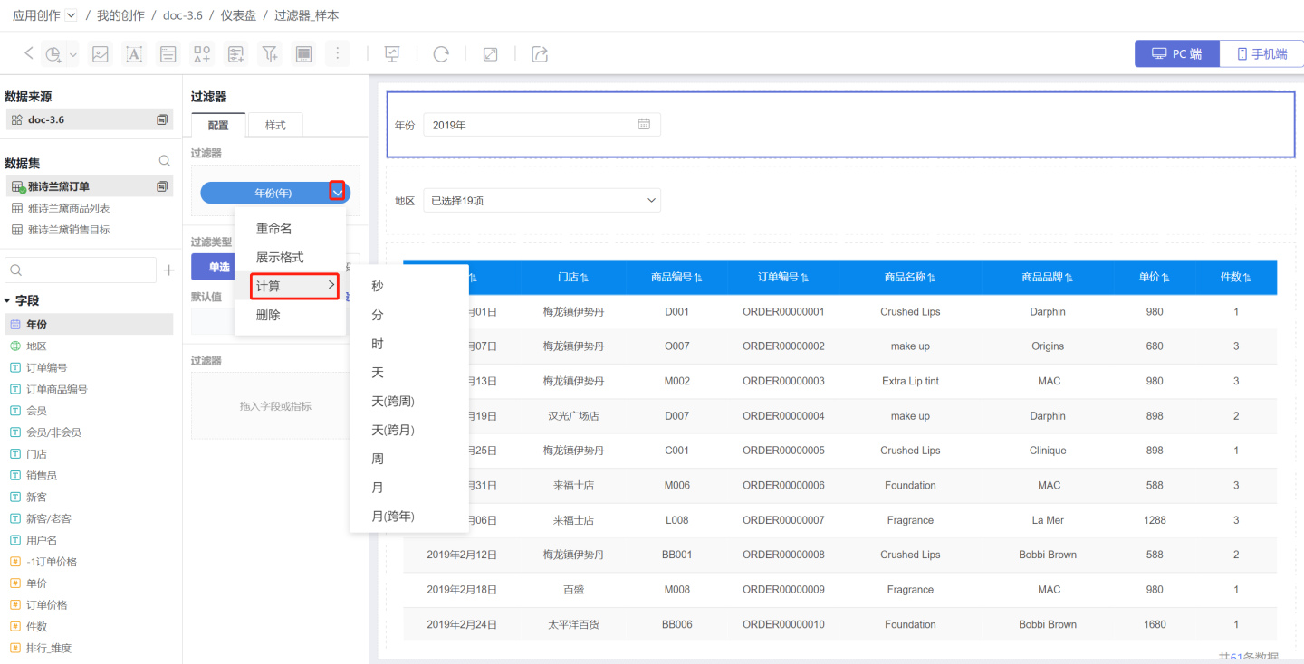
Configure Default Value for Time Filter
Time filters are divided into single selection, time range, and time period based on the filter type.
1. Configure Single-Select Time Filter
A single-select type time filter refers to filtering data information for a specific point in time. 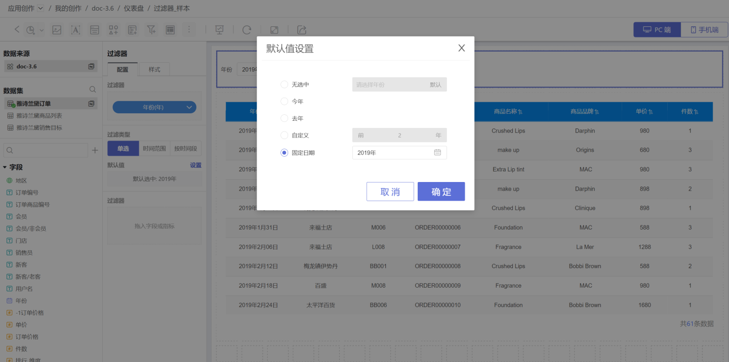 Default value setting method:
- No selection: Refers to the filter displaying without selecting any options, not using any options to filter data, and displaying all data.
- This year: The default value selects this year and filters data through this year.
- Last year: The default value selects last year and filters data through last year.
- Custom: Displays data from the previous N years in the custom section, and selects the field for the previous N years in the filter.
- Fixed date: The default value selects a fixed date and uses it to filter data.
The display effects of the above filtering methods. 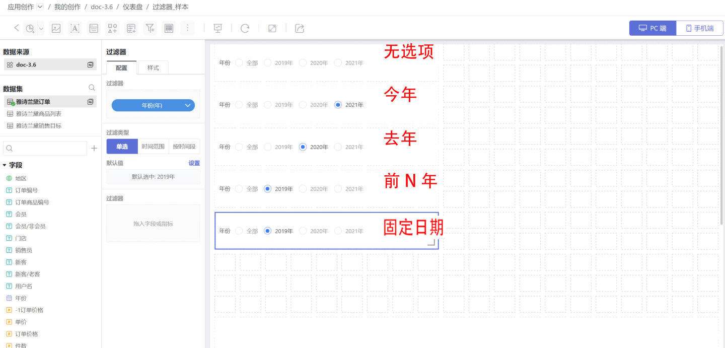
Mobile Filter Calendar Single Selection Interaction: 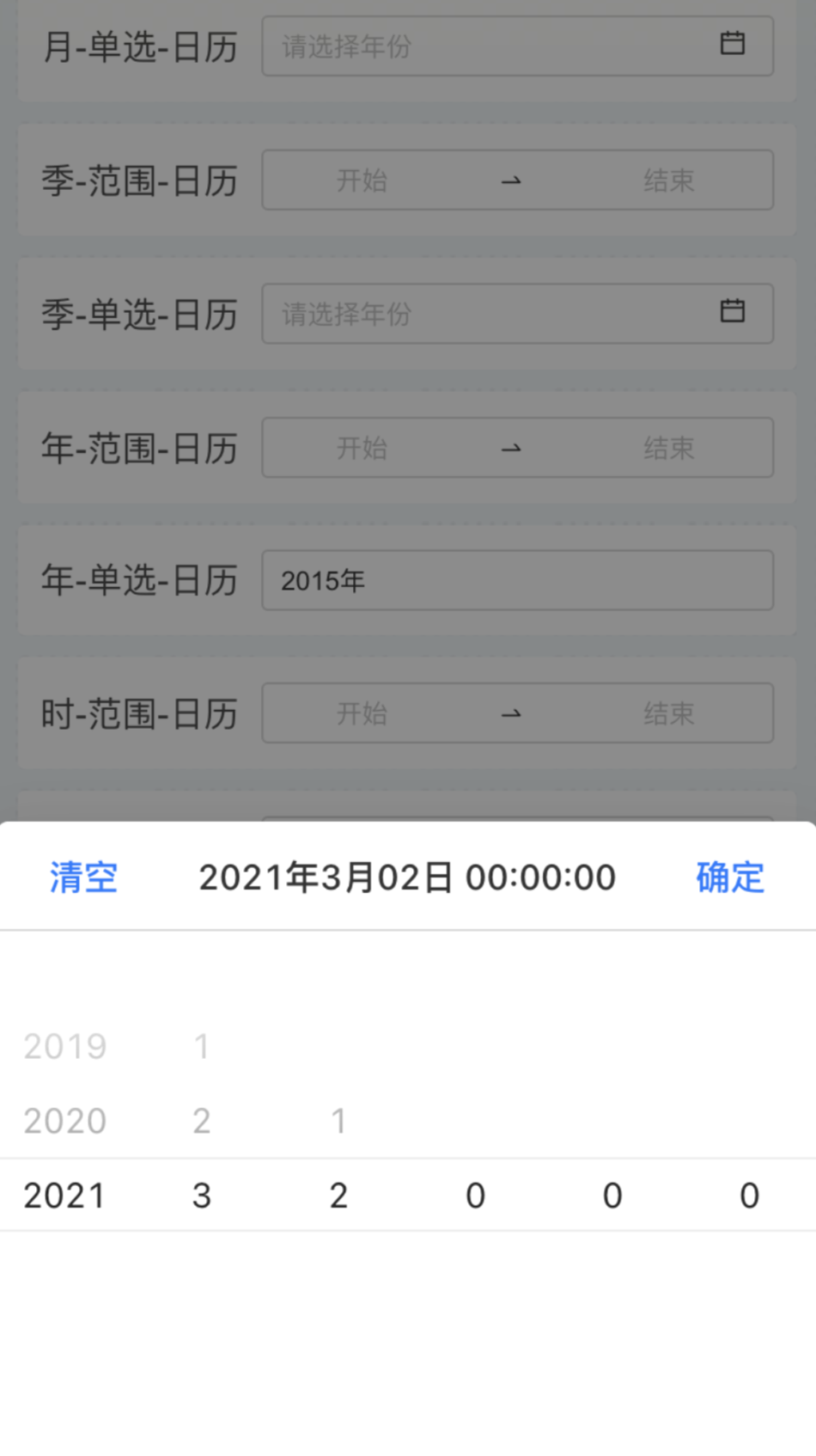
Tip
If the time unit is month or day, the time unit of all selected options will change accordingly.
2. Configure Time Range Type Filters
The time range type refers to filtering data information for a specific time period. 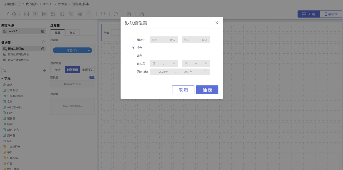
Default Value Setting Method:
- No selection: Refers to the filter displaying without selecting any options, not using any options to filter data, and displaying all data.
- This year: The default value selects the time range of this year and filters data within this year's range.
- Last year: The default value selects the time range of last year and filters data within last year's range.
- Custom: The default value is a custom time range and filters data within the custom time range.
- Fixed date: The default value is a fixed range and filters data within the fixed range.
The display effects of the above filtering methods. 
Time Range Filter, when the date field calculation granularity is "day/hour/minute/second", the default value selection this year, this quarter, this month, this week allows the end time to be set as "current date T / current date T-1 / last day of XX". 
Filter Style Settings: You can set the title, display style, selected state, etc. in the style. Multiple styles such as dropdown and tile are supported. 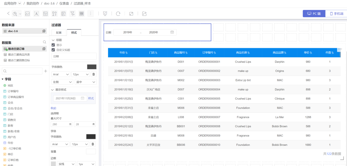
Mobile Filter Calendar Time Range Selection Interaction: 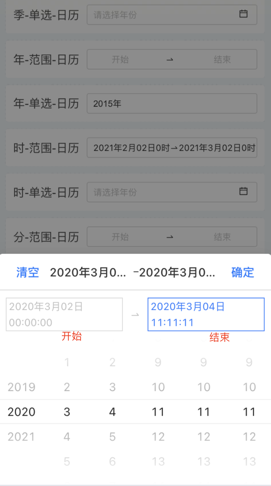
Tip
If the time unit is month or day, the unit of the time range type option will change accordingly. When selecting in the date range filter, you can use shortcuts to select the time range.
3. Configure Quick Time Filters
Quick Time Filters refer to the system providing some quick time periods, allowing users to select the desired options based on their business scenarios and filter data according to the time period.
Default Value Setting: As shown in the figure, check the time period provided by the system on the left, and the right displays the selected result and the default time period. Drag the red box part 【1】 button to adjust the filter option order; 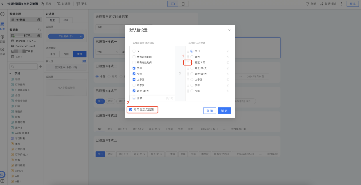
When using the shortcut date filter, checking the option in the red box [2] in the previous figure allows users to customize the start and end dates, accommodating different user settings for filtering conditions, as shown below. 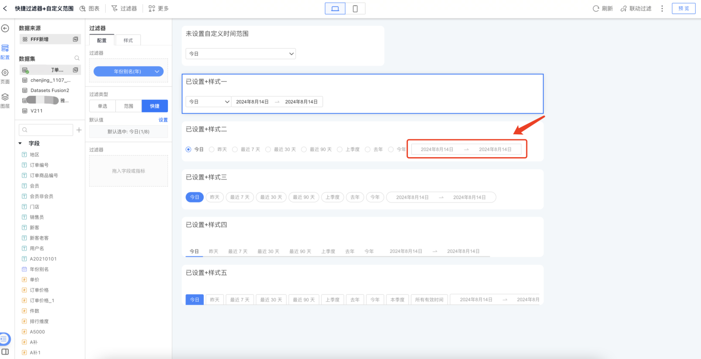
Filter Style Settings: You can set the title, display style, selected state, etc. in the style. Multiple styles such as dropdown and tile are supported. 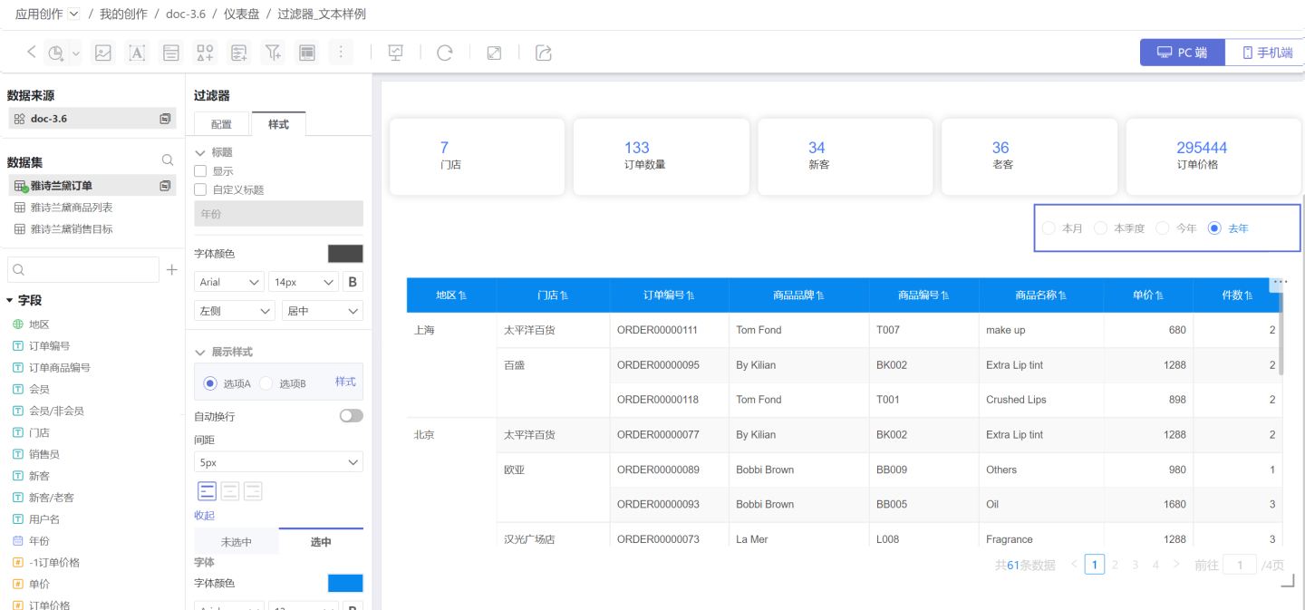
Time Filter Additional Notes
- For the default value settings of the two filter types: single selection and time range, the time unit options vary according to the filter field settings. For example, if the filter field is set to "month," the options change to "this month" and "last month." If the filter field is set to "day," the options change to "yesterday" and "today."
- When the filter field is set to "day (across weeks)," "day (across months)," "month (across years)," or "quarter (across years)," the time is displayed in text format. For example, when the time is set to "day (across weeks)," the filter options are
Monday,Tuesday,Wednesday,Thursday,Friday,Saturday, andSunday. At this time, the filter types are limited to single selection and time range filtering. The default value setting method for single selection refers to the corresponding setting method in Text Filter.
Numeric Filter
In the general filter, the filter that uses numeric fields to filter data is a numeric filter. An example is the sales situation of a product in shopping malls across the country. When viewing orders with unit prices greater than 1000 yuan, a numeric filter needs to be added to achieve this.
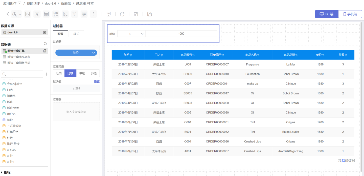
Numeric filters support range, comparison, single selection, and multiple selection to filter information. Below is a detailed introduction to numeric filters.
Add Numeric Filter
Add a numeric filter in the dashboard.
- Click New Filter -> Filter to create a new filter, adjust the size and position of the filter.

- Select the dataset where the filtering field is located, drag the numeric field to be filtered into the newly created filter.

Configure Default Value for Numeric Filter
The filtering types of digital filters are divided into range, comparison, single selection, and multiple selection.
1. Configure a Numeric Range Type Numeric Filter
Range filters refer to data information that meets the range of screening conditions. This type of setting is relatively simple. The default value only needs to be set at the start and end positions, supporting manual input of numerical values and dragging of the range. 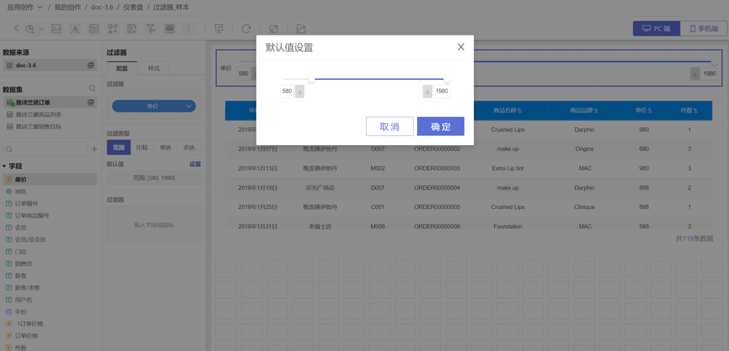
Set titles, display styles, selected states, etc. in the style. Support multiple styles such as dropdown and tile. 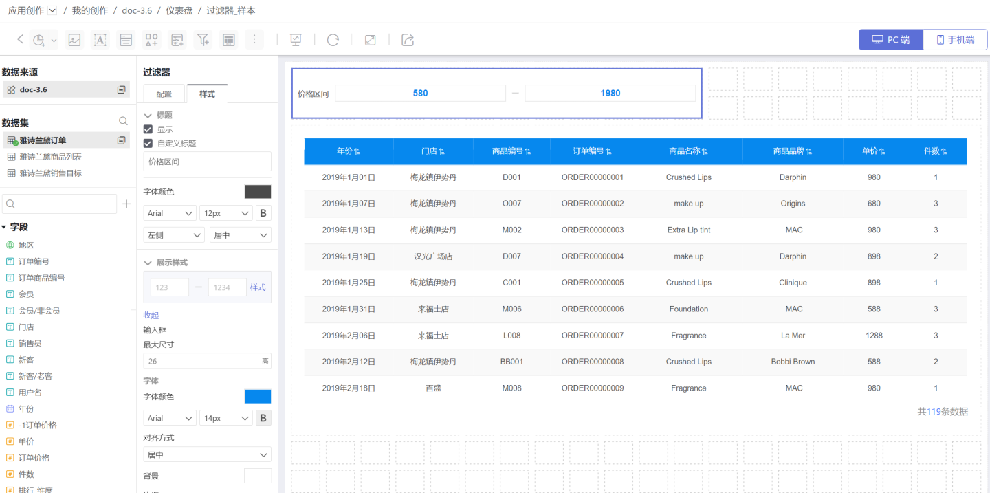
2. Configure Numeric Filters for Comparison Types
Comparison-type filters refer to the filtering of corresponding data when the filtering options meet the comparison conditions. When setting the default value, you need to set the comparison type (red box in the figure) and the comparison value (blue box). The comparison types include: not equal to, equal to, greater than or equal to, greater than, less than or equal to, less than, is empty, is not empty. 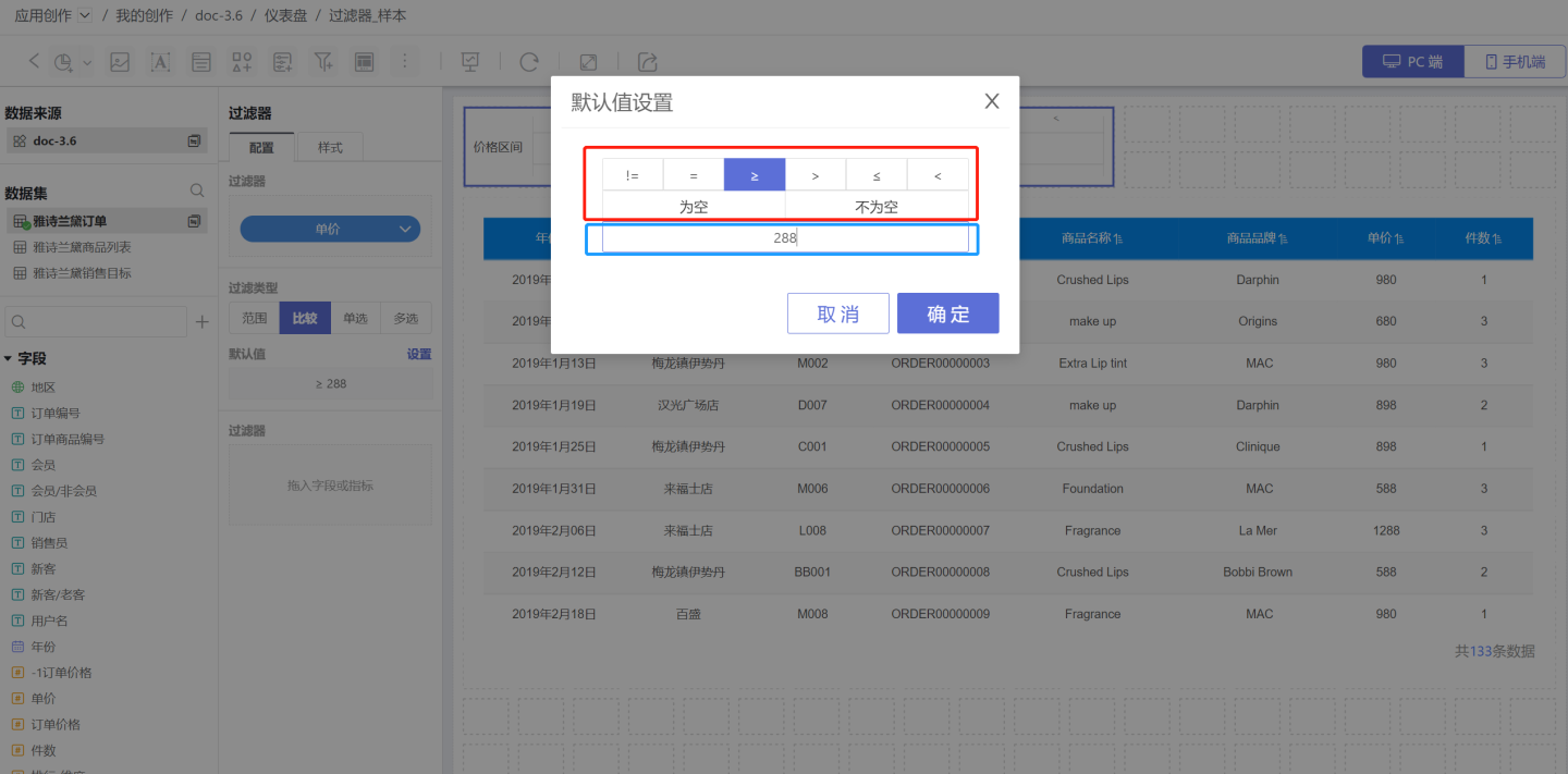 In the style settings, you can set the title, display style, selected state, etc. Two display styles are supported.
3. Configure Single-Select Numeric Filter
Single-select numeric filter refers to data filtering through a numeric option, where the numeric value is treated as a text type for selection. Please refer to Single-select Text Filter for filter configuration.
4. Configure Multi-Select Numeric Filter
Multi-select numeric filters refer to data filtering through one or more numeric options, where the numeric values are treated as text types for selection. Please refer to Text Filter Multi-select Type for filter configuration.
Internal Filter
Internal filters, which involve adding filters within filters, control the range of values for filter fields. For related usage and settings, please refer to Internal Filters.
General Filter Example
Example 1
The image below shows an API monitoring system of a company, displaying API statistics and related information. In the system, API information can be viewed by the creation time of the API (time filter), the call time of the API (time filter), the release status (text filter), and the total number of calls (numeric filter). The example demonstrates querying API statistics for the past six months and APIs with a total number of calls greater than 100. 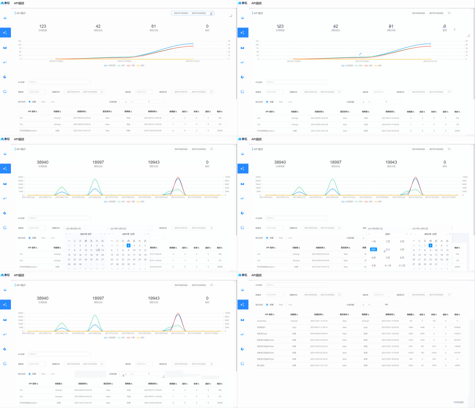
Example 2
The image below shows the order query system. You can query order information by year (time filter), time period (time filter), store, order price (numeric filter), etc. 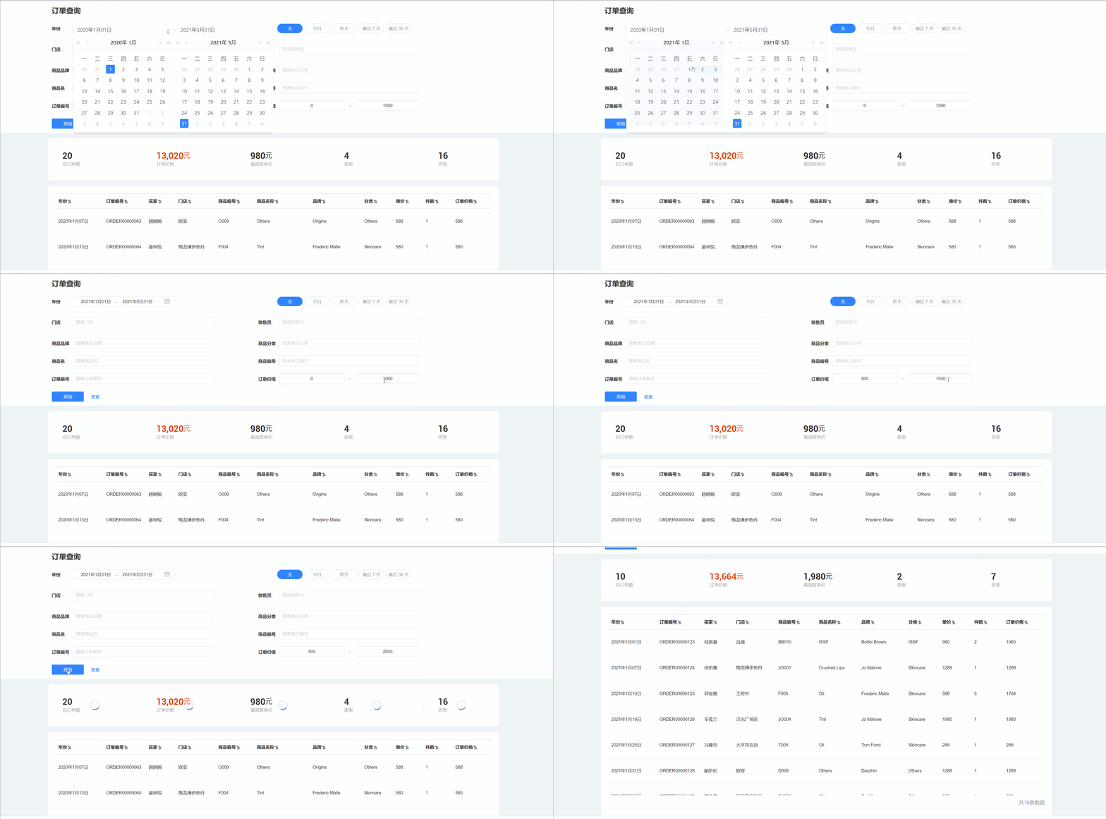
General Filter Settings
General filters support the following settings.
- Control the content of the filtering field by adding Internal Filters.
- Adjust the hierarchical relationship of filters through Global Settings, making filters interrelated.
- Move to the Sidebar Section to save canvas space.
- Set the Chart Scope for filtering.