Table Style Settings
In table-type widgets, you can configure the styles of the table header, cells, field styles, and more, making the table display more visually appealing and allowing users to access data more intuitively and conveniently.
The table supports settings for the title, serial number, header, cell, field styles, subtotal, collapsible dimensions, and other auxiliary functions. Below is a detailed introduction to the features and display effects of each style.
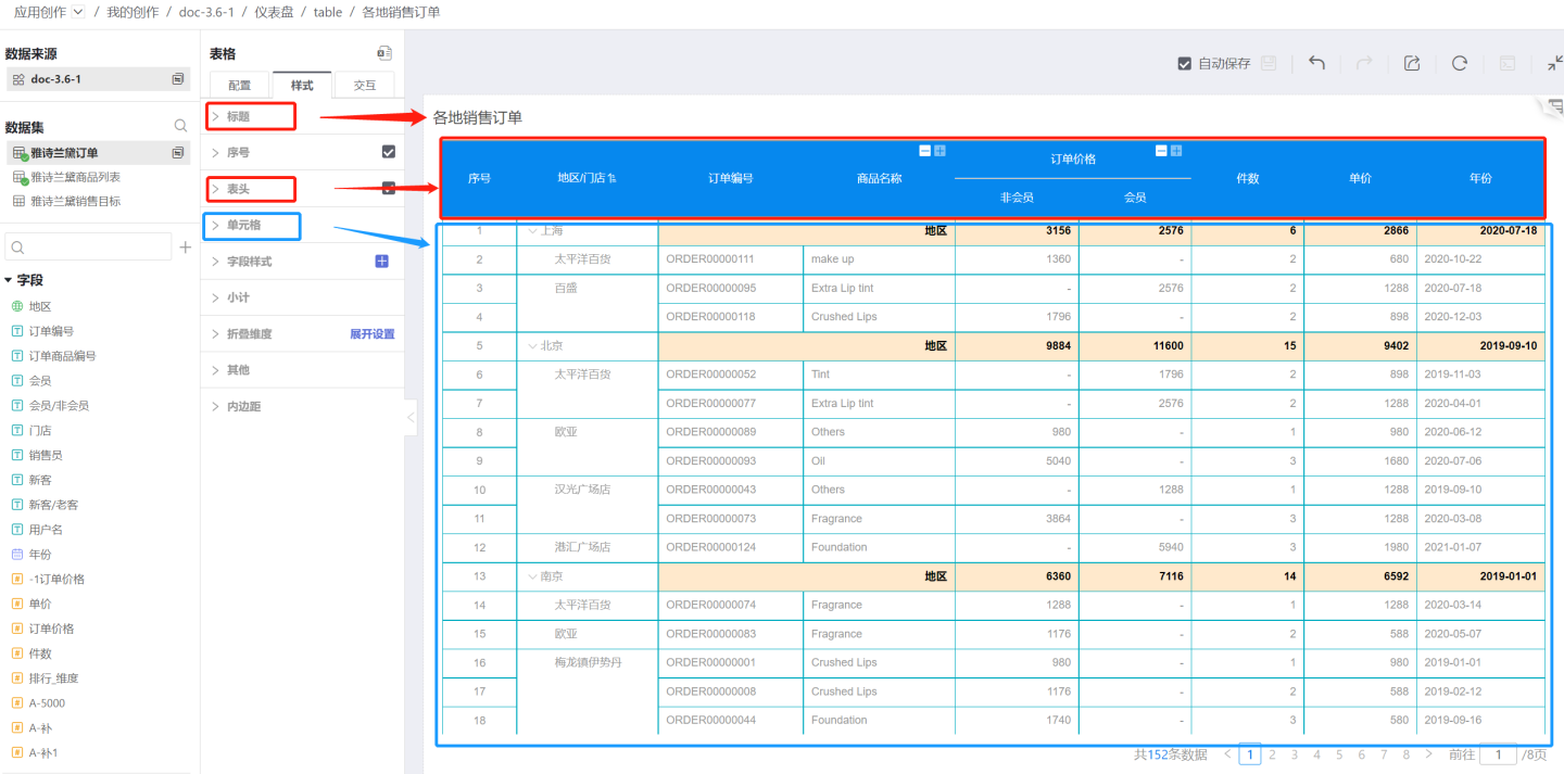
Title
The table supports setting the display of the title, customizing the title, title color, and title position.
Table Serial Number
Tables support adding serial numbers to facilitate users in locating data.
When data analysts use tables to create data charts and want to display ranking effects, they can set serial number styles for the top 3 ranked data items. Configuration path: Style > Content > Serial Number > Top 3 Serial Number Style. 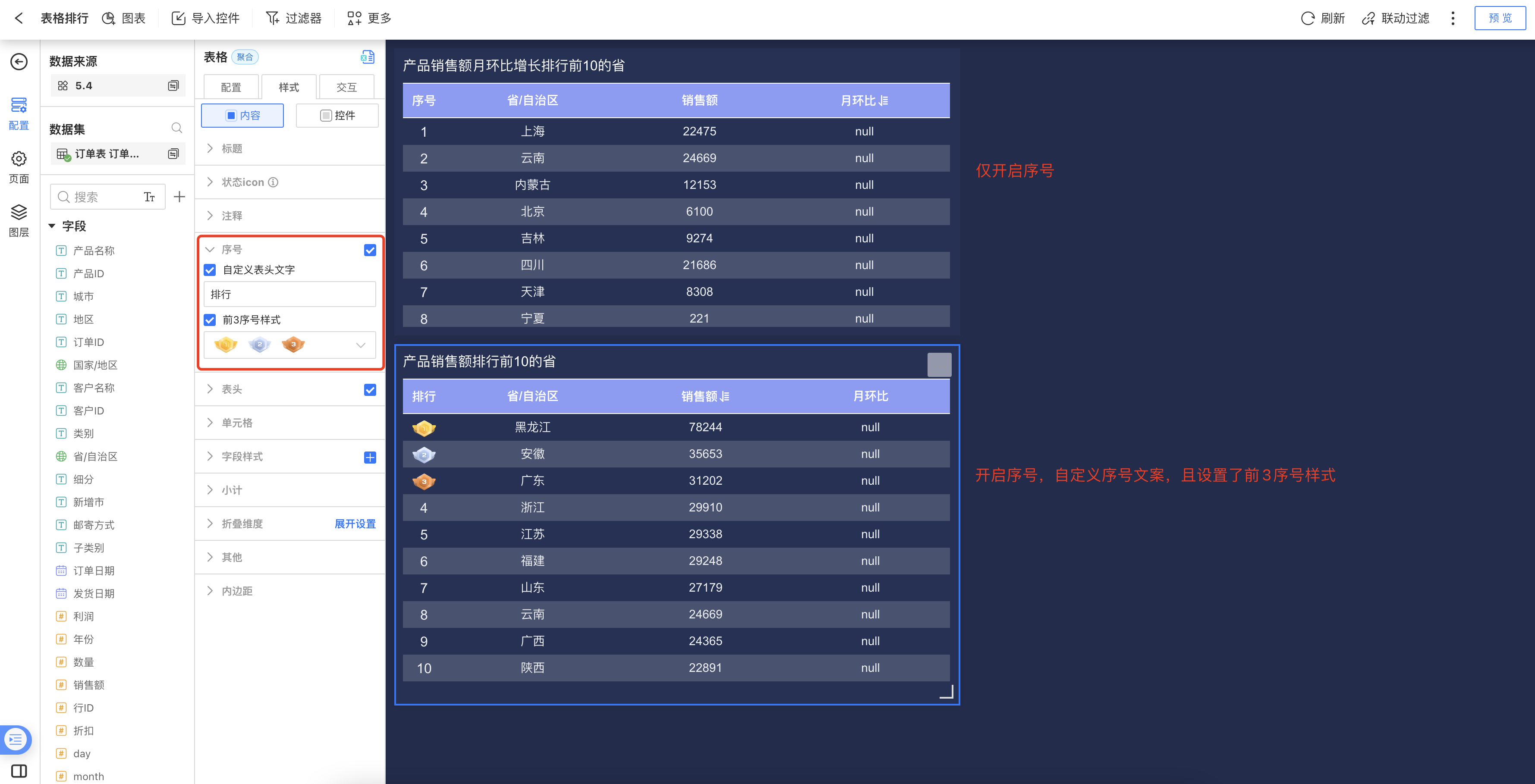
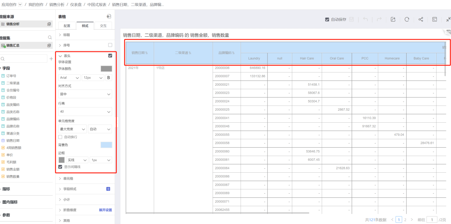
Table Header
The table supports settings for the display, font, color, border, and more for the table header.
Show Table Header
You can choose whether to display the table header. By default, the table header is shown. Uncheck this option if you do not want to display it.Text Settings
Supports settings for font color, font family, font size, bold, and more.Alignment
Refers to the horizontal alignment of text within the table header cell. By default, header text is center-aligned.Row Height
You can set the height of a single table header. The row height range is 30-120px.Cell Width
To uniformly set the width of table cells, configure the cell width in the table header.Auto Mode: When set to auto, the cell width adjusts according to the content length.
Maximum Width: If the cell content exceeds the set range, it will maintain the maximum width; if it is less than the maximum width, it will auto-fit. You need to specify a value for the maximum width.
Fixed Width: Displays the cell according to the set fixed width. You need to specify a value for the fixed width.
Auto Wrap: When the content is too long to be fully displayed, you can enable the auto wrap feature. This feature is only effective under maximum width and fixed width modes, and does not work in auto mode.
Background Color
The table header background color only supports a single solid color, with no transparency.Show Divider Lines
This option is checked by default. Unchecking it will hide the divider lines.
Metric Group Display
The table header can use the metric grouping feature to display the relationships and groupings among metric fields.
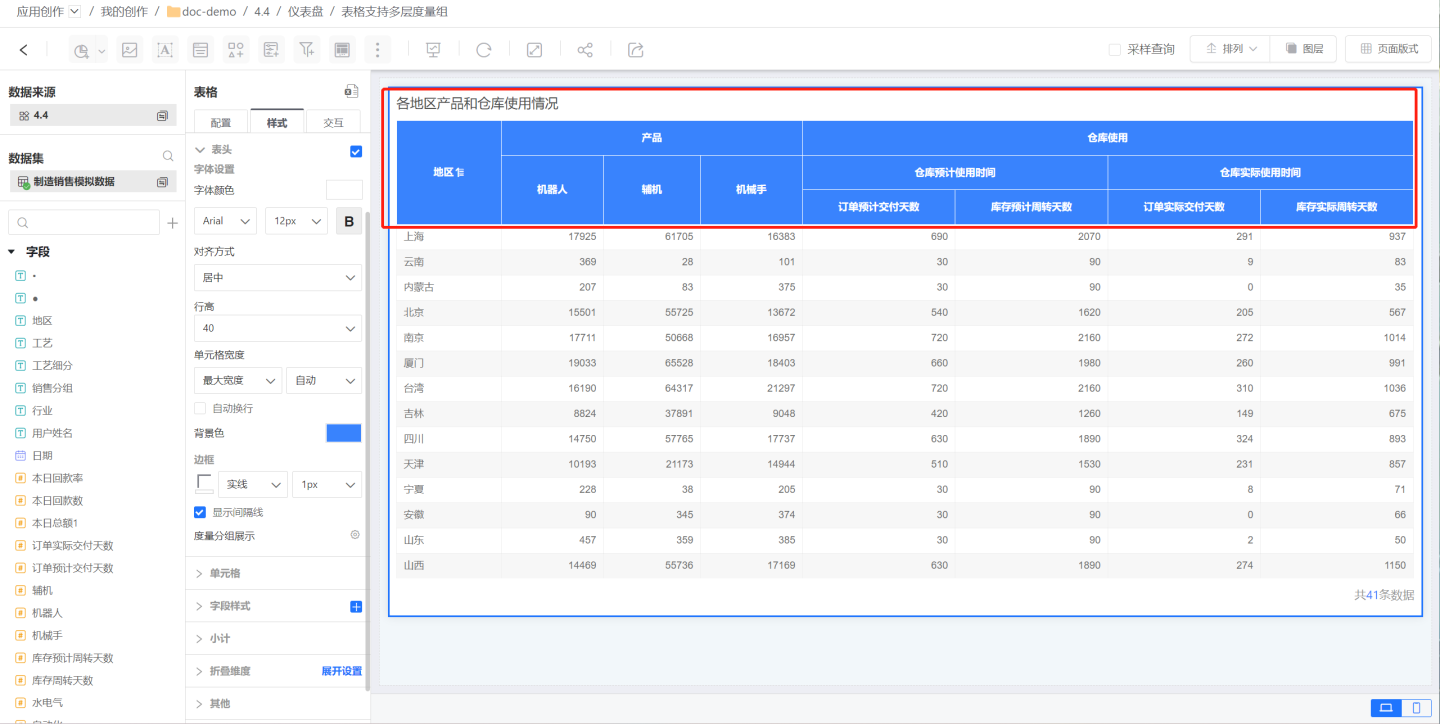
Click on Metric Group Display to open the metric group editing dialog. Click Add Group to create a new metric group, which will be displayed at the bottom.
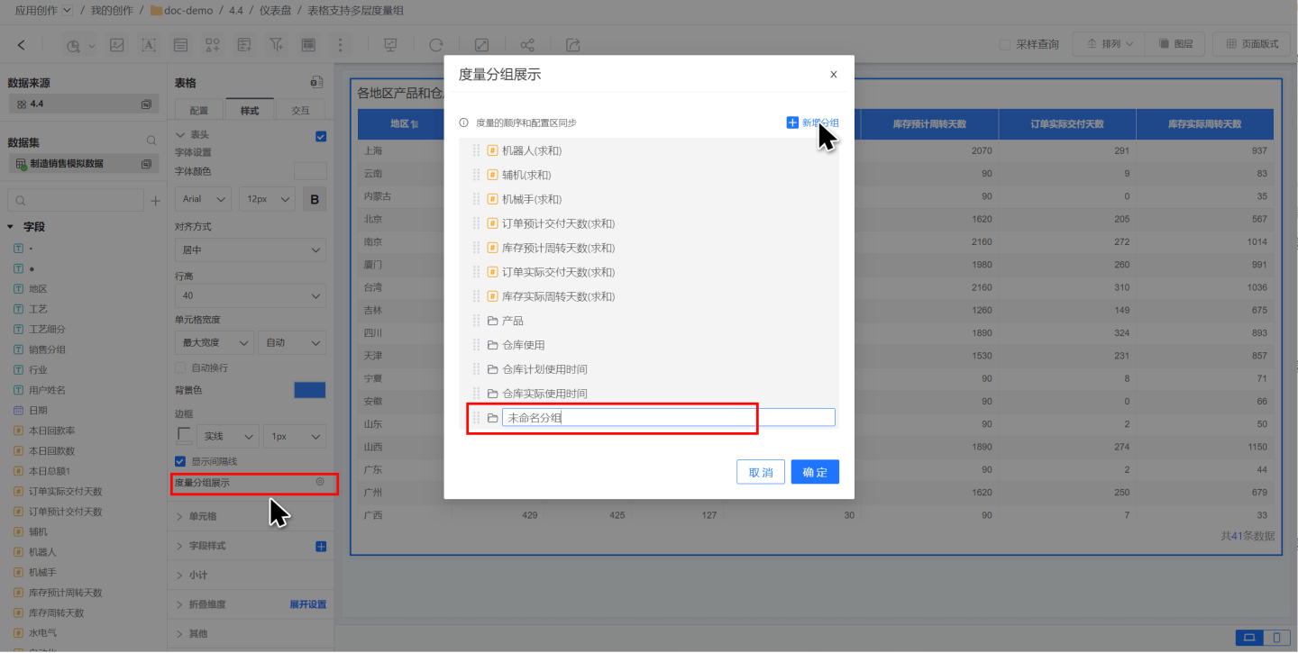
In the editing dialog, you can drag and drop metric information to adjust the hierarchy of the metric group display, presenting multi-level relationships among fields.
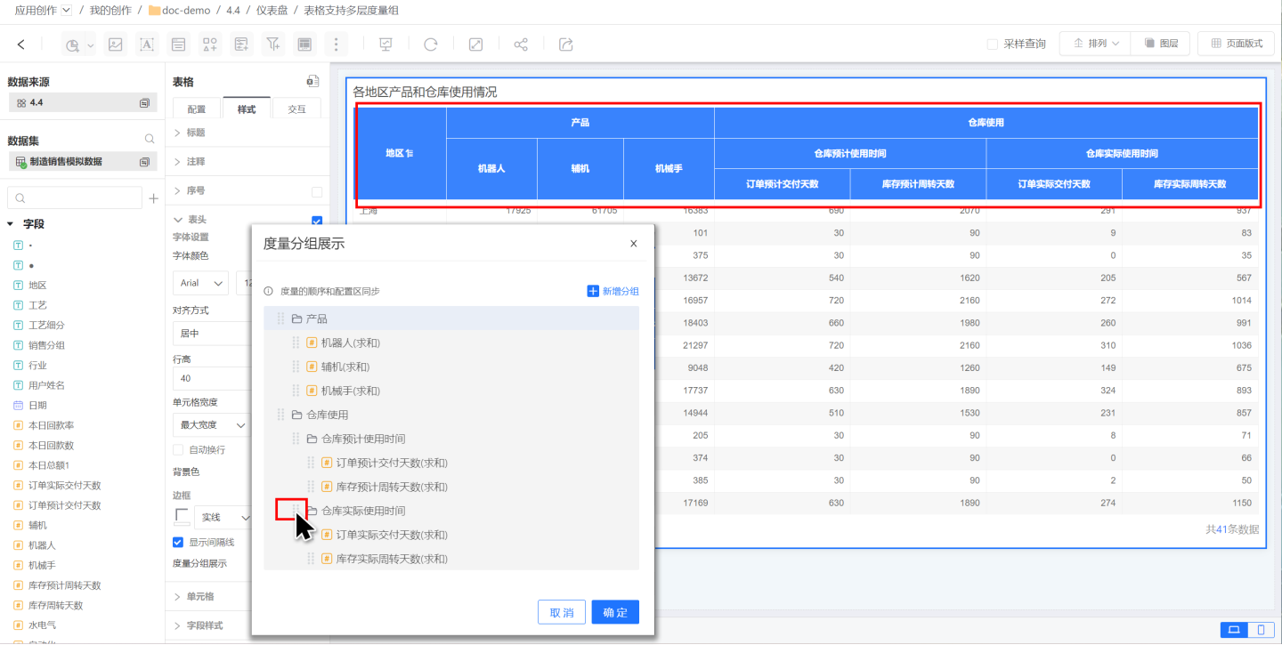
After setting up the metric group, if you adjust the order of metric fields, the metric group information will also be automatically updated, and the table header display will change accordingly. 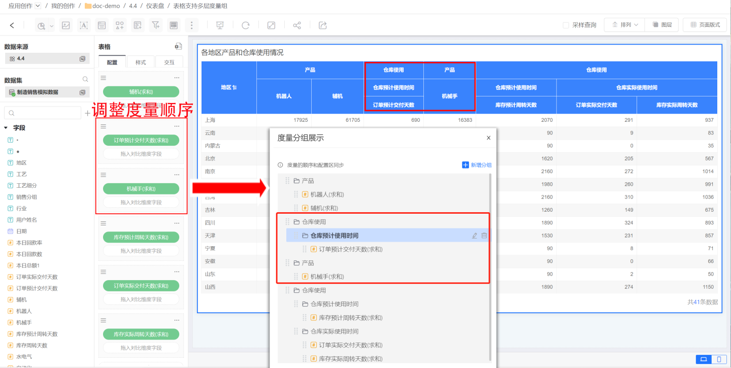
Tip
- Metric groups are different from Metric Sets. Metric groups are for display purposes only, while metric sets not only provide display functionality but also support merging comparison dimensions within the metric set.
- Metric groups can display metric relationships across multiple levels, while metric sets only support displaying a single level.
Cell
You can configure the background color, text color, row height, borders, and more for cells.
Background Color
You can set the background of cells, supporting both uniform row coloring (left card) and alternating row coloring (right card). By default, uniform row coloring is applied.- Uniform Row Coloring: All table rows are set with the same color, with no distinction between rows. Color settings support both solid color and opacity adjustments.
- Alternating Row Coloring: Requires setting two background color values, which will be displayed alternately by row. Color settings support both solid color and opacity adjustments.
Text Settings
Supports configuration of font color, font family, font size, bold, and more.Alignment
Refers to the horizontal alignment of text within the cell. Options include Auto, Left, Center, and Right.
The default alignment is Auto. Auto alignment means the alignment is determined by the field type, such as text being left-aligned by default and numbers being right-aligned by default.Row Height
Sets the height of the cell, ranging from 30-120px.Merge Cells
Merges cells with the same data within the same column.Show Divider Lines
Enabled by default. If unchecked, divider lines will be hidden.
Field Style
Cell settings apply to all cells in the entire table. If you want to apply special settings to a specific column or several columns, you can do so in Field Style.
In Field Style, in addition to basic cell settings, jump links are also supported.
Add Field Style
Click the "+" icon to the right of Field Style to open the field selection popup. Select the fields for which you want to set column styles; you can select multiple fields.
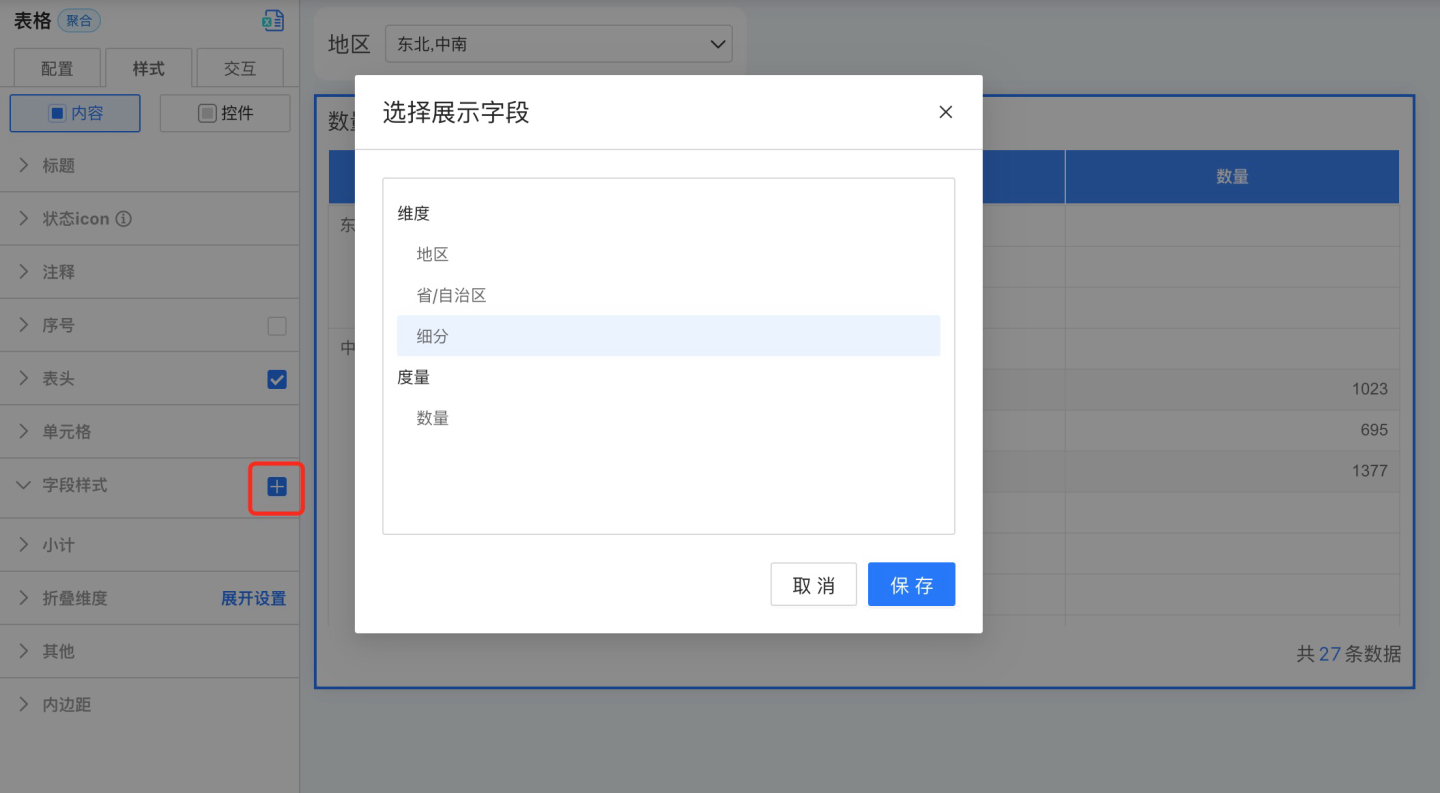
After clicking Save, a field style will be generated under Field Style.
Set Field Styles
After adding field styles, click to configure the following style settings.
Background Color
In addition to supporting same-color and alternate-color row settings, background color also supports conditional formatting.Text Settings
Supports setting font, font color, font size, and bold. Font color supports conditional formatting.Horizontal Alignment
Refers to the horizontal alignment of text within a cell. Options include Auto, Left, Center, and Right.
The default alignment is Auto. Auto alignment means the alignment is determined by the field type, such as text being left-aligned automatically and numbers being right-aligned automatically.Vertical Alignment
Refers to the vertical alignment of text within a cell, including Top, Middle, and Bottom.Cell Width
To set a uniform width for table cells, configure the cell width in the table header.- Auto Mode: When set to Auto, the cell width adjusts according to the content length.
- Maximum Width: If the cell content exceeds the set range, it maintains the maximum width; if it is less than the maximum width, it adapts automatically. A specific value must be set for the maximum width.
- Fixed Width: Displays the cell according to the set fixed width. A specific value must be set for the fixed width.
- Auto Wrap: When the content is too long to be fully displayed, you can enable the auto wrap feature. This feature is only effective under Maximum Width and Fixed Width modes, and does not work in Auto mode.
Column Jump
Set jump actions for field styles. The specific operation is the same as the jump settings in Table -> Control Settings -> Jump.Tip
- After setting a jump in the table, clicking a cell will execute the jump action, while clicking the table header will not trigger the jump.
- The jump settings in Table -> Control Settings apply to the entire table. When a jump is set in the field style, clicking the field style will only trigger the jump set for that field style.
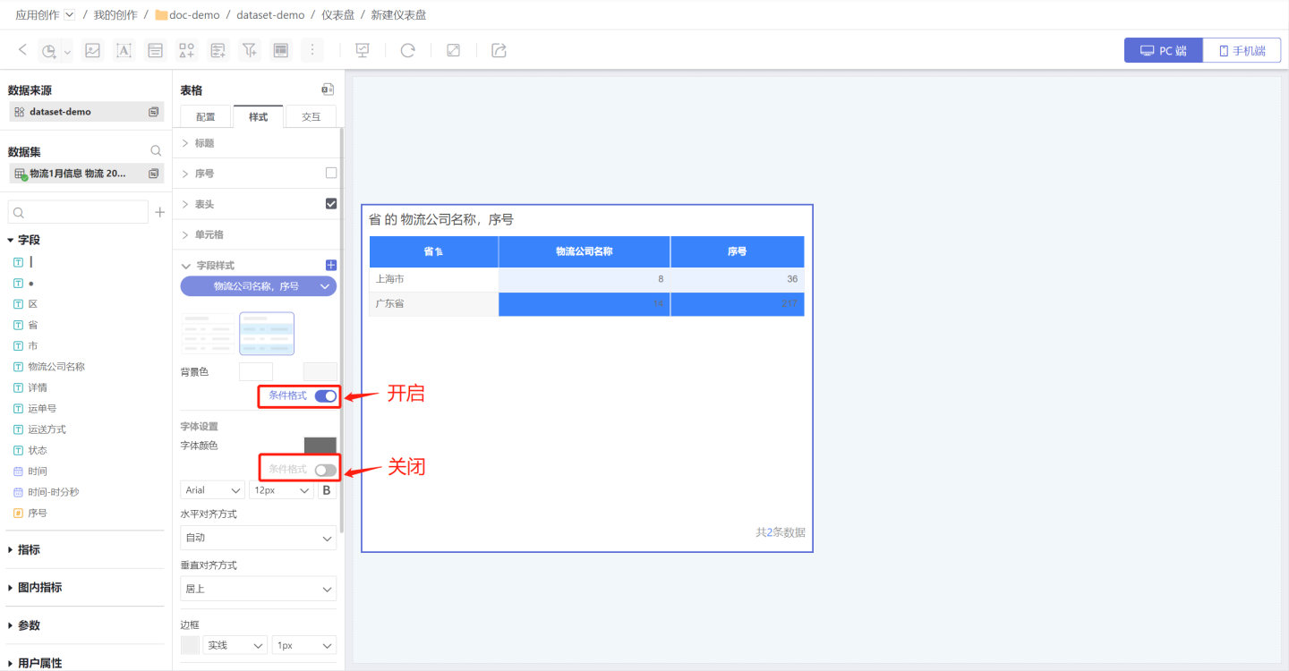
Conditional Formatting Settings
Conditional formatting refers to rendering the color of a cell by setting conditions. Both the background and font of a cell support conditional formatting, making the cell stand out so that users can identify data that meets the criteria by color. For example, in a student report card, green indicates scores above 90, and blue indicates scores above 80. Conditional formatting can control the display of a specific field or an entire row of data. The following introduces the relevant configuration of conditional formatting. 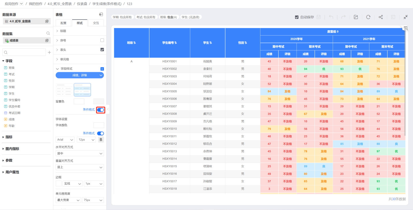
The toggle switch for conditional formatting. Once enabled, you can configure conditional formatting.
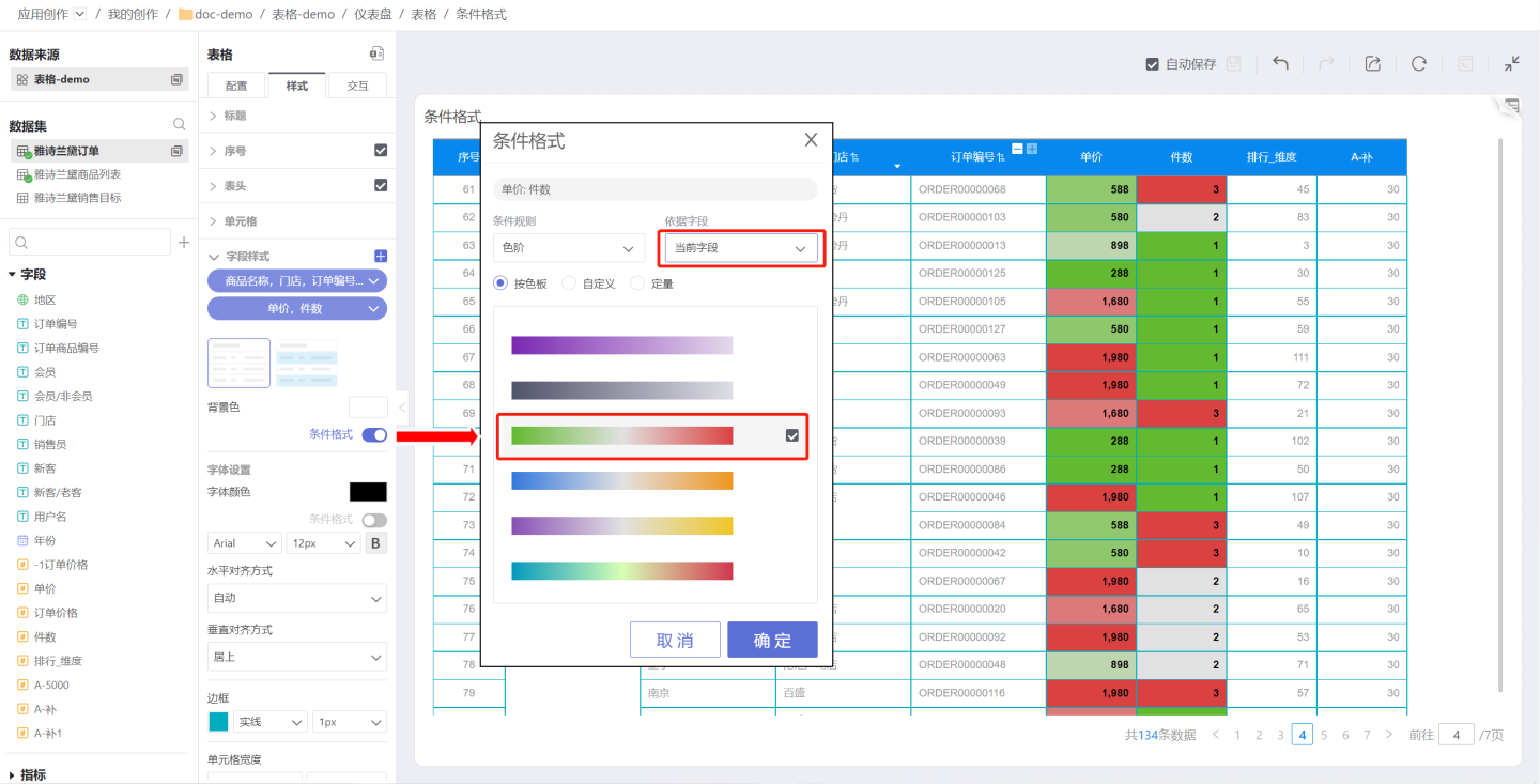
Conditional formatting rules are divided into color scales, max/min, and rules, and are categorized by field as either the current field or a specified field.
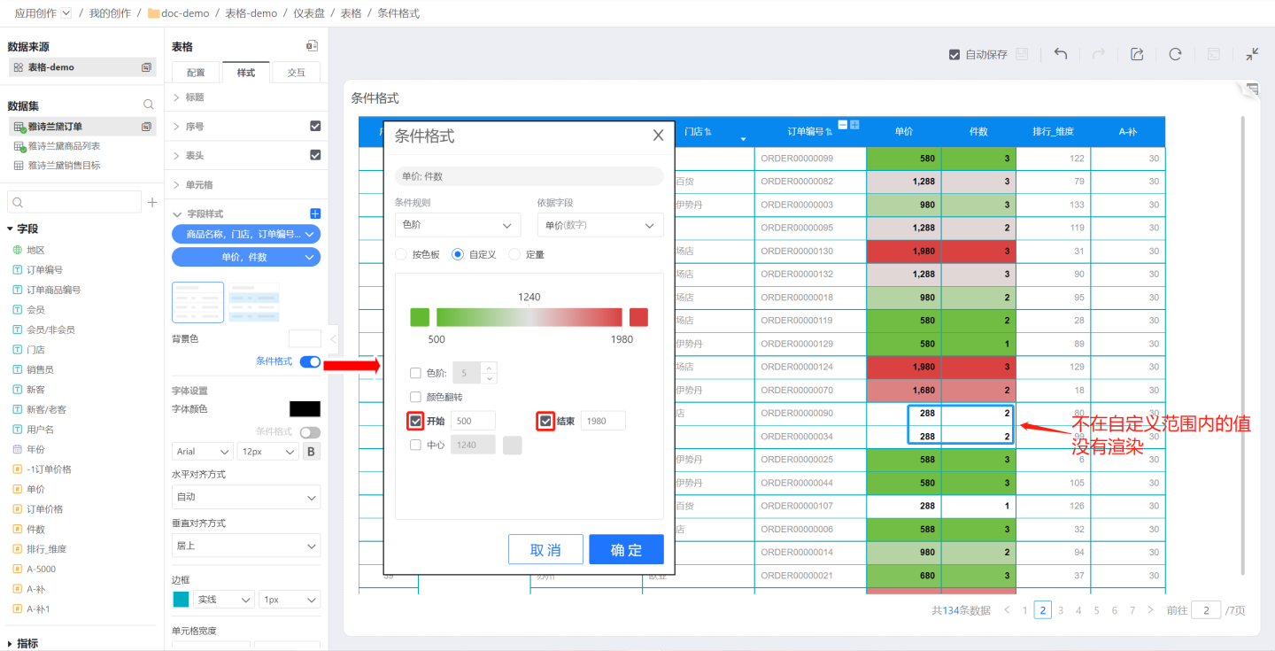
Current Field: When the basis field is set to the current field, each field in the field style is rendered with conditional formatting based on its own value. For example, if the field style in the example uses the current field as the basis field, each field uses its own value as the basis. The color scale values for the Unit Price field are 288~1980, and for the Quantity field are 1~3. You can see that the highest (red) value in the Unit Price field is 1980, and the highest (red) value in the Quantity field is 3.
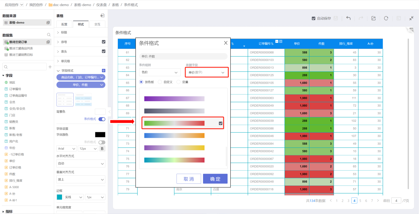
Specified Field: The specified field refers to a specific field in the table. When the basis field is set to a specified field, all fields in the field style are rendered with conditional formatting based on the value of that field. For example, if the field style in the example uses the Unit Price field as the basis field, all fields in that field style use the Unit Price value of the row as the basis. The color scale values are 288~1980, and you can see the related information for the product with the highest (red) unit price.
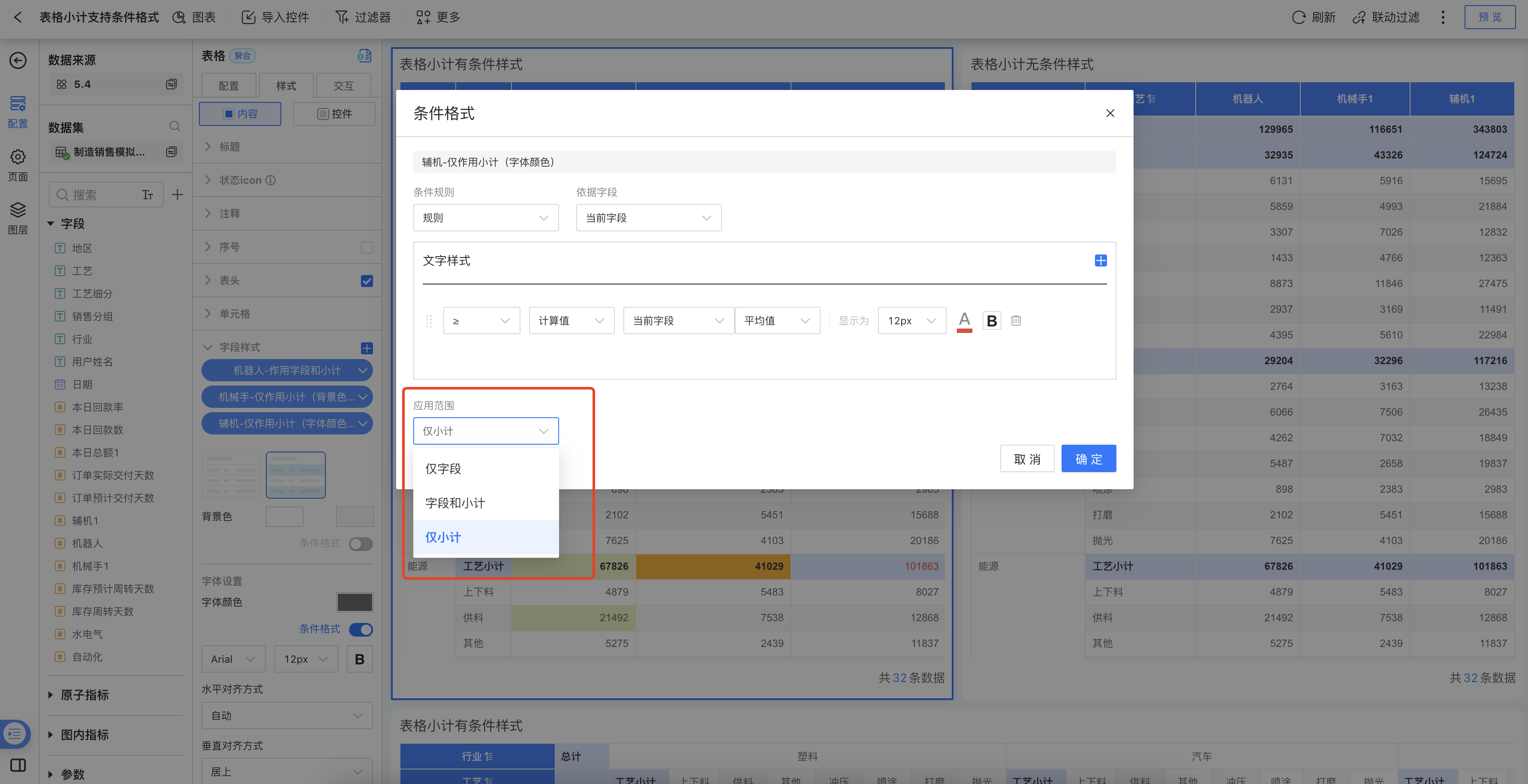
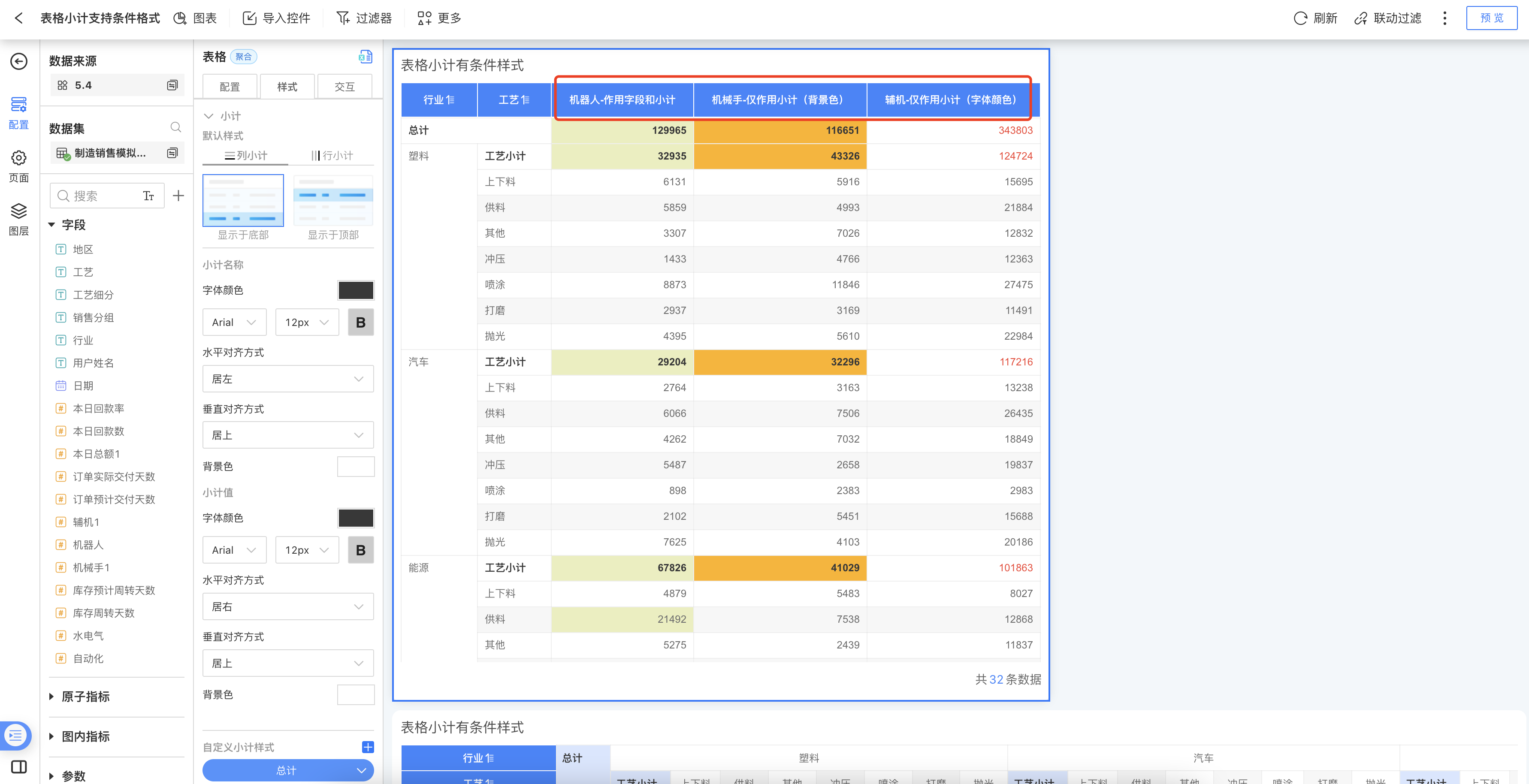
- When data analysts create tables and want to set conditional formatting for subtotal values, version 5.4 supports configuring conditional formatting for both data and subtotal values of the selected field in "Field Style". Configuration path: Style > Content > Field Style > Conditional Formatting > Application Scope.
Select "Field Only": Selected by default, conditional formatting only applies to field data, not to subtotal values.
Select "Field and Subtotal": Conditional formatting applies to both field data and subtotal values.
Select "Subtotal Only": Conditional formatting only applies to subtotal values, not to field data.
Tip
The purpose of the table serial number is to indicate the display order of the data and has no actual business significance, so the table serial number cannot be used as a basis field.
Color Scale
Use the color scale to set conditional formatting, including by palette, custom, and quantitative options.
By Palette: Select a preset palette for rendering. The example shows the rendering result using a system preset palette.
Custom: Customize the color scale for rendering. You can set the number of steps, reverse the colors, and specify the start, end, and center values along with their corresponding colors. As shown in the example, the start and end values are set for rendering in the custom option. Values outside the specified range will not be rendered.
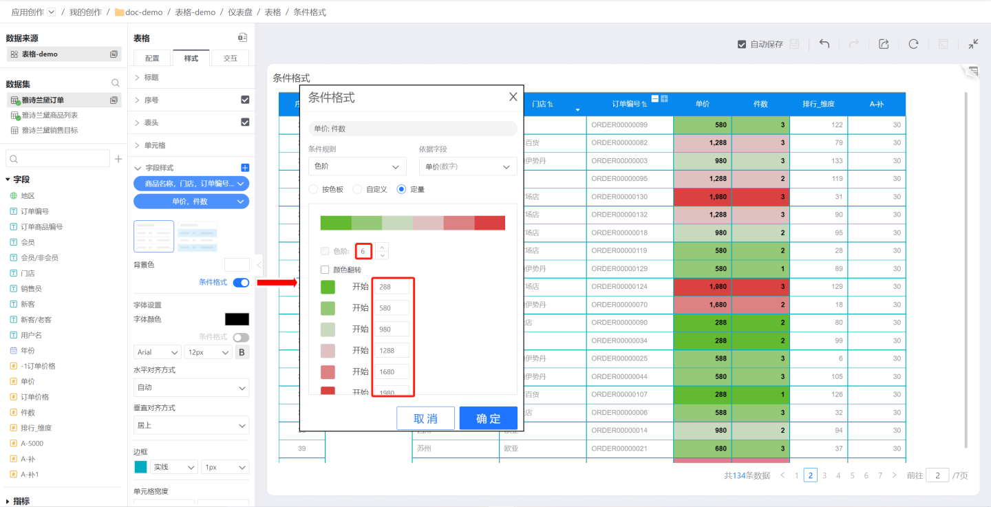
Quantitative: Set the number of color scale steps, with each step corresponding to a specific value and color. In the example, five color scale steps are set, each with its corresponding color and value. If a value does not fall within the defined color scale range, the cell will not be rendered.
Note
- If the value in a cell does not fall within the defined color scale range, the cell will not be rendered.
- For custom color scales, if the start, center, and end values are not set, the system will automatically use the minimum, center, and maximum values of the first field in the field style as the start, center, and end values of the color scale.
Maximum/Minimum
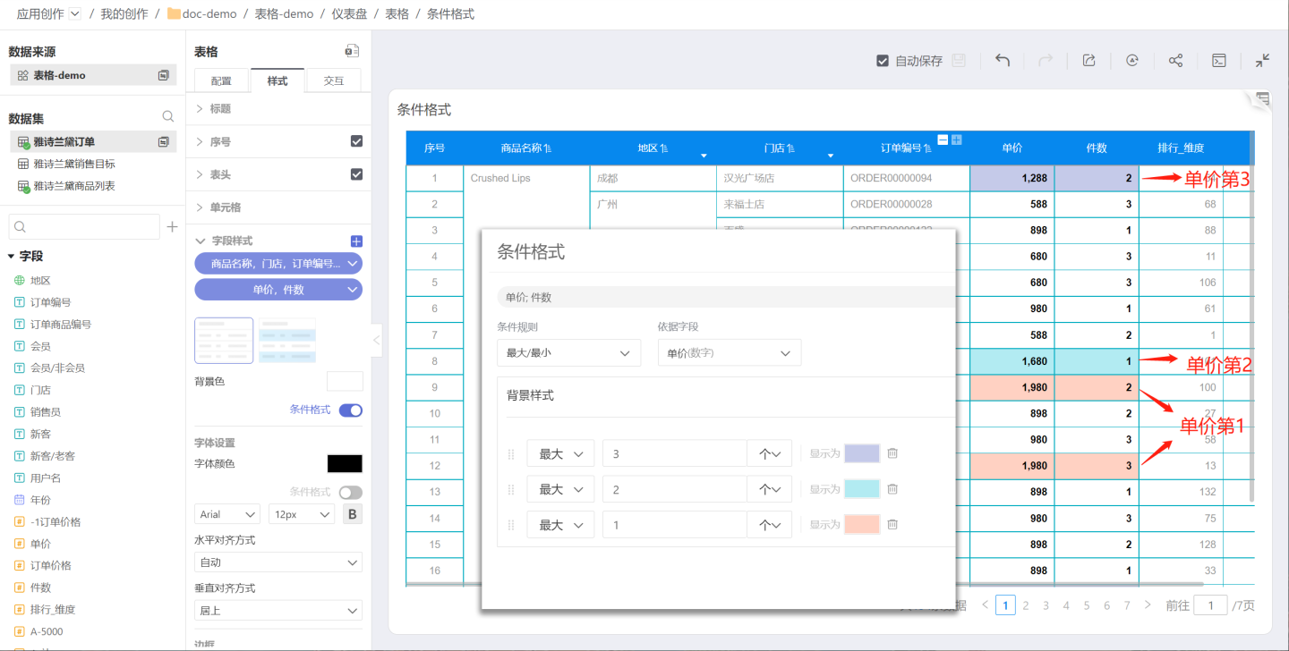
Use the maximum/minimum setting for conditional formatting to highlight the maximum or minimum values in a field. You can set conditions using either "count" or "%". Multiple conditions can be set, and the latter conditions will override the rendering effects of the former.
In the example, you need to highlight the top three products by unit price. In the conditional formatting, set the display color for the top 3, then the top 2, and finally the top 1. As shown in the example, the latter conditional formatting overrides the previous ones. The final result is that the 1st, 2nd, and 3rd places are rendered in different colors.
Rules
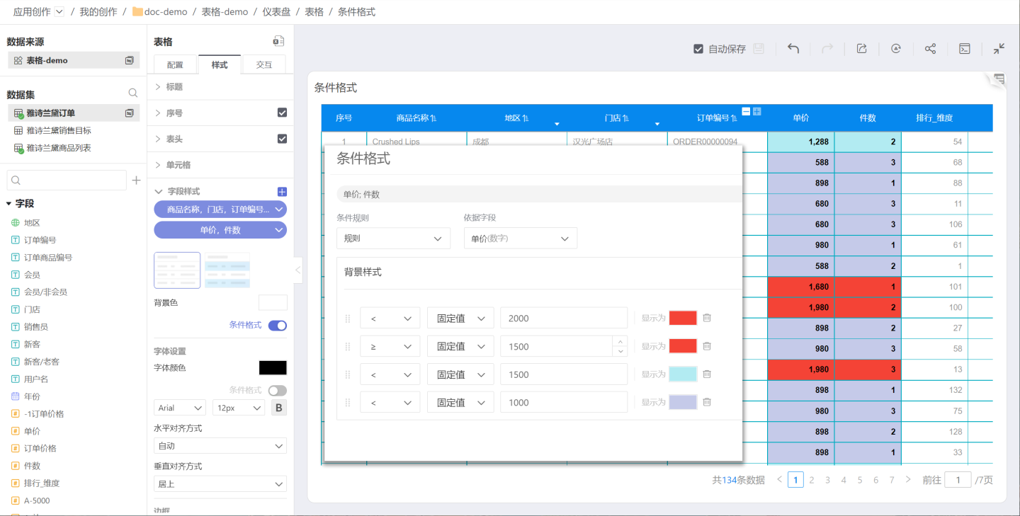
Use rules to set conditional formatting, which applies conditional styles based on logical judgments such as >, ≥, <, ≤, =, !=, contains, does not contain, between, not between, empty, NULL, etc., according to the field values. Multiple conditions can be set in rules, and the rendering effect of later conditions will override those of earlier ones. For example, you can label different price ranges, such as 0~1000, 1000~1500, and 1500~2000. In this example, comparison operators are used, and the later rules override the earlier ones, forming price intervals. Users can try using the between operator in rules to achieve price range rendering.
Note:
- When setting maximum/minimum or rules, the rendering result of later conditions will override that of earlier ones, so the order of conditions is important.
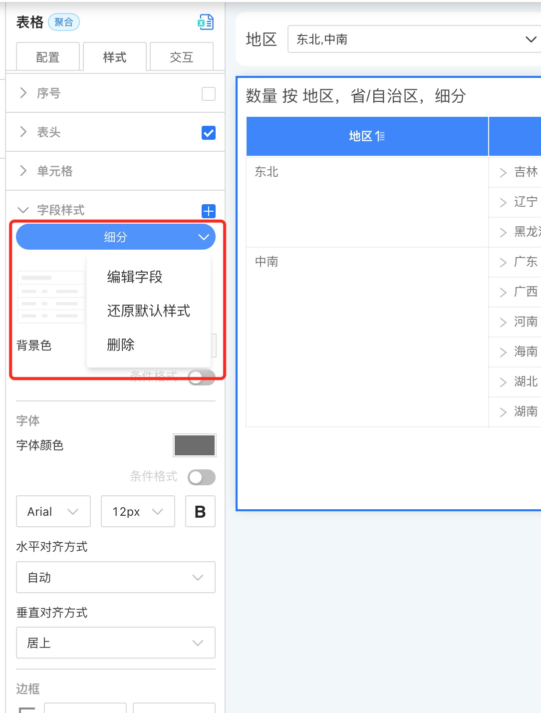
Edit Field Style
After creating each field style, you can re-edit the fields within it. Click the "dropdown arrow" on the right side of the label and select "Edit Field" to reselect the fields.
Please Note
If a field is grayed out when selecting fields, it means that the field has already been assigned a field style. A field cannot exist in two field styles at the same time.
Restore Default Style
Restore the settings in the field style to the default style.
Delete
After a field style is deleted, all related settings will become invalid.
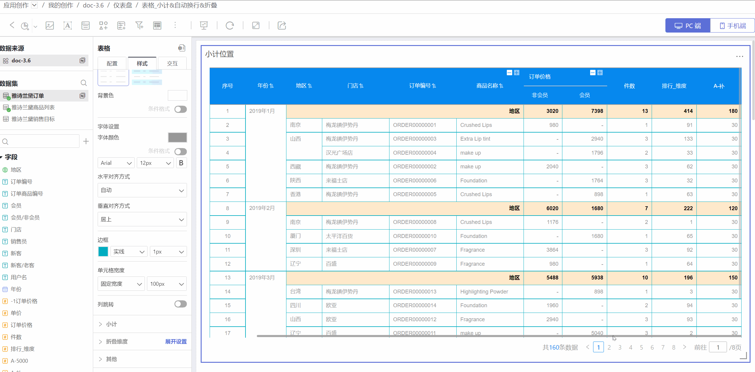
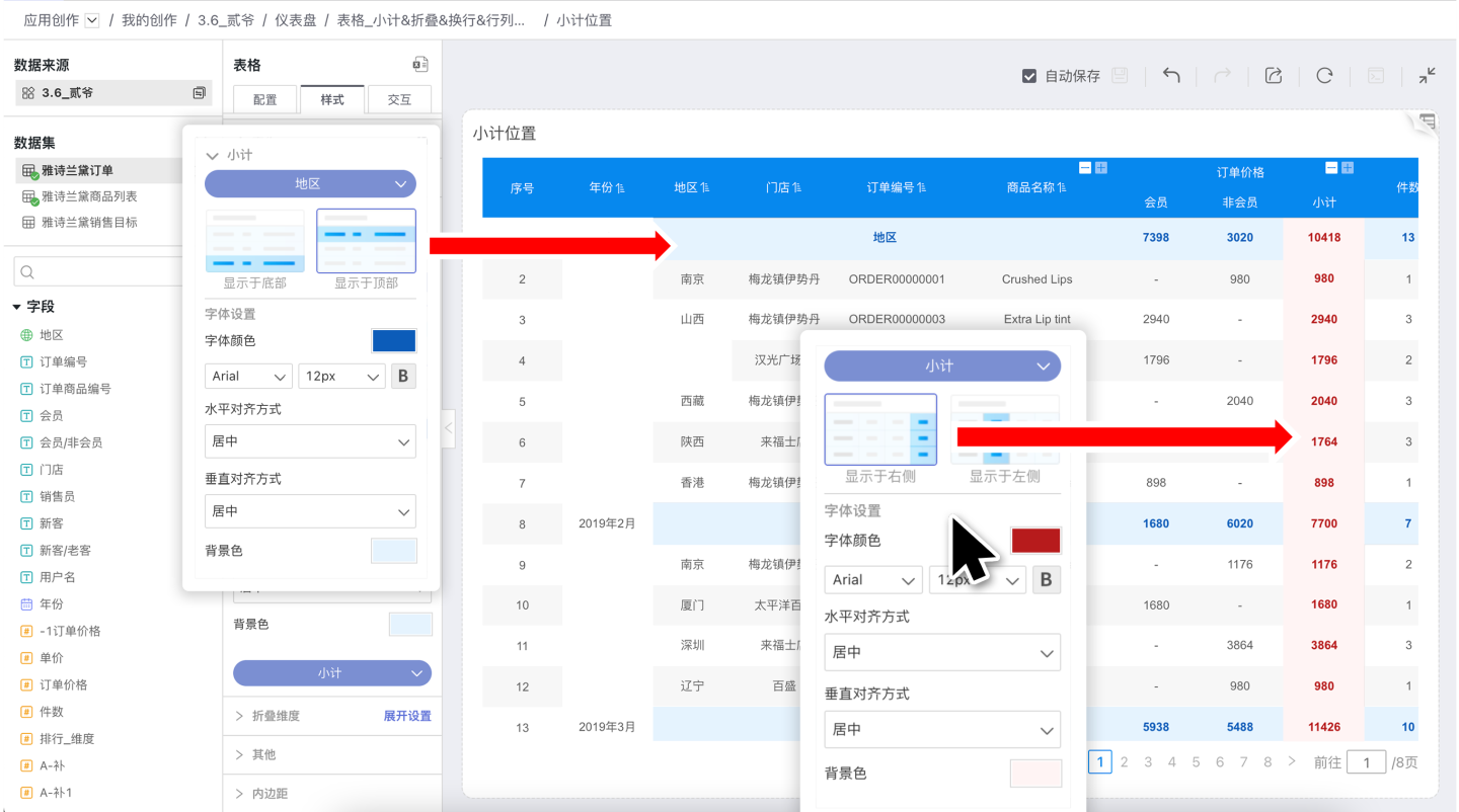
Subtotals
Tables support subtotals, including settings for position, font color, alignment, background color, etc. Each subtotal can be configured individually. Subtotals occupy a row when the table is aggregated.
- The position of dimension subtotals can be set to either the top or bottom. In the example, the subtotal for Region is a dimension subtotal, and its position is set to the top.
- For measure comparison dimension subtotals, the position can be set to either the left or right.
Collapsible Dimensions
The table supports collapsible dimension settings. As shown in the figure: after selecting "Region" in the collapsible dimensions, the table will collapse the region information. 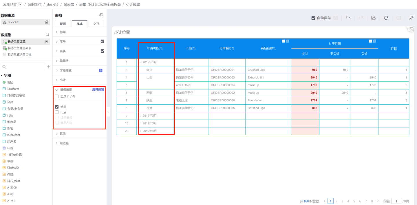
The expand setting allows users to freely set the expanded state of each dimension level, so that the table displays in different forms. 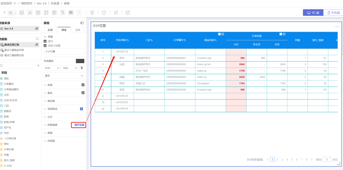
Tip
You can use the subtotal feature to add data to the collapsed layers.
Others
- Fill Empty Rows: Fill in empty rows in the table when they exist.
- Enable Virtual Scrolling: When enabled, the table uses virtual scrolling to render only the visible area, improving performance. This is enabled by default. When disabled, all data is rendered at once, which may reduce performance but is more suitable for auto-scrolling scenarios.
- Lock Dimension Columns: After locking a dimension, the dimension columns remain fixed during horizontal scrolling. You can lock specific dimension columns.