Visualization Content
Visualization content is the ultimate form of data analysis presentation, representing the final display of data analysis.
HENGSHI SENSE offers different methods for creating visualizations across various application types. For analytical applications, users can create Dashboards to build visualization content. Dashboards provide a wide variety of control types and complex layout management, meeting the needs of sophisticated visualizations. For query applications, complex layouts are not necessary; we provide Pages to allow users to easily configure their content. For report applications, the process is even more streamlined than for query applications—users only need to configure the report and query condition controllers to complete the setup.
Regardless of the application type, HENGSHI SENSE abstracts certain concepts within visualizations. All visualizations are composed of a Canvas and various types of Controls, with controls serving as the basic unit.
Canvas
The main function of the canvas is to arrange controls, set the canvas style, and better present visual content.
Within the canvas, you can adjust the arrangement of controls through layer ordering.
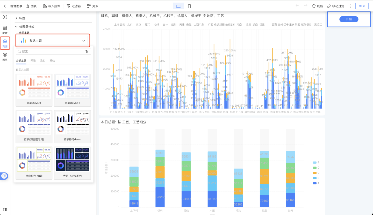
Canvas style refers to the dashboard style. Users can set different themes to display various styles for the dashboard.
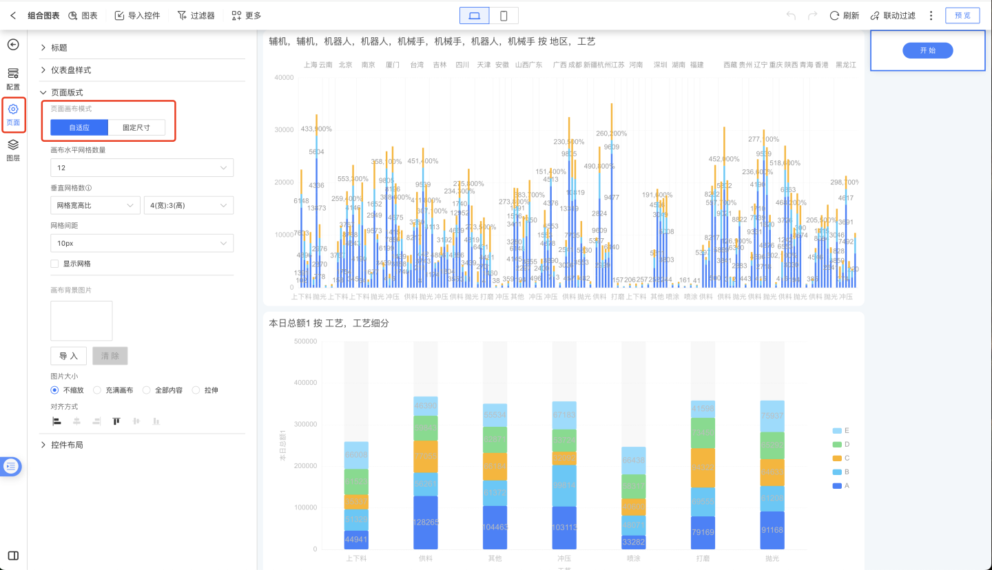
The canvas supports two types of page layouts: adaptive and fixed size, catering to different display requirements.
Controls
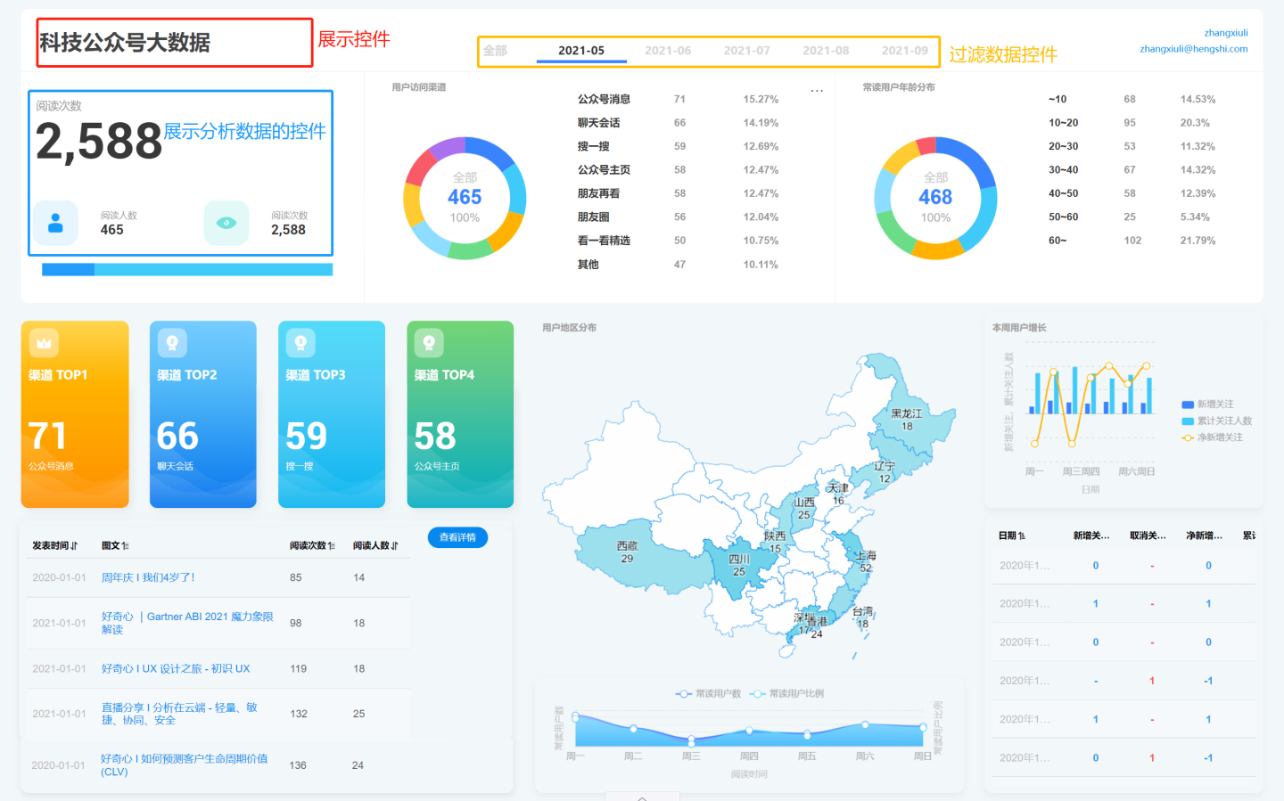
There are many types of controls, including chart controls for displaying analytical data, display controls for showing images and text, as well as functional controls for exporting data, refreshing data, filtering data, and more. A complete dashboard is composed of various controls with different functionalities. All controls follow the Control Settings.
Control Types
Controls can be categorized into chart controls, display controls, and functional controls based on whether they display analytical data.
Chart Controls
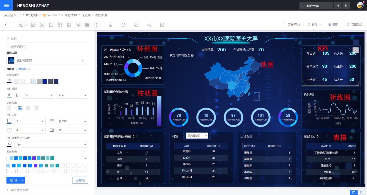
Refers to various chart controls used to display analytical data, such as Bar Chart, Donut Chart, Pie Chart, Table, Map, and Custom Chart, with nearly 50 types of charts in total.
Display Controls
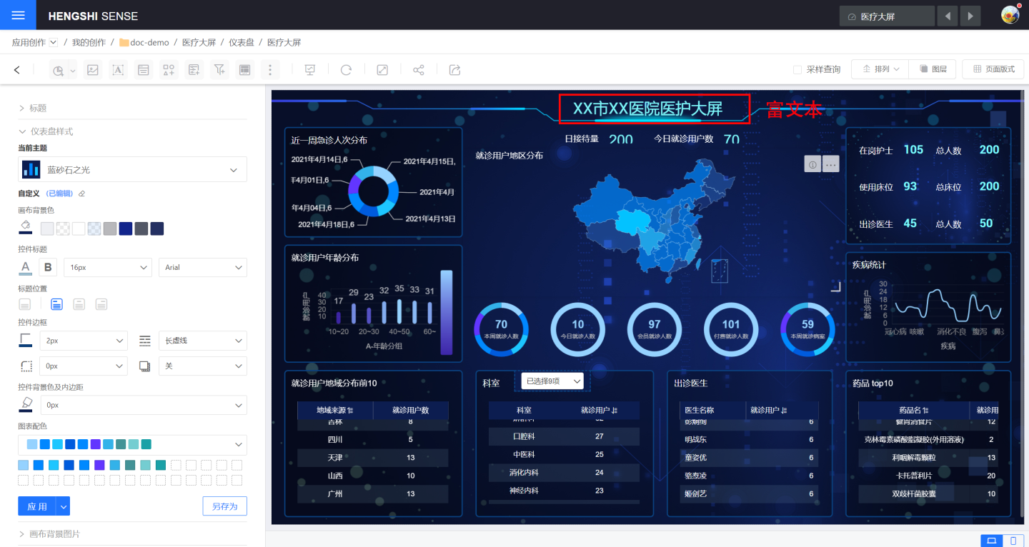
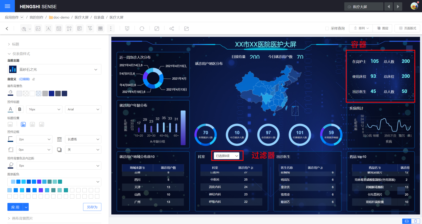
Generally, these do not contain analytical data and are mainly used to display images, text, and other content to enhance the dashboard's visual presentation. Examples include Container, Image, Rich Text, Shape Control, Web Control, Button, etc.
Functional Controls
Perform certain functions within the dashboard to assist users in obtaining analytical data, such as filtering data, exporting data, refreshing, and other features, such as Filter and Parameter Control.
Control Example
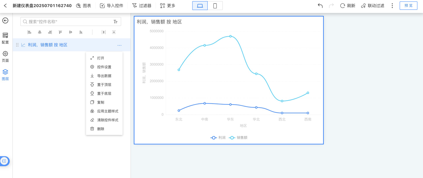
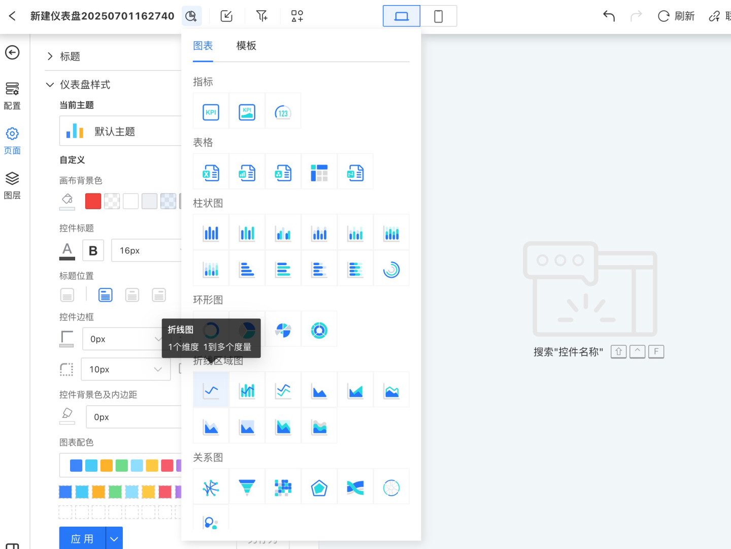
Below is an example of creating a line chart control to demonstrate the control creation process. The process for creating other controls is similar.
Select the chart control from the menu bar (in this case, a line chart).
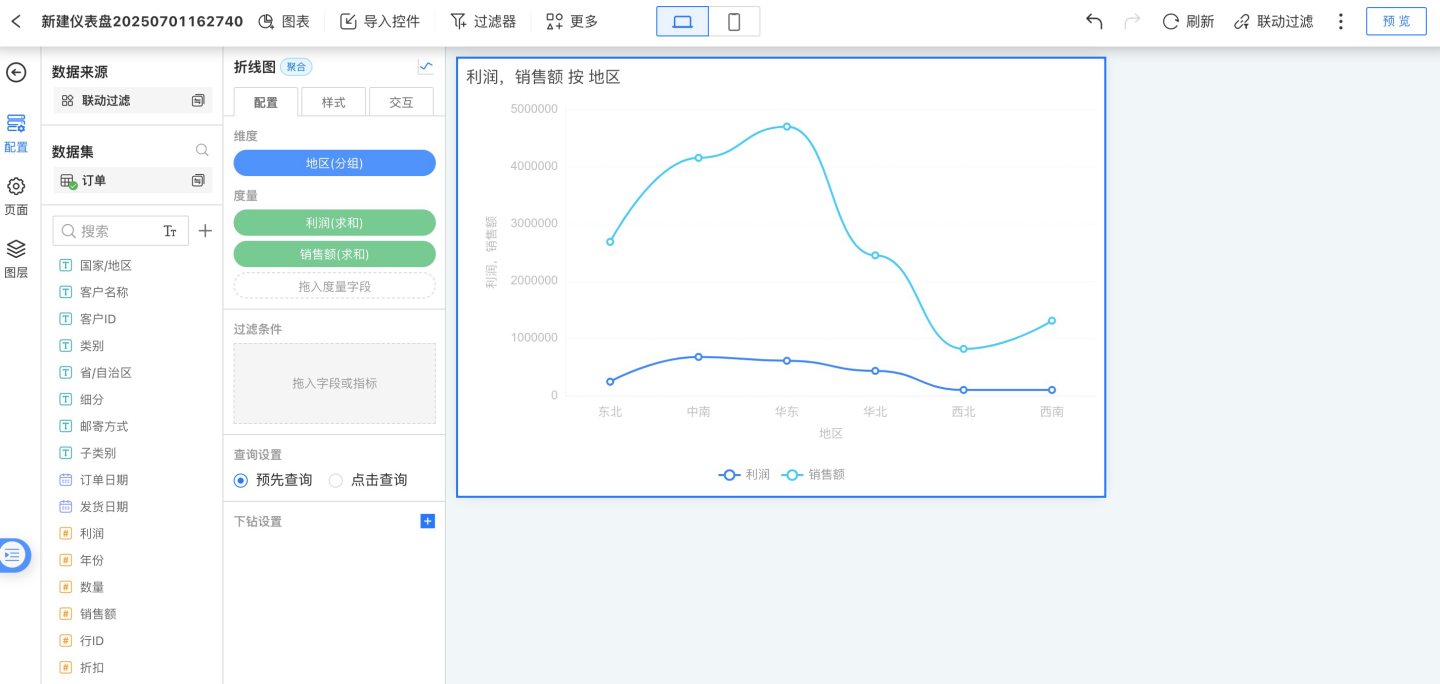
Set the control content, including configuration, style, and interaction.
- Configuration: In the configuration section, drag dimensions and measures to generate aggregated chart data, displaying business data information. In the example, the "Date" field (calculated by month, display format set to year/month) is dragged into Dimensions, and the fields "User Name," "Actual Order Delivery Days," and "Inventory Cycle Days" are dragged into Measures to generate the chart.
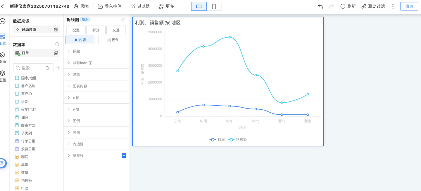
- Style: Set the display style of the control. In the example, a custom title is set, along with chart content color, size, x-axis, y-axis, legend, and other styles. The chart after modification is shown below.
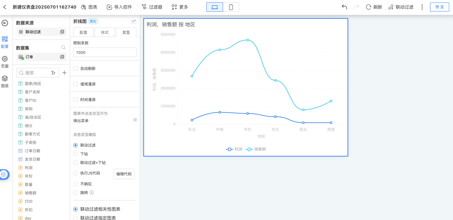
- Interaction: Set the in-chart interactions for the control. In the example, only the limit of 1000 rows is set, and the click interaction in the chart is set to pop up a menu.
- Configuration: In the configuration section, drag dimensions and measures to generate aggregated chart data, displaying business data information. In the example, the "Date" field (calculated by month, display format set to year/month) is dragged into Dimensions, and the fields "User Name," "Actual Order Delivery Days," and "Inventory Cycle Days" are dragged into Measures to generate the chart.
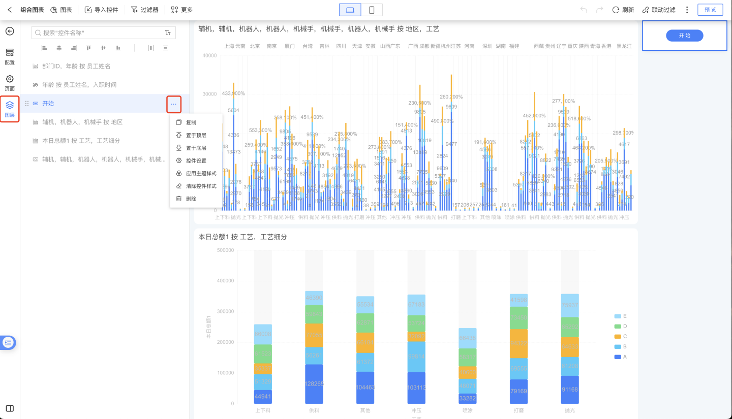
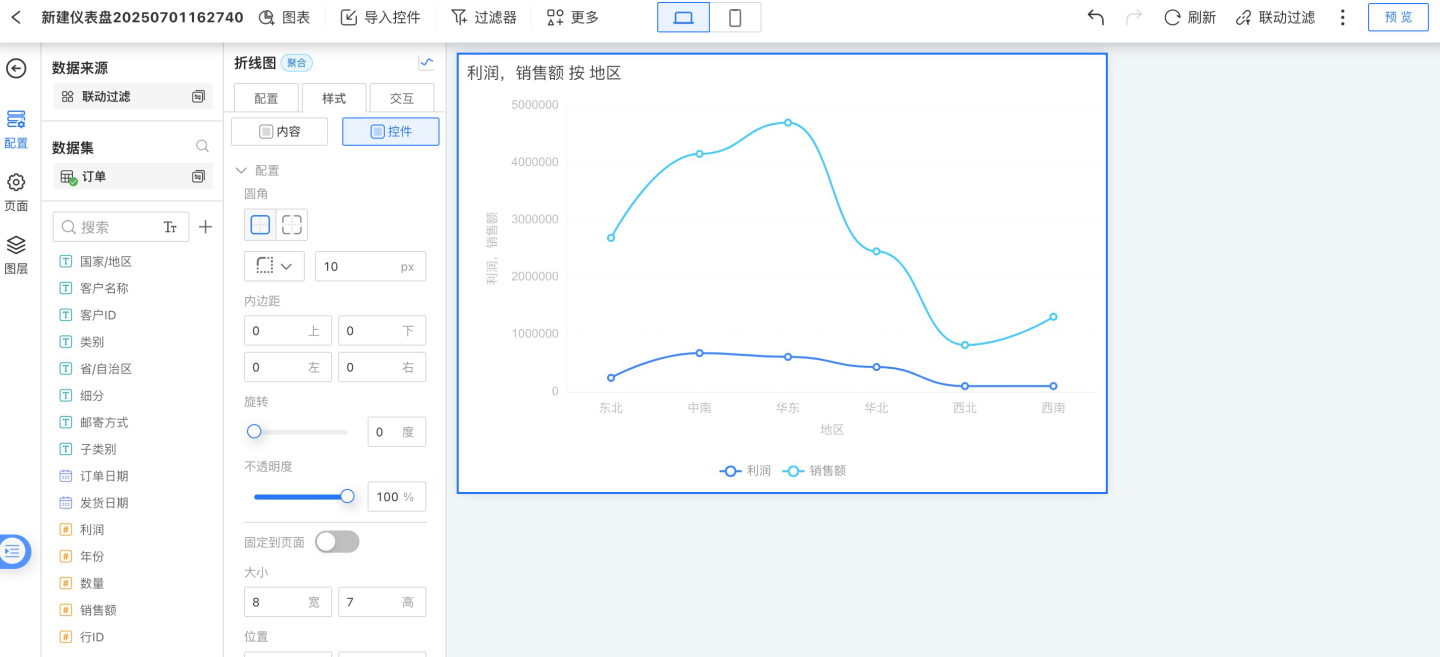
Set the control appearance and control interactions. In the example, the control's corner radius is set, and for interaction with other controls, linked filtering of related charts is selected.
After the control is created, adjust its layout on the canvas.
As shown in the example, a control requires both content configuration and appearance & interaction configuration. The following sections introduce these two aspects in detail.
Control Content
Control content includes the display content of the control (analytical data, text content), display style, and internal interactions. These three aspects are configured respectively in the control's configuration, style, and interaction settings.
Configuration
In the configuration section, you set up analytical data, including configuring and processing data.
Configuring data: This refers to dragging dataset fields, parameters, metrics, and user attributes into the configuration area to generate charts.
For details, see Fields and Metrics
Processing data: After data is dragged into the chart, it needs to be processed. This includes calculations such as sum, average, deduplication, percentage, period-over-period comparison, and year-over-year comparison; setting display formats such as decimal places and calculation units; setting sorting styles; and applying data filters.
For details, see Dimension Calculation, Metric Calculation, Sorting, Filter
Style
In the style section, you adjust the display style of the control. On one hand, this makes the control more visually appealing and consistent with the overall dashboard style, such as configuring colors, font settings, and legend display. On the other hand, it helps highlight key content in the control, such as axis settings, reference line settings, and conditional formatting.
For details, see Chart Style
Interaction
This mainly refers to the control's own interactive behaviors, such as the number of data rows displayed, auto-refresh, value range roaming, time roaming, and click interactions after opening the chart.
For details, see Chart Interaction
Tip
The options available in configuration, style, and interaction may vary for different controls. Not all controls include configuration, style, and interaction. Chart-type controls generally include all three, while display-type controls usually do not involve analytical data and have no configuration options. Functional controls generally do not involve interaction and have no interaction options.
Control Layout
When using multiple controls, you can arrange the layout through layer ordering, adjusting the control hierarchy, alignment, distribution, and more.