Map Charts
Map charts include two types: Simple Map and Layered Map. The Simple Map displays geographic information on a map with straightforward operations and is suitable for uncomplicated data usage scenarios. The Layered Map, on the other hand, is designed for complex geographic information display. It allows users to overlay different layers to present geographic data, enabling a more intuitive understanding and analysis of the data.
Before introducing the two types of map charts, let's first discuss the map positioning modes.
Positioning Modes
When creating maps, it is necessary to position data on the map based on geographic information. The commonly used positioning modes are Place Mode and Latitude/Longitude Mode.
Place Mode positions locations on the map based on geographic names, such as country/region, province/city/autonomous region, city, and district/county names. For example, Beijing, Tianjin, or Shanghai Pudong New Area can be located on the map using these place names. When using Place Mode, you first need to convert the geographic name field to a Geographic Role, and then create the map chart.
Latitude/Longitude Mode refers to positioning based on longitude and latitude information. This positioning mode can automatically match the corresponding geographic location without the need for geographic role conversion.
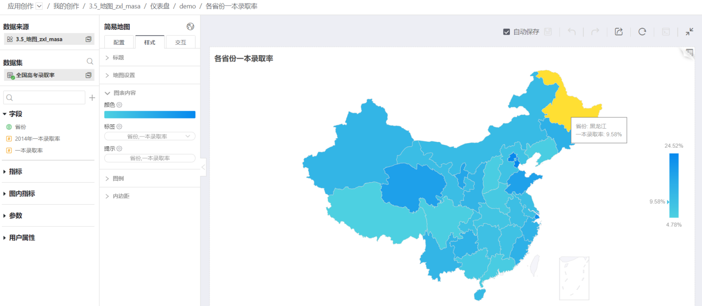
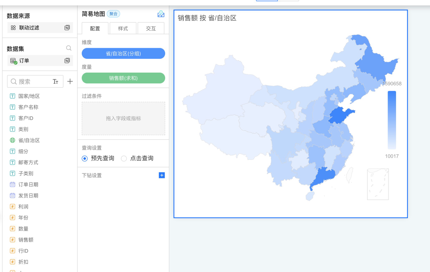
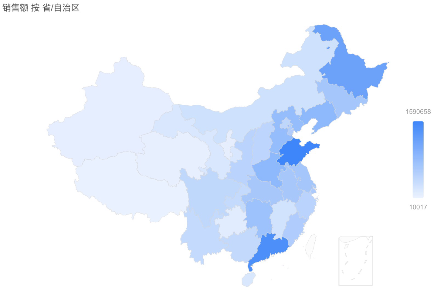
Simple Map
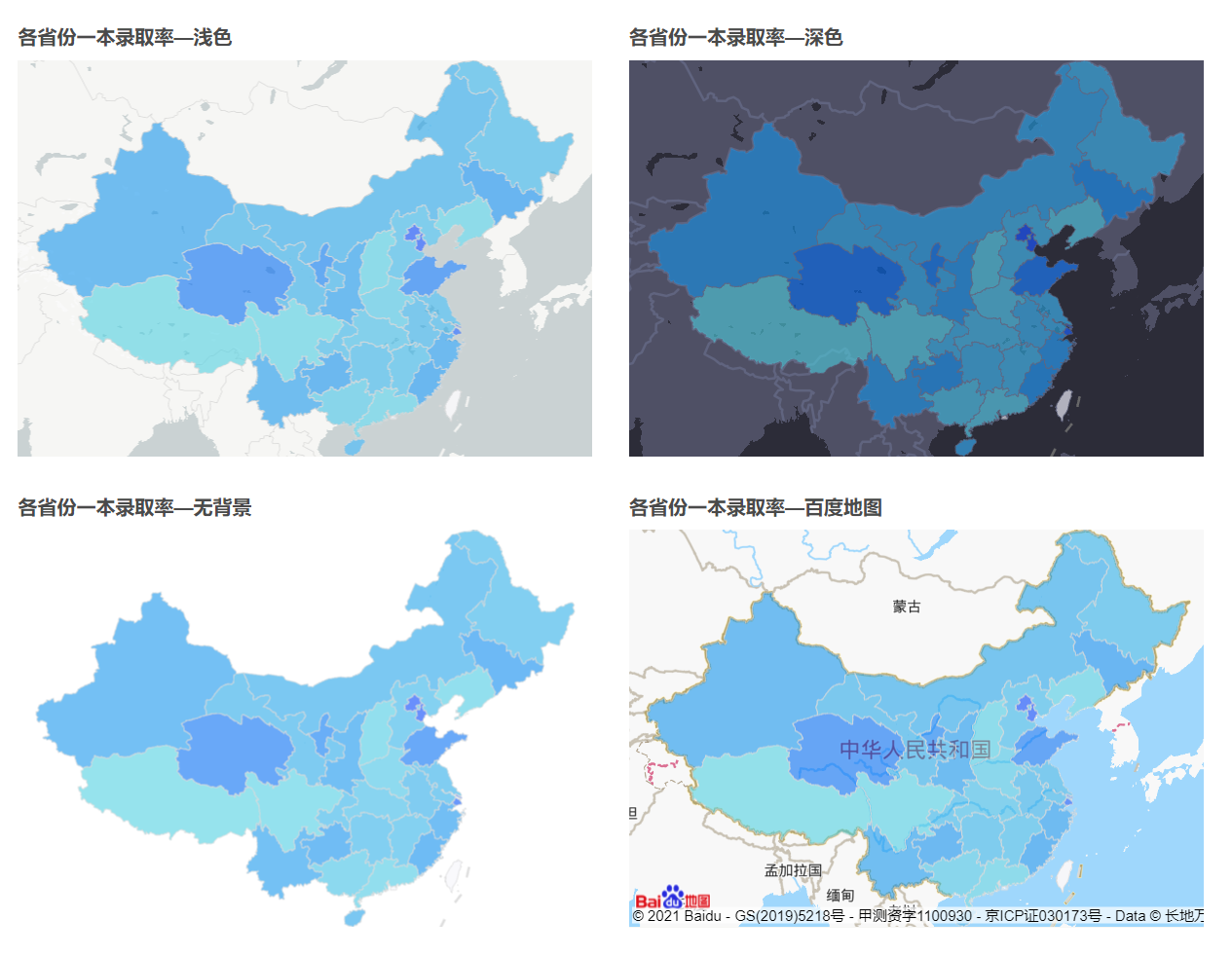
A simple map displays geographic information on the corresponding map regions, without other complex data presentation scenarios. The figure below shows the admission rates for the first-tier universities in each province.
In addition, the simple map also supports Regional Map and Drill-down Function.
Simple maps are easy to create. The production process is introduced later in this article, and you can refer to the sample to create a simple map.
Layered Map
Layered maps are commonly used in complex map analysis scenarios, such as displaying sales performance by region, flight routes, product transportation trajectories, product popularity, and more. All of these can be visualized using layered maps.
Currently, layered maps support various layers including label maps, area maps, heat maps, scatter plots, flow maps, trajectory maps, and polygons. They support multi-layer overlay, layer order adjustment, and other features. Please refer to Layered Map for the usage scenarios and display effects of each layer. In addition, layered maps also support GIS Layers.
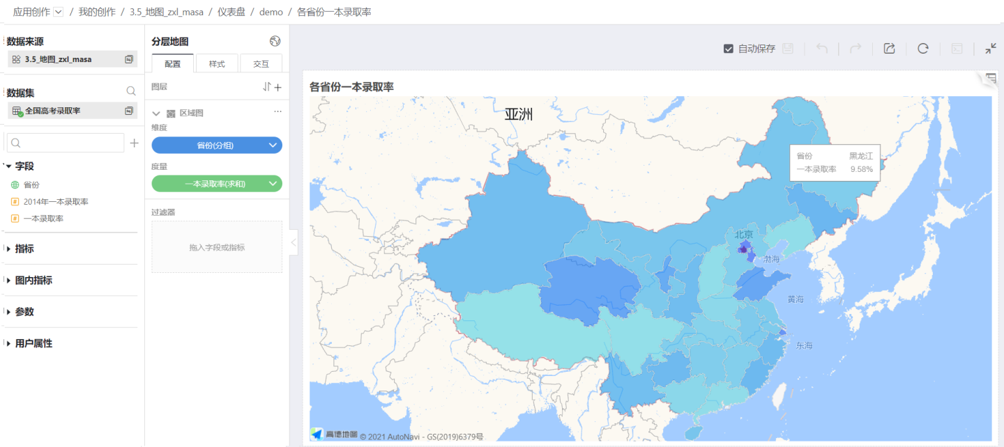
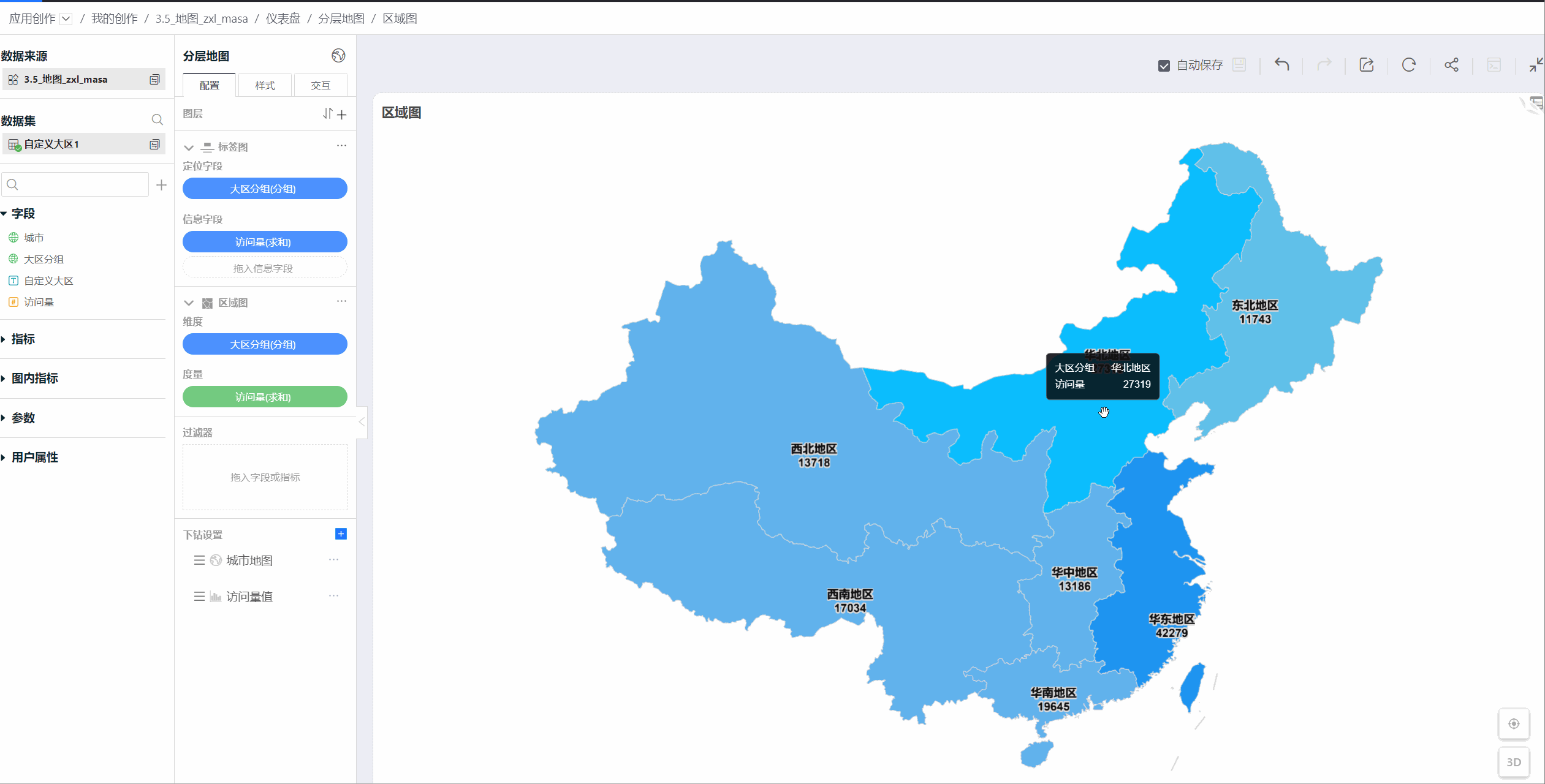
Below is an example of using an area map in a layered map to display the admission rate of top-tier universities by province.
Layered maps support both 2D and 3D display modes, and you can switch between them at will during visualization. 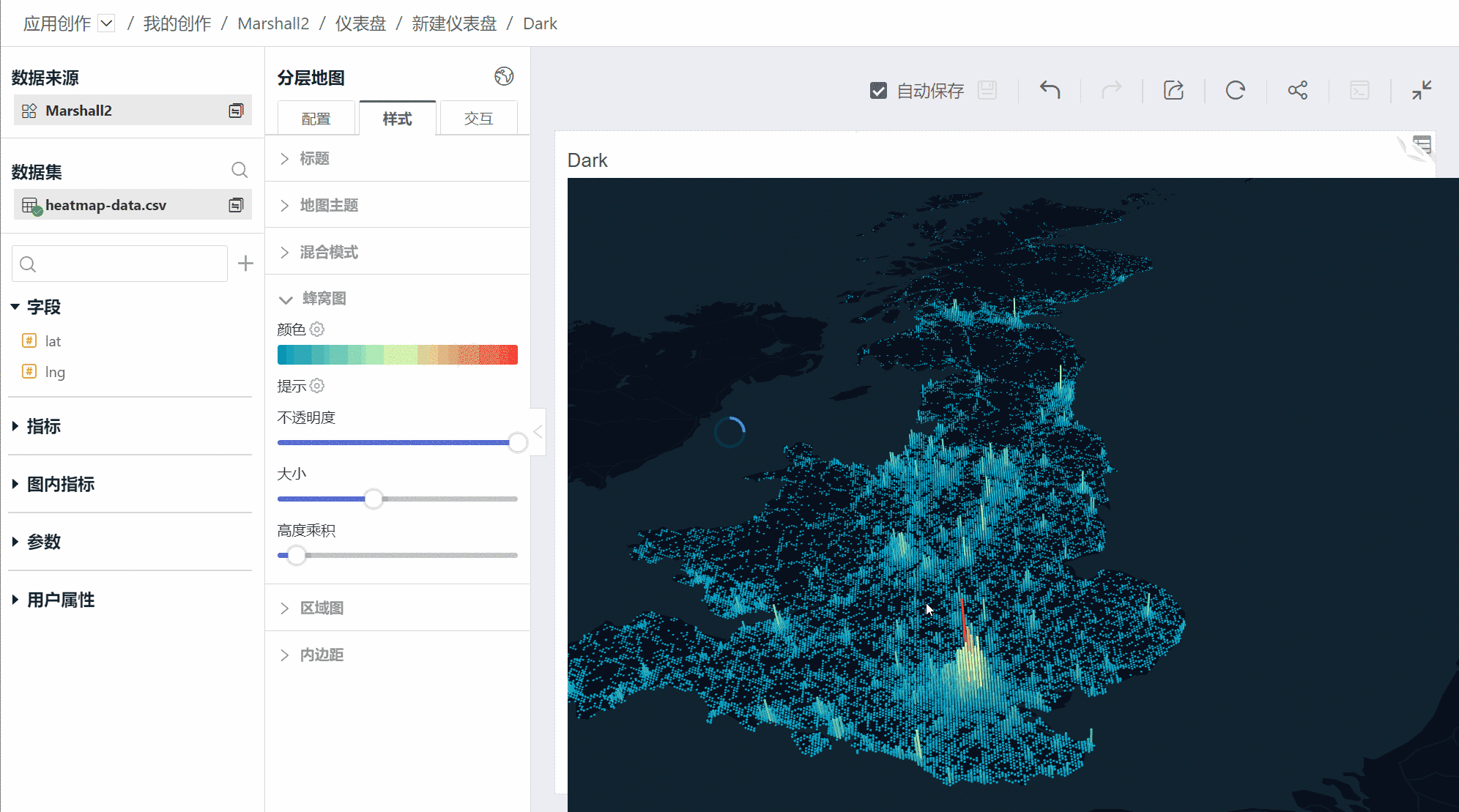
Map Creation
Introduction to the Editing Area
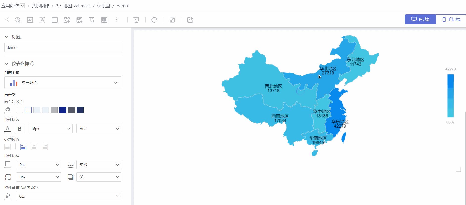
The map editing interface is shown below and is mainly divided into three areas. 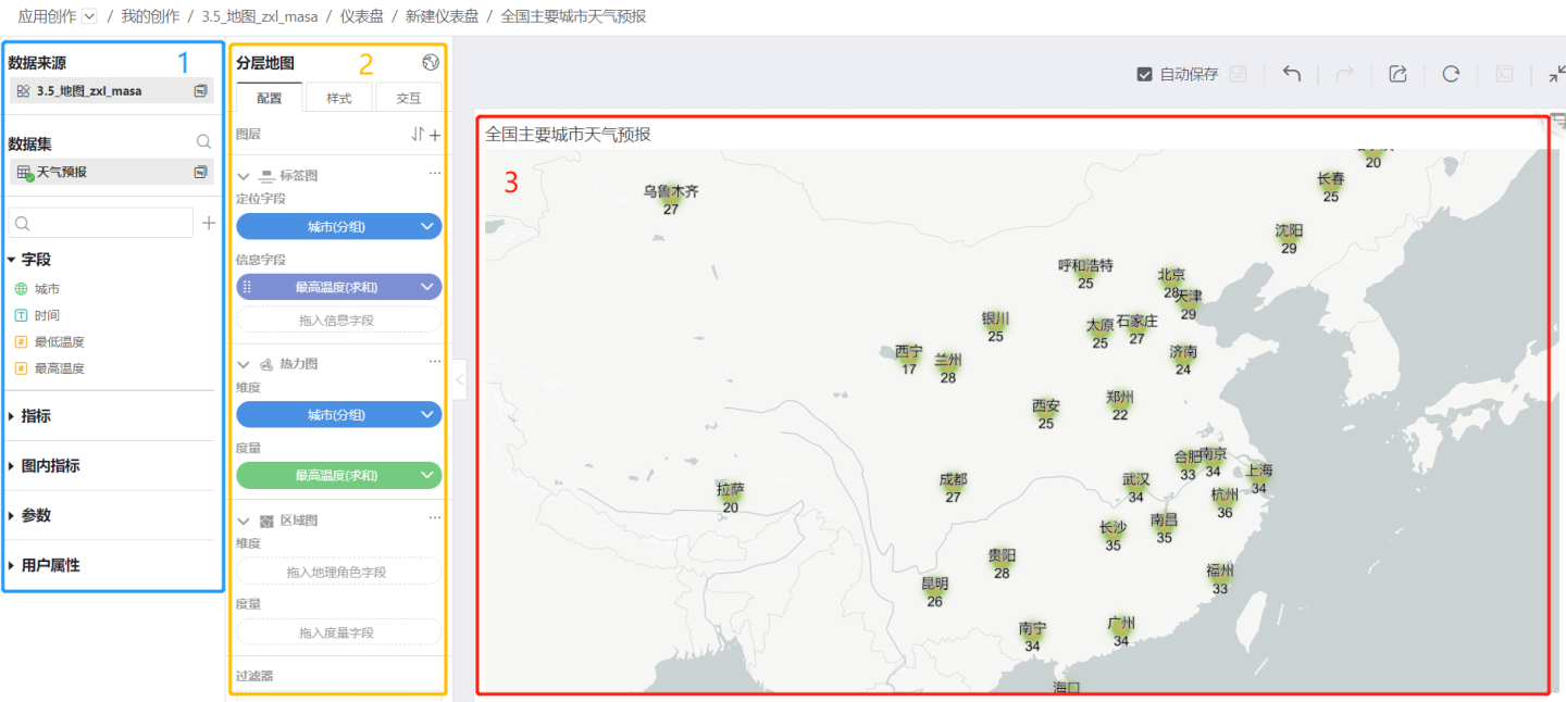
Area 1 (blue box) is the data source area, displaying the dataset and its model, fields used by the chart, metrics, in-chart metrics, parameters, user attributes, etc.
Area 2 (yellow box) is the map creation area.
In the configuration, you can generate a map by dragging and dropping dimension and measure information.
- A simple map contains one dimension and one measure. The dimension needs to use a Geographic Role field.
- Layered Map
- You can add layers by clicking "+", adjust the order of layers using the up and down arrows, add various layers, and sort the layers.
- There can be one or multiple layers. For the usage scenarios and detailed introduction of each layer, please refer to the relevant section.
In the style section, you can set the map's style, including the title, map theme, blend mode, padding, and settings for each layer. The following introduces style settings related to maps. For general chart style settings, refer to Style.
- Simple Map
- Map settings include border and background color.
- In the chart content, you can set color, labels, and tooltips.
- Layered Map
- Map themes use GIS Background Maps, including five types: light, dark, no background, Baidu Map, and Amap.
- Blend modes include Normal, Additive, and Subtractive. Additive means displaying colors using the Additive Color Model, while Subtractive means displaying colors using the Subtractive Color Model.
- Map themes use GIS Background Maps, including five types: light, dark, no background, Baidu Map, and Amap.
- Simple Map
In the interaction section, you can set Limit Number of Records, Map Zoom, Auto Refresh, Time Roaming, and other related settings.
Area 3 (red box) is the map display area. You can view detailed data and information.
Production Process and Example
Simple Map Creation
Below is the process for creating a simple map. Please follow the steps below to create a simple map.
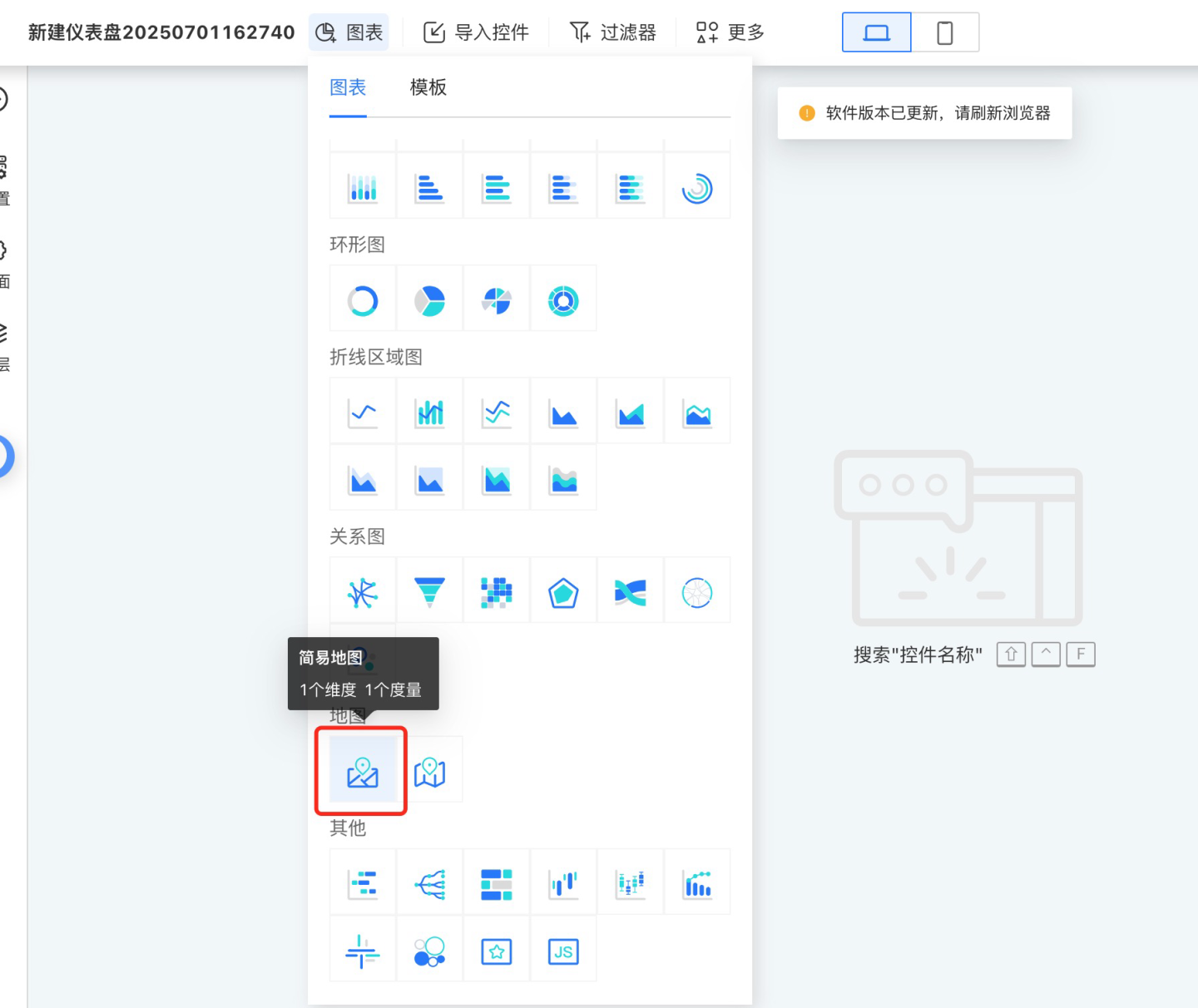
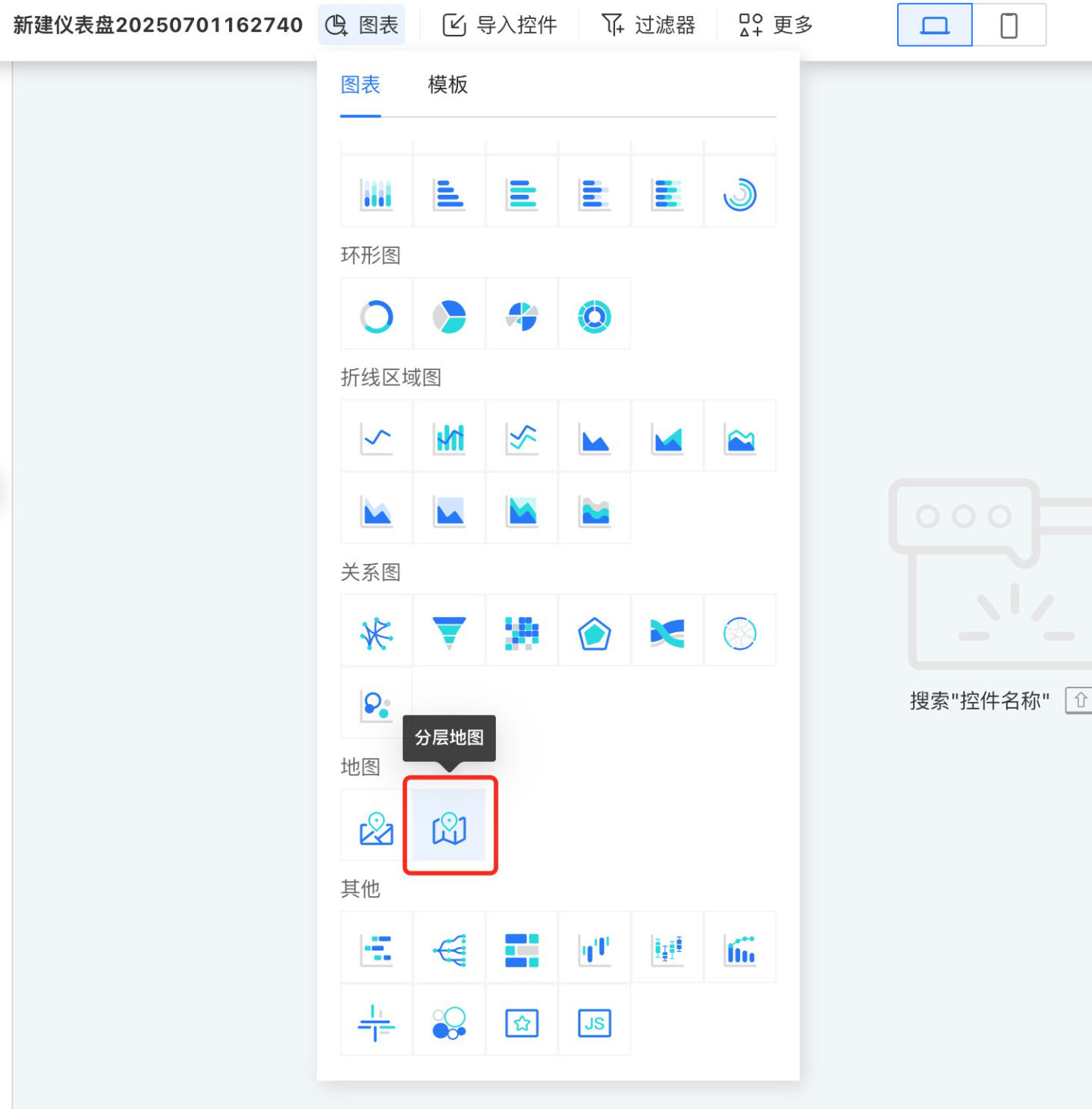
- Click the red icon to create a new chart. In the pop-up dialog, select the data source and dataset, and choose Map -> Simple Map as the chart type.
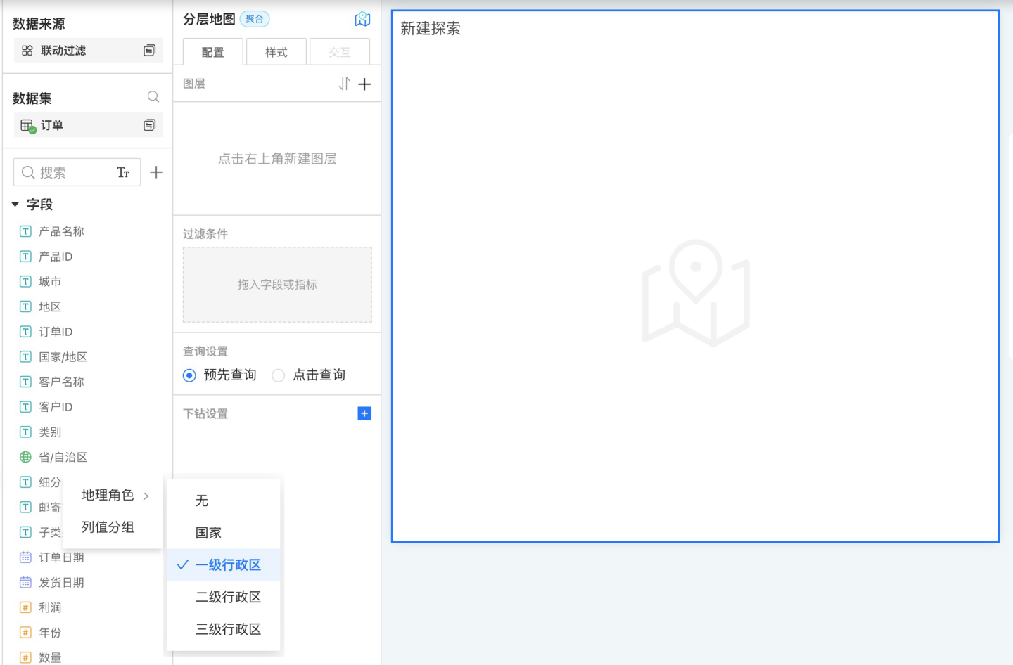
- After the chart is successfully added, the data information will be displayed in the data panel on the left. Refer to Geographic Role Conversion to convert the geographic location fields into geographic roles.
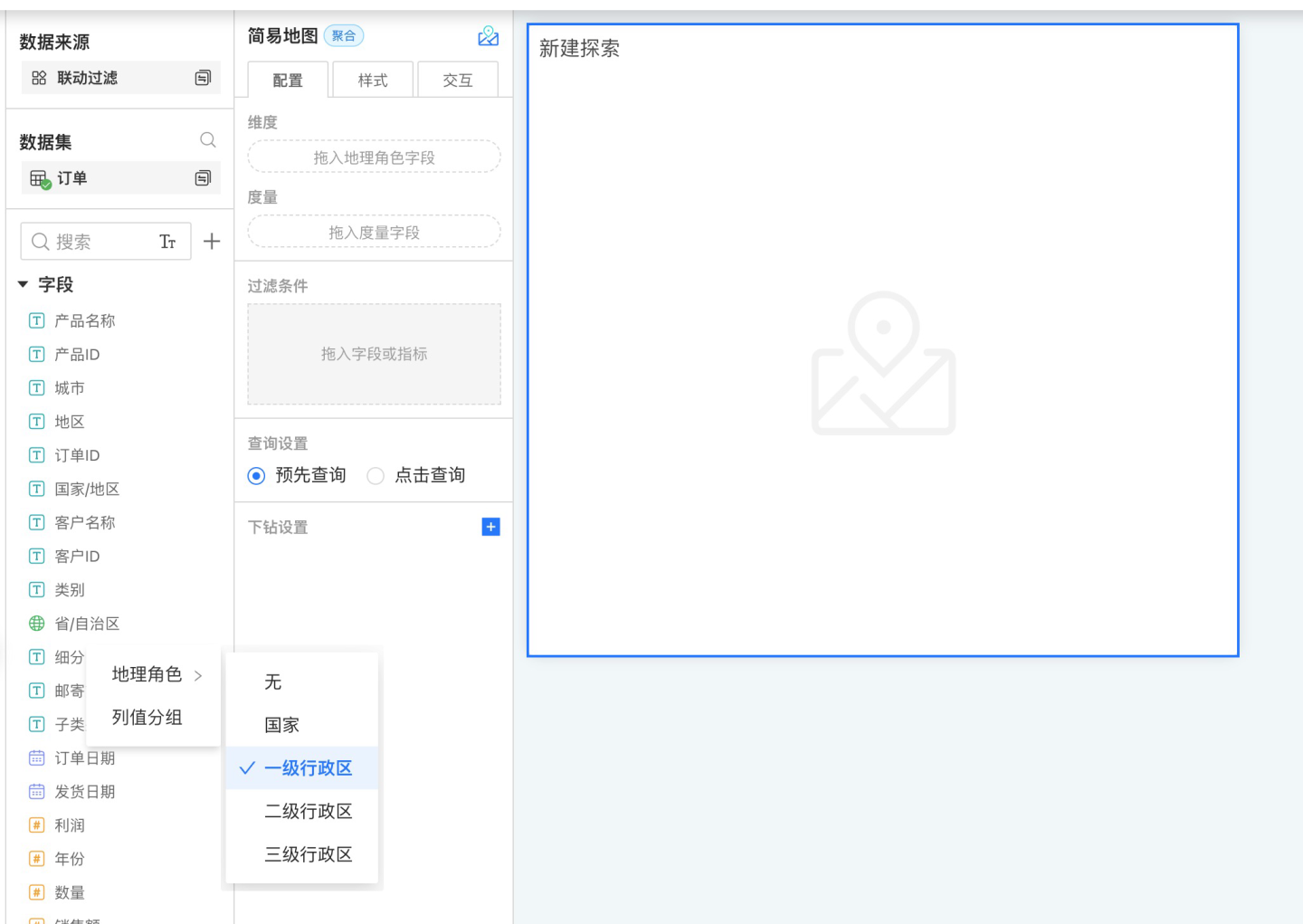
- Drag the geographic role fields and measure fields to generate the map.
- Set the map style, including color, labels, tooltips, etc.
- Configure related settings such as Interaction, Controls, and Theme.
- Preview the map display effect.
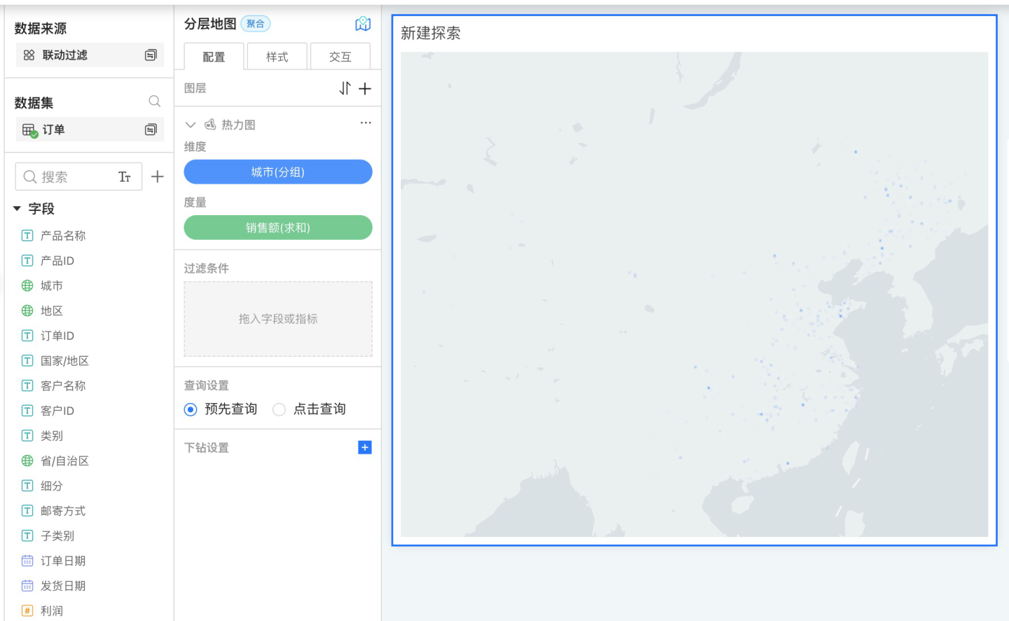
Creating a Layered Map
Below is the process for creating a layered map. Please follow the steps below to create a layered map.
- Click the red icon to create a new chart. In the pop-up dialog, select the data source, then select Map -> Layered Map in the chart options.
- After the chart is successfully added, the data information will be displayed in the data panel on the left. Convert the geographic location field into a geographic role. If you are using latitude and longitude for positioning, you can skip this step. In the example, the geographic role is set to the city-level administrative district.
- Add layers to the layered map in the configuration. Click the "+" icon, select the geographic layer you want to add, and drag in the dimension and measure information. In the example, a heatmap layer is selected.
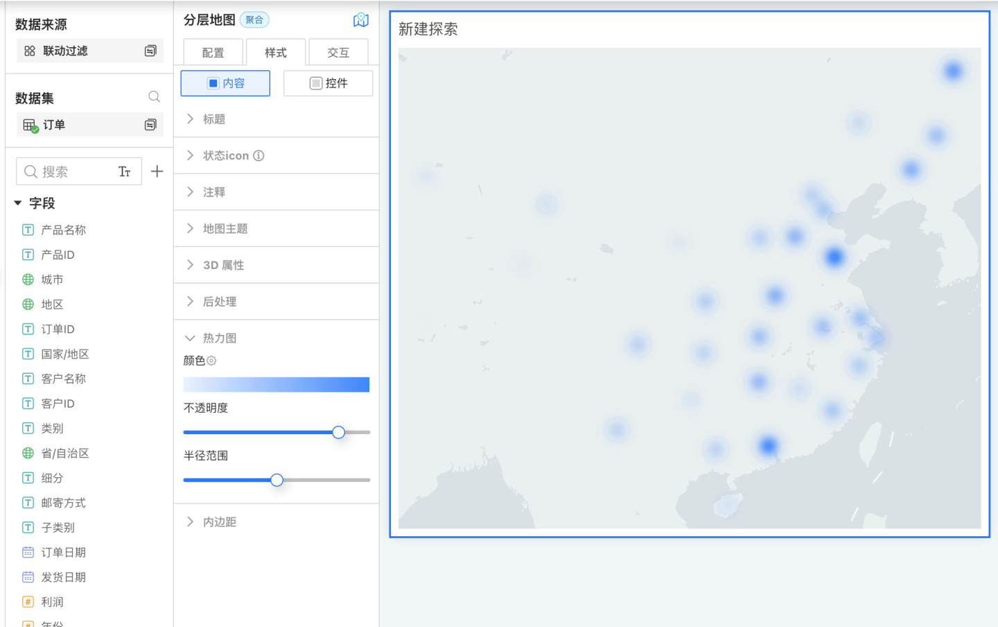
- Edit the map title in the style settings, select the map theme, blending mode, top and bottom padding, and other basic styles for the map chart. At the same time, edit the relevant styles for the layers. The example shows editing the style of the heatmap layer.
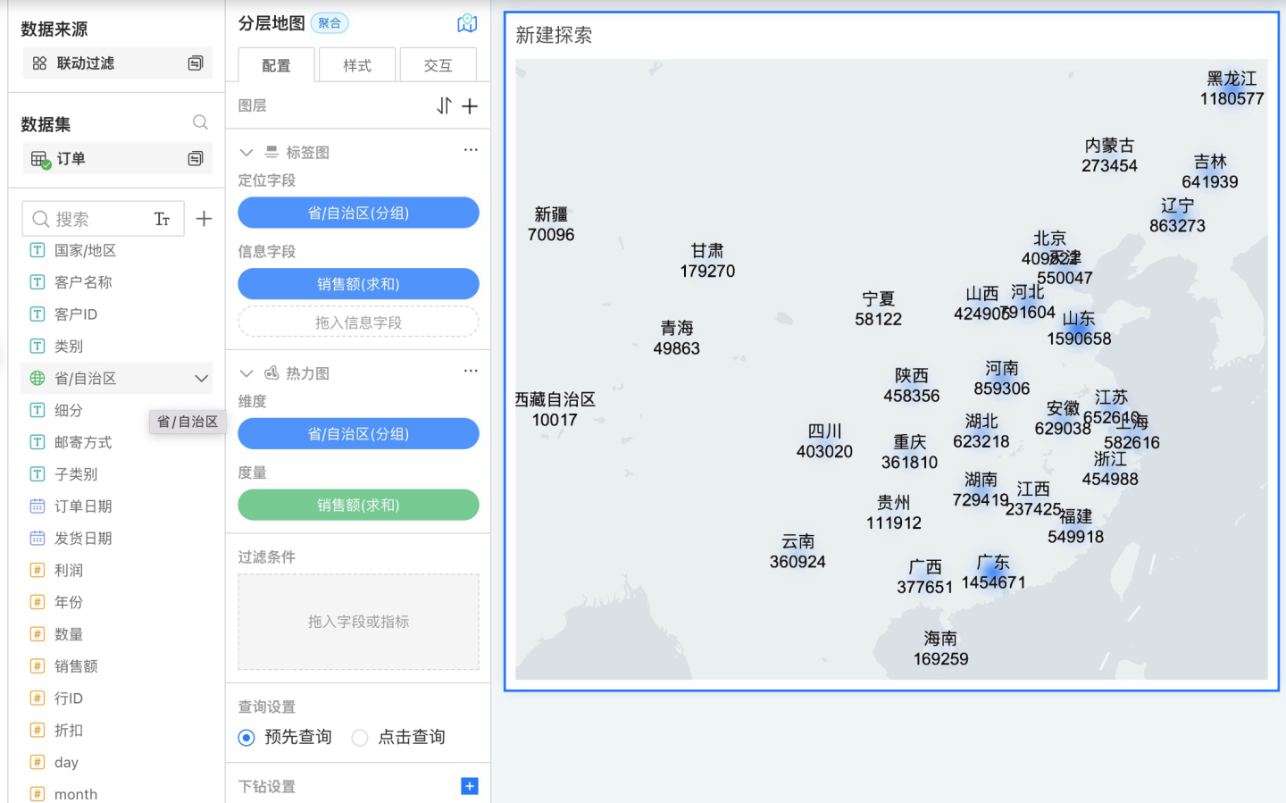
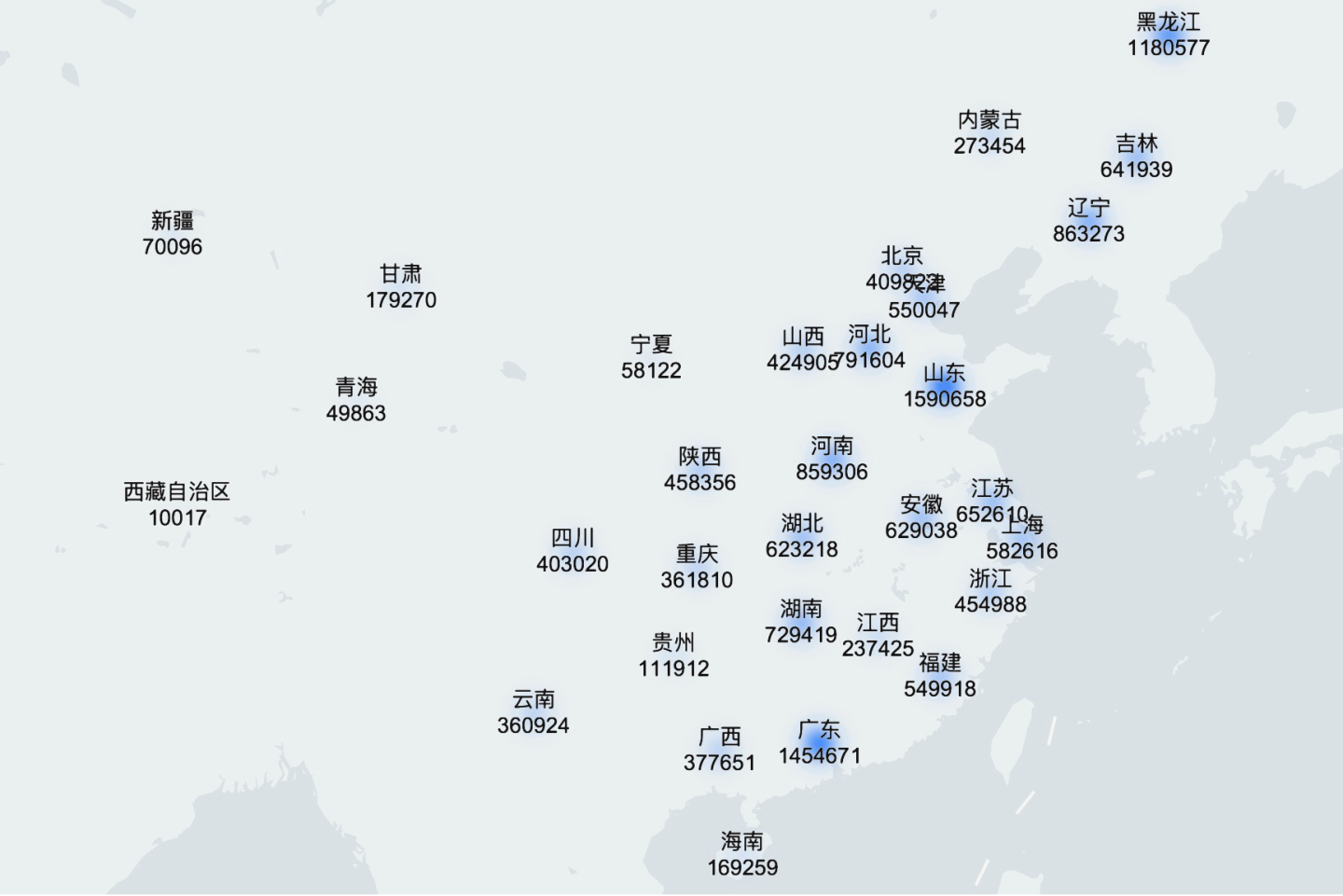
- If the layered map has multiple layers, repeat steps 3 and 4, and click the arrow to adjust the order of the layers. In the example, both a heatmap layer and a label layer are created, and the order is adjusted so that the label layer is above the area layer.
- After all layers have been added, proceed with related settings such as Interaction, Controls, and Theme.
- Preview the map display effect.
Map Drill Down
In a map chart, you can generate the corresponding map simply by dragging in a geographic role field. Therefore, in the drill-down hierarchy of the map, you can drag in geographic role fields to achieve drill-down at various geographic levels. The drill-down layers of the map can be set freely, and drilling down to other charts is supported.
For detailed operations on map drill-down, please refer to the control Drill Down Settings.
Map Limitation Instructions
When the number of maps on the same dashboard exceeds 5, the system will prompt that having too many maps is not recommended, as an excessive number of maps can cause the browser to load slowly or even crash.
Currently, most browsers limit the number of webgl contexts to 8, which means that a browser allows a maximum of 8 contexts to exist simultaneously, corresponding to 8 webgl canvases. In our layered maps, each map layer creates a context, and each context's system resources cannot be shared. As a result, when more than 8 contexts appear in the same browser, contexts will be lost, leading to loading failures.
If you are using Chrome, you can adjust the context limit by modifying the experimental flag. For example, on a Mac system, you can launch Chrome from the command line to change this limit:
/Applications/Google\ Chrome.app/Contents/MacOS/Google\ Chrome --max-active-webgl-contexts=32