Page Layout and Layout Modes
This article introduces page layout and layout modes. Page layout refers to the canvas mode, which includes two configuration options: custom and fixed size. The canvas layout currently supports multiple modes to meet the needs of different scenarios.
Note
Report applications do not support setting page layout and layout modes.
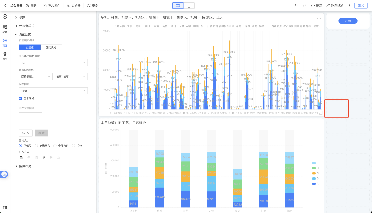
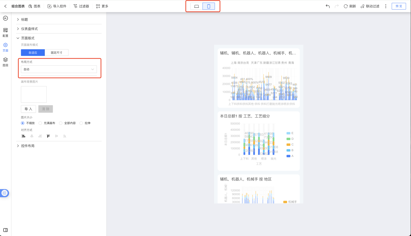
Page Canvas
The page canvas mode includes adaptive and fixed size. The adaptive mode uses the number of grids for page layout, while the fixed size uses pixels for page layout.
Adaptive Mode
Adaptive mode uses the number of grids for page layout.
Number of Horizontal Grids
Supports setting any integer value between 6 and 500.
Vertical Grid Count
The vertical grid count can be set using the grid aspect ratio and adaptive settings.
Grid Aspect Ratio
The grid aspect ratio represents the vertical grid width depending on the horizontal grid width. The available ratio settings are:
1:14:33:416:99:16
When the aspect ratio is 1:1, it means the vertical grid width is the same as the horizontal grid width. If the aspect ratio is 4:3, it means the vertical grid width is 3/4 of the horizontal grid width.
When using the grid aspect ratio, the vertical grid width is first calculated based on the horizontal grid width. Then, the number of grids in the vertical direction is calculated based on the vertical canvas width. When the horizontal canvas is fixed, the grid size remains constant. Adjusting the vertical height of the canvas increases the number of grids in the vertical direction, allowing more controls to fit into the canvas. 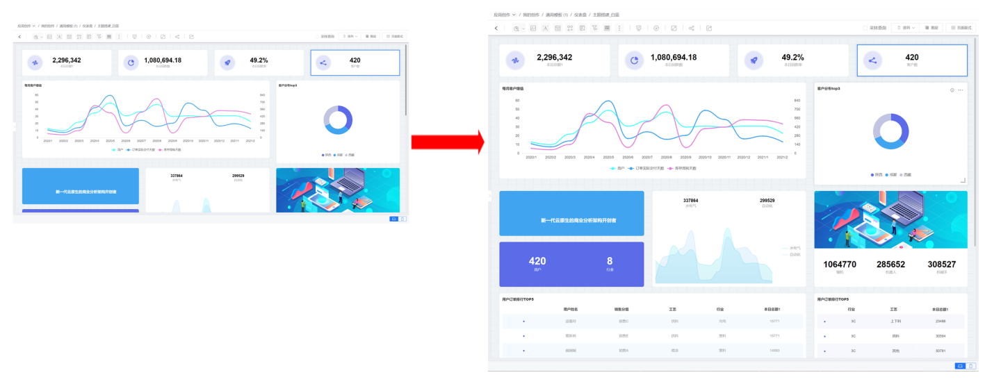
Adaptive
Adaptive means that the number of vertical grids is independent of the number of horizontal grids and can be set separately to any integer value between 6 and 400. When the vertical grid count is adaptive, since the horizontal and vertical grid counts of a page are fixed, adjusting the vertical height while the horizontal width of the canvas remains fixed will keep the vertical grid count unchanged. The controls within the canvas remain the same, but due to changes in grid shape, the controls will also deform accordingly. 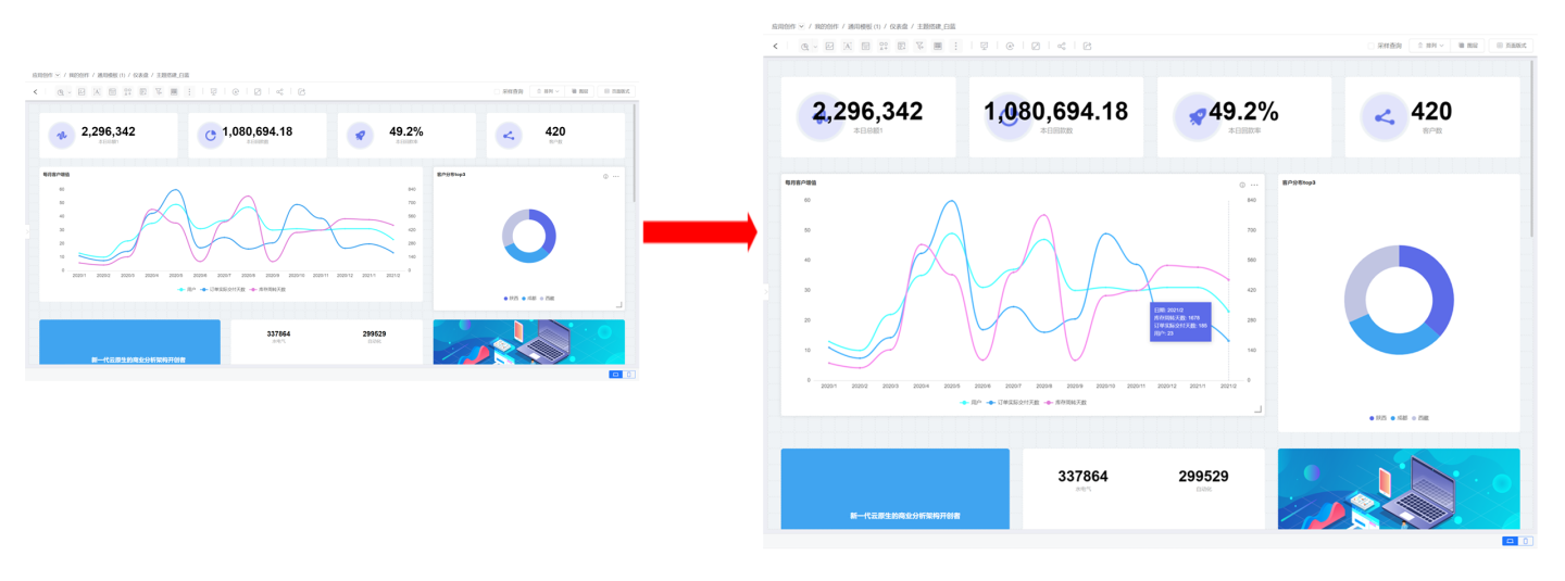
Once the horizontal and vertical grid counts are set, the canvas becomes fixed. The size of the controls is determined by the grid count, with the smallest control being the size of one grid. Grid spacing can be adjusted for layout fine-tuning. When creating charts, grids can be displayed to facilitate the adjustment of control positions and sizes.
Mobile Adaptive Mode
The layout in mobile adaptive mode supports two methods: automatic and manual. Automatic means the system handles the layout, and users cannot move controls. Manual mode is configured the same way as on the PC side; refer to the relevant instructions for configuration.
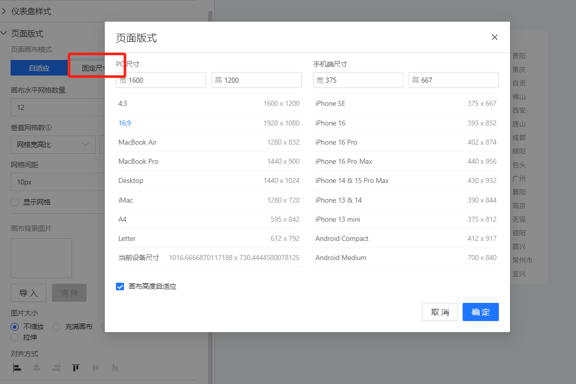
Fixed Size Mode
Fixed size mode means that the page dimensions remain constant. Different canvas sizes can be set separately for desktop and mobile devices. Predefined sizes are shown in the figure below, and custom sizes can be set according to requirements.
When the page layout is set to fixed size, you need to configure the page embedding, preview scaling mode, and the display position (top, middle, bottom, left, center, right) under various modes. The scaling modes include:
- No Scaling: Displays without scaling, adhering to the set dimensions.
- Full Content: Displays the entire content of the dashboard.
- Fill Screen: Displays the dashboard to fill the entire screen.
During dashboard editing, you can also adjust the fixed size display mode. Options such as scaling, filling the canvas, and showing all content can be switched at the bottom, making it convenient for users to preview chart display effects during editing.
Note
When customizing canvas dimensions, it is recommended to use even numbers; otherwise, display issues may occur in certain browsers. The allowed canvas dimensions range from a minimum of 1 to a maximum of 100,000. Larger values increase page loading time and may cause browsers to fail to render. Please set dimensions cautiously and reasonably.
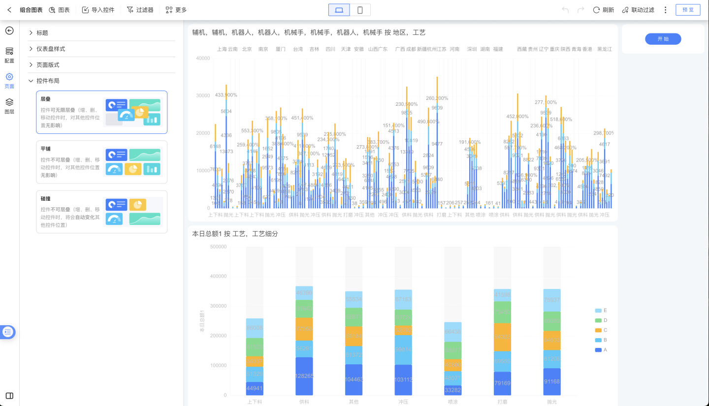
Layout Modes
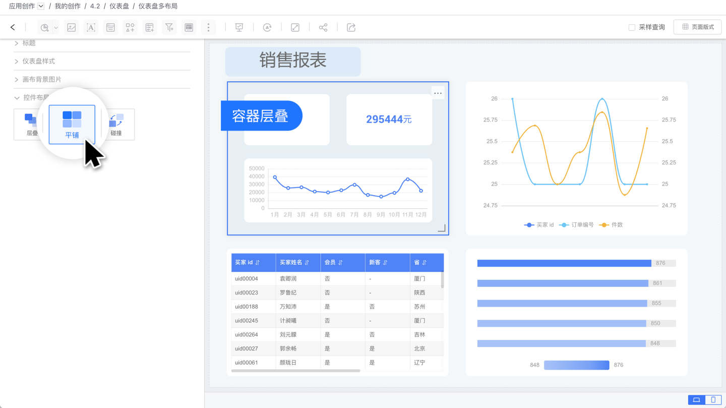
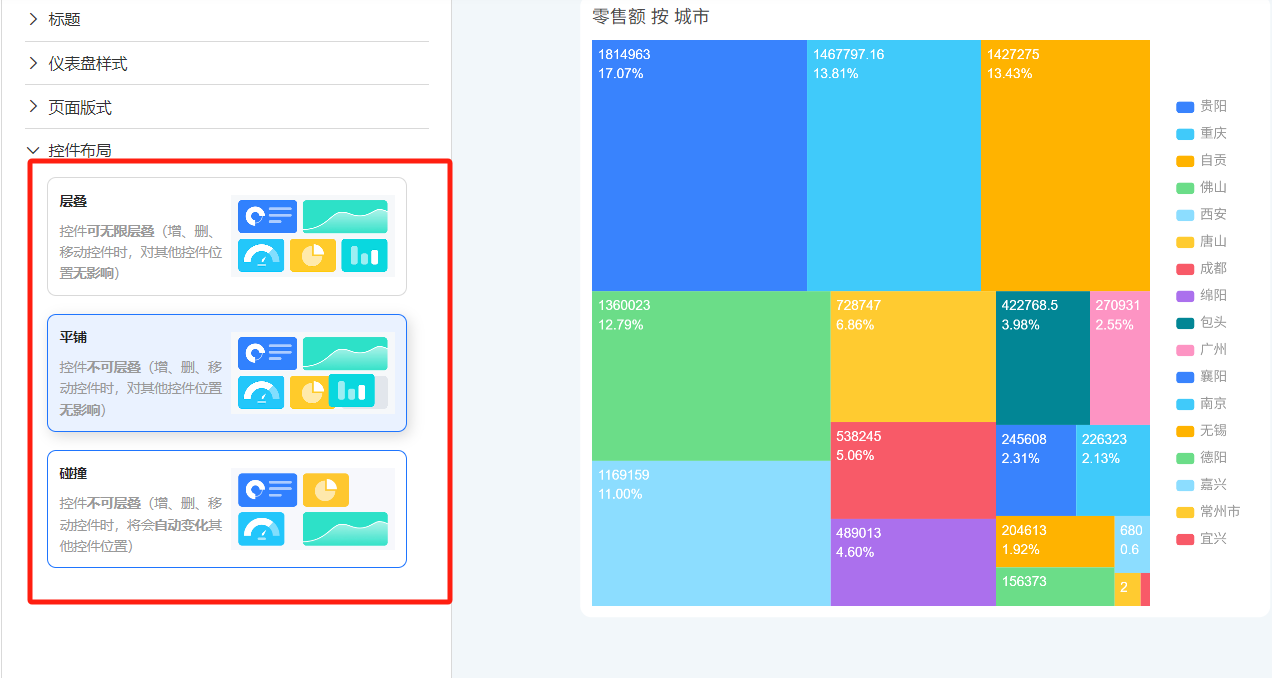
Layout refers to the arrangement of controls within the canvas, including three modes: Stack, Tile, and Collision.
Note
- Query Apps only support Tile and Collision modes.
The three modes can be switched freely. When switching from Stack mode to Tile or Collision mode, layers will disappear, and all controls will be tiled and expanded, making it impossible to revert. Therefore, please use caution when switching from Stack mode to other modes.
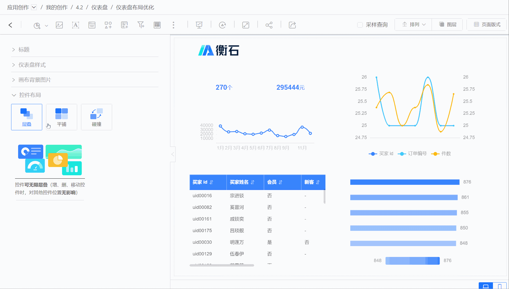
Cascade
Cascade mode refers to controls existing as layers, which can achieve display effects through layer stacking. The relationship between layers is shown in the diagram below.
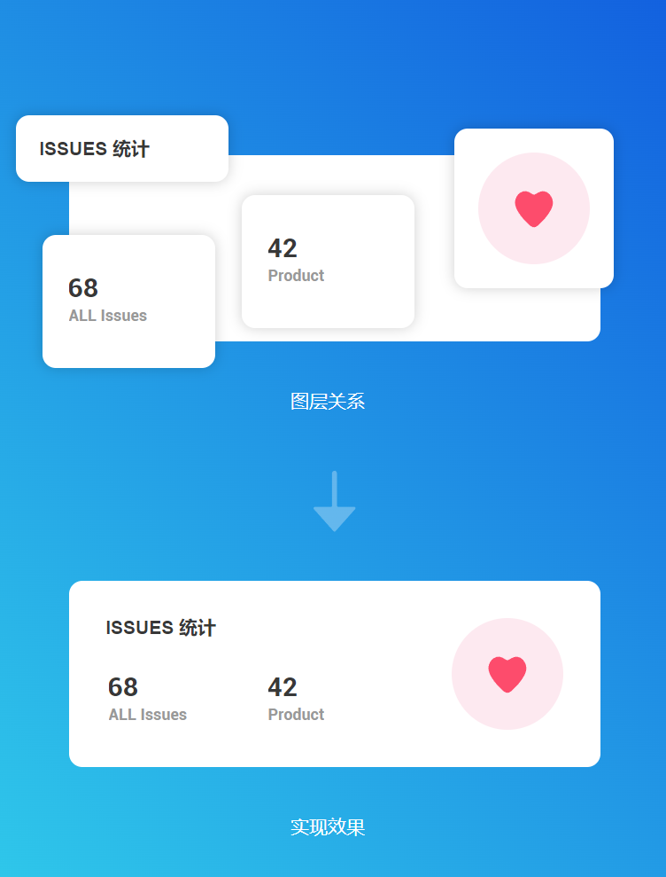
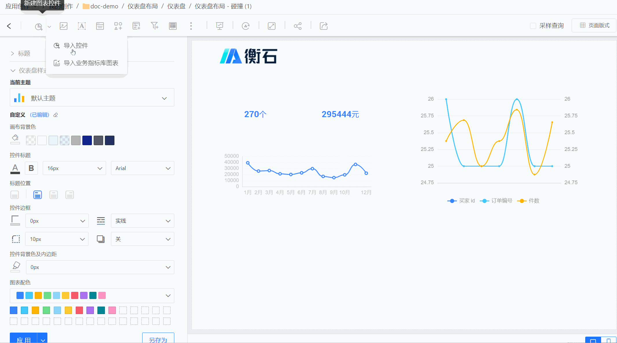
Cascade mode stacks layers to achieve a nested synthesis effect among controls, enabling the creation of complex display scenarios. It allows for the simultaneous presentation of analytical data with more aesthetically pleasing and diverse styles. Below is an example created using cascade mode. 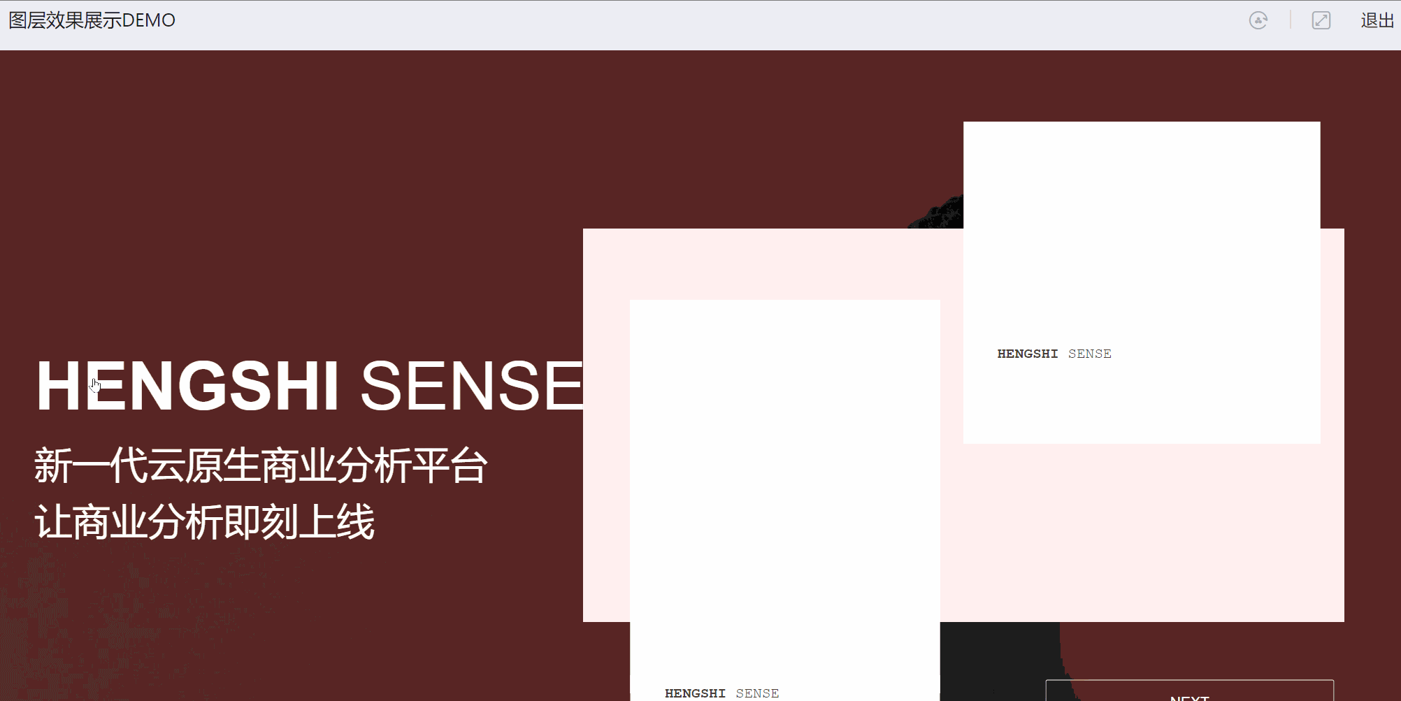
In cascade mode:
- Each control exists as a layer concept, which can be stacked and arranged, and the layer order can be adjusted.
- Newly added controls or duplicated controls will be displayed within the current canvas's visible range.
Layers
When controls are stacked for display, you can quickly locate and edit controls through the control list in the Layers panel.
Clicking a control in the Layers panel simultaneously selects the corresponding control on the canvas. Similarly, selecting a control on the canvas also selects the corresponding control in the Layers panel.
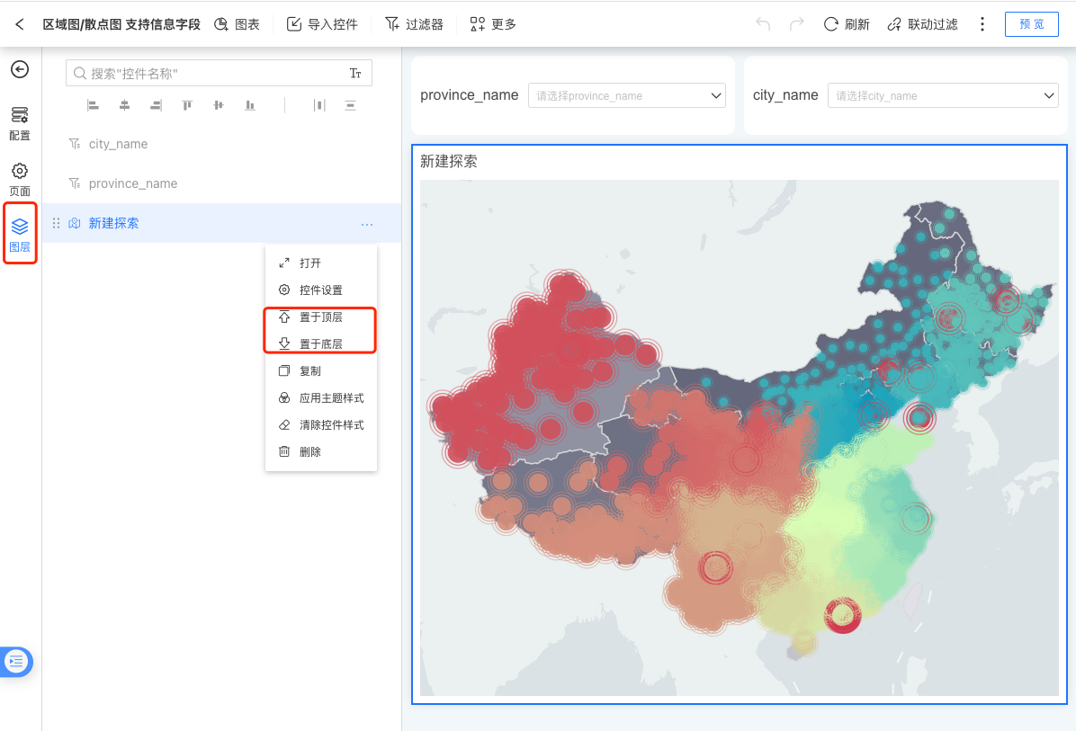
The Layers panel displays a list of controls, and the order of the control list determines the stacking order of the layers. In the Layers list, Control 1 appears before Control 2, meaning Control 1 is displayed above Control 2 on the canvas.
Arrangement
When controls are displayed through layer stacking, adjusting the order of layers is a frequent operation.
Select a control and click the arrangement button to quickly adjust the layer position of the selected control, including operations such as bringing to the front, moving up one layer, sending to the back, and moving down one layer. 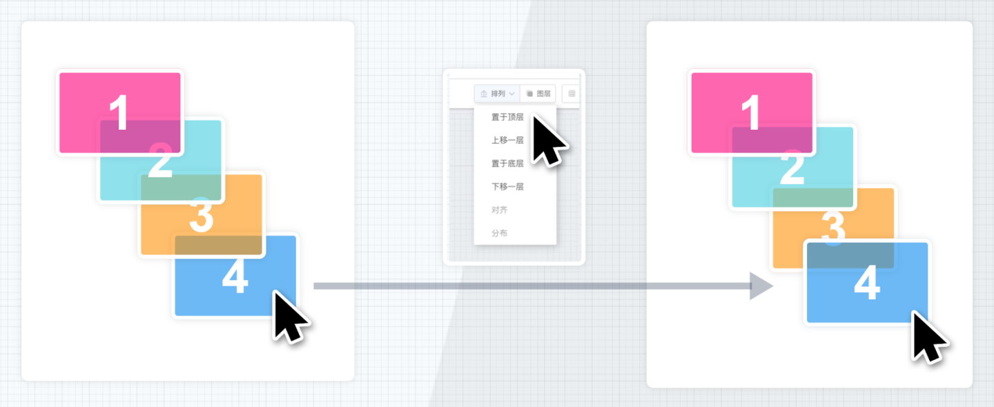
In addition to adjusting layer order, the arrangement also supports alignment and distribution operations for multiple controls. Alignment includes left alignment, horizontal centering, right alignment, top alignment, vertical centering, and bottom alignment. 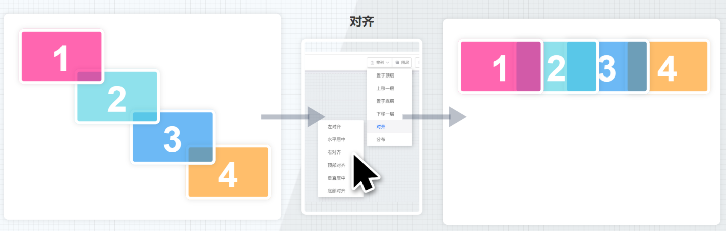
Distribution includes horizontal distribution and vertical distribution. 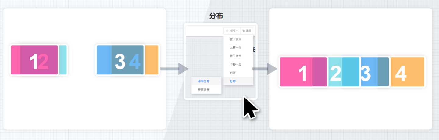
Tiled
In Tiled mode, controls are displayed tiled on the canvas, with each control independently occupying a position on the canvas without sharing space with other controls. Tiled mode is suitable for simple business layout scenarios.
In Tiled mode:
- Each control independently occupies a position on the canvas, with no concept of layers, and cannot overlap or intersect.
- Newly added controls or duplicated controls will be placed in the vacant areas of the canvas.
- Adjusting the control layout is relatively simple, achieved by dragging to adjust the position and size of the controls, making operations straightforward.
Collision
The collision mode is similar to the tiled mode, where controls are displayed tiled on the canvas, occupying independent positions on the canvas without sharing space with other controls. The difference lies in the horizontal direction, where controls can move freely, while in the vertical direction, they automatically move upward, closely adjacent to other controls.
In collision mode, each control occupies an independent position on the canvas. Moving a control can push other controls away from their original positions.
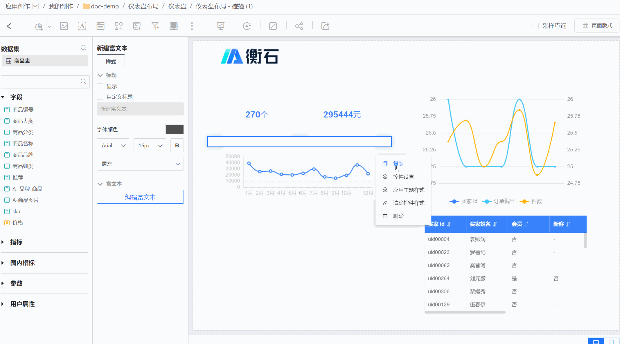
When a control is deleted, the controls below it will automatically move upward. 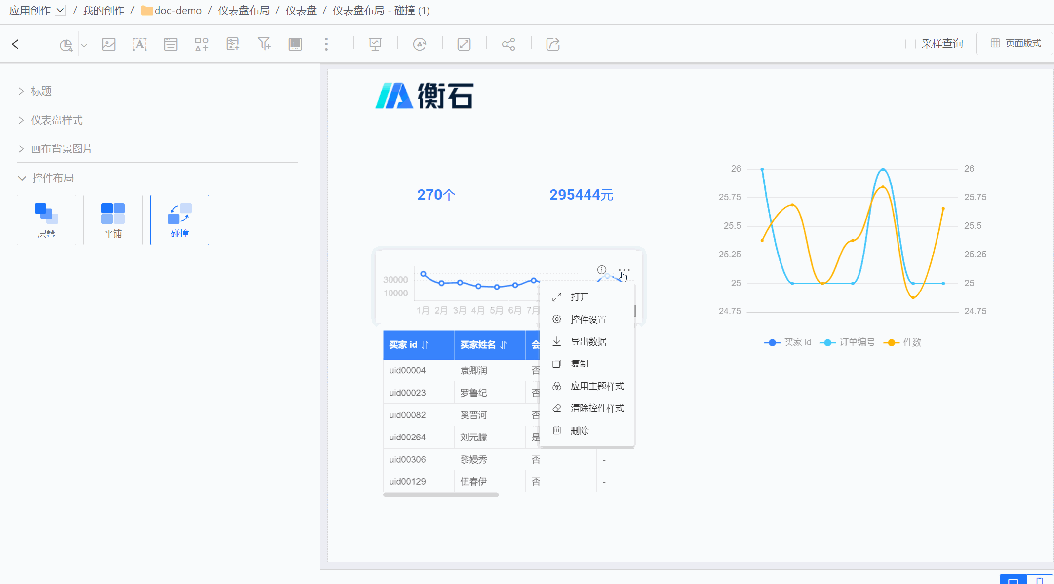
Multi-Mode Coexistence
Controls within the Container also support the aforementioned three control layouts, independent of the parent dashboard layout. When the dashboard and container are set to different control layouts, it enables a scenario where multiple modes coexist within the same dashboard.
As shown in the figure below, the entire dashboard uses the tiled mode, while a specific section requires a stacked mode for display. In this case, the local display effect is achieved using a container.