Metric Analysis Dashboard
The Metric Analysis Dashboard is an analysis dashboard tailored for business metrics. You can create a dashboard simply by dragging and dropping metrics, and configure metric analysis charts through point-and-click operations, making the entire process easy and user-friendly. Analysts can create charts based on business analysis scenarios without the need for further processing of metric data.
Metric analysis is a dashboard customized for business metrics, so all metrics mentioned in this chapter refer to business metrics and do not involve atomic metrics.
Dashboard States
A dashboard includes Preview Mode and Edit Mode, each supporting different functionalities.
Edit Mode: Edit Mode is primarily used for editing the dashboard, including creating, modifying, and deleting metric analysis charts, as well as setting the data displayed in metric charts.
Preview Mode: Preview Mode is mainly for viewing the analysis dashboard. In Preview Mode, charts cannot be edited, but you can export and refresh chart data, and adjust the chart display information. This includes modifying chart metrics, changing metric analysis dimensions, adjusting filter conditions, changing chart types, sorting charts, and displaying analysis charts of related metrics in path attribution. All adjustments to chart display information in Preview Mode are temporary; when the page is refreshed, the dashboard reverts to its original state.
Dashboard Creation Example
Let's go through a simple example to understand the dashboard creation process.
Prerequisites for Creating a Dashboard:
- When a metrics analyst creates a dashboard, there must be analyzable metrics. So, how are metrics created?
- Step 1: Create Metrics. Users with one of the following roles—data management, data analysis, or metric management—are authorized to create metrics.
- Step 2: Configure Metric Business Domain. Users with the metric management role are authorized to create business domains and associate metrics with these domains.
- Step 3: On the [Metric Management] page, the metric administrator grants business domain permissions to users who need to view or analyze metrics on dashboards. Once authorized, users can view metrics in the [Metric Marketplace] and use metrics for analysis when creating dashboards in [Metric Analysis].
Dashboard Creation Process:
In the Metrics Analysis module, click "Start Analysis" to enter a blank analysis dashboard.
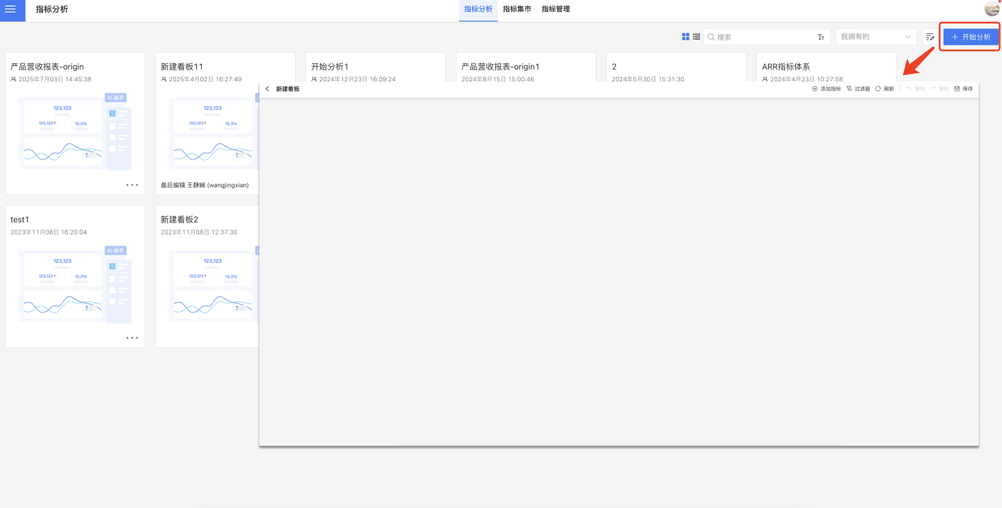
In the blank dashboard, click the "+" button in the upper right corner to add metrics. You can search for metrics or filter them by group, and multiple metrics can be added at once.
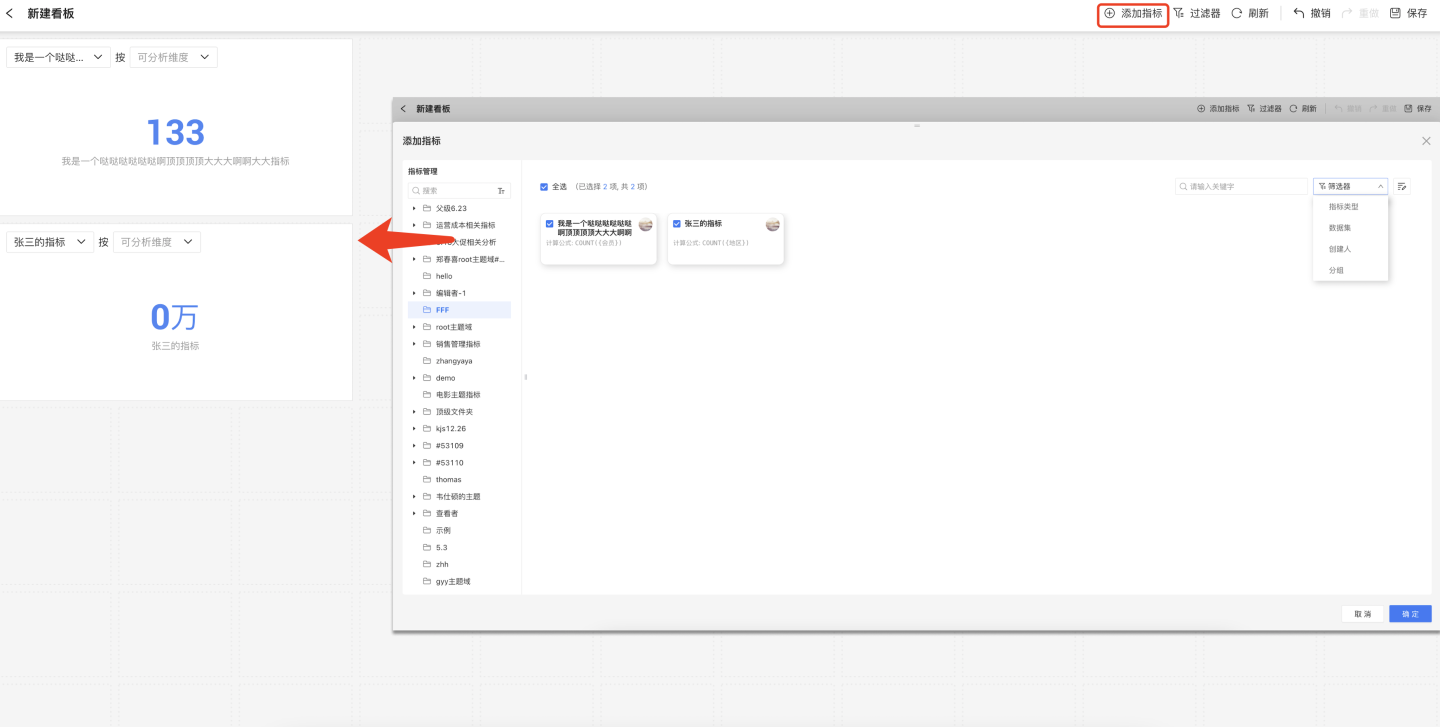
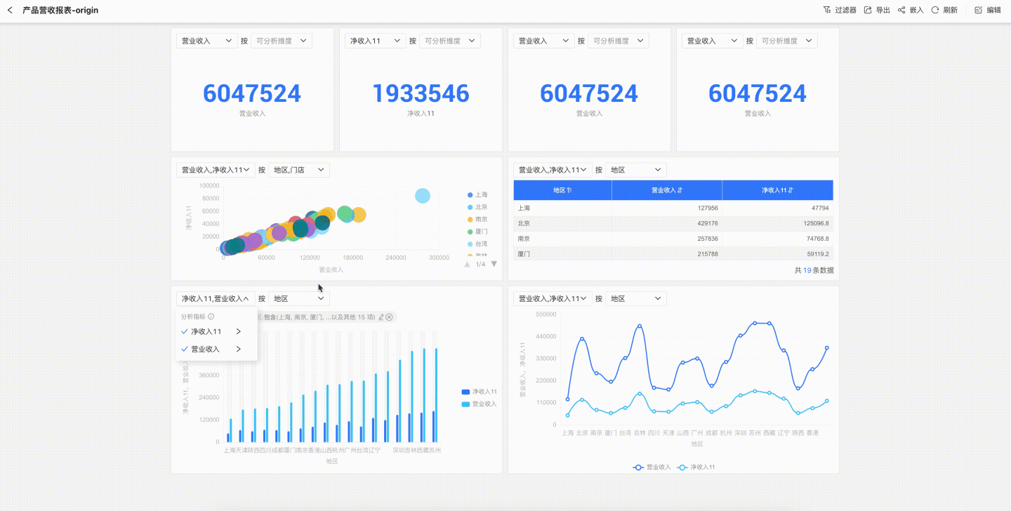
Add metrics one by one and adjust the chart size. Configure each metric chart, including setting the Metric Analysis Dimension, Metric Display Chart, and Metric Filter Conditions. If a chart requires multiple metrics, you can add several metrics for comparative analysis.
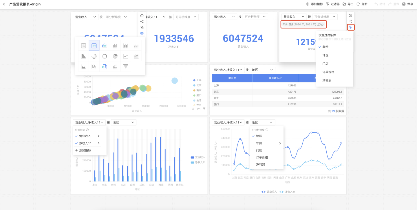
Once all charts are configured, click Dashboard Filter to set filter information. This includes the system's built-in public time filter and user-defined dimension filters, which can be set for charts according to business scenarios. In the example, data filtering is applied to the chart by setting a public time filter and adding a dimension filter for region.
Click the save button in the upper right corner, enter the dashboard name, exit the dashboard editing mode, and enter the dashboard preview mode.
In preview mode, you can set filter conditions to view the dashboard under different business scenarios. You can also configure individual metric charts, but these are temporary states. When the page is refreshed, the metric dashboard will revert to its initial state.
The above steps describe how to create a metric dashboard. For detailed instructions on configuring metric charts, please refer to Metric Chart Configuration.
Metric Chart Configuration
Metric analysis charts support setting filter conditions, metric analysis dimensions, and switching between different display charts, allowing the same metric to present different business data information.
Setting Filter Conditions
Charts support setting filter conditions to create business metric charts under specific criteria. First, click the filter button on the right side of the chart, then select the field you want to filter. In the pop-up window, edit the filter conditions and set whether to display the filter condition in the chart.
You can choose to display the filter condition above the chart. When there are multiple filter conditions, you can use the scroll bar to view the filter options.
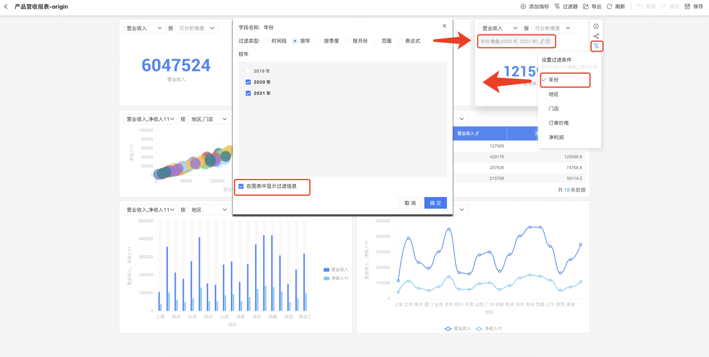
Tip
In dashboard preview mode, you can modify the filter conditions of metric charts. However, when the dashboard page is refreshed, the chart will revert to its default settings.
Metric Analysis Dimensions
When displaying metrics through charts, you can set dimension information to show the impact of dimensions on the metrics. After setting the dimensions, the system will automatically recommend the optimal chart style for the selected dimensions.
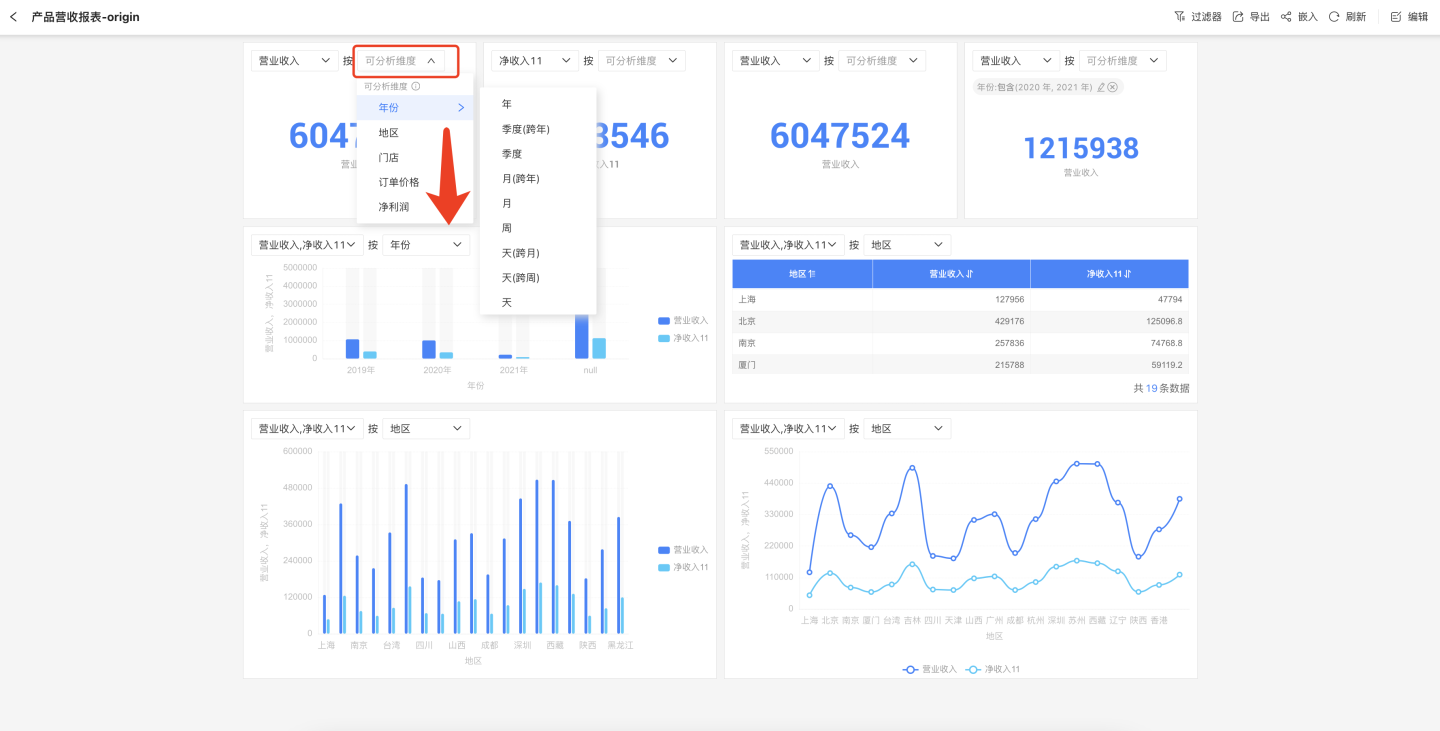
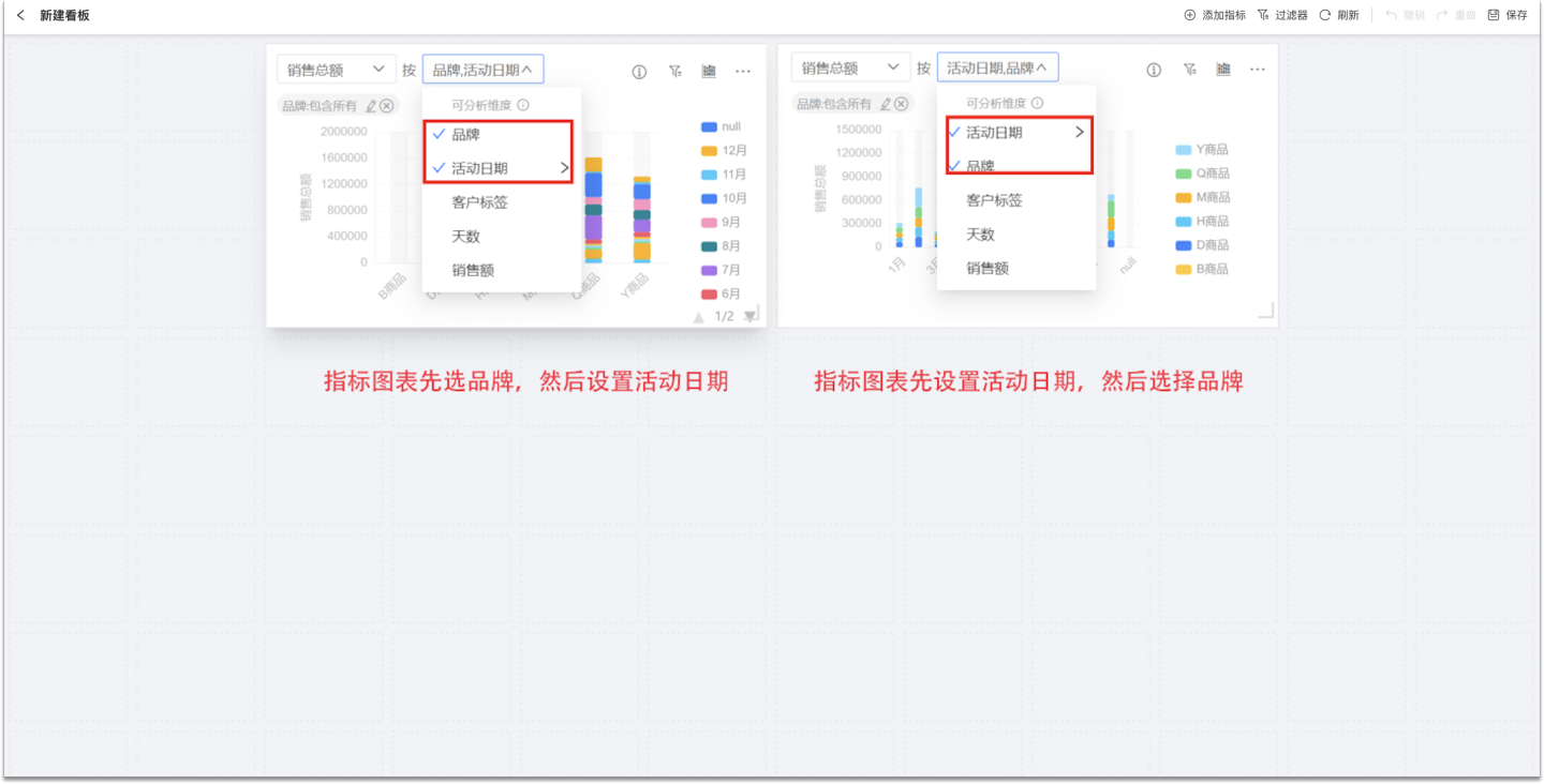
Metric charts support setting multiple dimensions. The order in which dimensions are selected determines the display order; different selection orders will result in different chart presentations. As shown in the figure, both charts have the dimensions "Brand" and "Event Date" set, but due to the different selection orders, the business scenarios displayed are also different.
Tip
In the dashboard preview mode, you can modify the analysis dimensions of metric charts. However, when the dashboard page is refreshed, the chart will revert to its default settings.
Switch Chart Type
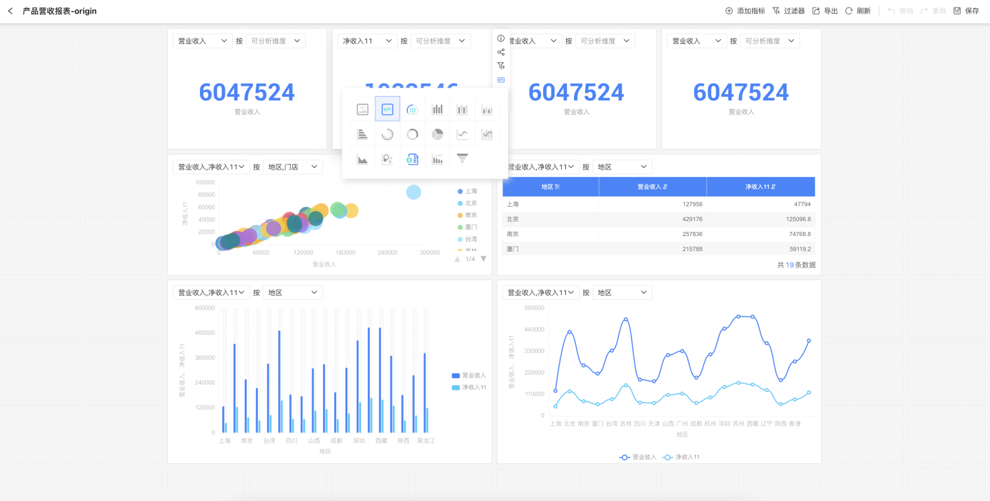
When a metric is dragged into the canvas area, a chart will be generated. The default chart is system-recommended. If the default chart type does not meet your display needs, you can click the chart button and select the appropriate chart type from the dropdown list.
Tip
Chart types that are grayed out when switching indicate that the current metric settings do not meet the requirements for that chart and cannot be used.
In dashboard preview mode, you can switch the metric chart for business analysis. However, when the dashboard page is refreshed, the chart will revert to its default settings.
Multi-Metric Comparative Analysis
Metric charts support comparative analysis of multiple metrics. Click on a metric in the metric chart, select "Add Metric" from the dropdown menu, and add multiple metrics to the chart for comparative analysis. 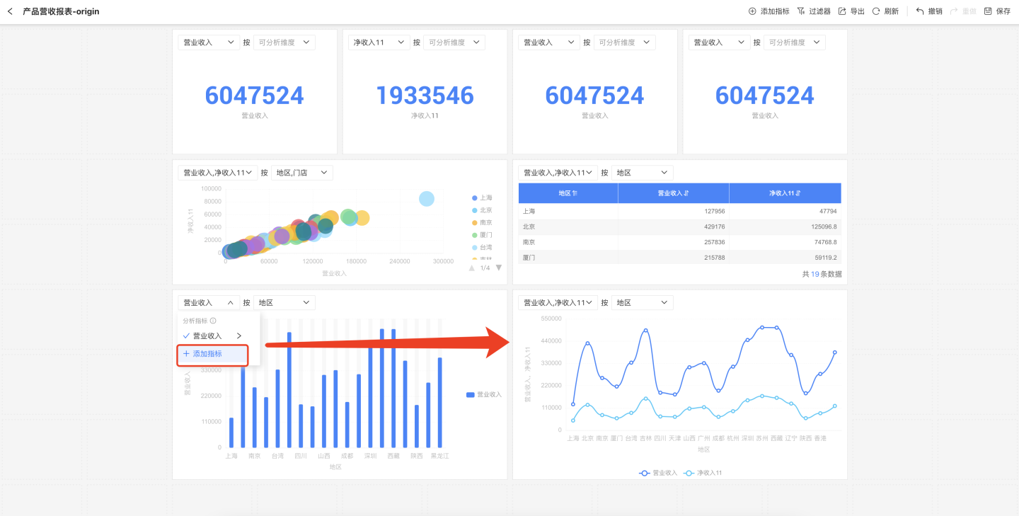
Tip
Comparative analysis is only supported for different metrics generated from the same dataset. Metrics generated from different datasets cannot be compared.
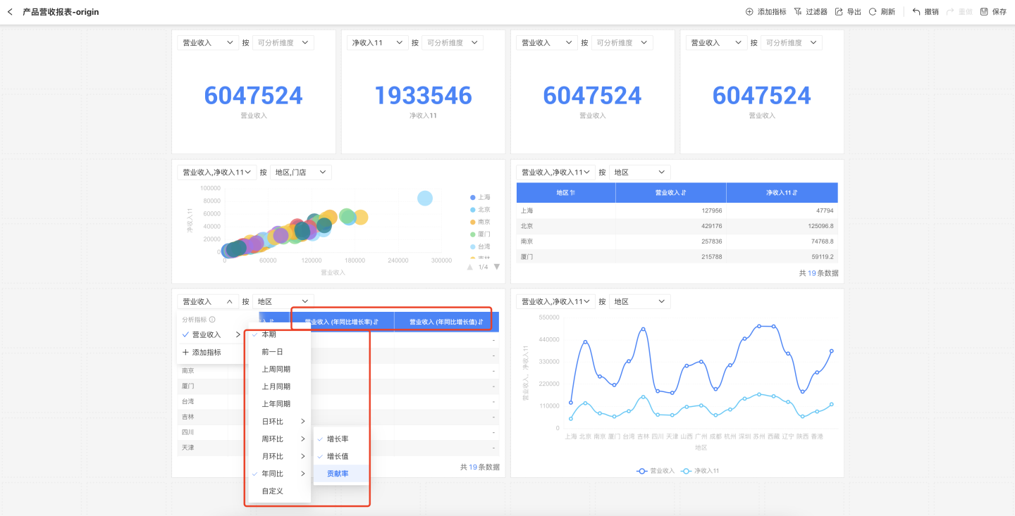
Quick Year-over-Year and Month-over-Month Comparison for Metrics
Business metrics can utilize the quick year-over-year (YoY) and month-over-month (MoM) comparison features to display comparative information directly in charts. Users can customize the display of YoY and MoM information based on the current time dimension of the chart. At the same time, the time axis defined for the metric will automatically link with the dashboard's global time filter, making it easy and efficient to track metric changes over different time periods.
Tip
The business metric must include a time dimension field and have the time axis information set in order to use the quick YoY and MoM comparison feature. Otherwise, the configured YoY and MoM values will display as null and no calculation result will be shown.
Chart Sorting
When the metric analysis chart is a bar chart, pie chart, or donut chart, you can sort the chart. Three sorting options are supported: ascending, descending, and original order. 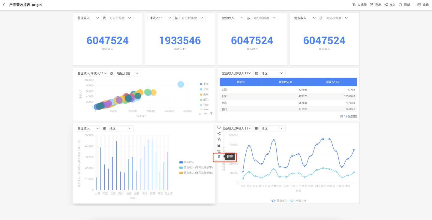
Path Attribution Analysis
If a business metric has set up Path Attribution, you can use path attribution during metric chart analysis to display all related metrics together in the chart.
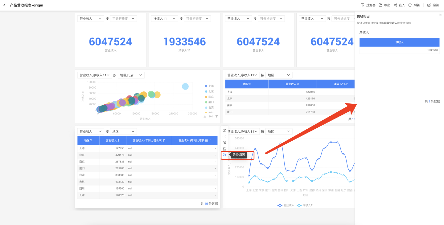
Tip
If path attribution was not configured when the business metric was created, the path attribution action button will not appear in the three-dot menu of the metric chart.
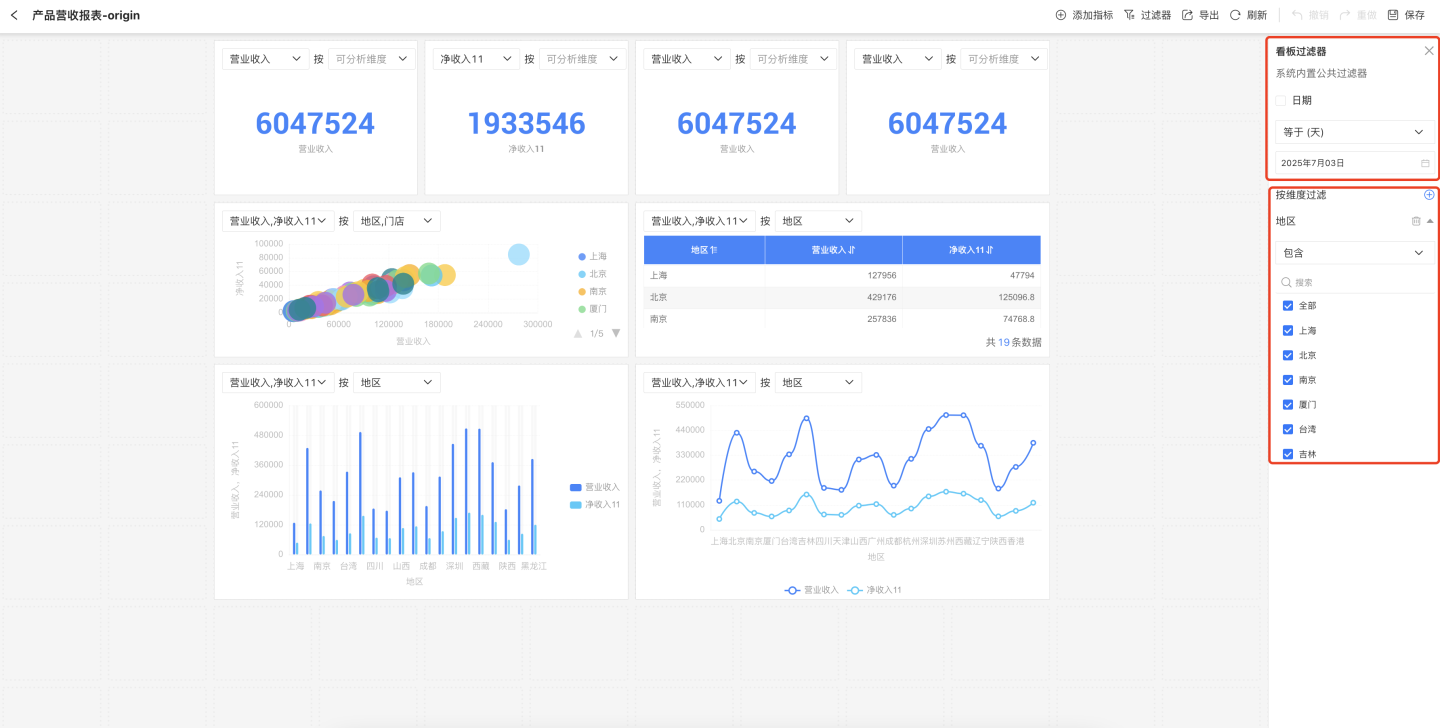
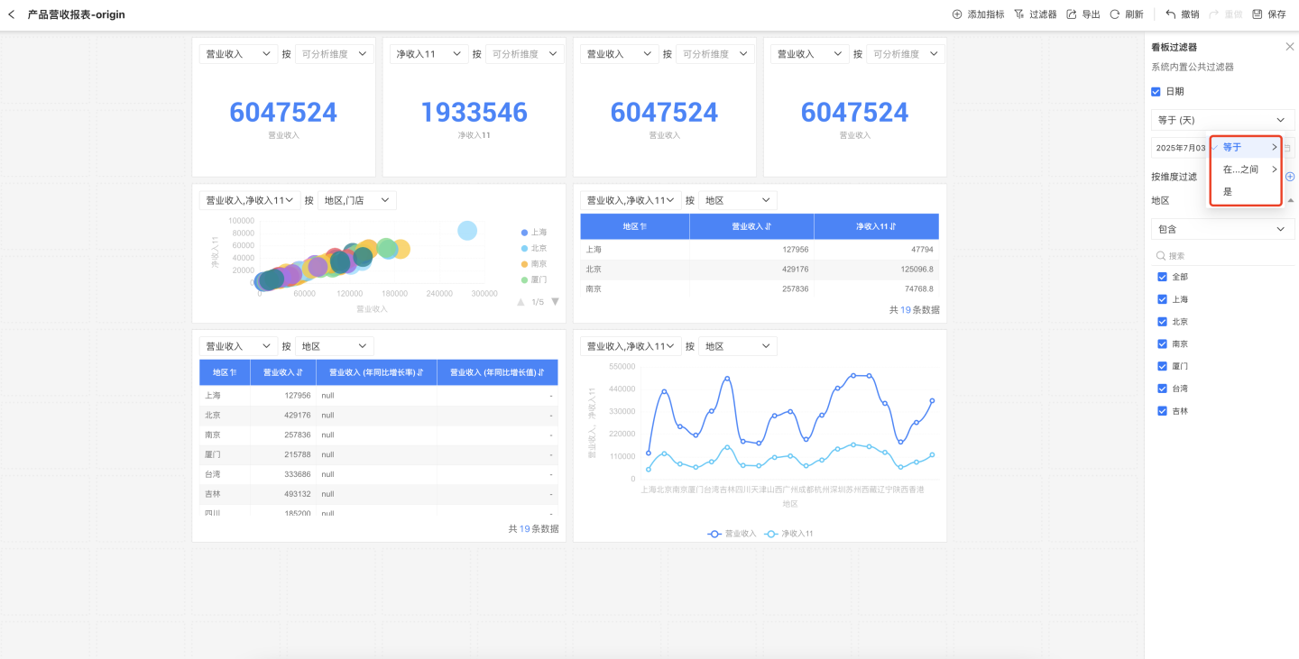
Dashboard Filters
Each chart in the dashboard supports adding filter conditions to filter metric data. In addition, the entire dashboard also supports adding filters to filter all charts within the dashboard. Dashboard filters include system-built public filters and custom dimension filters.
Built-in Public Filters
The dashboard comes with a built-in public date filter, which can filter all business metrics on the dashboard that have a timeline set. Business metrics without a timeline are not affected by this filter.
The public date filter consists of operators and date values. The operators include "Equals", "Between", and "Is".
- "Equals" means the timeline of all metrics is equal to the selected date. It supports second, minute, hour, day, day (across weeks), day (across months), week, month, month (across years), quarter, quarter (across years), and year.
- "Between" means the timeline of all metrics falls within the selected date range. It supports second, minute, hour, day, week, month, quarter, and year.
- "Is" includes four date shortcuts: This Year, This Quarter, This Month, and Today.
Custom Dimension Filter
In addition to the common time filter, the system supports custom dimension filters, allowing you to add dimension information from business metrics as filters. As shown in the figure, click the "+" icon to display all dimension information on the dashboard, select the dimension of the business metric you want to add, and set the filter options.
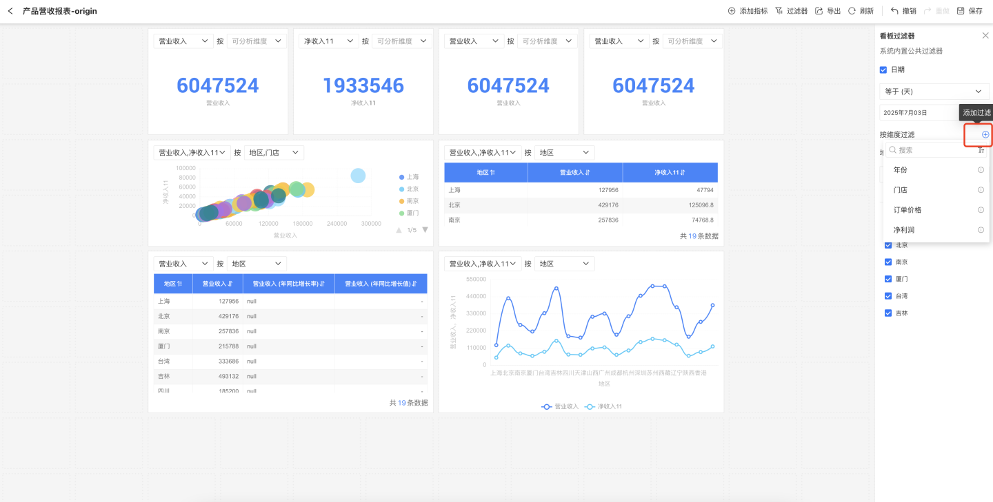
Tip
Custom dimension filters only take effect on charts of business metrics corresponding to the selected dimension, and do not affect charts of other business metrics.
Dashboard Page Layout
The chart layout in the metrics analysis dashboard uses a collision mode. Each chart independently occupies a position on the canvas and does not share space with other widgets. Charts automatically move up vertically, closely adjacent to other widgets. Moving a chart can push other charts away from their original positions. When a chart is deleted, the charts below it will automatically move up. 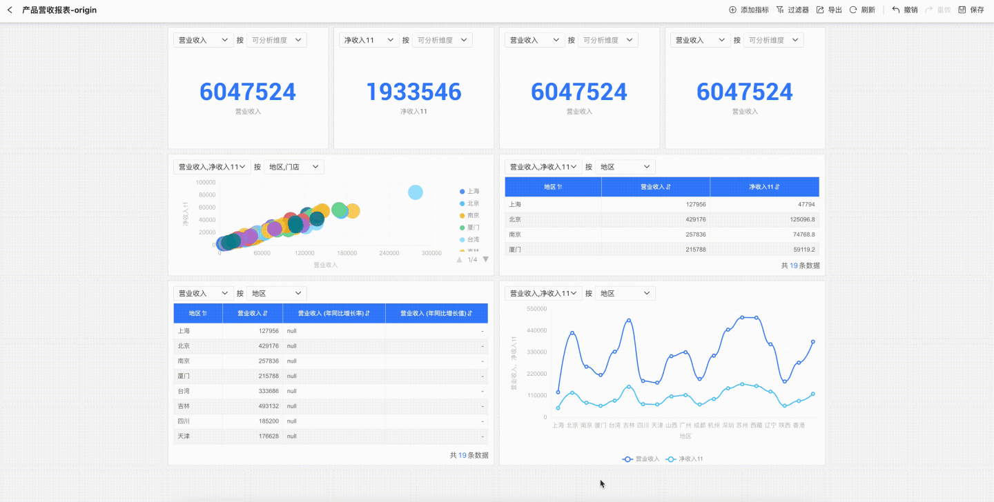
Tip
If there are already charts in the dashboard, a newly created chart will be placed in the largest remaining blank area within the currently drawn region of the canvas.
Dashboard Page Features
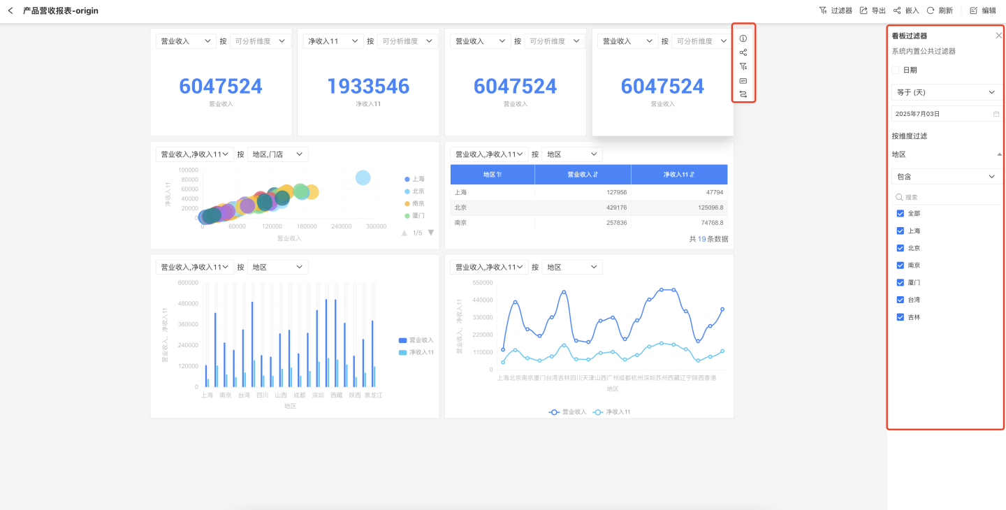
The dashboard supports operations such as refresh, export, undo/redo.
- Refresh: Refreshes the data of the charts.
- Export: Exports the data of the charts in the dashboard.
- Undo/Redo: The dashboard creation process supports undo and redo.