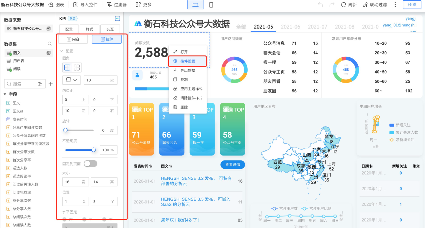
Control Settings
You can access control settings from the three-dot menu of each control. In the control settings, you can configure the appearance and interaction with the dashboard.
Control Appearance
The control appearance allows you to set the control's border radius, padding, size and position, border, background, and more. These can be configured in Control Settings -> Style, or through the control theme settings.
Customizing Widget Appearance
In Widget Settings -> Style, you can customize the appearance of the widget. Please follow the instructions below to configure the settings.
Apply Theme Style to Widgets
Apply Theme Style
After individually setting and visually adjusting the appearance of a single widget, if you want the widget's appearance to follow the theme style, simply click the three-dot menu in the upper right corner of the widget and select "Apply Theme Style" from the dropdown. The widget's appearance will then follow "Theme + Customization."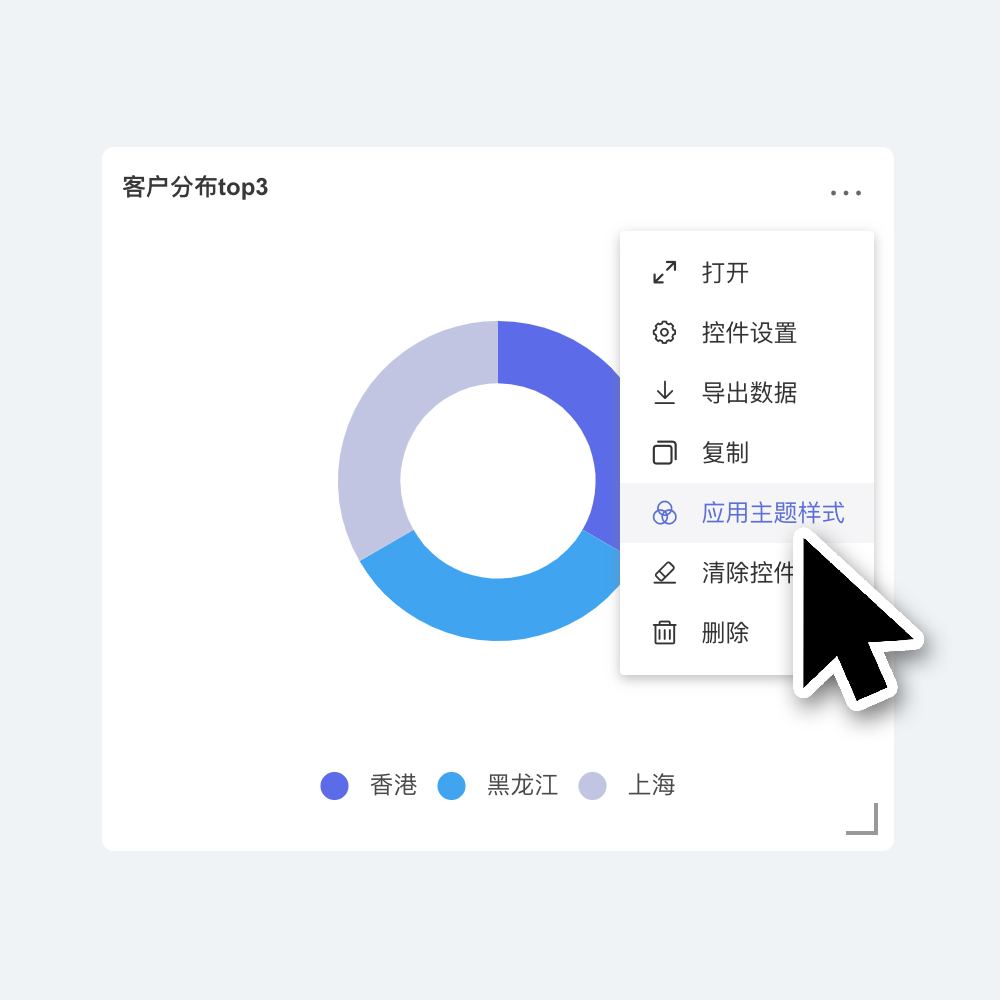
Clear Widget Style
Click the three-dot menu in the upper right corner of the widget and select "Clear Widget Style" from the dropdown. The widget's appearance will then follow "Theme + Customization," and all custom settings within the widget will be cleared. This includes adjustments to chart visualizations, which will revert to the initial default style.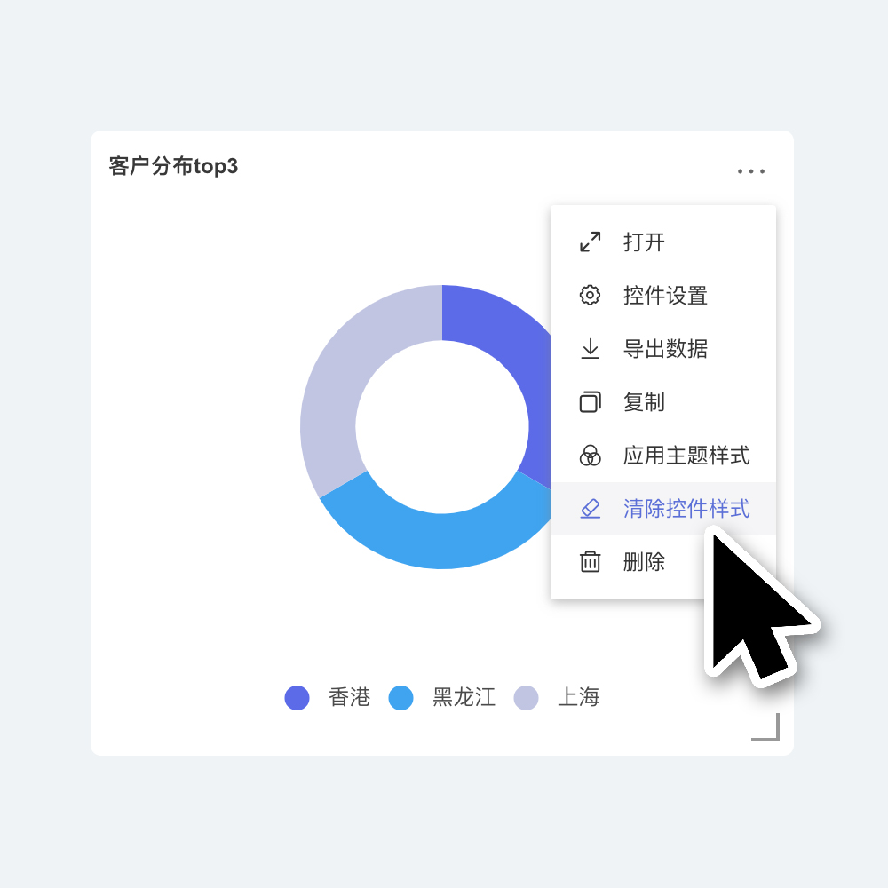
Tip
Widget appearance is affected by the theme. Settings within the theme will be applied by default to newly created widgets and widgets with default styles. For individual widgets with custom appearances, the theme will not affect the individually set content when switching themes (e.g., widget background color, widget title, etc. If you have set elements within the widget individually, the theme will not affect these elements when switching themes).
If you want certain individually customized widget elements to follow the theme, you can select "Apply Theme Style" for the widget.
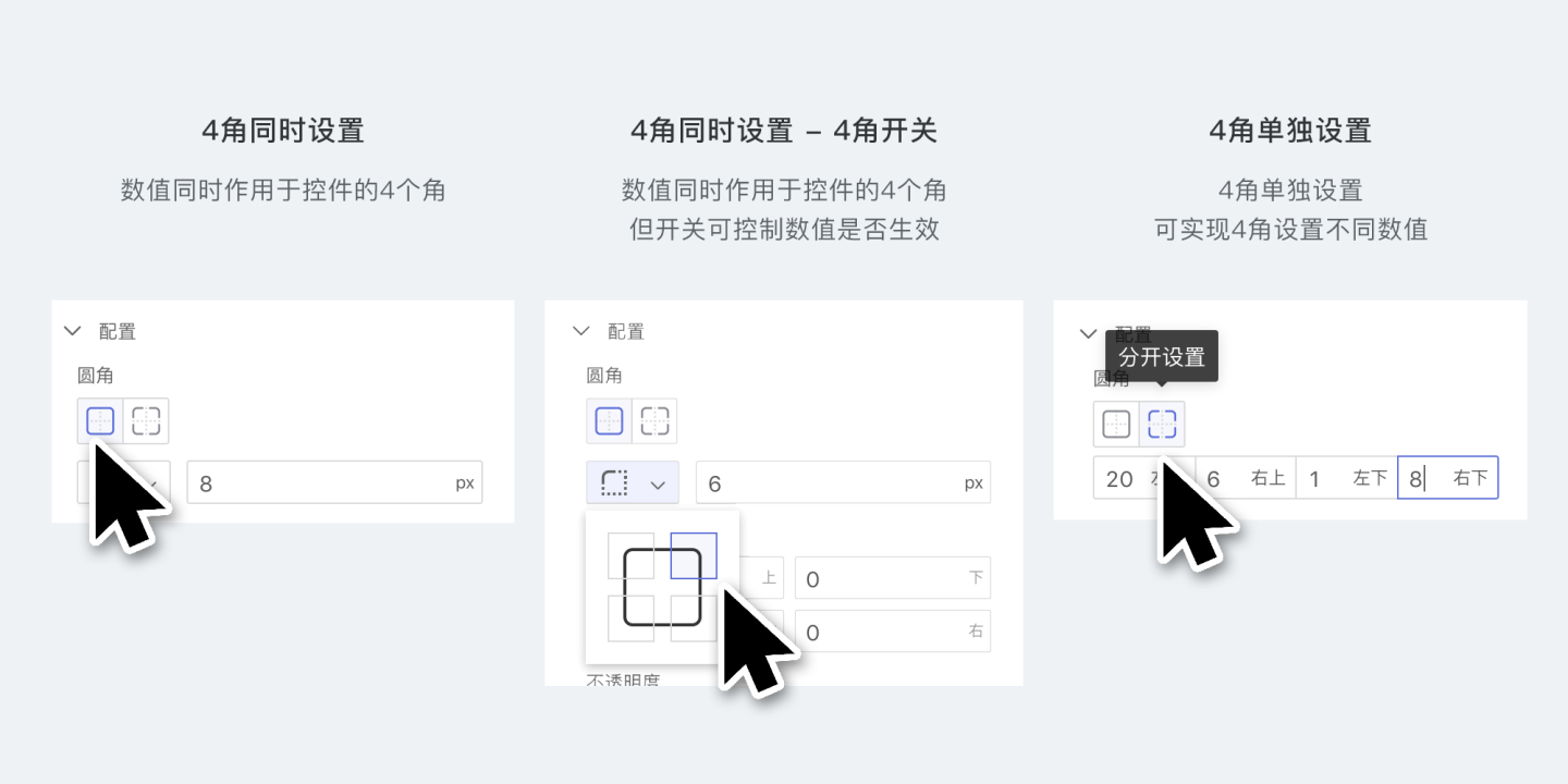
Configuration
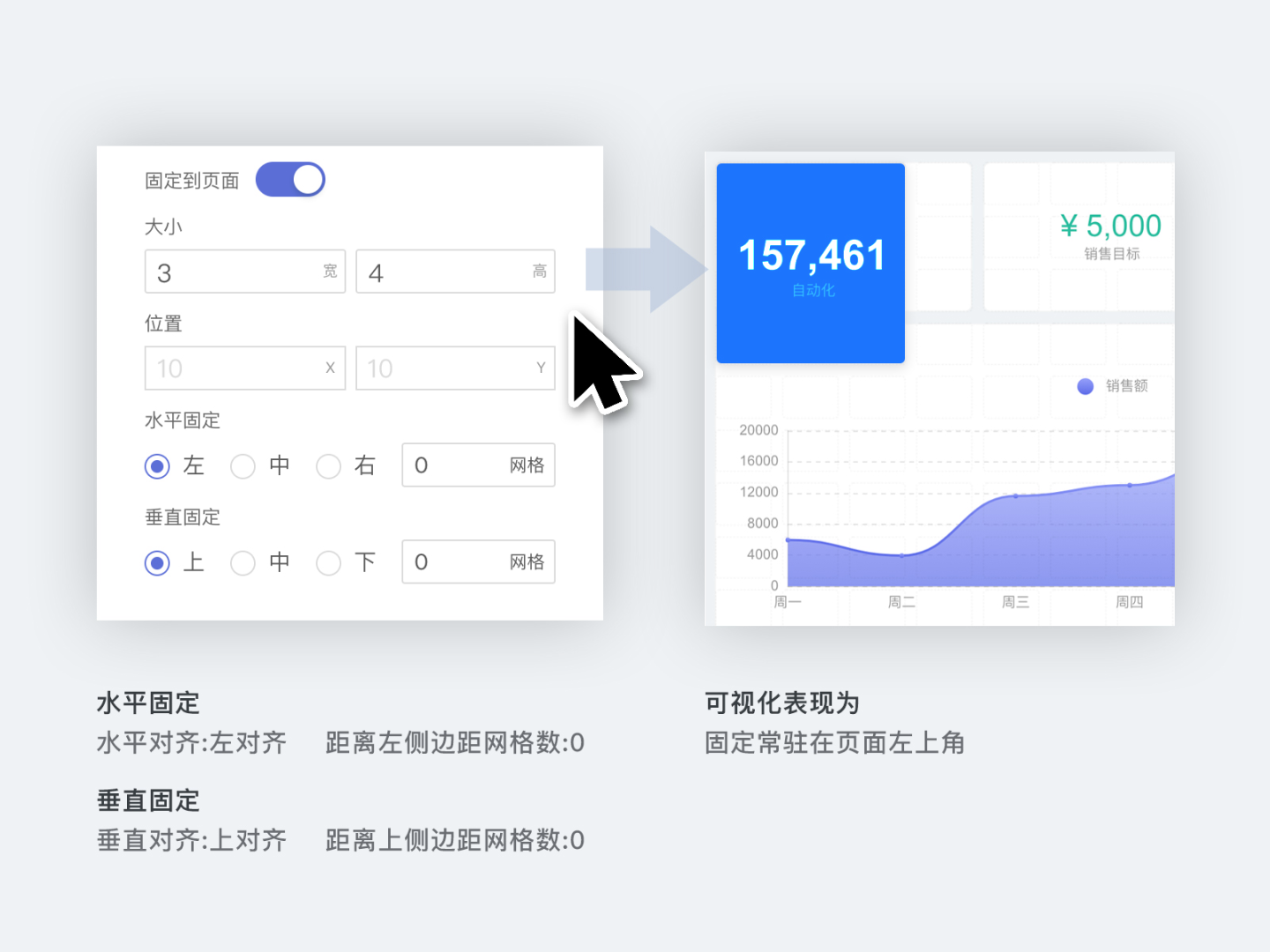
In the Configuration tab, you can set the corner radius, padding, opacity, and pin the control to a specific position on the page.
- Corner radius refers to the radius value of the four corners of the control.
- Padding refers to the distance from the content of the control to its border.
- Opacity refers to the overall opacity of the control, with a setting range of 0~100.
- Pin to page means fixing the control to a specific position on the page, such as the top or bottom of the dashboard. After enabling the pin to page feature, you can set the control's size, position, and alignment. However, resizing the control by dragging is no longer supported.
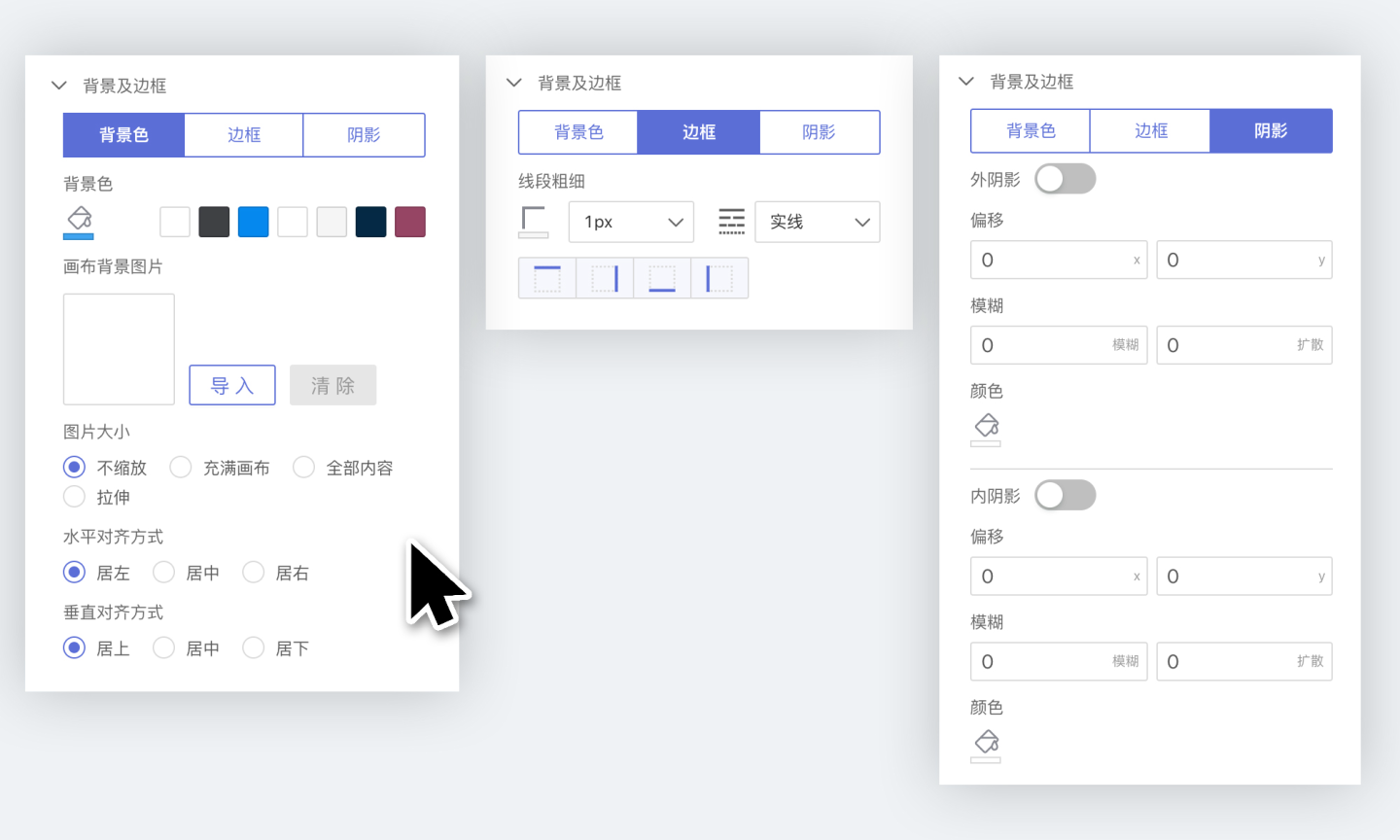
Background and Border
In the Background and Border tab, you can configure the background, border, and shadow of the control.
- Background Color
- You can set the background color of the control, supporting both solid and gradient colors.
- You can add a background image to the control; the background image layer is above the background color.
- Border
- You can set the border of the control, including color, thickness, line type, etc.
- Shadow
- You can set the outer shadow and inner shadow of the control.
Control Interaction Settings
Control interaction refers to the interactive behavior between a control and other controls in the dashboard when the control is clicked, including linked filtering, drill-down, linked filtering + drill-down, executing JS code, no response, and redirection.
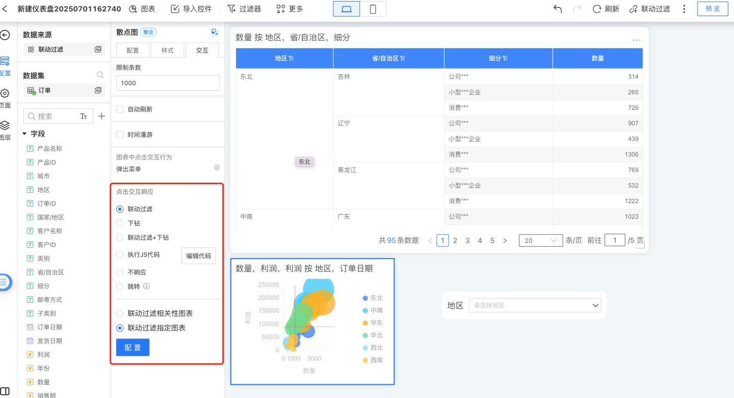
Linked Filtering
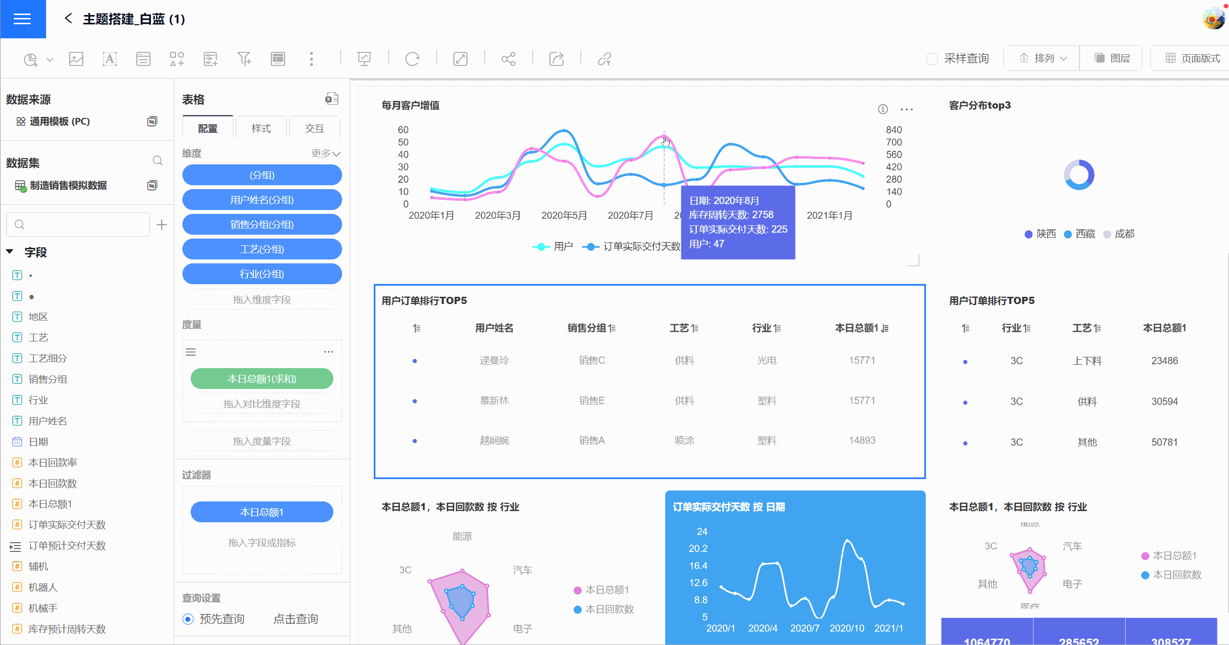
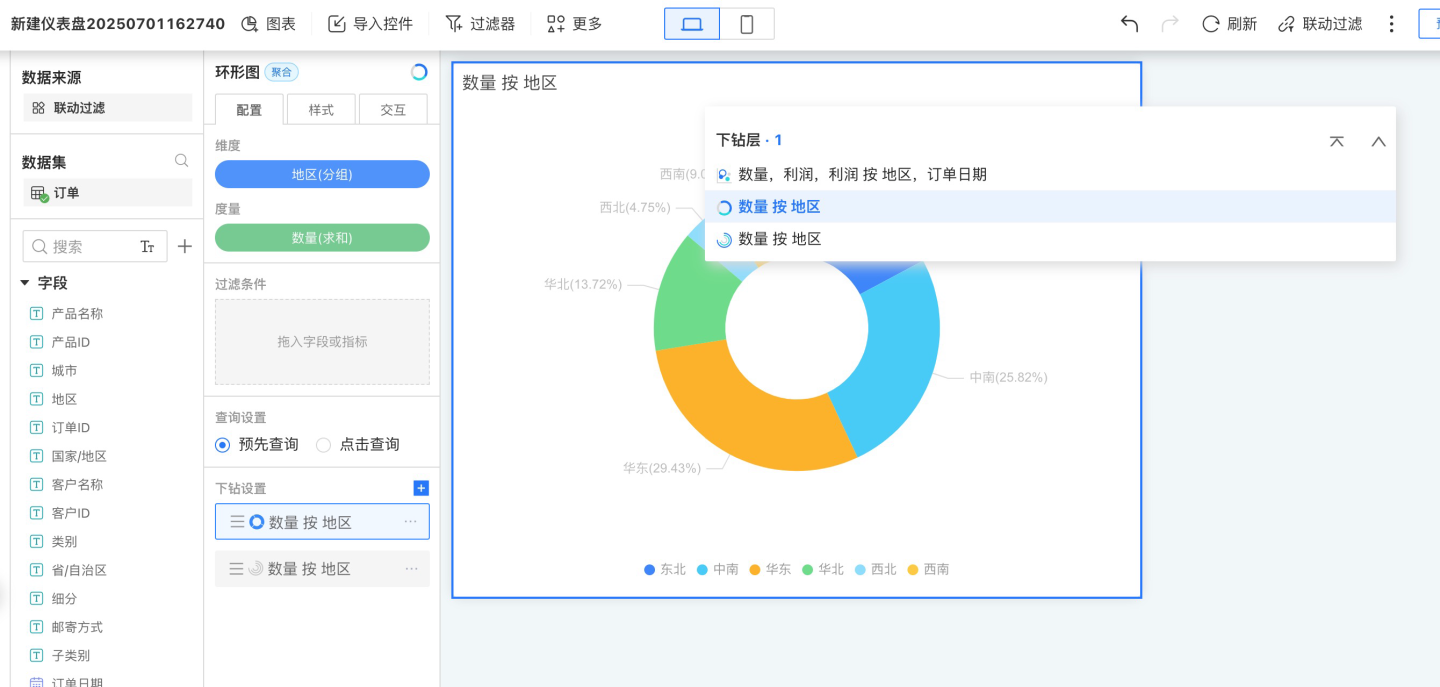
When the control interaction is set to linked filtering, clicking on dimension information in a chart will trigger data linkage in all associated chart controls. As shown in the figure, when you click on the Daily Customer Value-Added chart, all related chart controls will perform linked filtering based on the selected value in that chart. For example, if the filter date is August 2020 and you click on Liaoning Province in the customer distribution, other charts will also use Liaoning Province for data association.
By default, linked filtering applies to all related charts, meaning it filters charts created using the same dataset. You can also configure linked filtering for specific charts only. 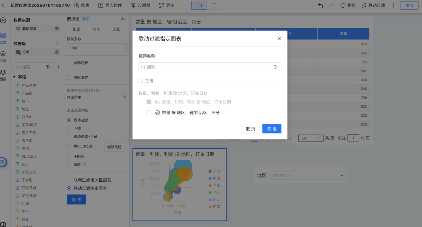
Tip
By default, chart controls use linked filtering for interactions.
Multi-level Linkage
Clicking on a chart triggers linkage, and the charts that are linked will be displayed on the current chart. The linked charts will show the linkage conditions applied to them. It supports linking multiple charts at the same time. 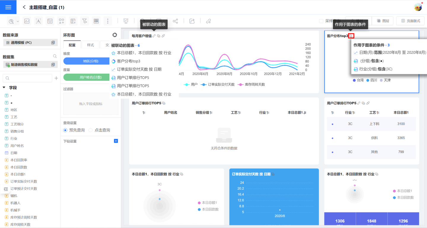
View Linked Filter Conditions
On the linked chart, you can view the linked conditions applied to the current chart. On the linked filter panel, you can see the filter conditions for the entire dashboard, categorized by chart. For example, if there are two linked conditions in a table, two rows will be displayed on the chart, but only one row will be shown in the filter panel. 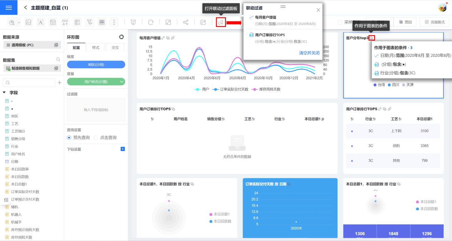
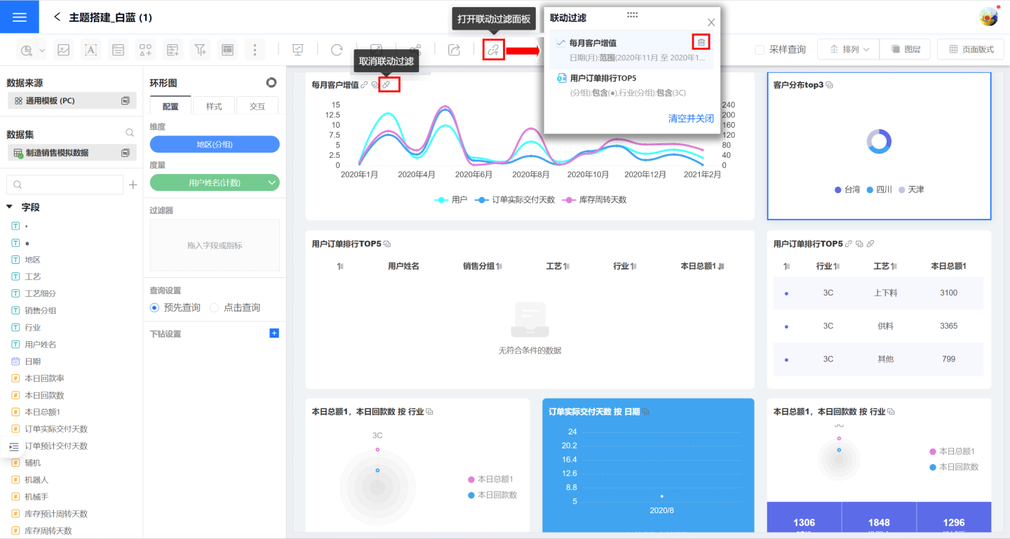
Cancel Linked Filters
Canceling linked filters can remove the linked filter for the current chart or for the entire dashboard.
- Click the "Cancel Linkage" button on the chart to remove the linked filter triggered by the current chart. You can also cancel the linked filter by deleting the chart from the linkage filter panel.
- On the filter panel, click "Clear and Close" to remove all filter conditions from all charts in the dashboard.
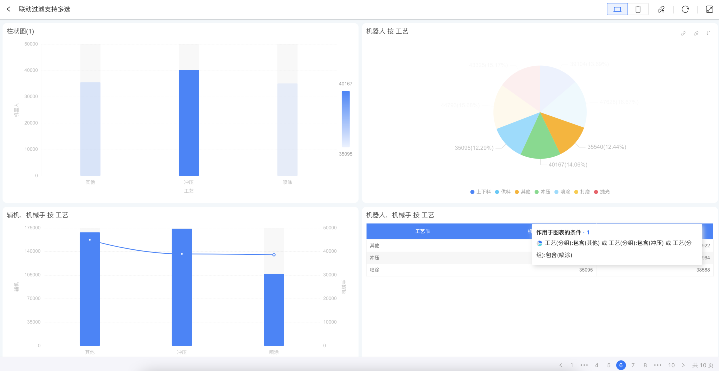
Multi-Select Conditional Linked Filtering
When users want to select multiple dimension conditions for linked filtering while viewing chart data, they can hold down the shortcut key command (macOS) / Ctrl (Windows), click to select one or more dimension conditions (1~n) on the chart, and then release the shortcut key to execute the linked filtering.
During the linked filtering interaction, users can hold down the shortcut key again to deselect unwanted dimension conditions and re-execute the linked filtering.
Tip
- This operation is only supported on PC and is not available on mobile devices.
- The multi-select condition logic also works in interactions such as linked filtering + drill-down, and drill-down.
Drill Down
Drill down refers to the process where, upon clicking a data item in a chart, the corresponding chart is displayed according to a predefined path, allowing users to explore data layer by layer for analysis. For example, consider the sales performance of a certain product. The chart displays the sales of the product across various cities nationwide. By clicking on a specific city, you can view the sales performance in each mall within that city, and by clicking on a mall, you can view the details of specific orders.
Each chart requires two steps to enable the drill down feature:
- Turn on the drill down switch.
- Configure the drill down layers.
Drill Down Switch
The drill down feature can be used both in dashboards and when a chart is opened. In each scenario, you need to enable the drill down switch.
- To perform chart drill down in a dashboard, go to Control Settings -> Interaction and select either
Drill DownorLinked Filter + Drill Down. The usage scenario is shown below.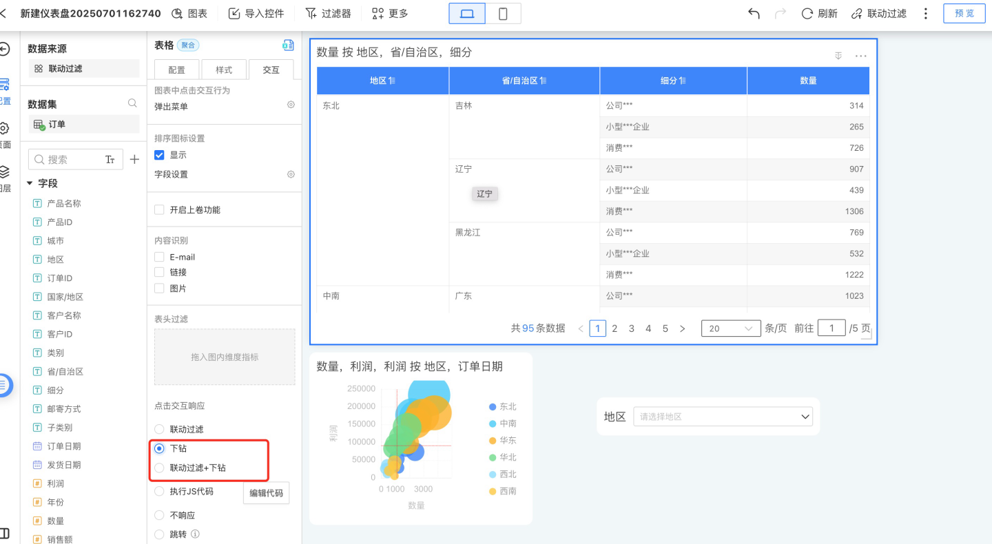
- To enable drill down interaction when opening a chart, go to the chart's interaction settings and select either
Context MenuorDrill Down. The usage scenario is shown below.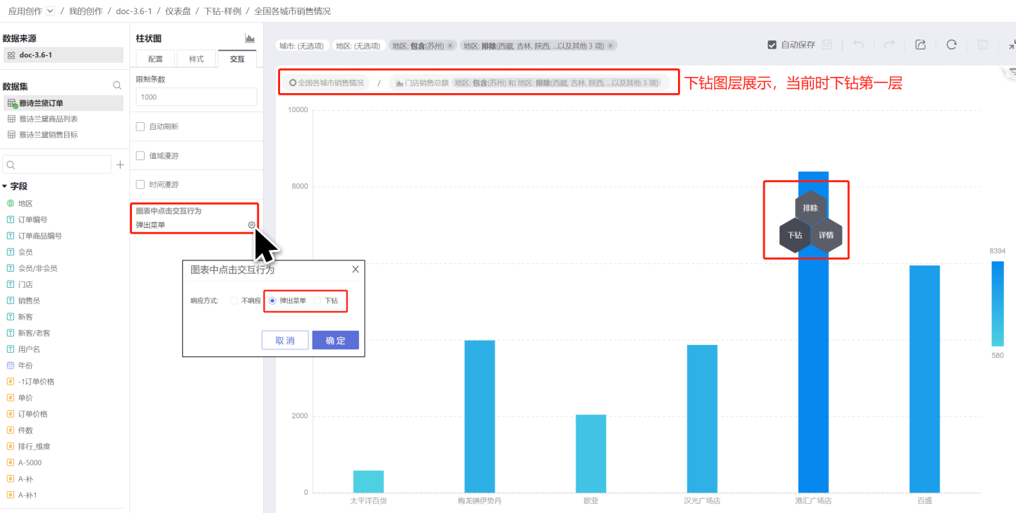
Tip
- The drill down switch only controls the scenarios where the drill down feature is used and is not related to the content of the drill down layers.
- The drill down layers of the same chart are identical in all scenarios.
Configure Drill-Down Layers
Each chart at every level of the drill-down path can be individually configured with dimensions, measures, and chart types. Refer to the following guide to configure drill-down layers.
- Click the "+" to the right of the drill-down settings to add a new drill-down layer. The new drill-down layer will directly copy the main chart.
- Configure the drill-down layer by modifying the chart type, dragging in dimensions and measures, and setting styles and interactions.
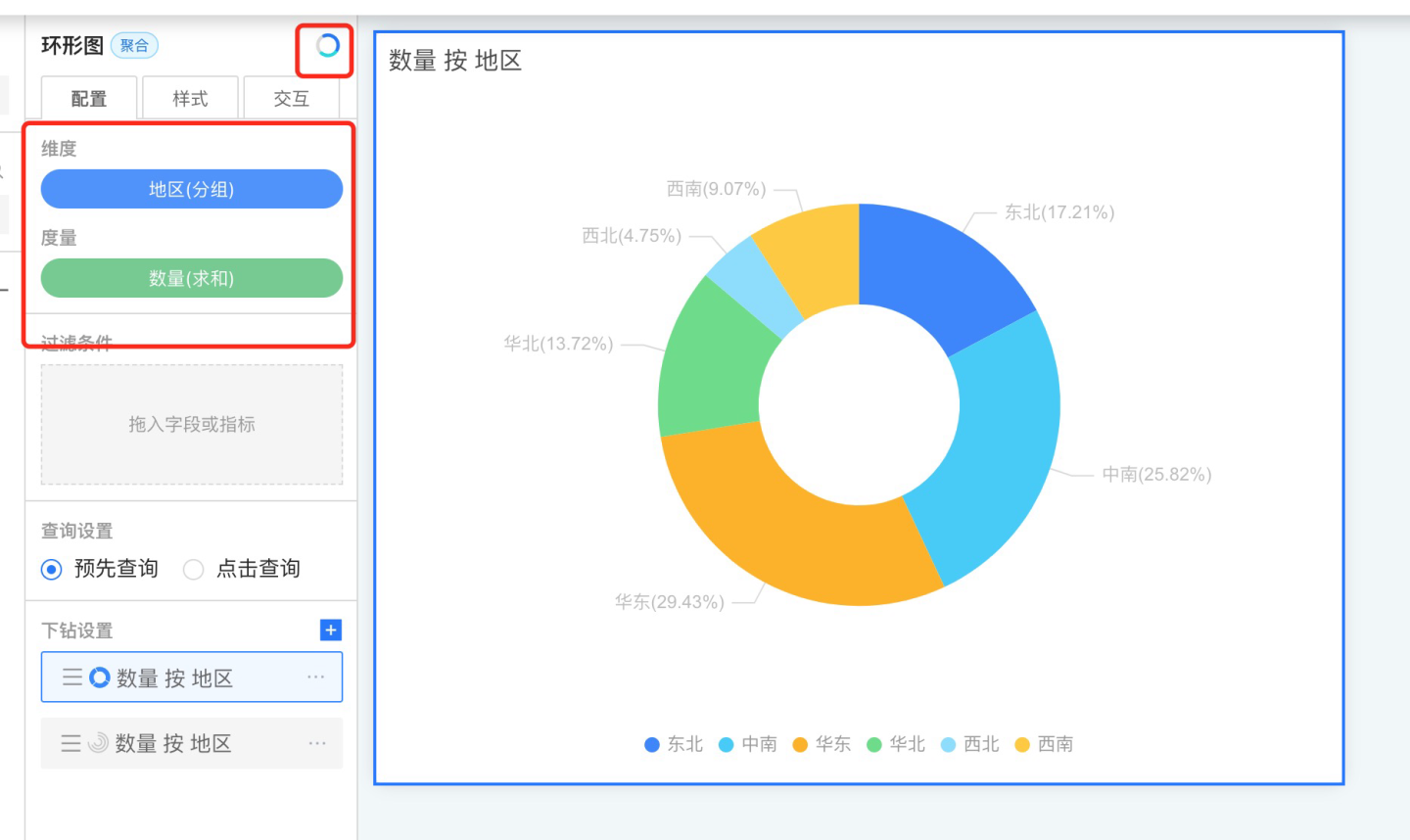
- Repeat step 2 to add the next drill-down layer, until all drill-down layers are configured.
Tip
Each chart in the drill-down will inherit the filter conditions from the previous layer, including chart dimensions and internal filter values.
You can adjust the order of drill-down layers by dragging them, such as rearranging Drill-Down Chart 1 and Drill-Down Chart 2.
Drill Up and Drill Down Button Display
When editing or displaying drill-down layers, a drill up and drill down button group will appear at the top right corner of the chart. This button group floats at the top right corner of the control, allowing you to go directly to the top layer, drill down or up layer by layer, display the drill-down path, and select any drill-down layer. 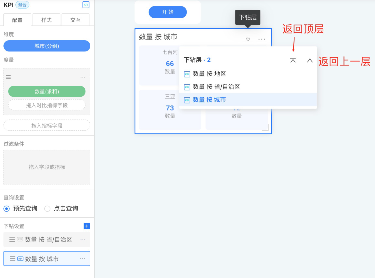
Linked Filtering + Drill Down
Linked Filtering + Drill Down refers to the combination of two interactive features: when clicking on a chart, it triggers linked filtering on other charts and performs a drill down operation on the chart itself.
No Response
No response means that no event is triggered when the control is clicked.
Navigation
When switching between dashboards within an app, HENGSHI's commonly used method is the persistent page navigator at the bottom, which allows users to quickly and freely switch between dashboards.
But what if users want to navigate to a specific dashboard by clicking on a particular chart object? How should this be configured?
In version 3.1, we introduced a powerful control navigation feature, allowing you to set navigation targets for individual controls.
For example, in a financial report, if a KPI indicator is "Profit," you can configure a click-to-navigate interaction for this KPI, setting the navigation target to the "Profit Analysis" dashboard, which provides a detailed analysis of profit.
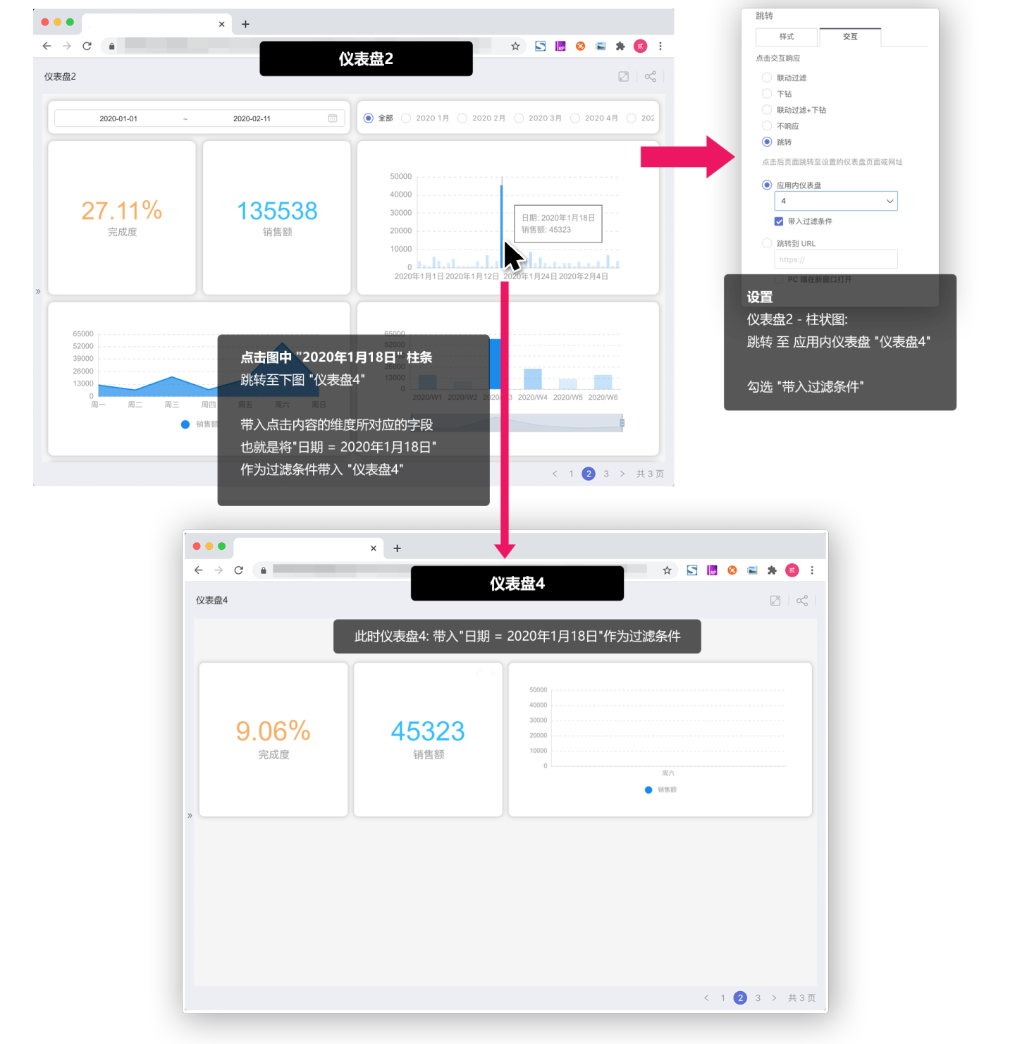
Jump to In-App Dashboard
Use the in-app dashboard as the jump target to achieve page navigation without using a pager. This operation can significantly enhance users' logical understanding between the jump target and the clicked object, establishing a logical hierarchy between pages and making the displayed information easier to comprehend.
Pass Filter Conditions
When we select the jump target as In-app Dashboard, you can check Pass Filter Conditions:
- Check
Pass Filter Conditions: The field metrics and other information contained in the clicked chart object will be used as filter conditions and passed to the target dashboard. - Do not check
Pass Filter Conditions: Only the jump action will be executed.
Tip
For example: In "Dashboard 1", set a click action on the "Bar Chart" to jump to "Dashboard 2", and check Pass Filter Conditions. The dimension of the "Bar Chart" in "Dashboard 1" is Month. At this point, when a user clicks the "May" bar in Dashboard 1, it will jump to "Dashboard 2". At the same time, "Month = May" will be passed as a filter condition to "Dashboard 2", filtering the charts in "Dashboard 2".
Please Note
To make Pass Filter Conditions effective, you need to ensure that both dashboards use the same dataset, or that a relation model has been established between the datasets.
Below is an explanation of the values passed when Pass Filter Conditions is checked in different charts
Bar Chart/Line Chart/Area Chart/Other Single-Dimension Charts
The content of the field corresponding to the clicked dimension will be brought in, as shown below:
Chinese-style Reports (Tables)
In tables, there are cross scenarios involving multiple dimensions and measures. The values passed as filter conditions when jumping follow these rules:
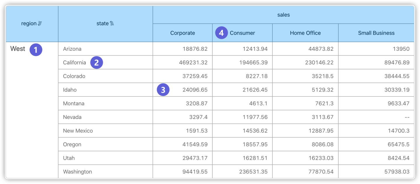
Clicking on ① passes the filter condition: "region = West"
Clicking on ② passes the filter condition: "region = West" & "state = California"
Clicking on ③ passes the filter condition: "region = West" & "state = Idaho" & "sales = Corporate"
Clicking on ④ passes the filter condition: "sales = Consumer"
Opening Location on PC
When navigating on the PC, you can choose to open in the current window, a new window, or a popup. When using a popup, you can set the popup size.
Tip
This setting does not take effect on mobile devices; the target dashboard will always open in the current window when navigating.
Redirect to URL
Allows the page to redirect to a specified URL, commonly used for linking to corporate websites, external links, and similar scenarios. You can set the URL to open in a new window, in the current window, or in a popup window.
Tip
This setting does not take effect on mobile devices; the specified URL will always open in the current window.
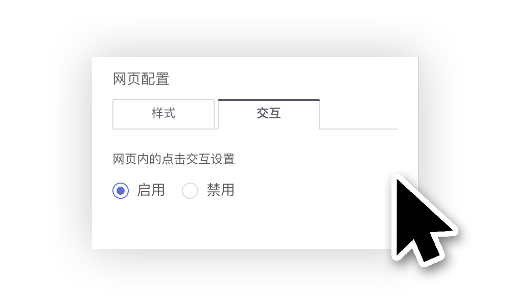
Please Note
Note: The web control's interaction setting can be set to Enable Click / Disable Click.
Execute JS Code
Typically, linked filtering and drill-through actions can satisfy most report drill-down requirements. However, inevitably, there are times when more complex scenarios arise that cannot be addressed by the preset centralized event handling options. In such cases, you can extend functionality by writing custom JS code.
After selecting "Execute JS Code" in the interaction response options, you can click the Edit Code button on the right to customize and write specific JS code.
The system provides invocation parameters called params, which users can utilize to implement related features. These parameters include a series of variables and callable methods.
params.appIdindicates the App ID corresponding to the current dashboard. The parameter is of type number.params.dashboardIdindicates the ID of the current dashboard. The parameter is of type number.params.chartIdIf the mouse clicks on a chart widget in the dashboard, chartId displays the ID of that chart. The parameter is of type number.params.loginUserContains all information about the currently logged-in user. The parameter is of type Object and includes id, loginName, tenantId, tenantCode, and other information.params.loginUser.idThe id of the currently logged-in user.params.loginUser.loginNameThe username of the currently logged-in user.params.loginUser.tenantIdIf the current user's role is tenant, this displays the tenant's id.params.loginUser.tenantCodeIf the current user's role is tenant, this displays the tenant's enterprise id.
params.userAttributesStores all user attribute information of the currently logged-in user. The parameter is of type Object.params.filtersThe filter conditions generated by clicking on a chart element.- Clicking on ① applies the filter: "region = West"
- Clicking on ② applies the filter: "region = West" & "state = California"
- Clicking on ③ applies the filter: "region = West" & "state = Idaho" & "sales = Corporate"
- Clicking on ④ applies the filter: "sales = Consumer"
params.allFiltersAll filters under the current dashboard, distinguished by filterType to determine if it is a parameter. This parameter is of type array.params.redirectCallbackOpens a link in the current page window.params.newTabCallbackOpens a link in a new browser tab.params.modalCallbackPops up a modal window in the current page, allowing users to customize the displayed content.
Example
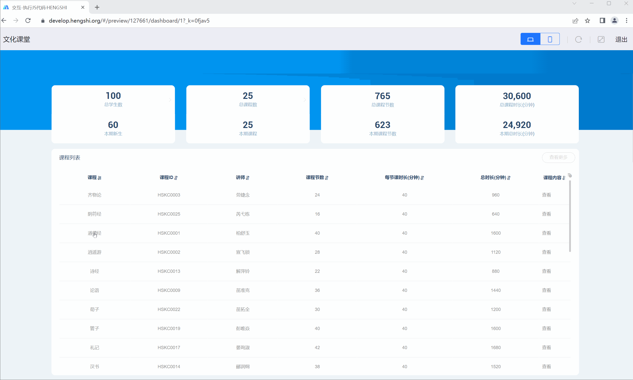
Take the Cultural Classroom as an example. When you click on the "Dao De Jing" course in the course list, a popup displays the course content. When you click on other courses, a popup shows their introduction on Baidu. In this scenario, you can use JS code execution to achieve different interactions by clicking on the same chart.
Here is a sample JS code:
console.log(params);
/* Get the course name at the mouse click position */
let Course = params.filters[0].args[1].op[0];
/* Concatenate the Baidu search URL based on the course name */
let url = 'https://www.baidu.com/s?wd=' + Course;

/* Condition: If "Dao De Jing" is clicked, a modal pops up displaying its content; if another course is clicked, its Baidu search page opens in a new tab */
if (Course === '道德经') {
   params.modalCallback({
   url: 'https://develop.hengshi.org/preview/127661/dashboard/29',
   title: "Dao De Jing",
   width: 1024,
   height: 768
   });
} else {
   params.newTabCallback(url);
}The chart interaction effect is shown below.
Multi-Selection Operation
In the dashboard, hold down the Ctrl key on Windows or the Command key on Mac to interactively select multiple marks in the chart. After releasing the key, the configured interactions, such as linked filtering or drill-down, will be triggered.
Accessing Restricted window Properties
In the JS code for widget interactions, we use new Function() to create a sandboxed environment for running user-defined JavaScript code. This means that access to the window object is restricted. However, we can add additional window properties to the sandbox environment through the global JS settings.
Below is an example of using window.postMessage:
- First, add the following code in the global JS settings:
// We cannot use window.postMessage() directly in the JS sandbox of widget settings
// But we can forward it to window.myJS
// This is our entry point to the sandbox
// Users can forward the required functionality through this custom window property
// These properties will be added to the window in the sandbox environment

window.myJS = window.myJS || {};
window.myJS.postMessage = window.postMessage;- Then, you can use postMessage in the JS code of the widget settings:
// Now we can use postMessage in the restricted sandbox window

postMessage(JSON.stringify({ hello: 'world' }), '*');In this way, you can safely add the required window properties and methods to the sandbox environment. This approach ensures both code security and the necessary functional extensions.