Table Interaction Settings
Table displays support various interaction operations, such as drill-down, filtering, and navigation, to present information for different analytical scenarios.
Table Pagination
Tables support configuring the content and display mode for each page.
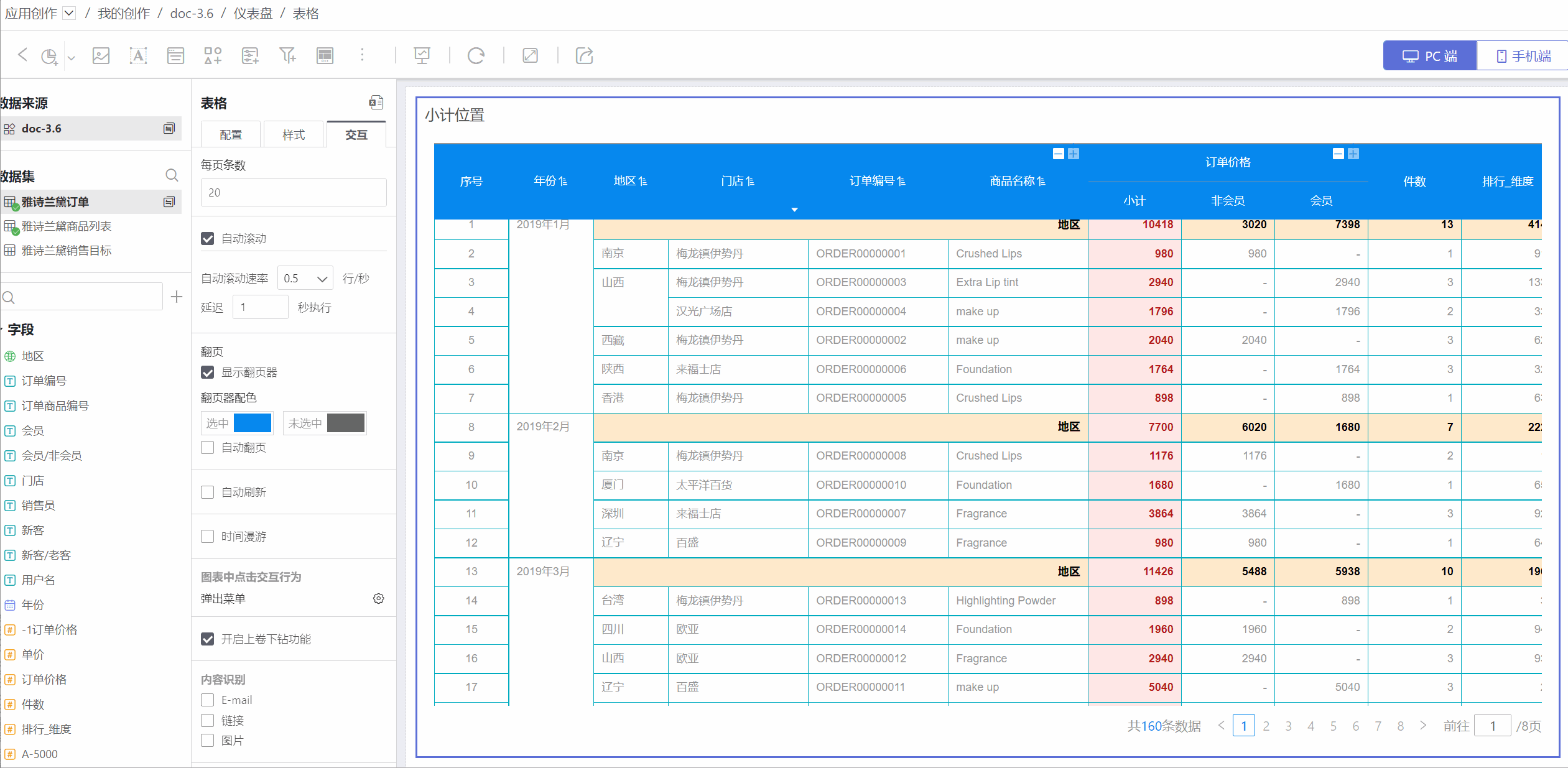
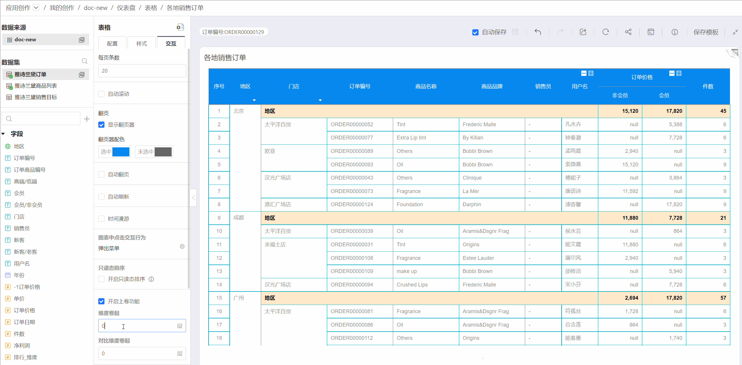
- In Interaction -> Limit Rows, you can set how many rows of data are displayed per page, with a minimum of 1 and a maximum of 10,000. By default, 1,000 rows are displayed per page. Subtotals occupy one row.
- When Interaction -> Auto Scroll is enabled, the page will play automatically. Users can set the auto scroll speed and delay time before scrolling.
When the number of table rows exceeds the per-page limit, the table will paginate the data.
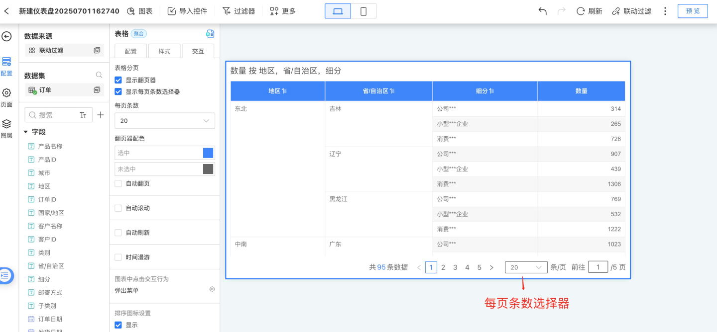
The paginator below the table displays the total number of data rows and total pages. The paginator supports page number jumps, previous/next page switching, as well as jumping forward or backward by five pages. The paginator is displayed by default when the table is paginated. If the paginator is manually turned off, only the first page of the table will be displayed. When the per-page row selector is enabled, the selector will be displayed if space allows.
After the table is paginated, you can enable auto page turning. In
Interaction->Auto Page Turn, set the interval and page turn animation.- After setting the interval, the page will turn after the specified time. If both auto page turn and auto scroll are enabled, the interval setting will be invalid. The page will turn automatically after the current page finishes scrolling, based on the scroll delay time.
- Auto page turn supports three animation modes: None, Fade, and Slide.

Click Interaction Behavior in Charts
Click interaction behavior in charts refers to the actions performed when clicking on a chart after opening a table.
No Response
When the table is open, clicking on the table detail area has no effect.Pop-up Menu
When the table is open, clicking on the table detail area brings up a menu with options for Exclude, Details, and Drill Down.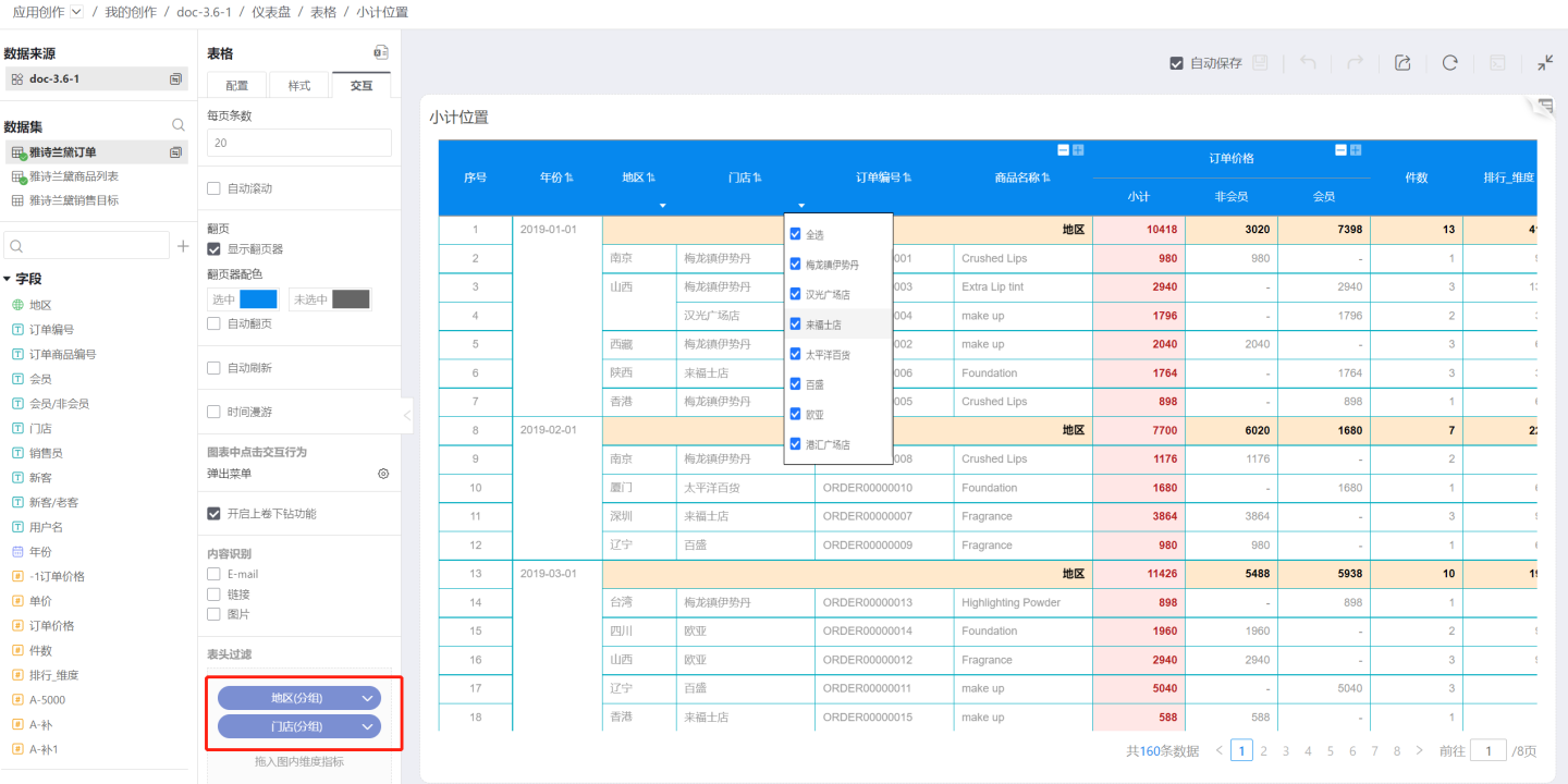
- Exclude: Deletes the data in the row where the clicked cell is located. As shown in the figure, after clicking Exclude, the data for row number 10 is deleted.
- Details: Displays detailed data information for the clicked cell.
- Drill Down: When drill-down layers are set, you can click to drill down.
Drill Down
When the table is open, clicking on the table detail area allows you to drill down into the drill-down layers.
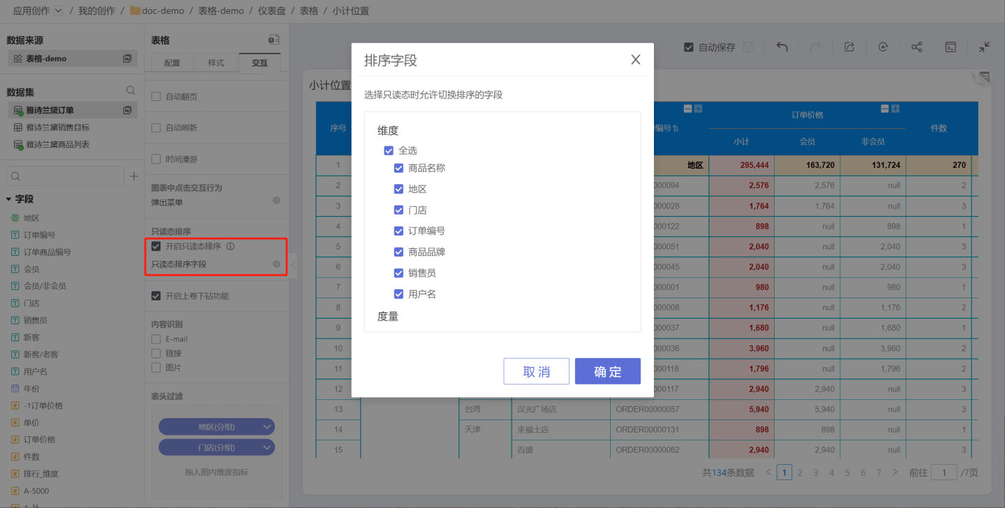
Enable Sorting in Read-Only Mode
Tables retain the sorting feature in read-only states such as publish, preview, and embed. Users can control the display of this feature in the published state via a toggle switch. When the switch is enabled, a sort button is displayed on the table, allowing viewers to adjust the order of fields and re-sort the table. When the switch is disabled, the field settings button will not be shown on the table, and viewers will not be able to sort the table.
When sorting in read-only mode is enabled, you can also specify which fields users are allowed to sort. On top of displaying fixed sorting content, app creators can allow users to sort and view specific fields.
Enable Roll-up Feature
The table roll-up feature allows you to set the number of levels to roll up for dimensions. By default, only the top-level column of a dimension is displayed, and other columns can be expanded as needed. You can set the roll-up levels for both dimensions and comparison dimensions.
After enabling the roll-up feature, "+" (roll-up) and "-" (drill-down) icons will appear on the dimension and subtotal headers in the table, allowing you to roll up or drill down step by step. Here, roll-up and drill-down refer to the collapsing and expanding of table fields. Roll-up means collapsing fields, while drill-down means expanding fields.
Content Recognition
Content recognition includes: E-mail, Link, and Image. By default, these options are not selected when creating a new table.
E-mail
When E-mail is selected, cells in the table will automatically recognize E-mail addresses. Clicking an E-mail link will automatically open your email client.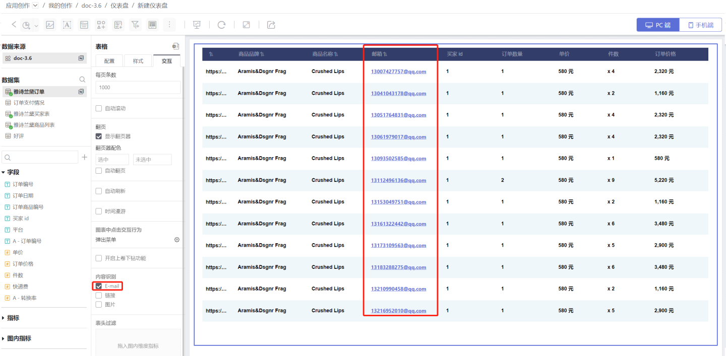
Link
When Link is selected and Image is not selected, cells in the table will automatically recognize links. Clicking a URL will automatically redirect to the linked page.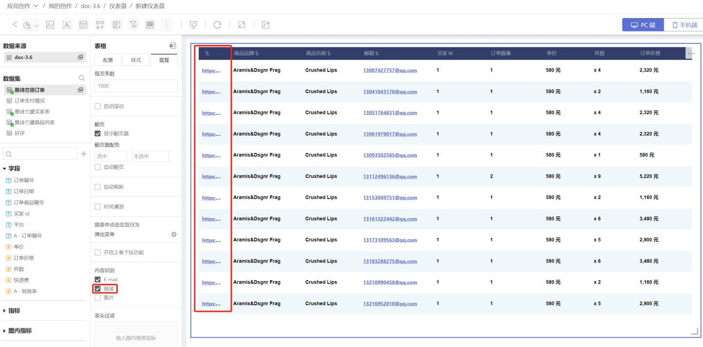
Image
When Image is selected, or both Link and Image are selected, cells in the table will automatically recognize image links and convert them into images. Clicking the image will redirect to the linked page.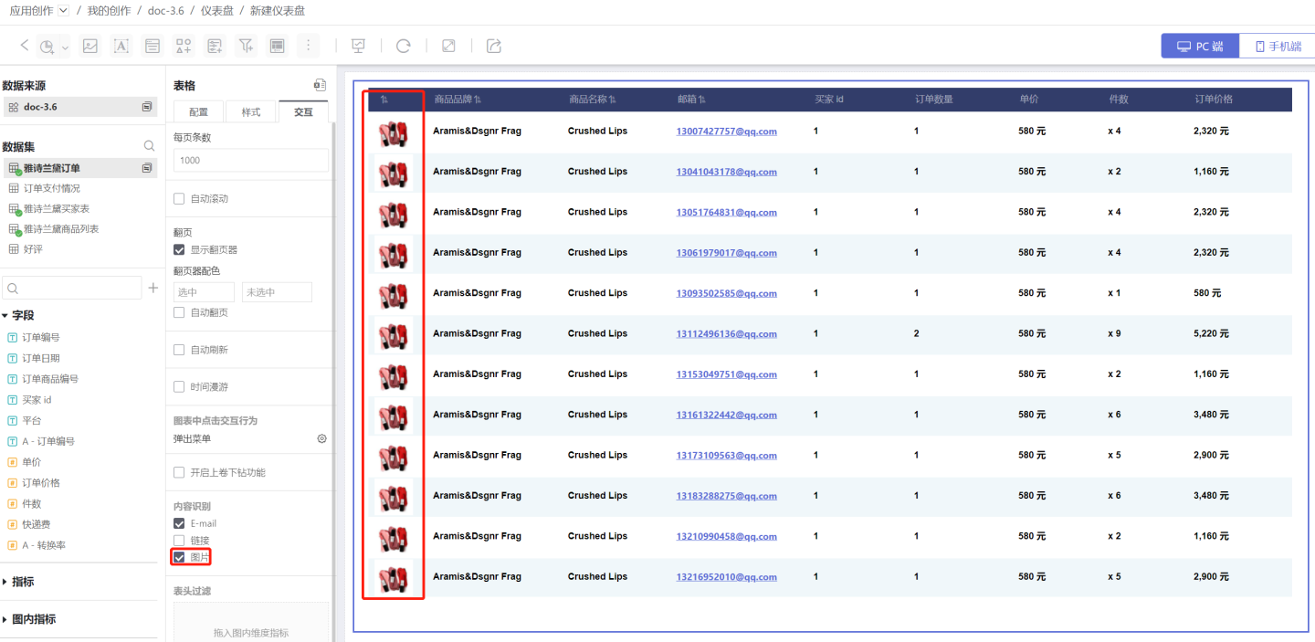
Header Filtering
Header filtering allows users to quickly filter and focus on the data they care about. Drag a metric from the chart into Header Filtering, and a triangle button will appear below the header. Click it to filter the data.
Tip
Header filtering is simple and convenient. You can use this feature when you only need to filter table information.
Header filtering can only be used when the table header is displayed. If the table is designed without a header, you can use a Filter to filter table data.
Control Interaction Settings
For more details, see Control Interaction Settings