Form Creation
This chapter explains how to create forms and design form content for data reporting. Users can follow the guidance to complete form creation and prepare for data collection.
Create Form
The data filling module allows you to create forms by dragging and dropping. Please follow the steps below to create a form.
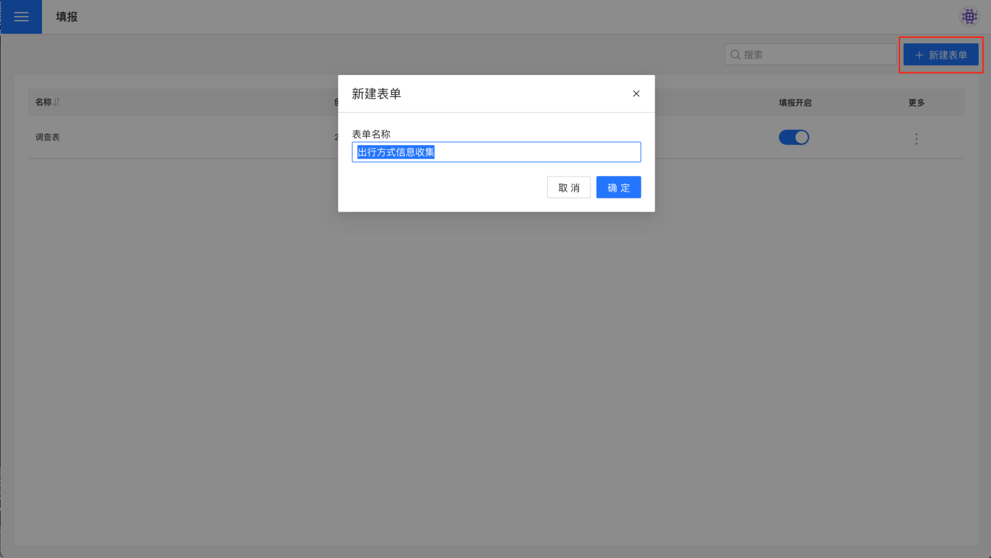
In the data filling module, click "New Form," enter the form name, and click "Confirm" to create a new blank form.
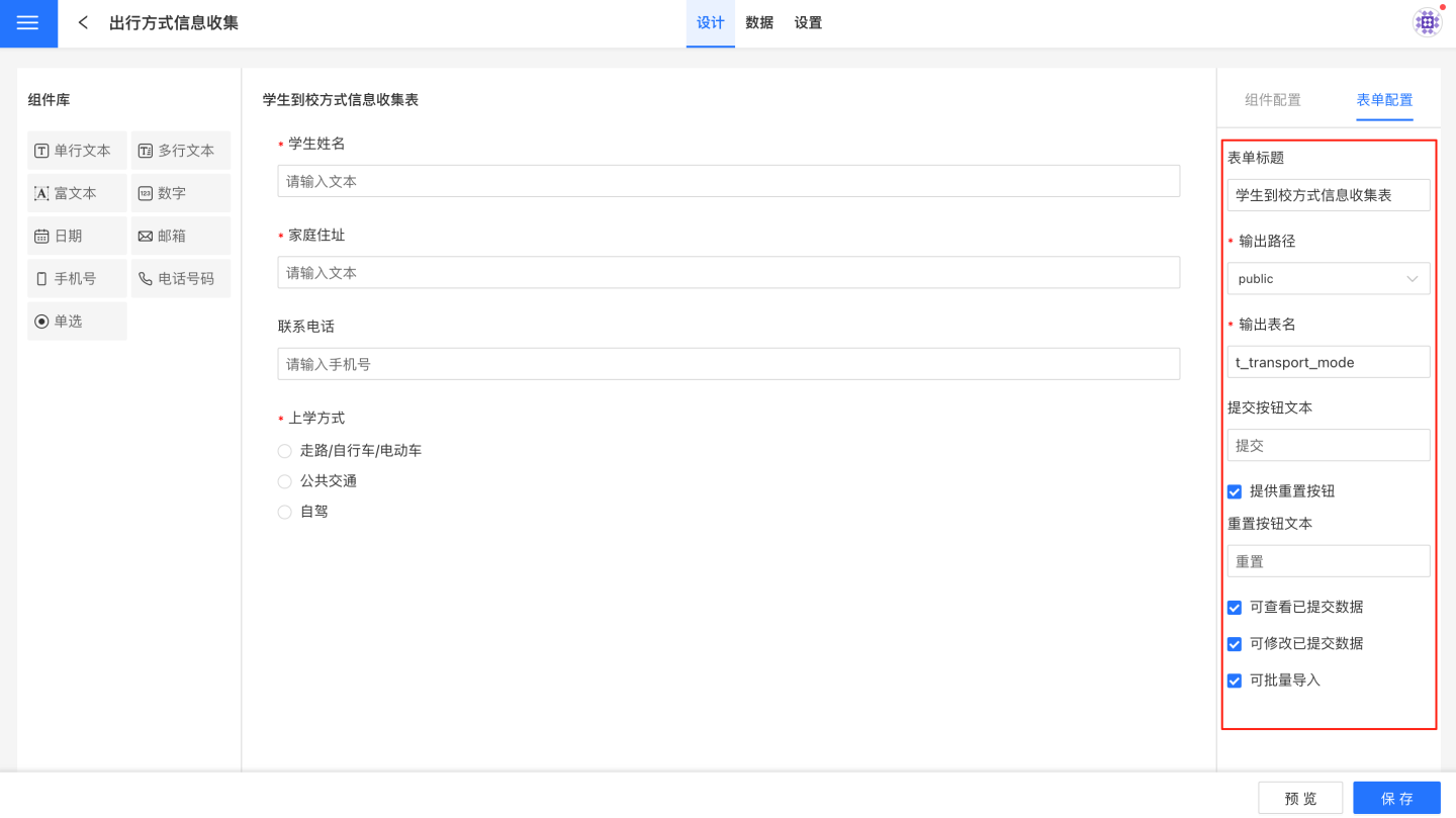
Open the blank form and start building the form. First, configure the form by setting the form title, output path, output table name, and other details. Each configuration item is explained in detail in Form Configuration.
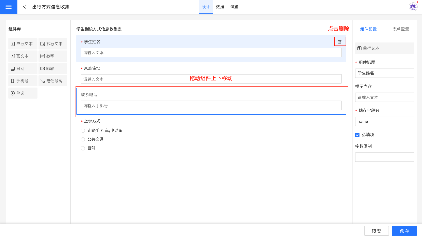
Add components to the form for data collection. Drag components from the component library to the canvas area, and configure the components in the component settings area on the right. For example, drag a single-line text component to collect student names.
Add components to the form one by one until all components are added. There are many types of components. For detailed explanations of component functions and related configurations, refer to the Components section.
Use the form preview to check whether the form meets your requirements. If it does not, return to the canvas to make modifications until it meets your needs.
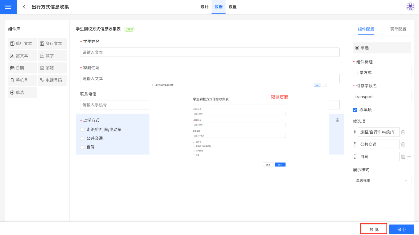
Save the form.
As shown in the steps above, the form creation process is relatively simple. The key task is the use of components within the form. The following section provides a detailed introduction to form components.
Form Configuration
Form configuration refers to the settings related to the form's submission style and data storage during the form creation process. The configuration of the form style includes:
Form Title: The title displayed on the page during form submission. The form title is not the same as the form name during the creation process. The form name is not displayed during submission.
Submit Button: During form submission, clicking the submit button uploads and stores the submitted data into the database.
Reset Button: When a large amount of content needs to be re-entered during form submission, the reset button can be used to clear all items in the form with one click and start over.
View Submitted Data: This configuration is currently effective only during batch import.
Edit Submitted Data: This configuration is currently effective only during batch import.
Batch Import: Supports batch data import during submission.
- The batch import file must meet the following conditions:
- The file header cannot be empty, merged cells are not allowed, and adding or modifying field names is not supported. It is recommended to download the template first and use it to fill in the data for import.
- Supports file types: csv, xls, xlsx, xlsm.
- File size must not exceed 9GB.
- Only the first worksheet of the file will be imported.
- Batch import supports viewing and editing submitted data.
- If the
View Submitted Dataoption is selected, you can download and view the submitted data. - If both
View Submitted DataandEdit Submitted Dataoptions are selected, you can download the submitted data, make modifications, and re-import the file to complete the changes.
- If the
- The batch import file must meet the following conditions:
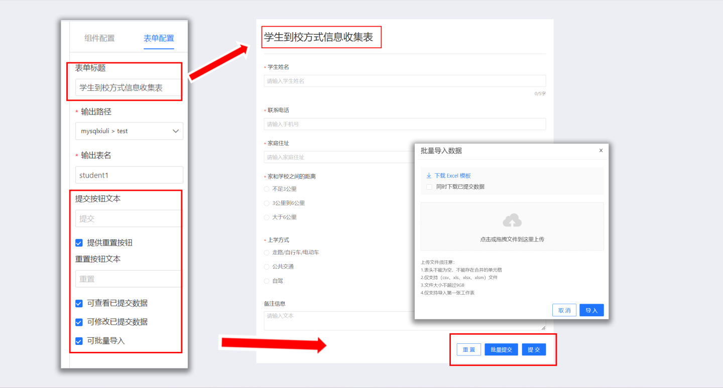
The configuration for form data storage includes:
- Output Path: Stores the data collected from the form in the specified database path.
- Output Table Name: Stores the data collected from the form in the specified table. A new table will be created based on the table name during storage. If a table with the same name already exists in the specified path, a configuration error will be prompted.
Tip
Currently, only certain data sources support the data submission feature, and the corresponding data connection must have the Support Operations on Connected Database option selected.
Supported Data Source List
| Data Source Name |
|---|
| mysql |
| doris |
| atomData |
| mongodb |
| tidb |
| tdsqlmysql |
| oracle |
| postgresl |
| greenplum |
| hologres |
| maxcompute |
| tdsql |
| sqlserver |
| dameng |
| redshift |
| clickhouse |
Components
Data entry provides 9 commonly used components: single-line text, multi-line text, rich text, number, date, email, mobile phone number, telephone number, and single choice. Different components serve different purposes, and users can choose the appropriate component based on the type of information to be collected.
Component Introduction
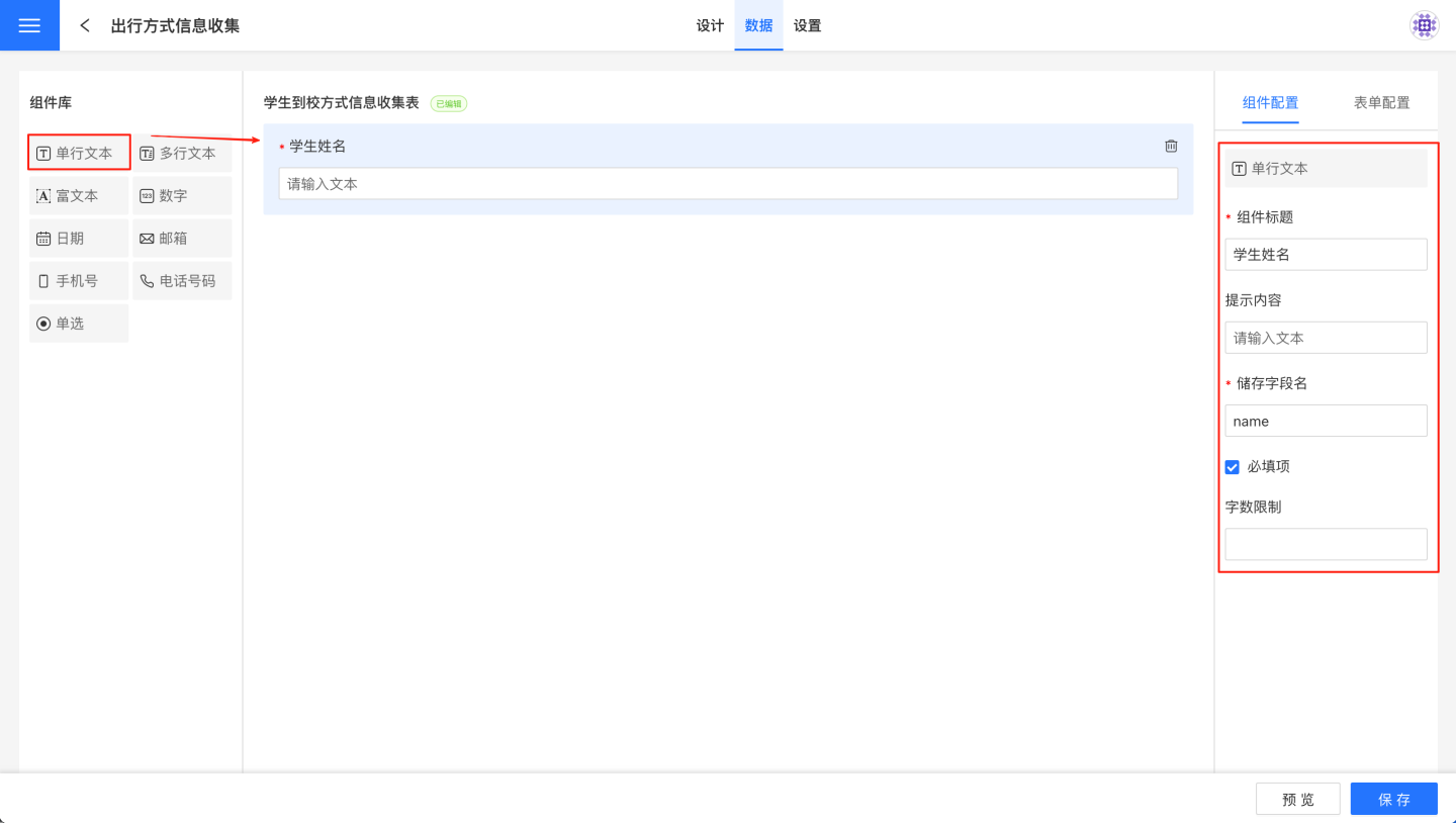
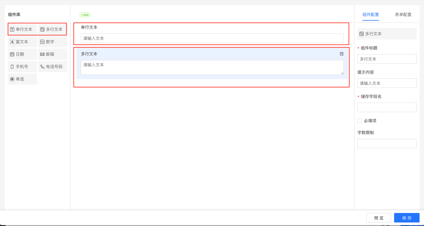
Text Component
The text component includes single-line text components and multi-line text components.
- Single-line text components support collecting text-type information. All input content is displayed in one line without wrapping.
- Multi-line text components support collecting text-type information. When the input text exceeds the display width, it automatically wraps, and you can also manually wrap using the Enter key. On the PC side, the input box can be enlarged when filling in multi-line text.
Text component configuration options include:
- Title: The title displayed by the component, defaulting to single-line text or multi-line text.
- Hint Content: Information prompting the content to be entered in the text box, defaulting to "Please enter text."
- Storage Field Name: The field name where data is collected and stored in the database. After setting, modifications are supported, with the last modification being final.
- Required Field: When this option is checked, the field cannot be left blank when filling out the form.
- Character Limit: The limit on the number of characters for the input text.
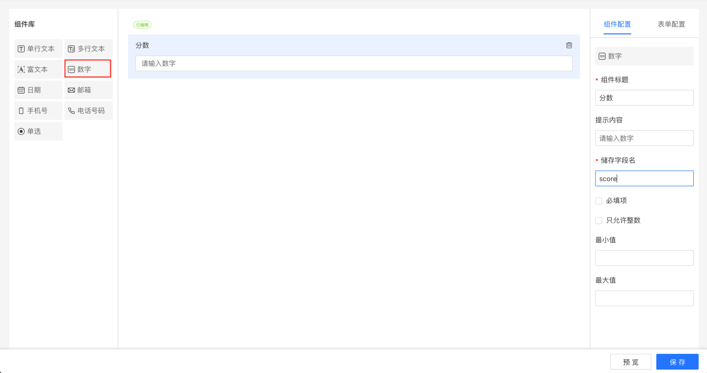
Number Component
The number component is used to collect numeric information, such as quantity, price, scores, etc.
The configuration of the number component includes:
- Title: The title displayed by the component, default is "Number".
- Hint Content: Information prompting the user to input, default is "Please enter a number".
- Storage Field Name: The field name where the collected data is stored in the database. Modifications are supported after setting, with the last modification taking precedence.
- Required Field: When checked, this field cannot be left empty when filling out the form.
- Allow Only Integers: The data type supports integers and decimals. When checked, only integers can be entered during form submission.
- Minimum Value: When a minimum value restriction is set, the entered number must be greater than or equal to the minimum value.
- Maximum Value: When a maximum value restriction is set, the entered number must be less than or equal to the maximum value.
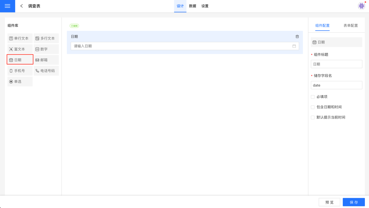
Date Component
The date component is used to collect date-type information, supporting date validation and setting a default date.
The configuration options for the date component include:
- Title: The title displayed by the component, default is "Date".
- Storage Field Name: The field name where the collected data is stored in the database. Once set, it can be modified, with the last modification taking precedence.
- Required Field: When this option is selected, the field cannot be left empty when filling out the form.
- Include Date and Time: This option affects the precision of the date. When selected, the date is precise to the second, with the display format as "Year-Month-Day Hour:Minute:Second". When not selected, the date is displayed in the format "Year-Month-Day".
- Default to Current Time: When this option is selected, the current date is displayed by default.
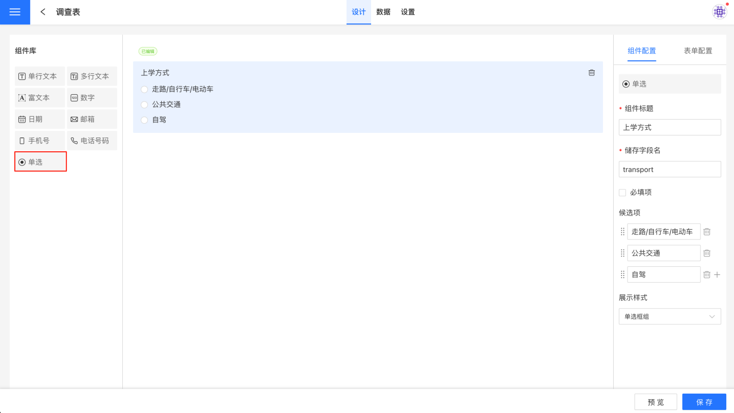
Single Selection Component
The single selection component is used to collect data of selection type, allowing only one option to be chosen from the candidates.
The configuration of the single selection component includes:
- Title: The title displayed by the component, defaulting to "Single Selection."
- Storage Field Name: The name of the field where the collected data is stored in the database. It supports modification after setup, with the latest modification taking precedence.
- Required Field: When this option is checked, the field cannot be left empty during form filling.
- Candidates: The options for the single selection component, which can be manually added.
- Display Style: Supports radio button group and dropdown selector.
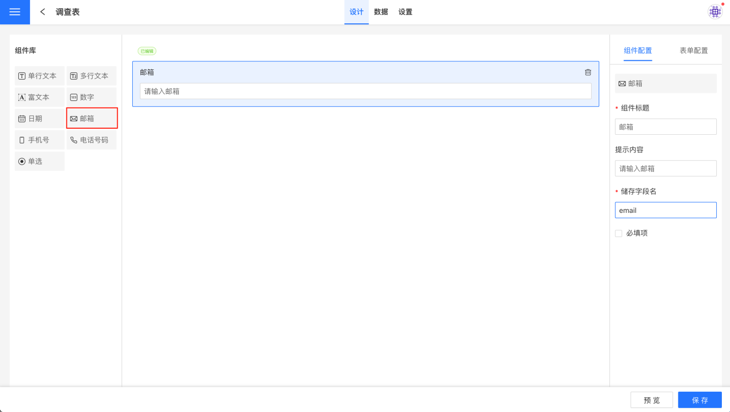
Email Component
The email component is used to collect email-type information and supports email format validation.
Email component configuration details:
- Title: The display title of the component, default is "Email".
- Hint Content: Information prompting the user to input, default is "Please enter your email".
- Storage Field Name: The field name where the collected data is stored in the database. Supports modification after setting, with the last modification taking precedence.
- Required Field: When checked, this field cannot be left blank during form filling.
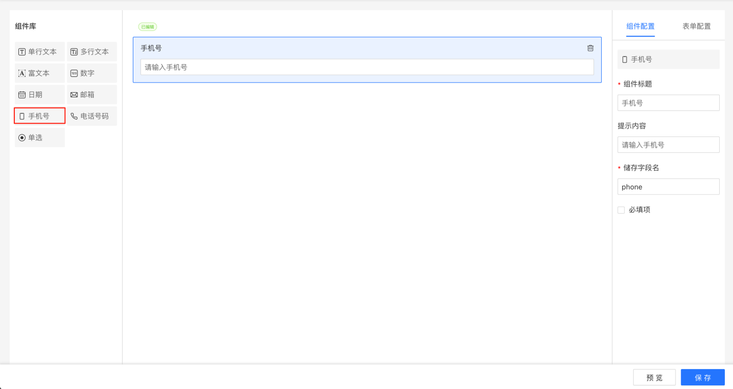
Mobile Number Component
The mobile number component is used to collect users' phone information and supports the following configurations:
- Title: The title displayed by the component, default is "Mobile Number".
- Placeholder: Prompt for input, default is "Please enter your mobile number".
- Storage Field Name: The field name where the collected data is stored in the database. Once set, it can be modified, with the last modification taking precedence.
- Required Field: When this option is checked, the field cannot be left empty during form filling.
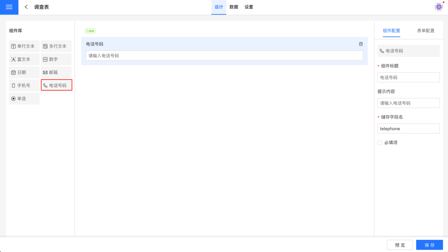
Phone Number Component
The phone number component is used to collect users' fixed phone numbers and supports the following configurations:
- Component Title: The title displayed by the component, default is "Phone Number."
- Placeholder Text: A prompt for input, default is "Please enter your phone number."
- Storage Field Name: The field name where the collected data is stored in the database. Once set, it can be modified, with the last modification taking precedence.
- Required Field: When this option is checked, the field cannot be left empty during form submission.
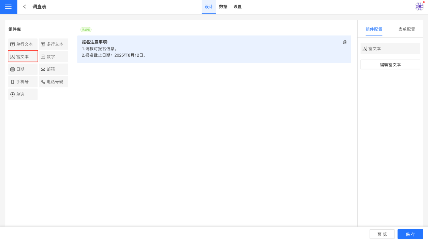
Rich Text Component
The Rich Text component is different from other components; it only displays form-related information, such as tips and notes, without collecting data. The Rich Text component has no configuration options, only an edit button. Please click link to learn how to write Rich Text components.
Component Operations
Components support delete and move operations.