Common Filters
Common filters are the most frequently used type of filter; they query data by filtering on a field. They include
The common filters described in this article are local filters—they affect only the charts within the current Dashboard and have no impact on charts in other Dashboards inside the App.
Text Filter
In common filters, a filter that uses text fields to screen data is called a Text Filter. For example, when analyzing nationwide sales in shopping malls, you may need to filter by city and mall; the filters for city and store are Text Filters.
A Text Filter supports one (single-select) or multiple filter conditions (multi-select). Details are provided below.
Adding a Text Filter
Follow the steps below to add a text filter to a Dashboard.
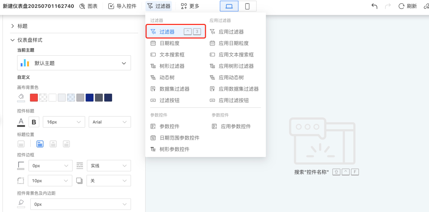
Click New Filter -> Filter to create a new filter.
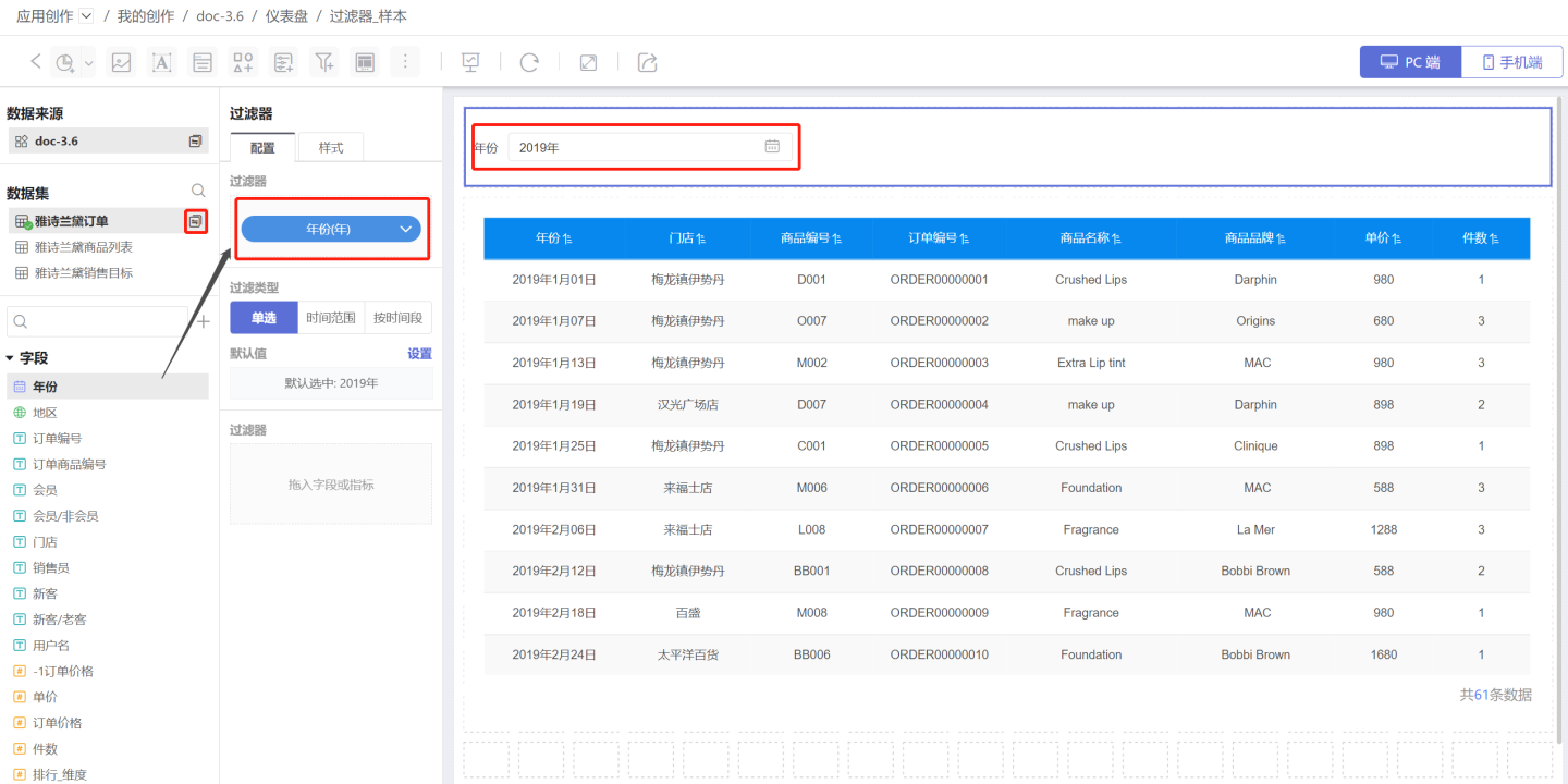
Select the data source for the filter and drag the text field you want to filter into the newly created filter. In the example, the field “City” is dragged in.
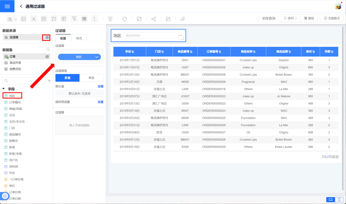
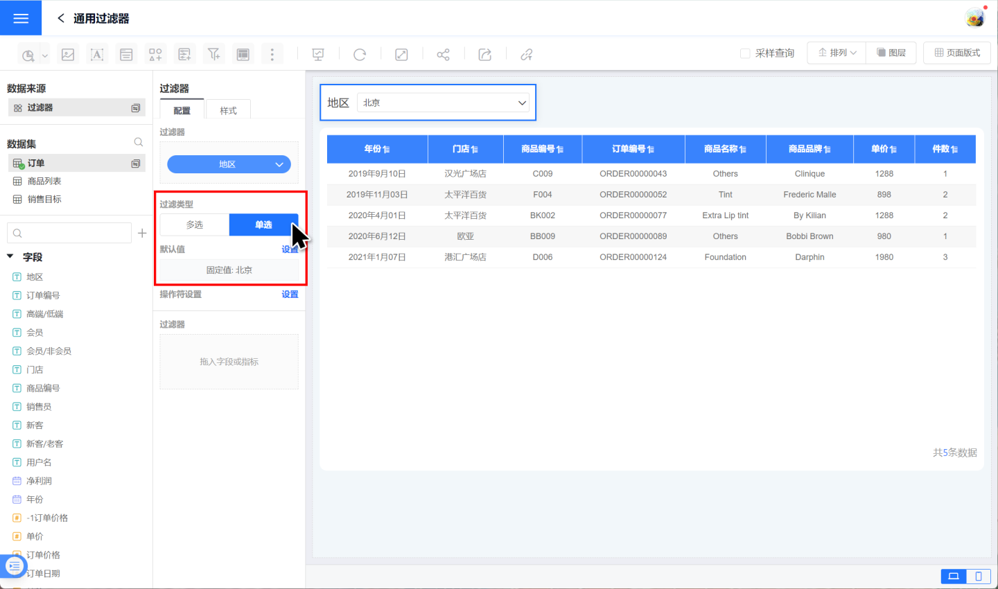
Choose the filter type and set the filter default value. In the example, the single-selection type is chosen and the default value is set to “Beijing”.
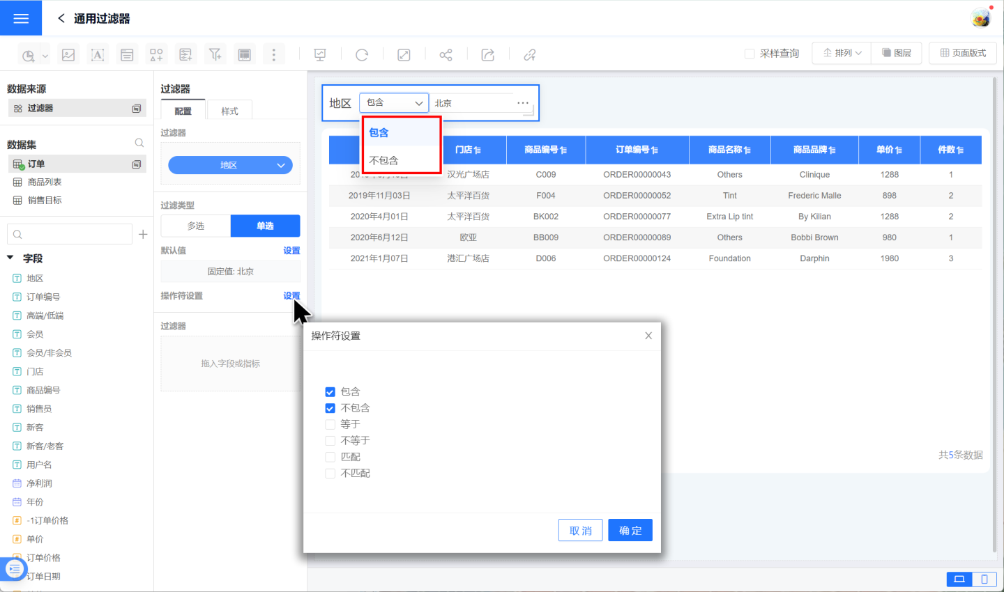
Configure the filter operators, i.e., the ways the filter options behave. In the example, both “include” and “exclude” options are provided.
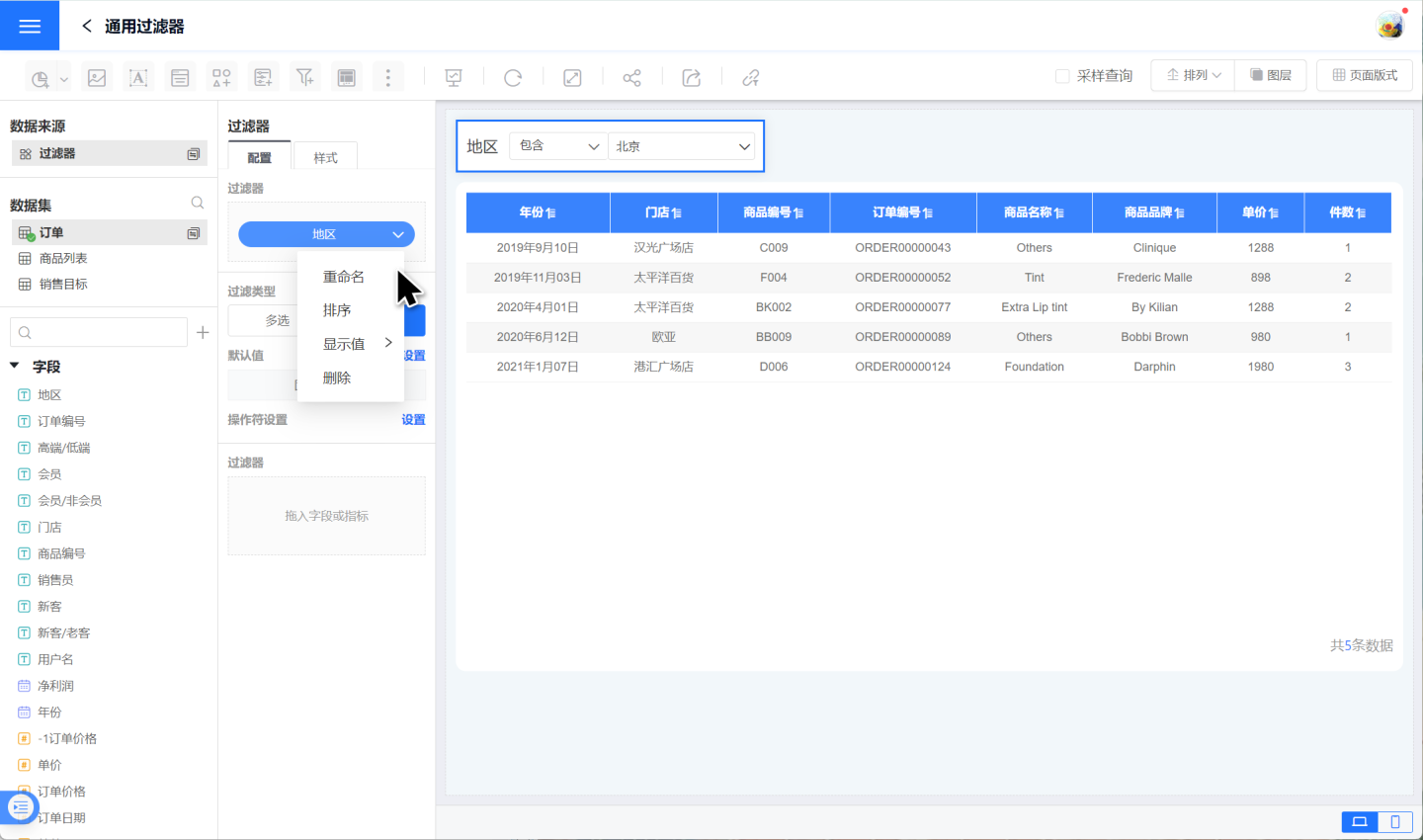
Click the downward arrow next to the filter field to rename, sort, or adjust display values for the field.
With the above steps, the text filter setup is complete. For detailed information on the default values and operators mentioned in the example, please refer to the sections below.
Configure Text Filter Defaults
After adding a text filter, you need to set its filter values based on the content displayed in the chart. Text filters are divided into single-select and multi-select types.
1. Configure a Single-Select Text Filter
The single-select filter type allows data to be filtered by only one option. Default-value configuration methods are:
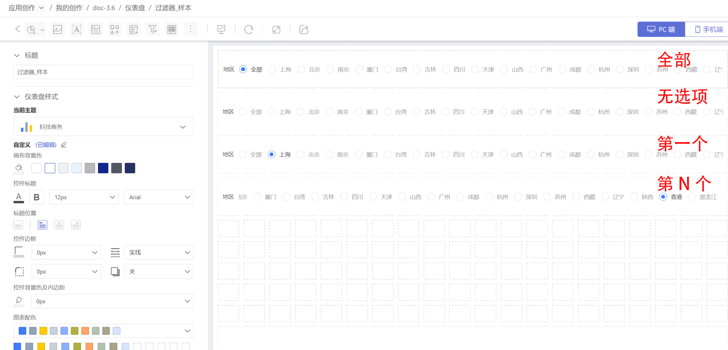
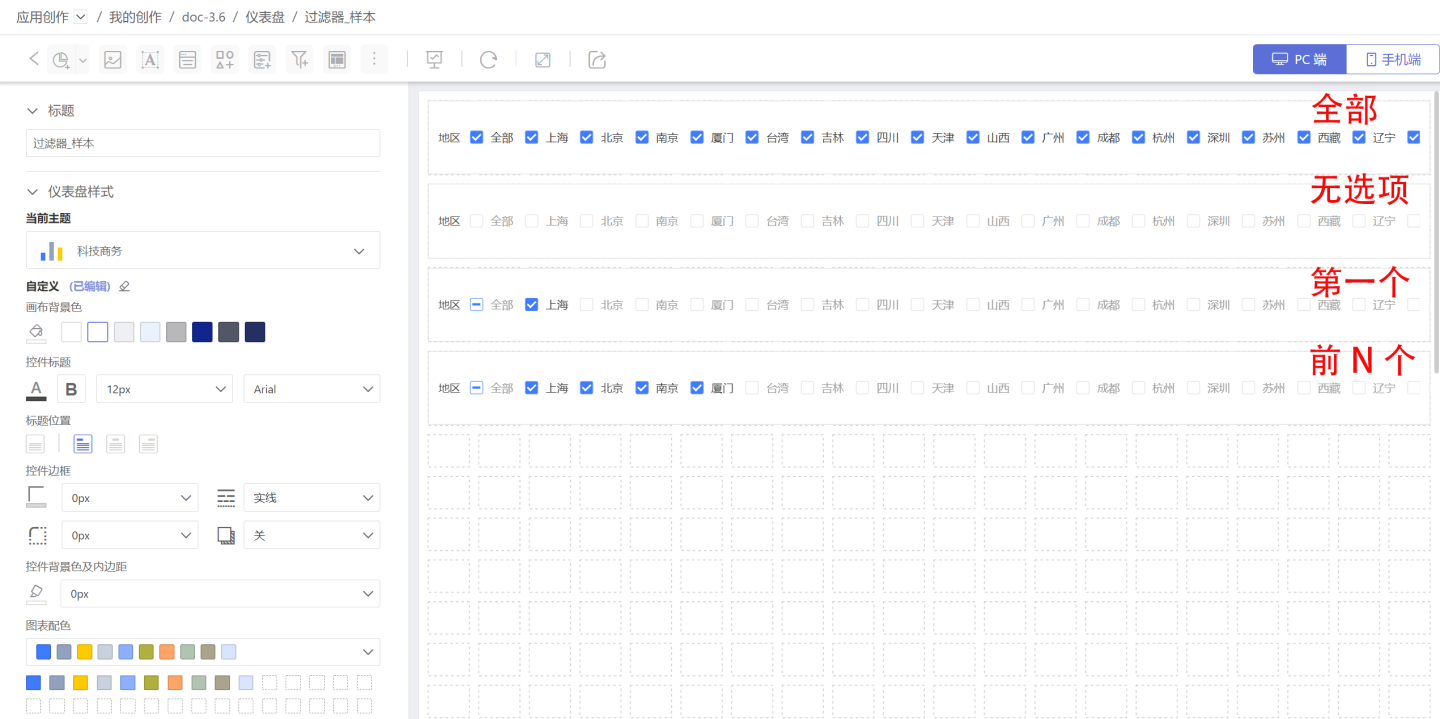
Dynamic Selection: Dynamically set the filter’s default value; supports All, None, First, and Nth options. The example below shows how the filter appears under dynamic selection.
- All: Selects the “All” option and displays the full data set.
- None: No option is selected when the filter loads, and the full data set is shown.
- Custom Filter: Use an expression to dynamically set the filter’s default value.
- First: Selects the first option in the list and filters data accordingly.
- Nth: Selects the Nth option in the list and filters data accordingly.
Fixed Selection: Designate a specific option as the default value.
Filter Style Settings: In the Style panel you can set the title, display style, selection state, etc. Both dropdown and tile layouts are supported.
After creating the filter, test it to ensure it meets design requirements and supports your analysis needs. 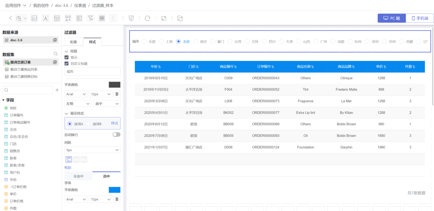
2. Configure a Multi-Select Text Filter
A multi-select filter lets users filter data by choosing one or more options. Default-value configuration methods are:
Dynamic Selection: Dynamically set the filter’s default value. Supported modes: All, None, Custom, First, Top N. The example below shows how the filter appears under dynamic selection.
- All: Selects every option and displays the full dataset.
- None: No option is selected when the filter loads; the full dataset is shown.
- Custom Filter: Use an expression to set the default value dynamically.
- First: Selects the first option in the list and filters data accordingly.
- Top N: Selects the first N options and filters data with them.
Fixed Options: Pick one or more specific options as the default and filter data by them.
After the configuration is complete, you can style the title, display mode, selection state, etc. Both dropdown and tile layouts are supported.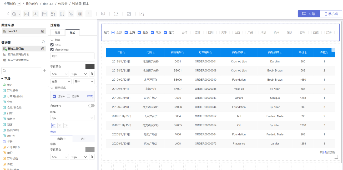
3. Notes
- Enable “All” Option: This toggle quickly turns the “All” option in the filter on or off and allows you to customize its label. The text shown inside the filter control will read “All” or your custom wording, e.g., “All Cities,” “All Stores,” etc.
- When the filter is configured with a hierarchical relationship in Global Settings, the default value of the child filter will change according to the selection made in the parent filter. Refer to the relevant instructions in Global Settings.
- Once set, the filter’s default value remains fixed.
Filter Operators
Filters support multiple operators for data filtering in different business scenarios.
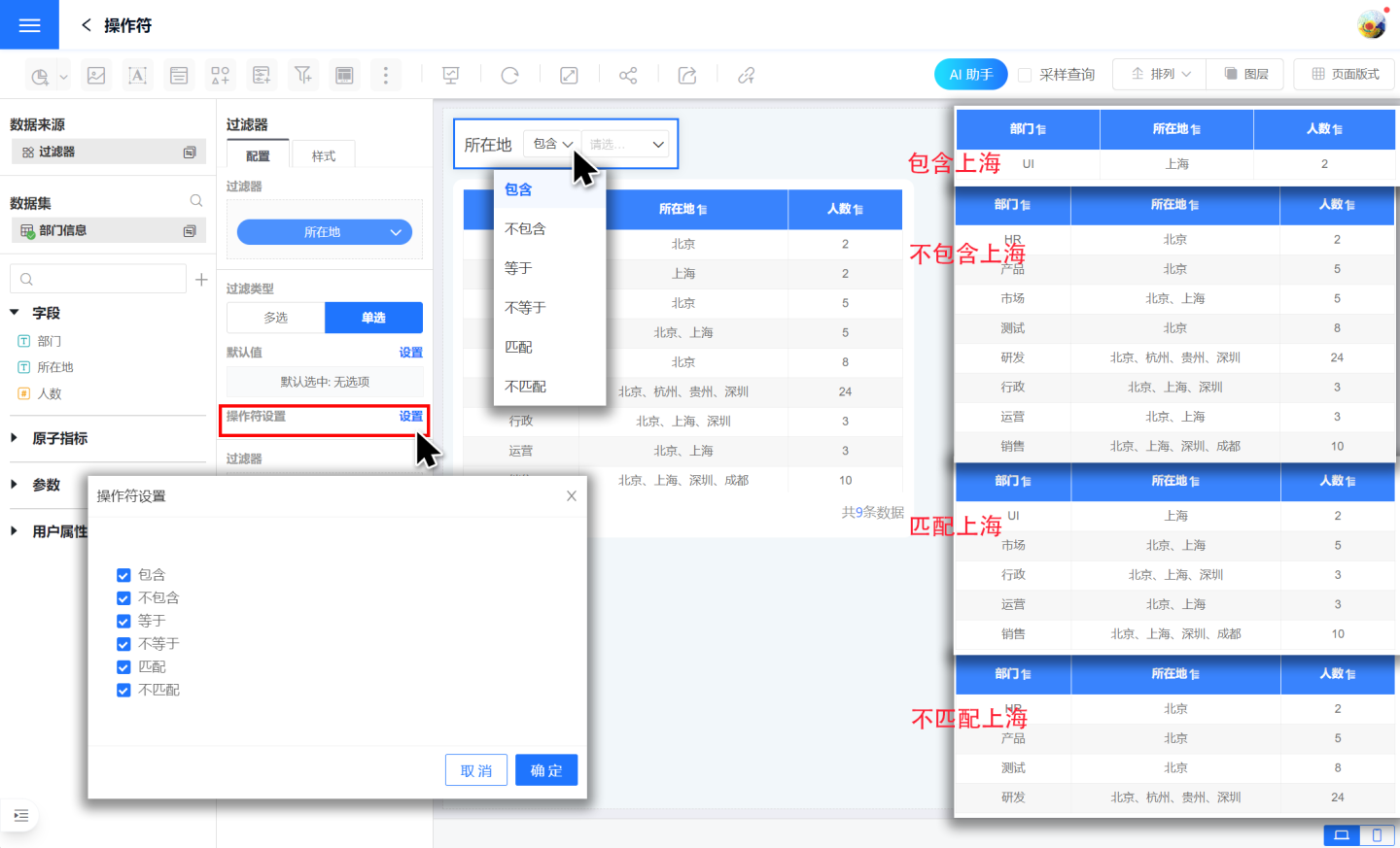
Single-select operators include Contains, Does Not Contain, Equals, Not Equals, Matches, and Does Not Match.
- Contains: Filters for data that includes the selected option. For example, if "Location" contains "Shanghai", it returns records where "Location" = "Shanghai".
- Does Not Contain: Excludes data that includes the selected option. For example, if "Location" does not contain "Shanghai", it returns records where "Location" ≠ "Shanghai".
- Matches: Filters for data that matches the selected option. For example, if "Location" matches "Shanghai", it returns records such as "Location" = "Shanghai" or "Location" = "Beijing, Shanghai".
- Does Not Match: Excludes data that matches the selected option. For example, if "Location" does not match "Shanghai", it excludes records like "Location" = "Shanghai" or "Location" = "Beijing, Shanghai".
- Equals: Functions the same as Contains.
- Not Equals: Functions the same as Does Not Contain.
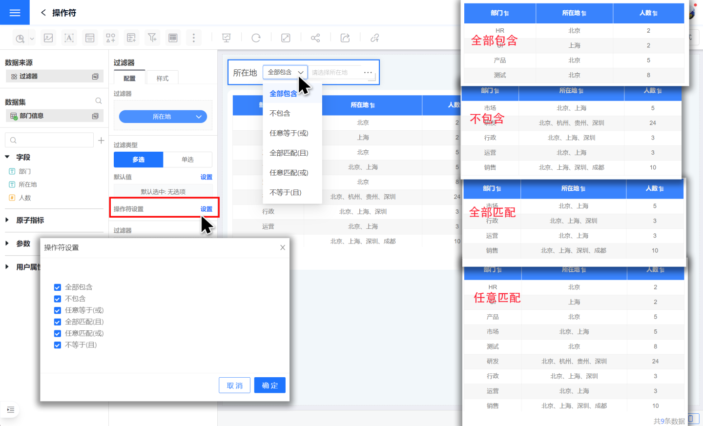
Multi-select operators include Contains All, Does Not Contain, Match All (AND), Match Any (OR), Equals Any (OR), and Not Equals (AND).
- Contains All: Returns data that includes every selected option. For example, if "Location" contains all of "Shanghai" and "Beijing", it returns records where "Location" = "Shanghai" and "Location" = "Beijing".
- Does Not Contain: Excludes data that includes any of the selected options. For example, if "Location" does not contain "Shanghai" or "Beijing", it returns records where "Location" ≠ "Shanghai" AND "Location" ≠ "Beijing".
- Match All (AND): Returns data that matches every selected option. For example, if "Location" matches all of "Shanghai" and "Beijing", it returns records that match both "Shanghai" and "Beijing".
- Match Any (OR): Returns data that matches at least one selected option. For example, if "Location" matches any of "Shanghai" or "Beijing", it returns records that match either "Shanghai" or "Beijing".
- Equals Any (OR): Functions the same as Contains All.
- Not Equals (AND): Functions the same as Does Not Contain.
Time Filter
In common filters, a filter that uses a time field to screen data is called a Time Filter. For example, when reviewing the nationwide sales performance of a product in 2019, you need to add a Time Filter to achieve this.
A Time Filter can filter information by time point, time range, or time period. Details are explained below.
Adding a Time Filter
Add a time filter to the Dashboard.
Click New Filter -> Filter to create a new filter, then resize and reposition it as needed.
Select the Dataset that contains the field to be filtered, and drag the required time field into the newly created filter.
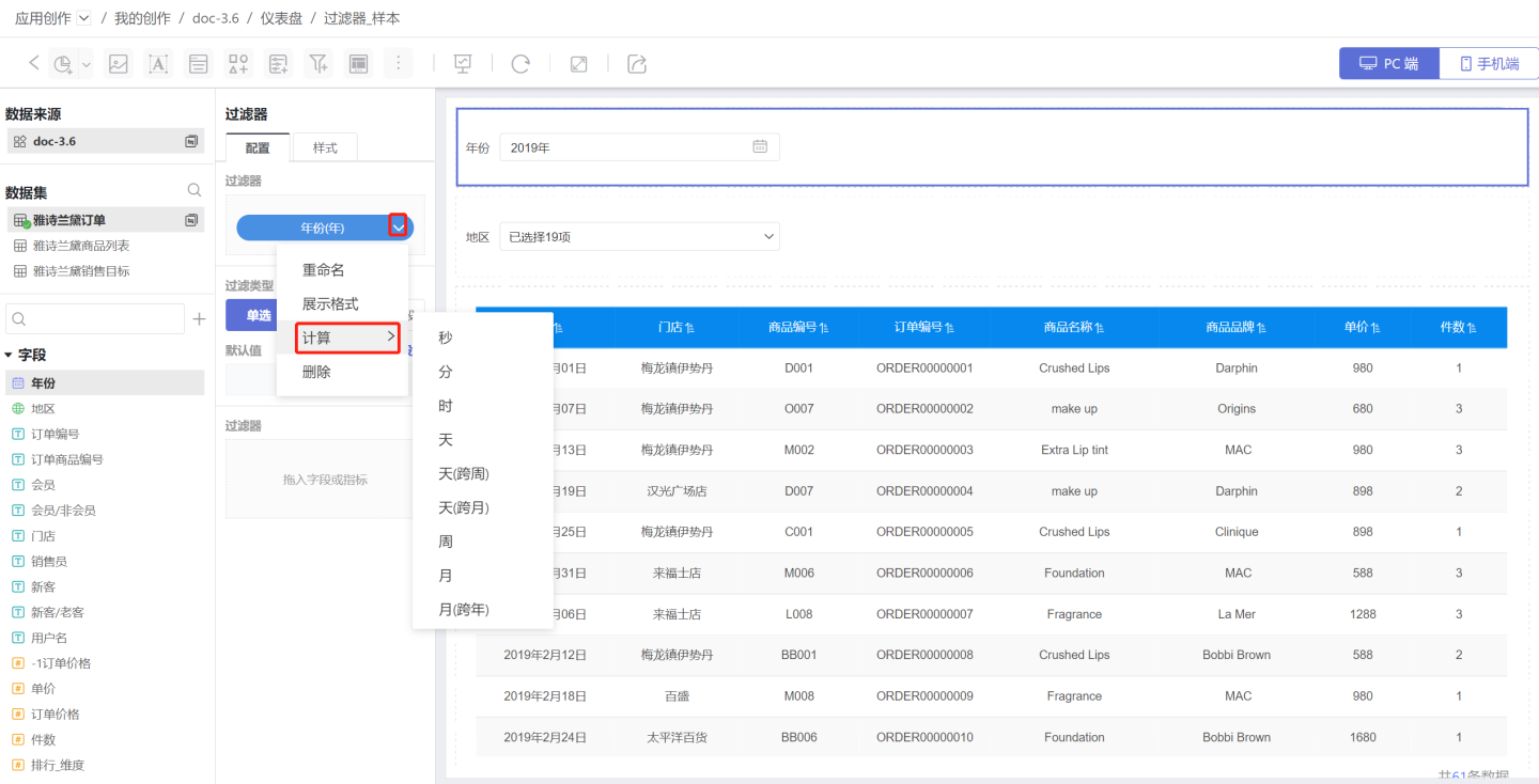
Adjust the filter granularity (year, month, day, etc.) and the display format of the time filter according to your needs.
Mobile filter calendar single-date interaction: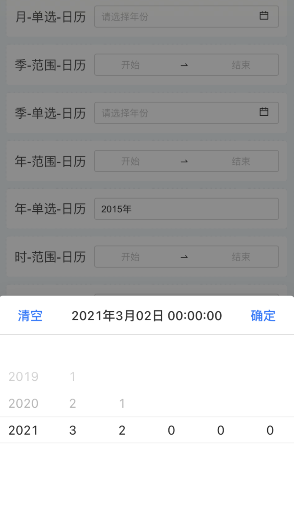
Mobile filter calendar date-range interaction: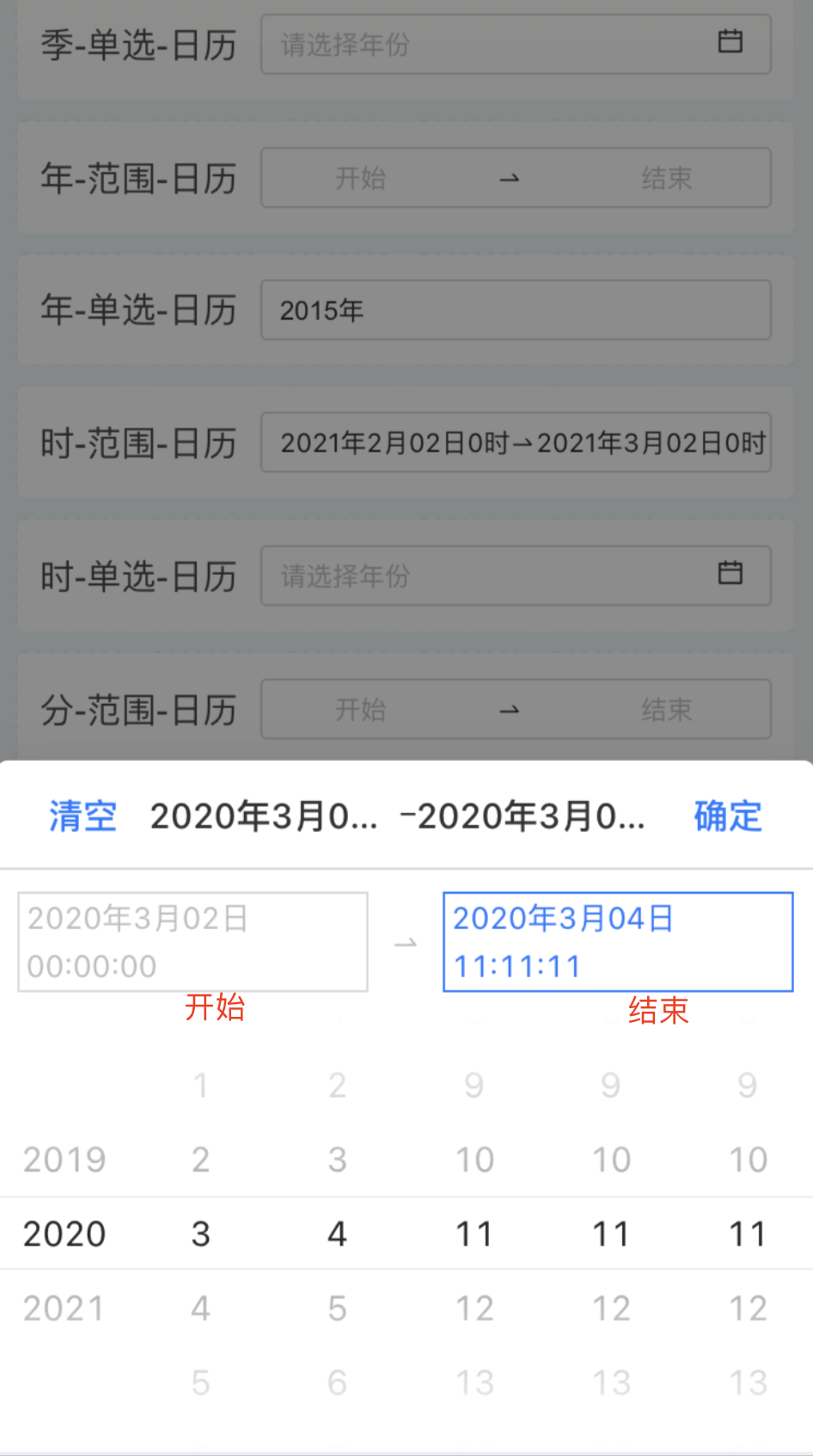
Configure Default Values for Time Filters
Time filters are categorized by filter type into single selection, time range, and time period.
1. Configure a Single-Select Time Filter
A single-select time filter is used to filter data for a specific point in time.
Default value options:
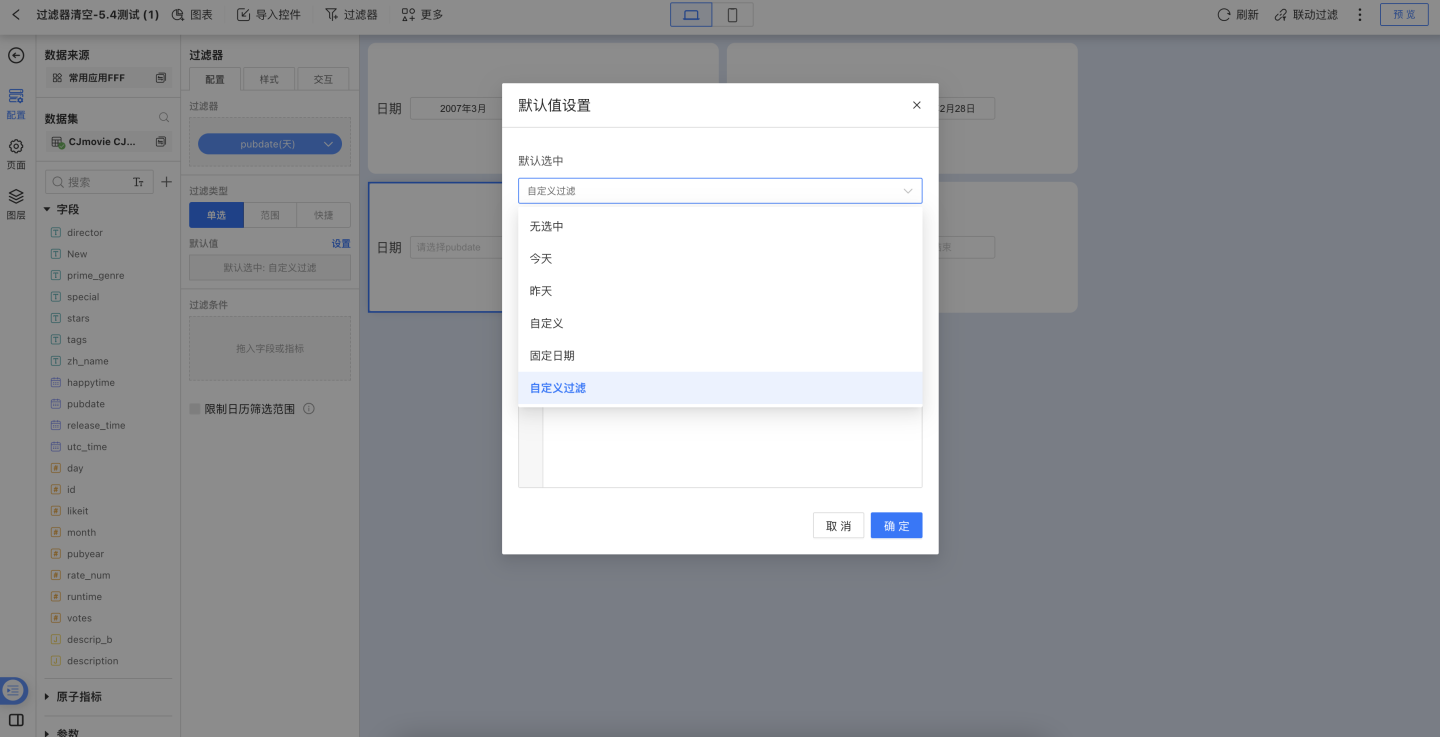
- None selected: No option is selected when the filter is displayed; no filtering is applied and all data is shown.
- Today: Defaults to today and filters the data accordingly.
- Yesterday: Defaults to yesterday and filters the data accordingly.
- Custom: Displays data for the previous N days; the filter pre-selects the field for the previous N days.
- Fixed date: Defaults to a fixed date and filters the data by that date.
- Custom filter: Allows writing an expression to filter dataset field values as the default filter value.
Tip
When the time unit is Year or Month, all options in the single-select list will switch to the same time unit.
2. Configure Time Range Filters
A time-range filter is used to slice data for a specific period.
Default value options:
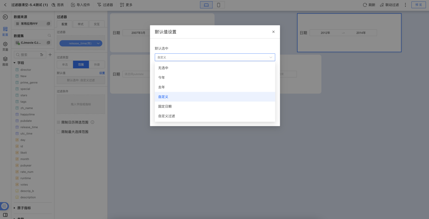
- None: No option is pre-selected; the filter is inactive and all data is displayed.
- This Year: Pre-selects the current year and filters data to that range.
- Last Year: Pre-selects the previous year and filters data to that range.
- Custom: Pre-selects a user-defined time range and filters data accordingly.
- Fixed Date: Pre-selects a fixed date range and filters data to that range.
- Custom Filter: Accepts an expression that returns dataset field values. When the expression yields multiple dates, the earliest and latest values are used as the default range.
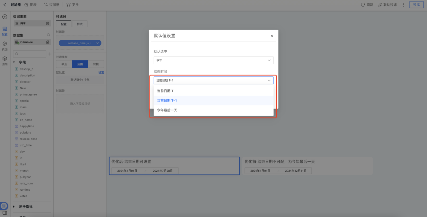
When the date field’s granularity is “Day / Hour / Minute / Second”, choosing This Year, This Quarter, This Month, or This Week as the default lets you set the end date to “Current Day T”, “Current Day T-1”, or “Last Day of XX”.
Filter appearance settings: you can configure the title, display style, and selected state. Both dropdown and tile layouts are supported.
TIP
If the time unit is Month or Day, the units in the time-range options adjust automatically.
When picking a date range, quick-selection shortcuts are available.
3. Configure Quick Time Filters
Quick time filters refer to the system-provided shortcut time ranges; users select the desired option based on their business scenario to filter data by the chosen period.
Custom Quick Time Ranges
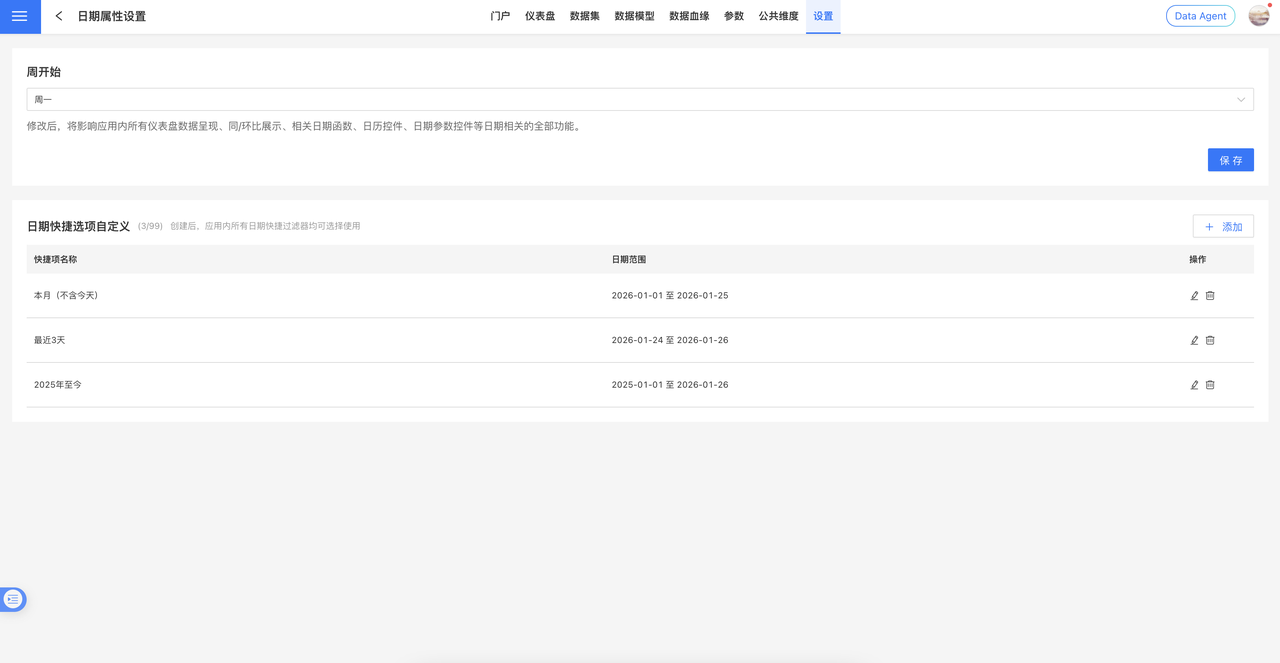
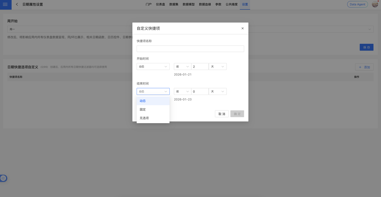
Version 6.2 introduces application-level custom date quick options. System administrators can centrally configure date quick items in App Settings > Date Attribute Settings, achieving “configure once, apply across the entire app.”
Applicable Scenarios:
- Date Range Filter
- Quick Date Filter
- Date Range Parameter Control
Configuration Notes: After configuration, the quick time range options in the above scenarios will be displayed uniformly according to the global settings, ensuring a consistent user experience throughout the system.
Quick Time Range Settings
Default value configuration: As shown in the image, tick the system-supplied time ranges on the left; the right panel displays the selection and the default range. Drag the button inside red box [1] to reorder the filter options.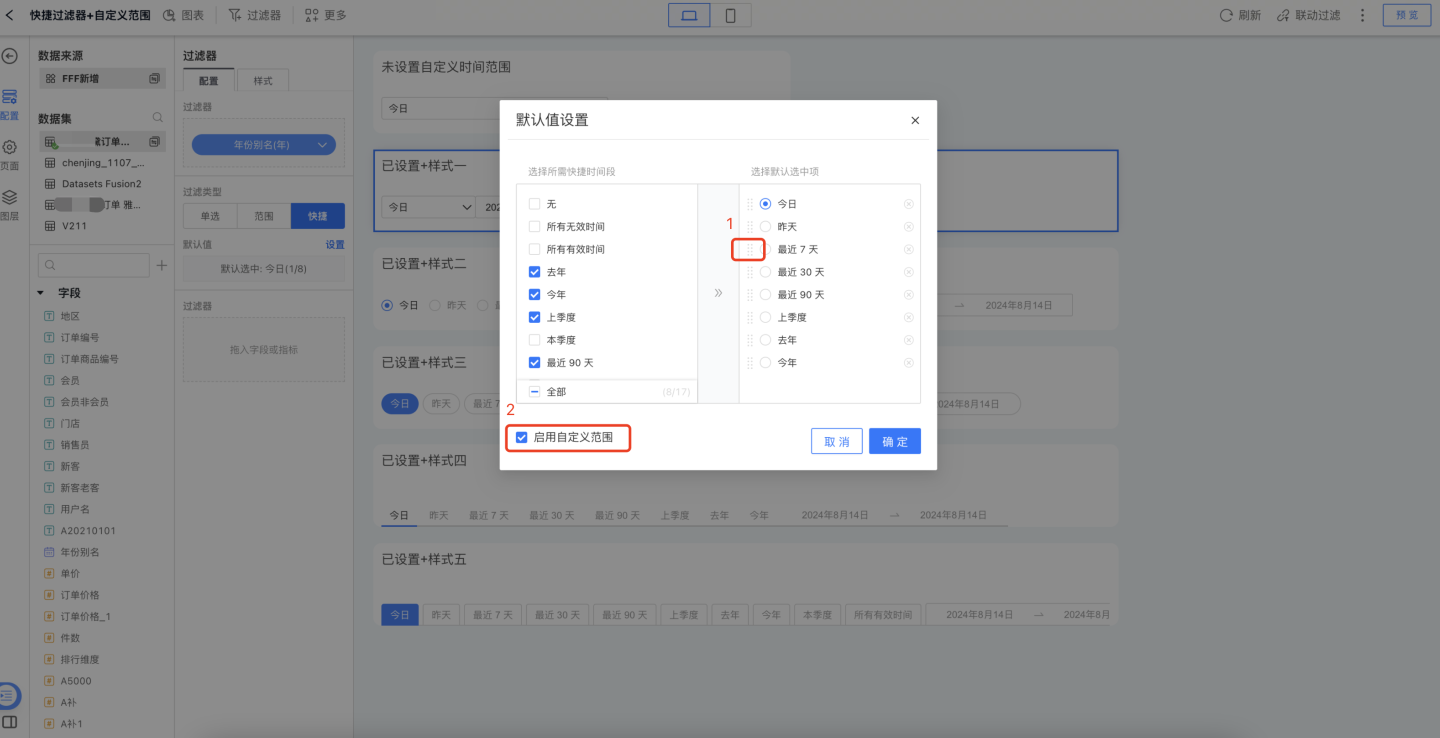
When users enable the quick date filter, ticking the option in red box [2] of the previous image allows them to define a custom start and end date, accommodating individual filtering needs. The display effect is shown below.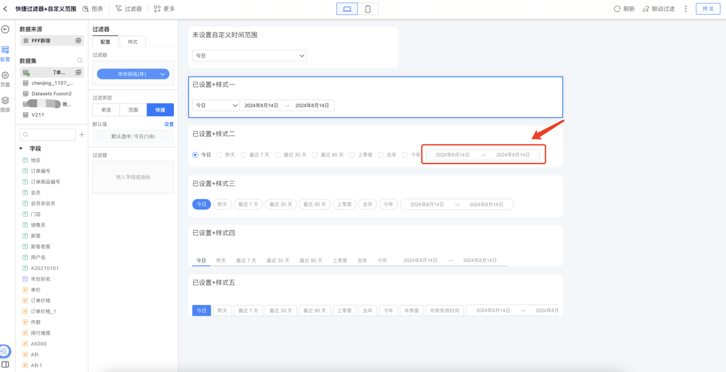
Filter style settings: You can configure the title, display style, and selected state in the Style tab. Both dropdown and tile layouts are supported.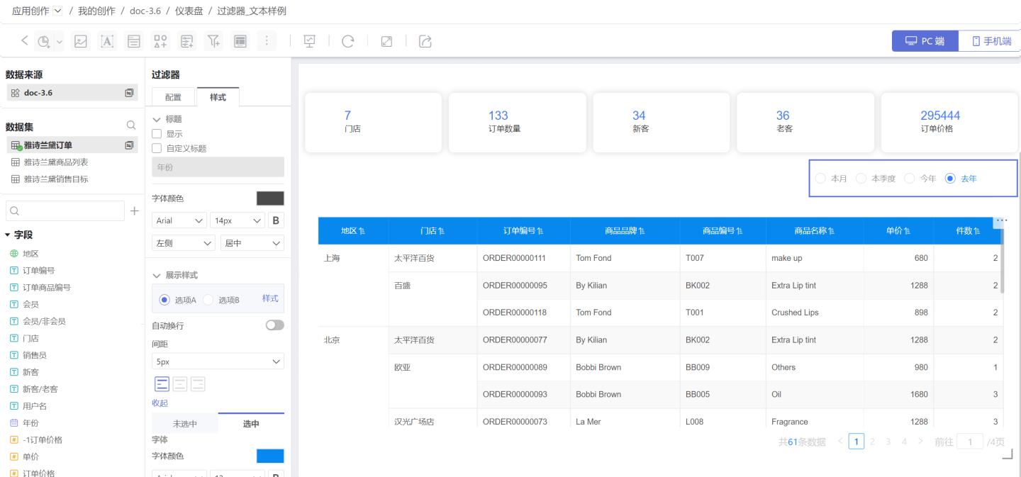
Additional Notes on Time Filters
When setting default values for Single Select and Time Range filter types, the time unit of the options changes with the filter field configuration. For example, if the filter field is set to Month, the options become This Month and Last Month; if the filter field is set to Day, the options become Yesterday and Today.
When the filter field is set to Day (cross-week), Day (cross-month), Month (cross-year), or Quarter (cross-year), the time values are displayed as text. For instance, when the time is set to Day (cross-week), the filter options are
Monday,Tuesday,Wednesday,Thursday,Friday,Saturday,Sunday. In this case, only Single Select and Time Period filter types are available. For Single Select default value configuration, refer to the corresponding setup described in Text Filter.
Add Range Limits to the Time-Filter Calendar
When data analysts add a date filter to a Dashboard, they often want to restrict the time span users can query. This prevents performance degradation and excessive platform-resource consumption caused by overly broad date ranges. There are two ways to enforce a limit:
- Restrict the calendar’s selectable range—non-selectable dates are grayed out.
- Restrict the maximum interval a user is allowed to select.
Restrict Calendar Selection Range: After enabling this option, the calendar’s selectable interval is bounded by the minimum and maximum values of the date field used in the internal filter. For example, if the internal filter yields 2021–2024, the calendar will only allow selection within 2021–2024. If no internal filter is configured, this setting cannot be activated.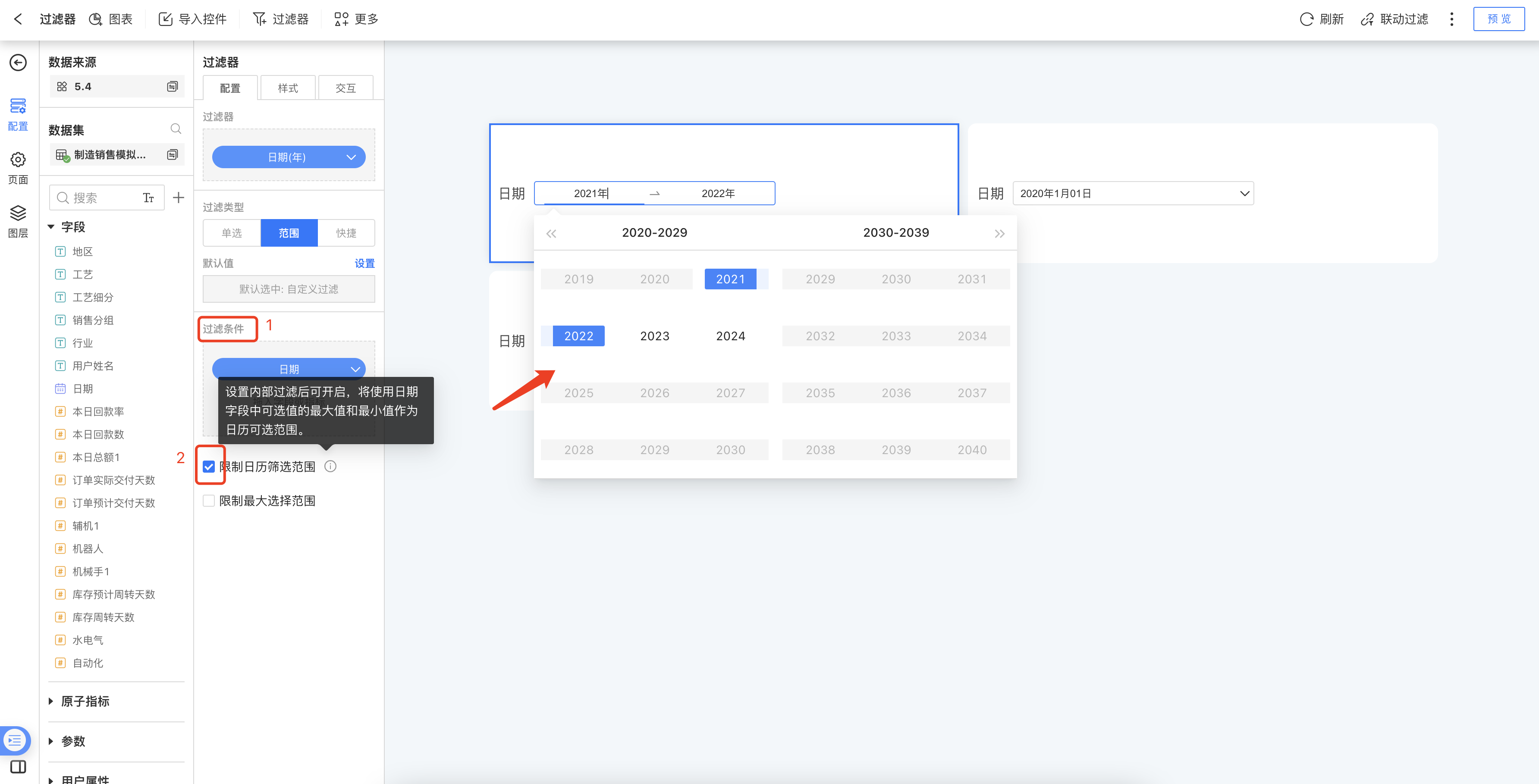
Restrict Maximum Selection Range: Once enabled, you can set the longest interval a user is permitted to select.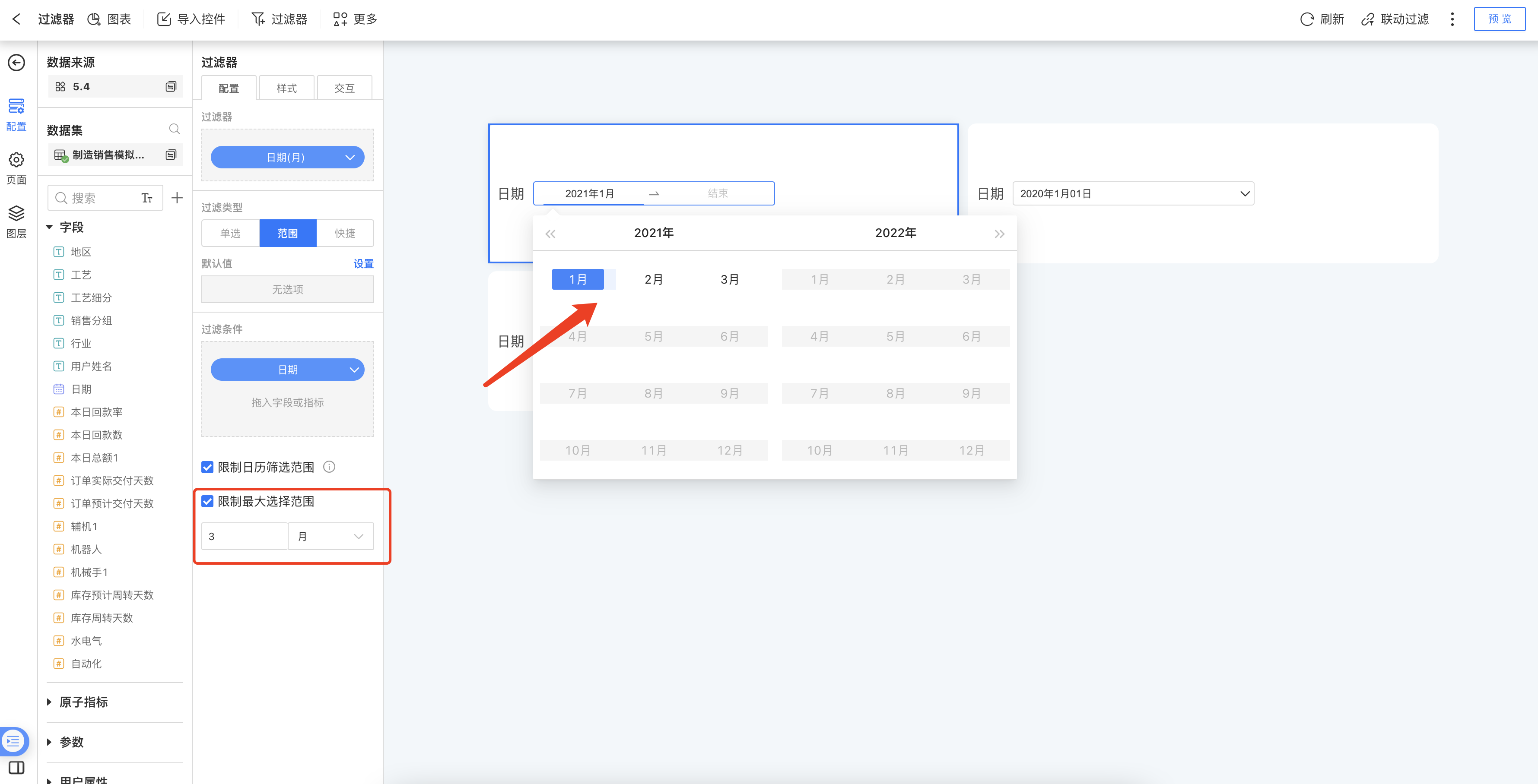
Numeric Filter
In the Common Filter, a filter that uses a numeric field to screen data is called a Numeric Filter. For example, when analyzing nationwide sales of a product in shopping malls, you can add a Numeric Filter to view orders whose unit price is greater than 1,000 yuan.
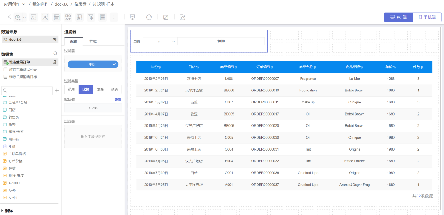
Numeric Filters support Range, Comparison, Single Select, and Multi Select to filter information. Details are provided below.
Adding a Numeric Filter
Add a numeric filter to the Dashboard.
- Click New Filter -> Filter, create a new filter, and adjust its size and position.
- Select the Dataset that contains the field to be filtered, and drag the numeric field you want to filter into the newly created filter.
Configure Default Values for Numeric Filters
Numeric filters are divided into four types: Range, Comparison, Single Select, and Multi Select.
1. Configure a Numeric Range Filter
A range filter screens for data that falls within a specified interval. Setup is straightforward: simply define the start and end values. You can type the numbers directly or drag the range slider. 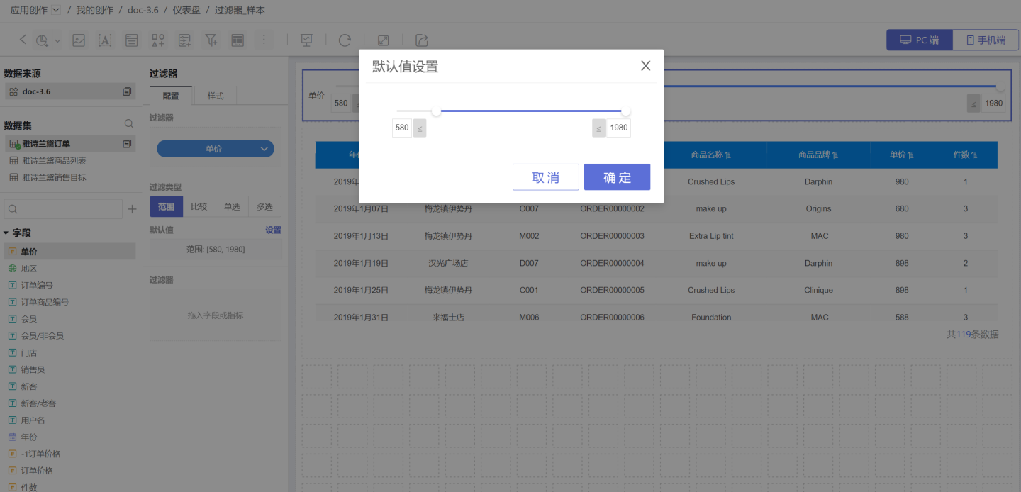
In the Style section, set the title, display format, and selection state. Both dropdown and tile layouts are supported. 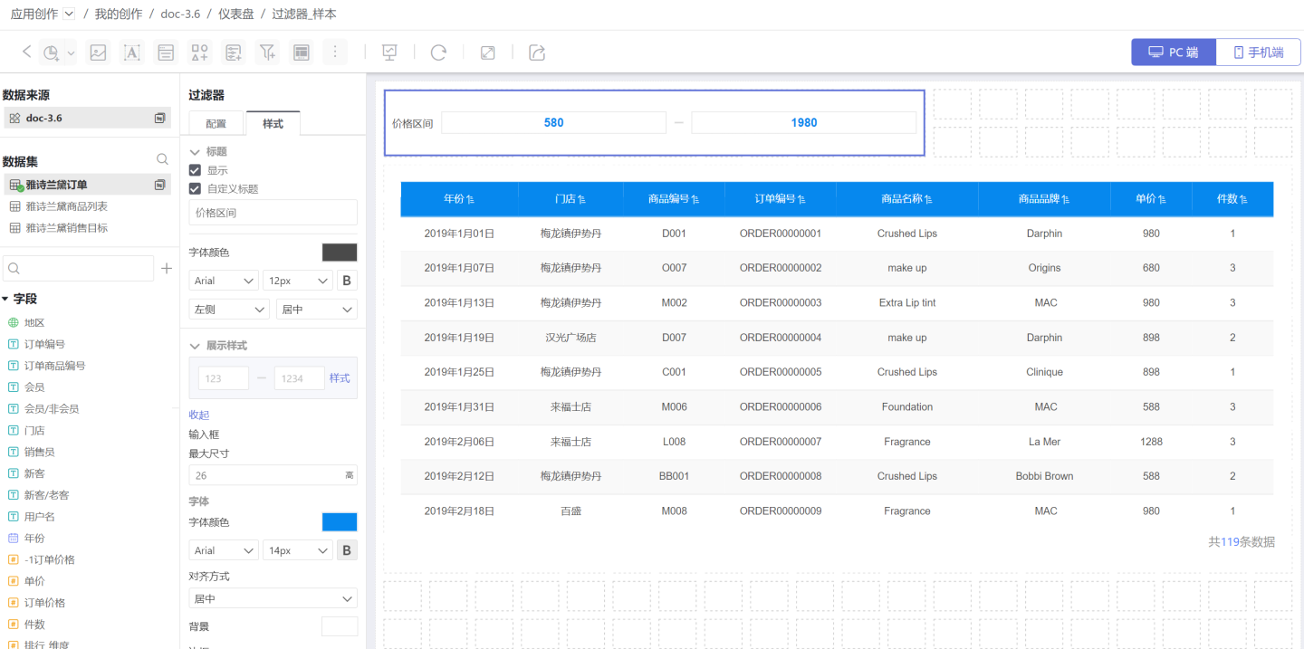
2. Configure Comparison-Type Numeric Filters
A comparison-type filter screens data when the filter option meets the specified comparison condition. When setting the default value, you must choose the comparison operator (red box in the image) and the comparison value (blue box in the image). The available operators are: Not Equal, Equal, Greater Than or Equal, Greater Than, Less Than or Equal, Less Than, Is Null, and Is Not Null. 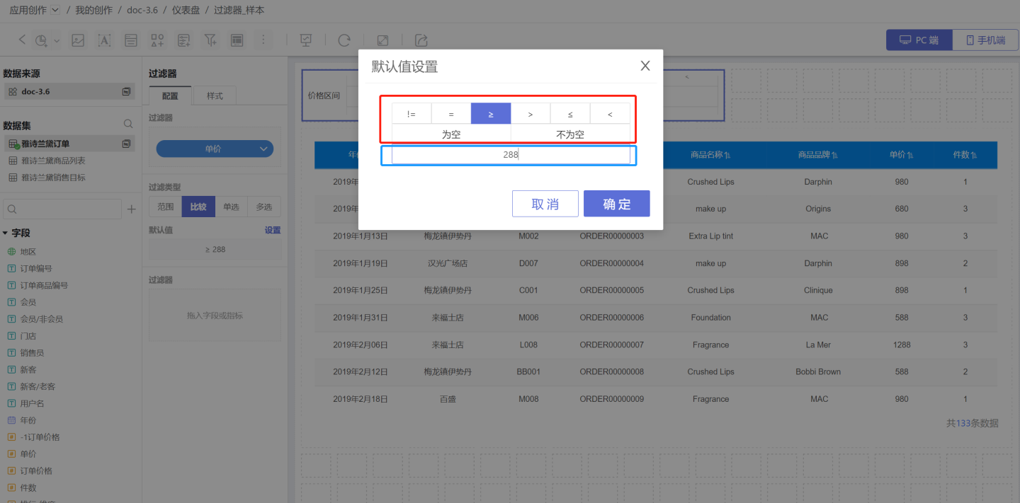 In the Style section, set the title, display style, selected state, etc. Two display styles are supported.
3. Configure Single-Select Numeric Filter
A single-select numeric filter filters data by choosing one numeric option, treating the numeric value as text. Please refer to Single-Select Text Filter for filter configuration.
4. Configure Multi-Select Numeric Filters
A multi-select numeric filter allows data to be filtered by one or more numeric options; in this case the numeric values are treated as text for selection. Please refer to Multi-Select Text Filters for filter configuration.
Inner Filter
An inner filter is a filter placed inside another filter, used to control the value range of the filter field. For usage and configuration details, please refer to Inner Filter.
Common Filter Examples
Example 1
The figure below shows an API monitoring system of a company, displaying API statistics and related information. In the system, API information can be viewed by API creation time (time filter), API call time (time filter), release status (text filter), and total call count (numeric filter). The example demonstrates querying API statistics for the past six months and APIs with a total call count greater than 100. 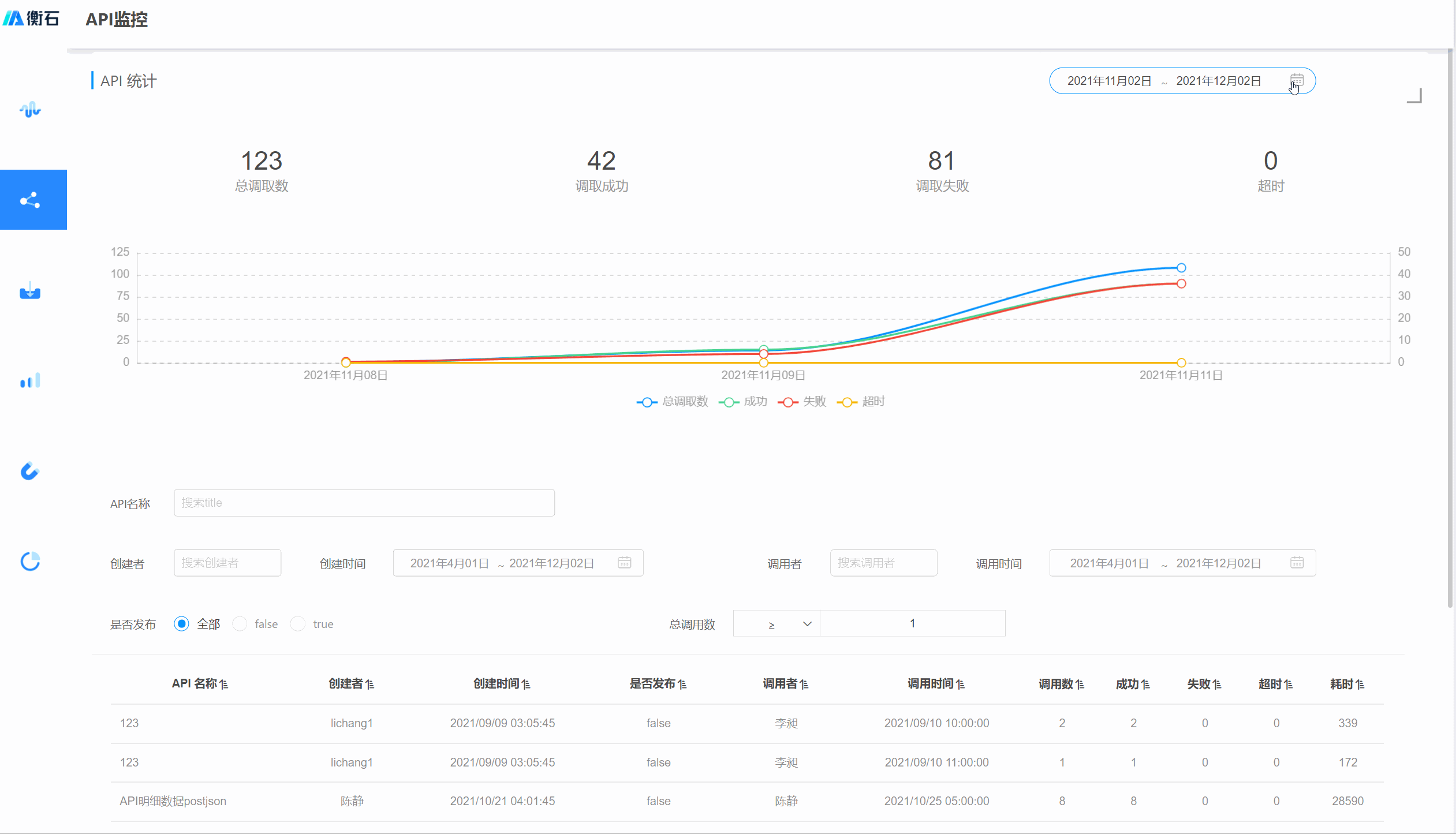
Example 2
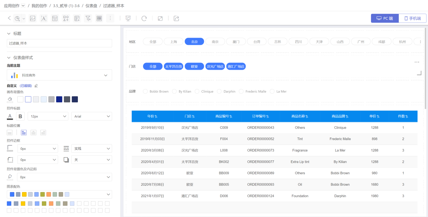
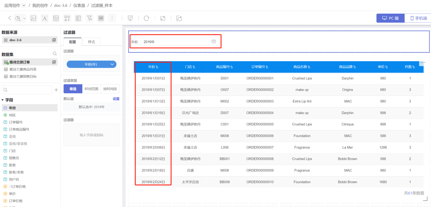
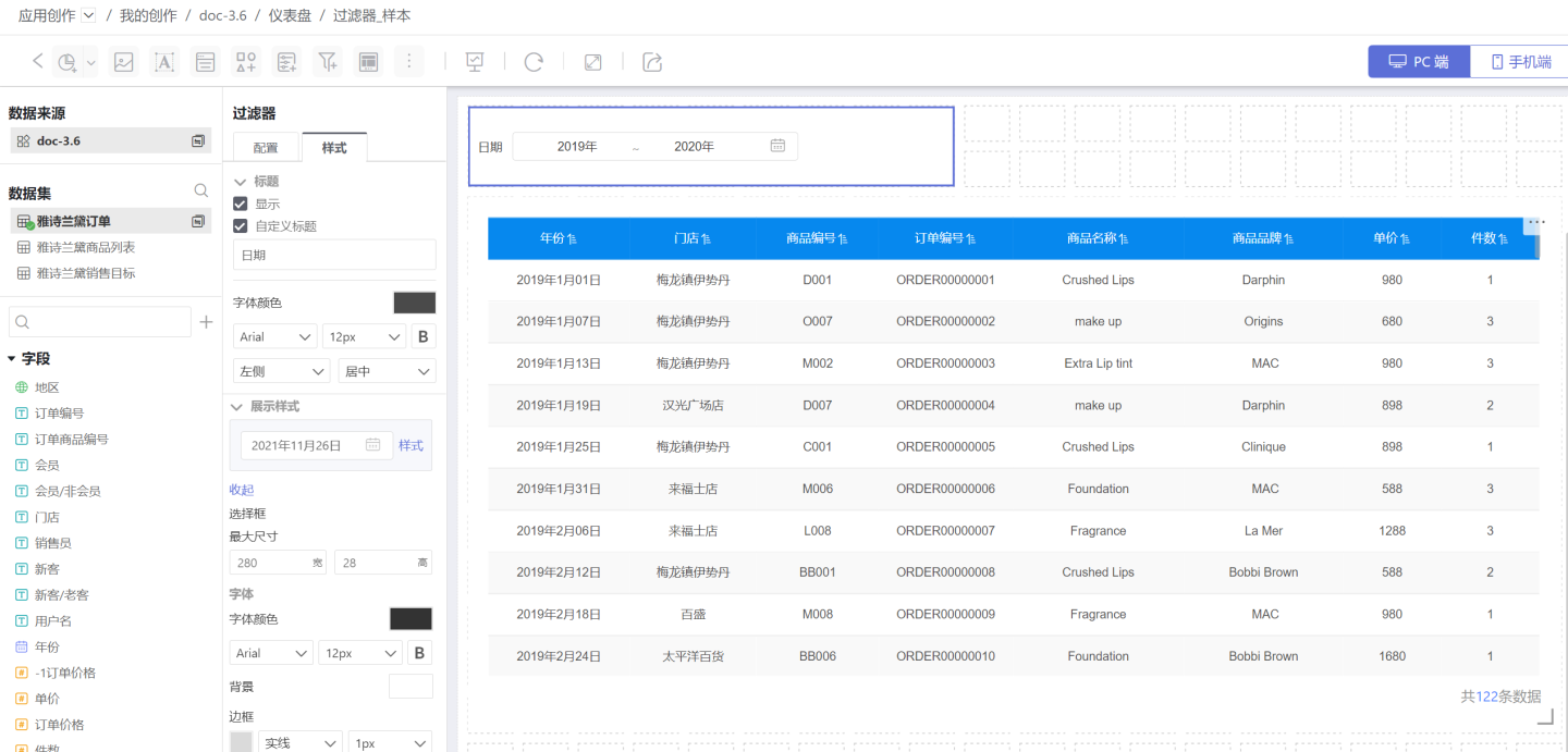
The image below shows an order inquiry system. Order information can be queried by year (time filter), time period (time filter), store, and order price (numeric filter), among others. 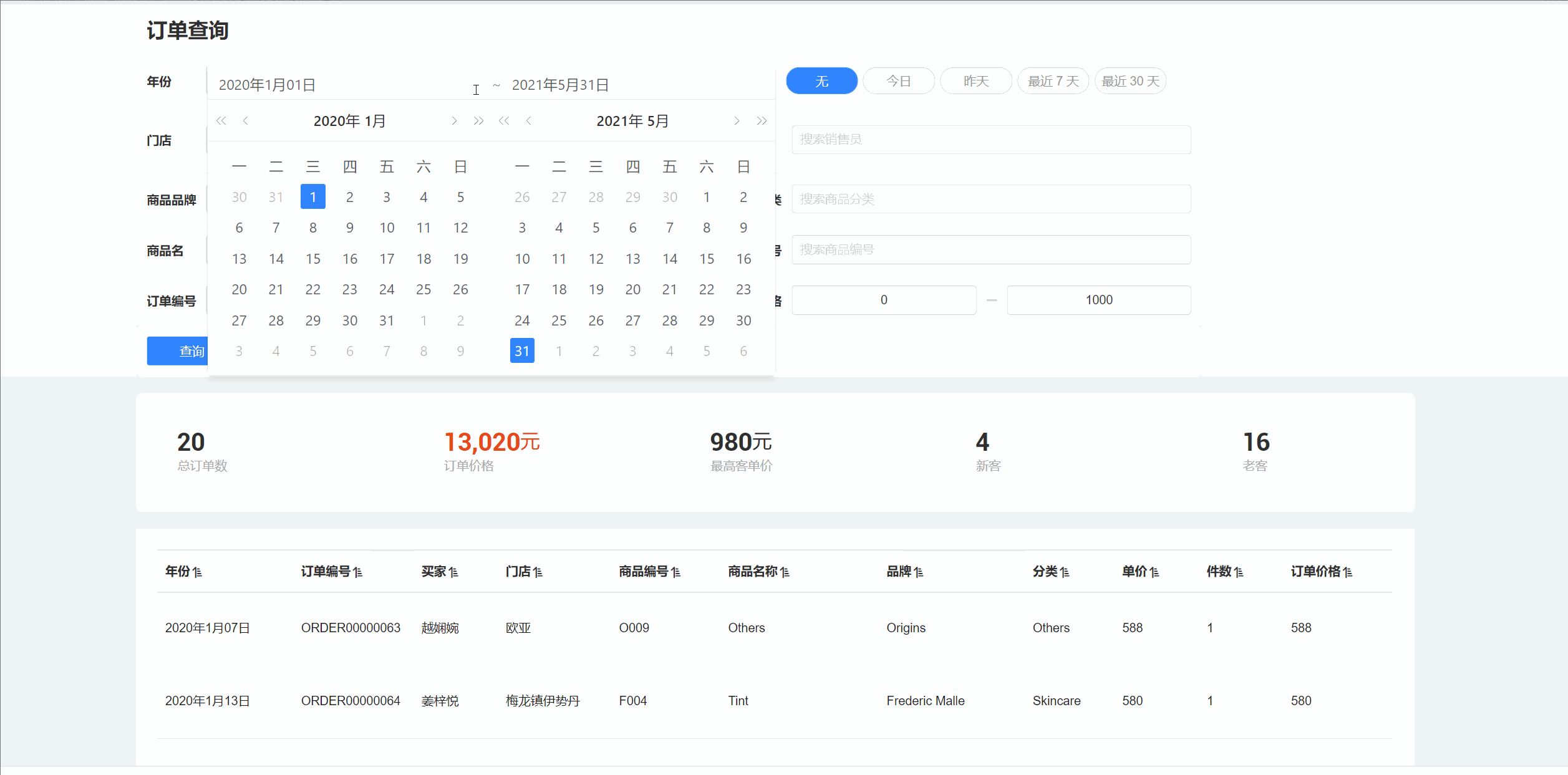
Common Filter Settings
Common filters support the following configurations:
- Control the content of filter fields by adding Internal Filters.
- Adjust the hierarchy among filters and make them interdependent through Global Settings.
- Save canvas space by moving to the sidebar section.
- Set the chart scope of filtering.