Chart
HENGSHI SENSE brings together a wide variety of visualization types and offers rich tools and convenient interactions, enabling data practitioners to explore and refine data on the fly and uncover hidden insights more efficiently.
This section walks through the chart interface of HENGSHI SENSE, covering its interactions and tools: 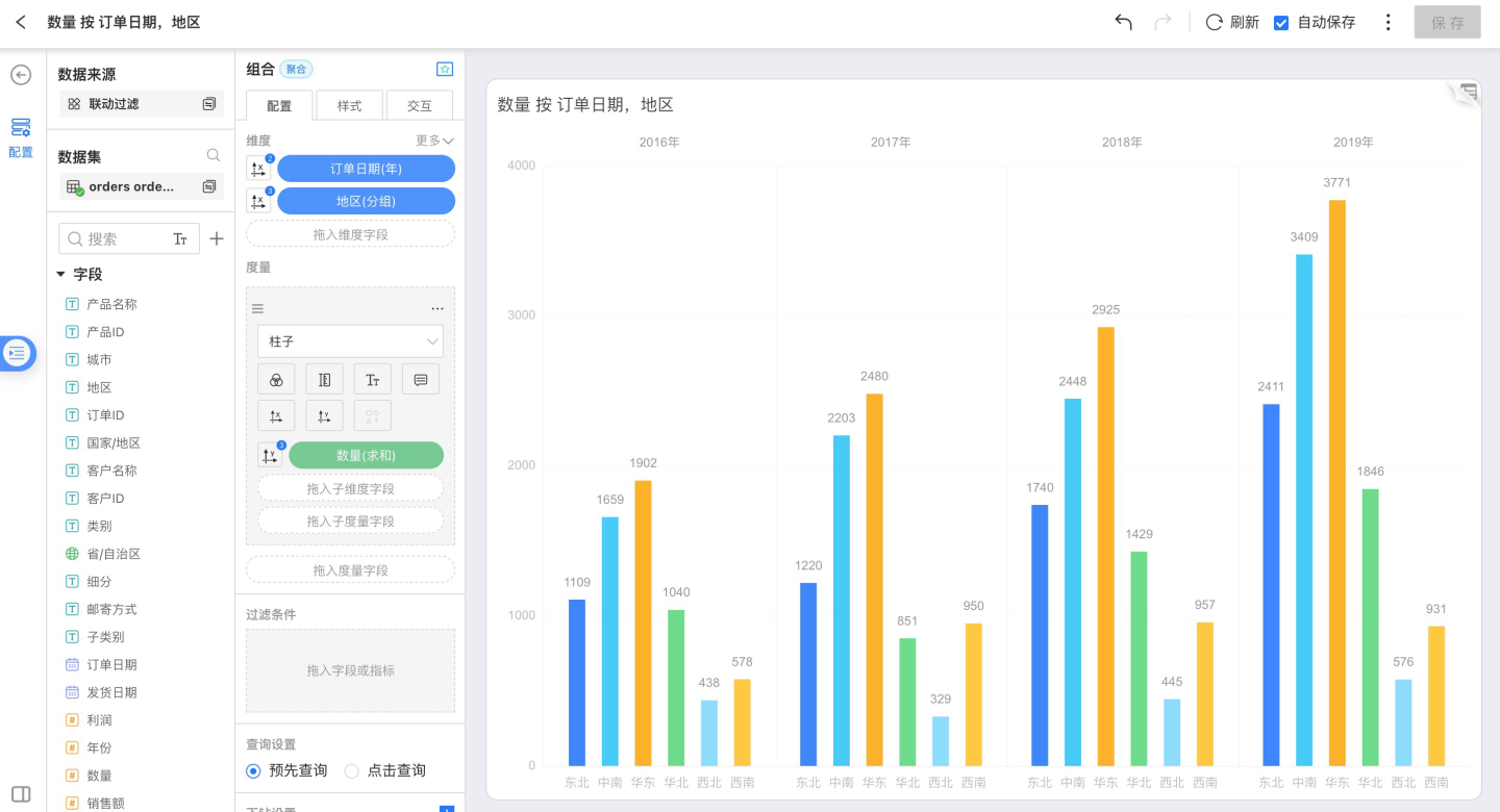
Creating Charts
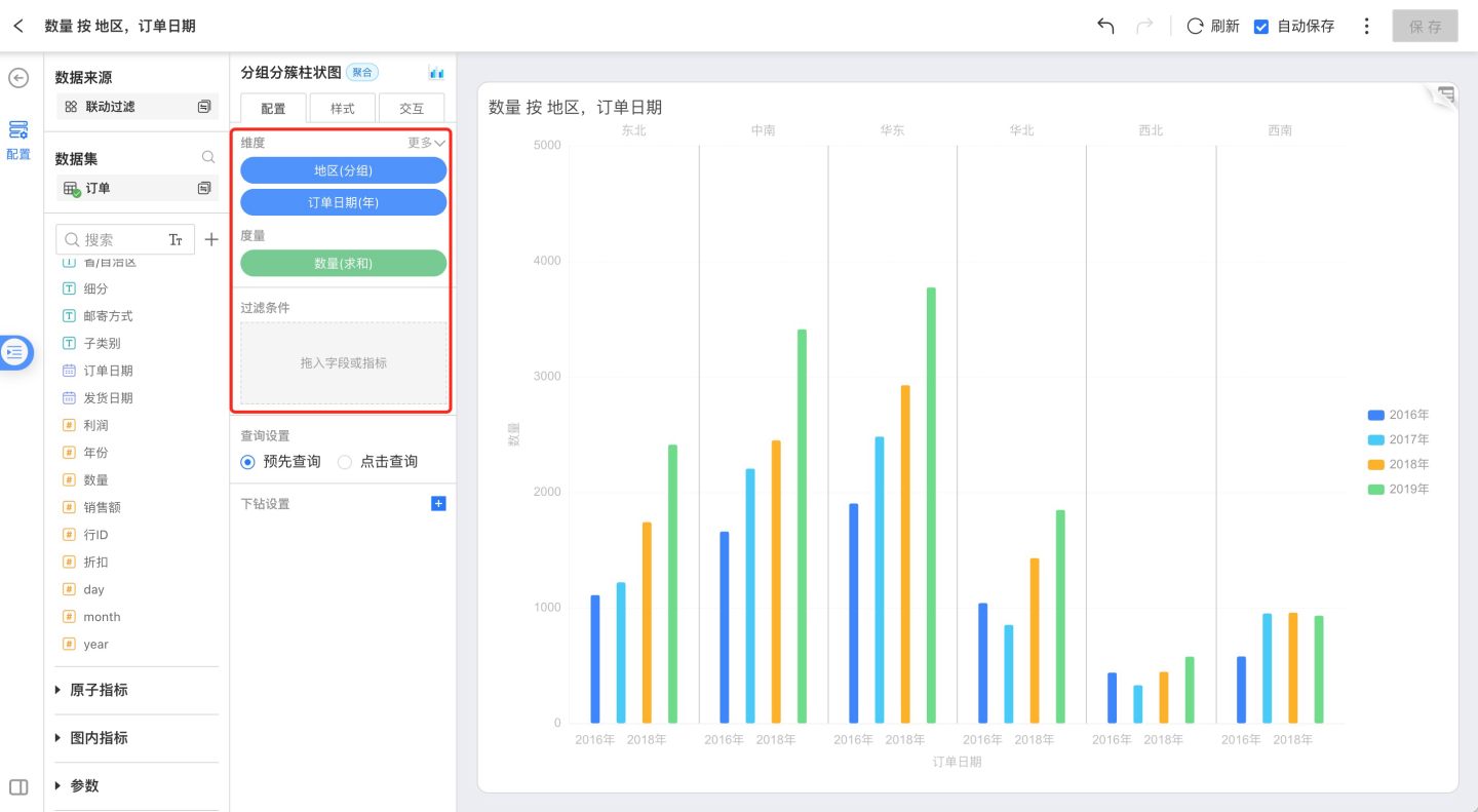
In an already-created Dataset, you can pick the chart type you need.
According to the requirements of each chart category, select dimension and measure fields, and the system will generate the chart automatically.
HENGSHI SENSE supports sharing Charts and collaborating on Apps among colleagues; for Charts under an App, you can use them directly or modify them before use.
Left Data Panel
Data
Select the created Dataset and use its data to build the required Chart; Datasets that have established relationships are linked to one another with lines. 
Click the Search icon to the right of a Dataset to jump directly to that Dataset’s management page. 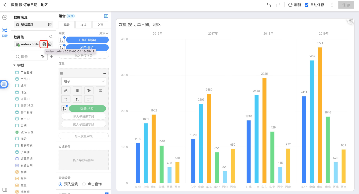
Fields and Measures
Fields
All original and newly-added fields in the current Dataset. If a field belongs to a group, the group hierarchy is displayed as a tree in the field list for quick navigation.Calculated Measures
All measures created within this Dataset. Their grouping information is also shown in the measure list.In-Chart Measures
Dimension and measure fields used inside the chart.
Drag fields into the configuration area to assign them as dimensions or measures.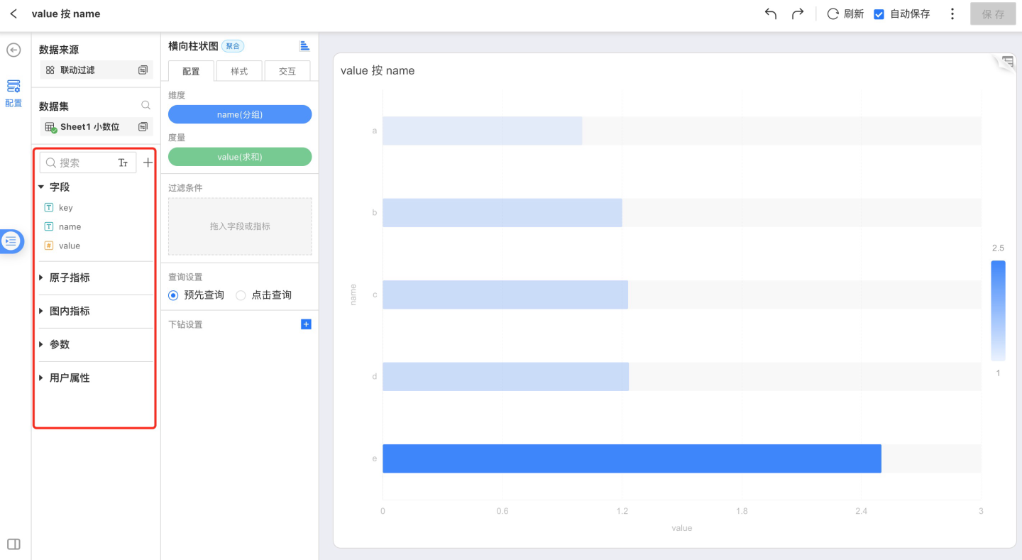
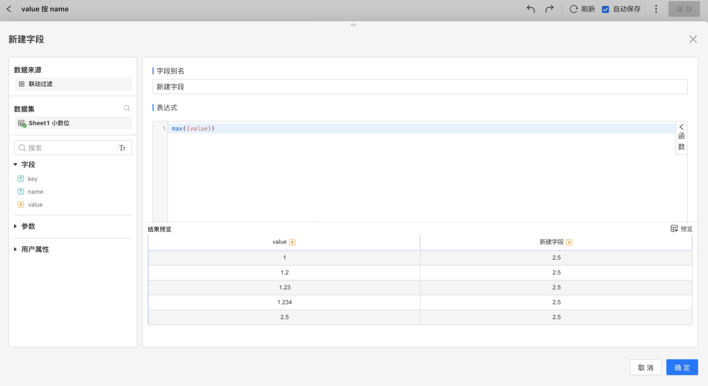
Create New Field
You can add fields of text, date, or numeric type through column-value calculation, advanced expressions, or column-value grouping. 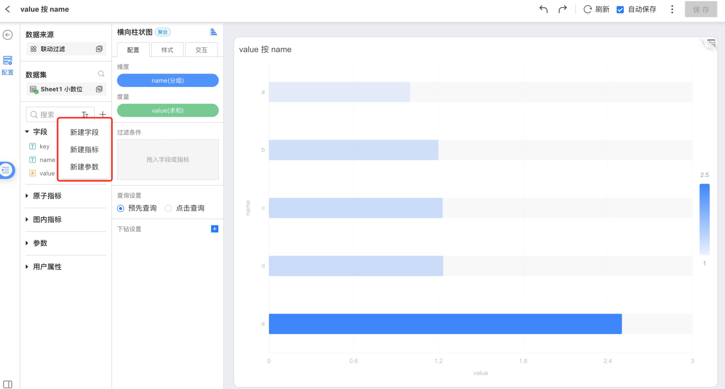
Create a New Calculated Metric
You can add fields of text, date, or numeric type through column-value calculations, advanced expressions, or column-value grouping. Non-aggregate metrics are not allowed. 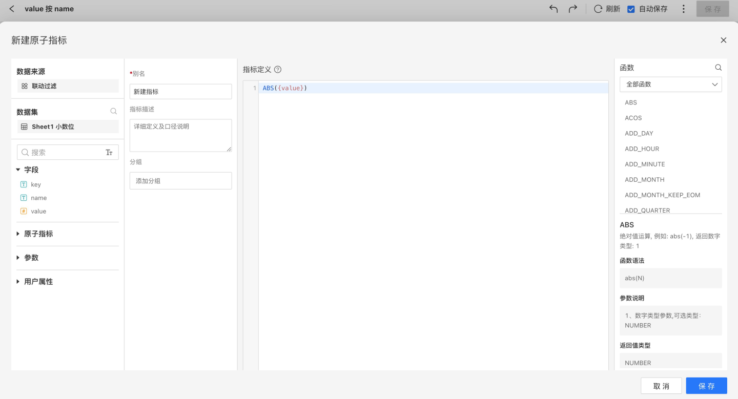
Create Parameter
You can add parameters of type Text, Number, Date, or Time to enable parameterized control of the App. 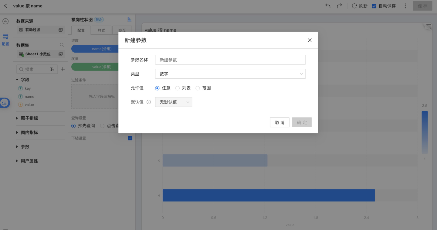
Top-right Toolbar
See Common Chart Operations for details.
Middle Toolbar
Switching Charts
Users can switch among different chart types as needed. Charts with a colored icon can be switched directly without re-configuration; charts with a gray icon will not retain the original dimensions and measures, so users must re-configure them manually. 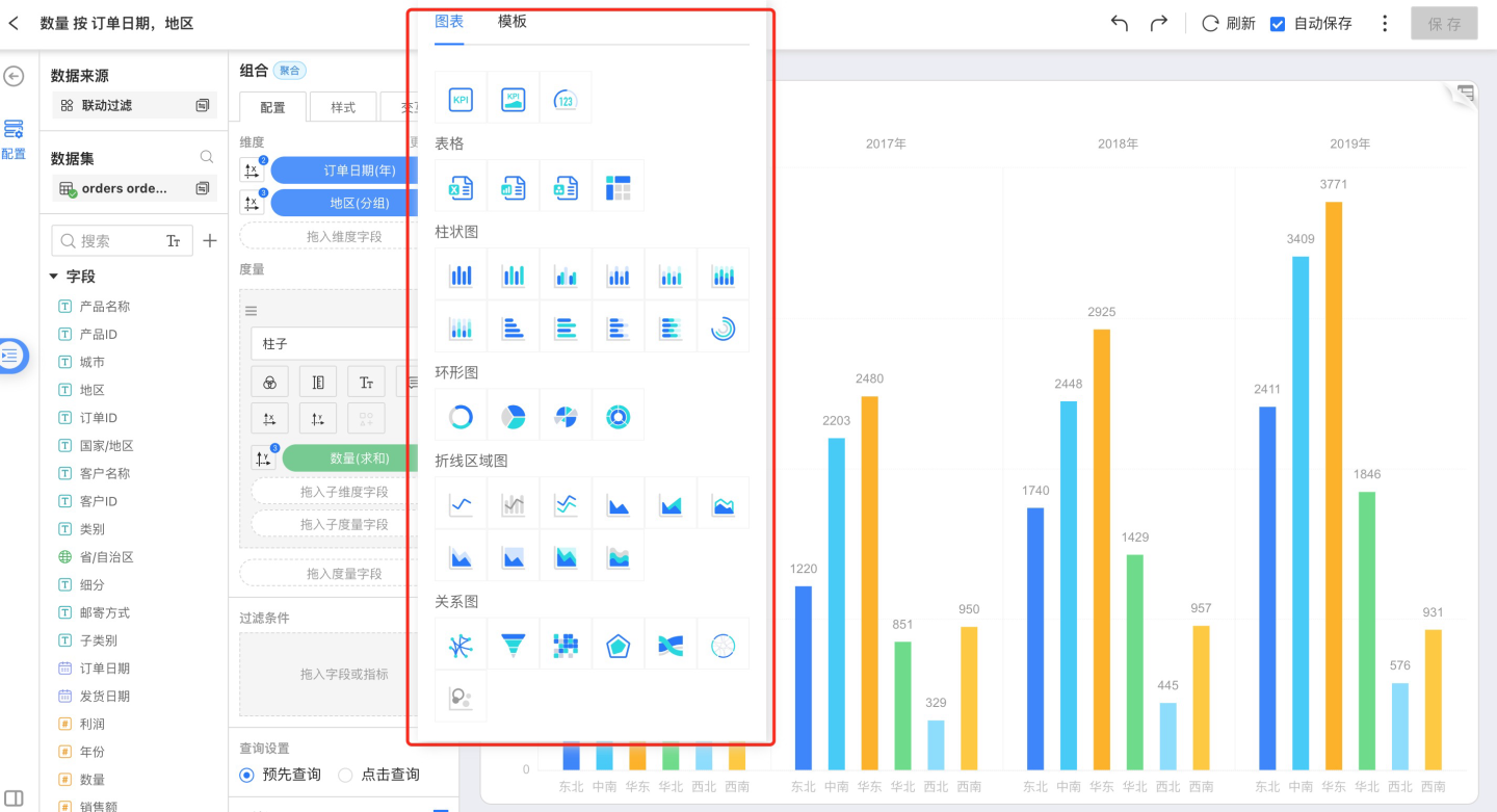
Configuration
Select Configuration from the middle navigation bar to apply the following settings as needed and refine the complete chart.
- Dimension
- Measure
- Filter
Dimension Tools
Dimension tools include:
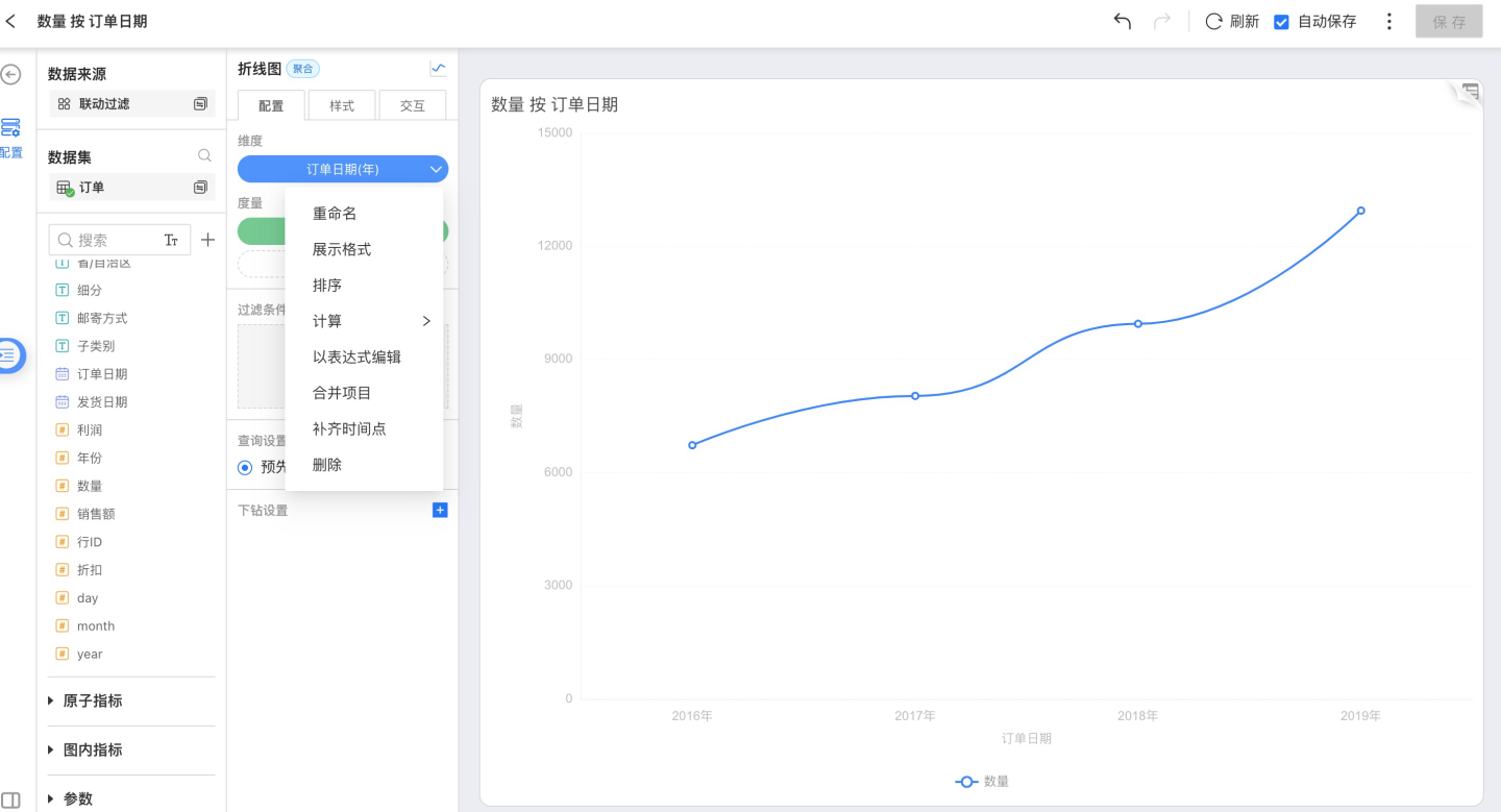
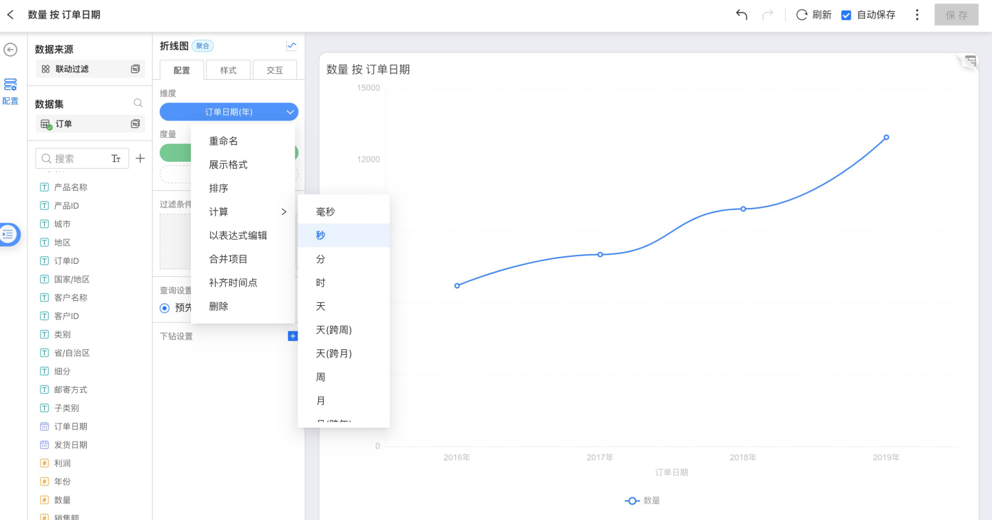
- Rename
Modify the dimension name so that the content in the chart better fits the business scenario. - Display Format
- Sort
- Calculation
Dimension aggregation method. - Edit as Expression
- Group Items
Combine items with very small proportions. - Fill Time Points
When a time dimension is selected, the Fill Time Points option appears. - Delete
Remove the current dimension.
Display Format
For numeric types, the display format is as shown below; you can customize the number format: 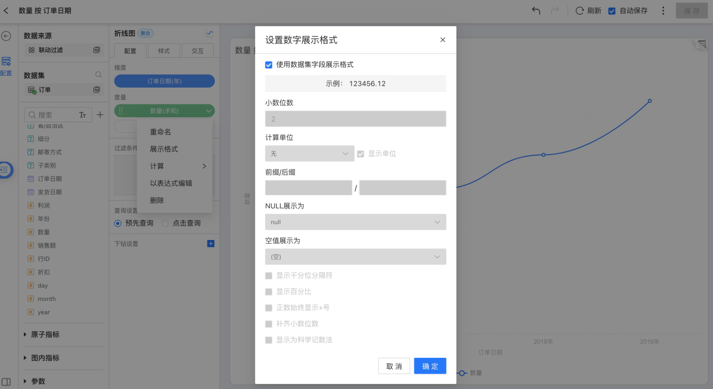
Use Dataset Field Format:
Display according to the field format configured in the Dataset.Decimal Places:
Defaults to 2 decimal places; you can customize the number of decimals.Number Unit:
Defaults to “None”; options include Auto, 100 M, 10 M, 1 M, 10 k, 1 k, 100, M, K.Prefix / Suffix:
Defaults to none; you can add a custom prefix or suffix.NULL Value Display:
Replace NULL values with specified text.Empty Value Display:
Replace empty values with specified text.Show Thousands Separator:
Unchecked by default; enable as needed.Show as Percentage:
Unchecked by default; enable as needed.Always Show “+” for Positive Numbers
Pad Decimal Places
Show Scientific Notation:
Unchecked by default; enable as needed.
For date types, the display format is as shown below; you can customize the date format: 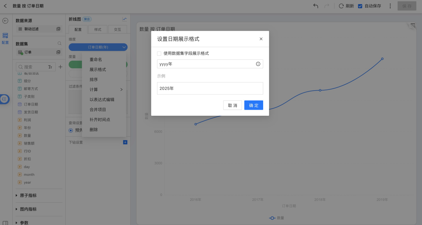
Sorting
Dimension sorting options include: data-source order, alphabetical, field-based, and manual.
Click the drop-down arrow to the right of a dimension field, open the menu, and choose Sort.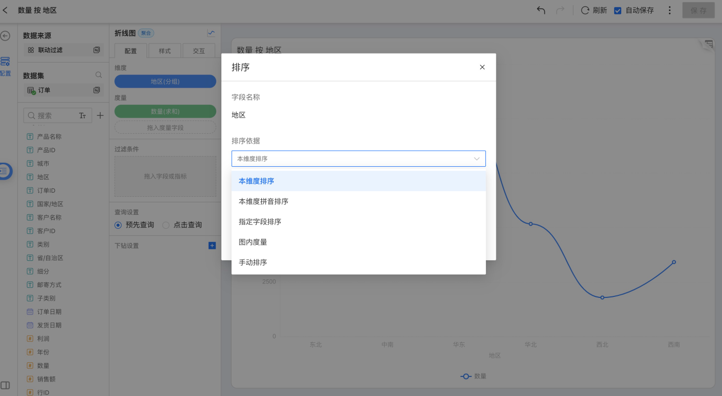
Sort by This Dimension
Orders the dimension values by their Unicode sequence.Sort by Pinyin (A-Z)
Arranges the dimension alphabetically by pinyin. Currently supported for: Oracle, MySQL, SQL Server, PostgreSQL, Greenplum, and Engine.
Date and numeric dimensions do not offer alphabetical sorting.Sort by Specified Field
Select a field from the same Dataset or a related Dataset, choose an aggregation, and sort the dimension by the aggregated result.Sort by In-Chart Measure
Pick a measure that exists in the current Chart and sort the dimension by that measure’s aggregated value.Manual Sort
Drag dimension members to set their order yourself.
Calculation
Non-time dimensions are aggregated by grouping; time dimensions can be aggregated as:
- Millisecond
- Second
- Minute
- Hour
- Day
- Day (across weeks)
- Day (across months)
- Week
- Month
- Month (across years)
- Quarter
- Quarter (across years)
- Year
Combine Items
Charts that contain dimensions (excluding maps) all support combining items into “Others.” When, during grouping, only the items with the highest share are of interest, the remaining low-share items can be merged into “Others,” yielding a cleaner, more concise visualization.
After combining, the resulting group still supports drill-down, detail view, and linked filtering, among other operations.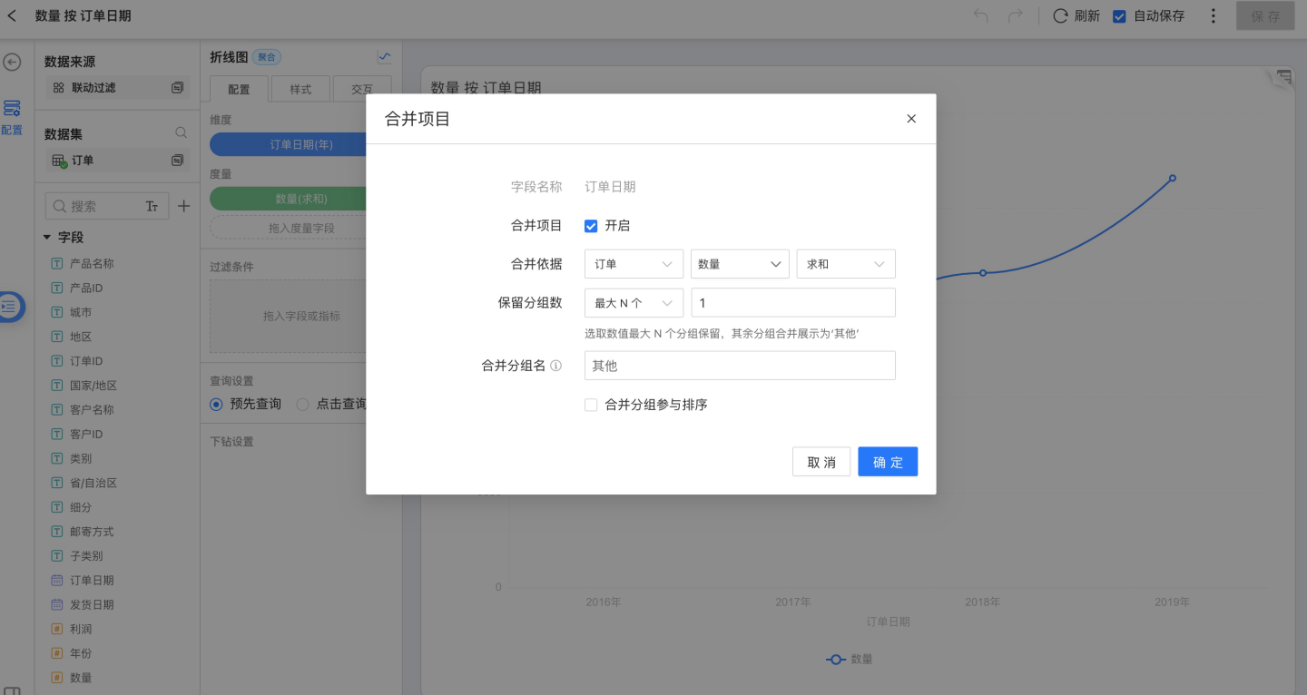
Completing Time Points
The following chart types currently support time-point completion:
- Line Chart
- Grouped Line Chart
- Line & Column Combo Chart
- Area Chart
- Grouped Area Chart
- Stacked Area Chart
- Stream Area Chart
- Grouped Stacked Area Chart
- Percentage Stacked Area Chart
- Percentage Grouped Stacked Area Chart
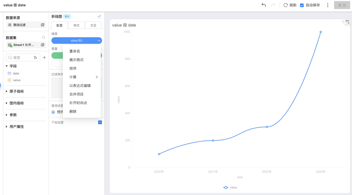
A chart with completed time points is shown below: 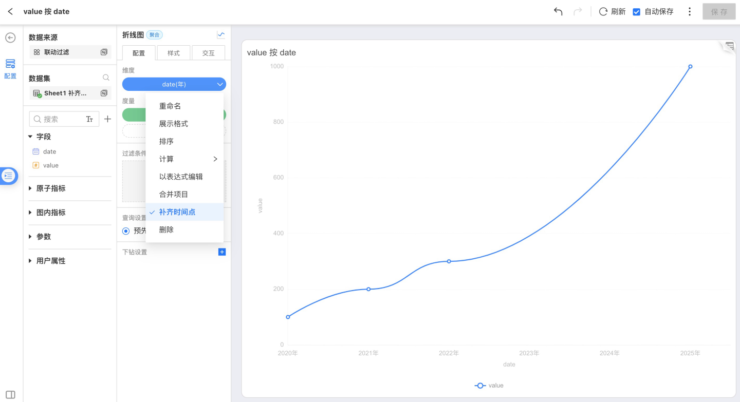
Metric Tools
Metric tools include:
- Rename
Modify the metric name so that the content in the chart aligns more closely with the business scenario. - Display Format
- Calculation
The aggregation method of the metric. - Delete
Remove the current metric.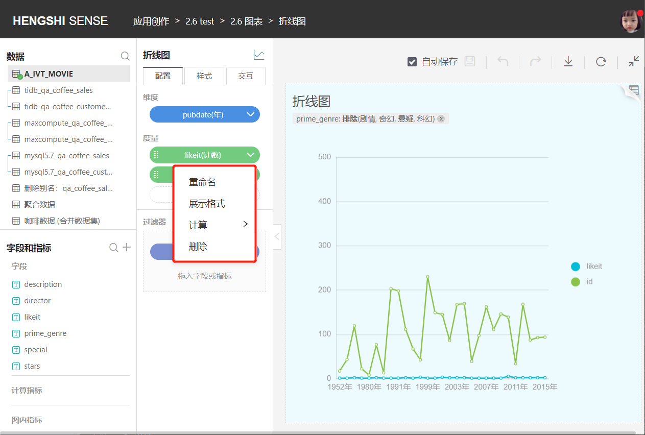
Display Format
For non-date fields, the display format is the numeric display format; for date fields, it is the date display format.
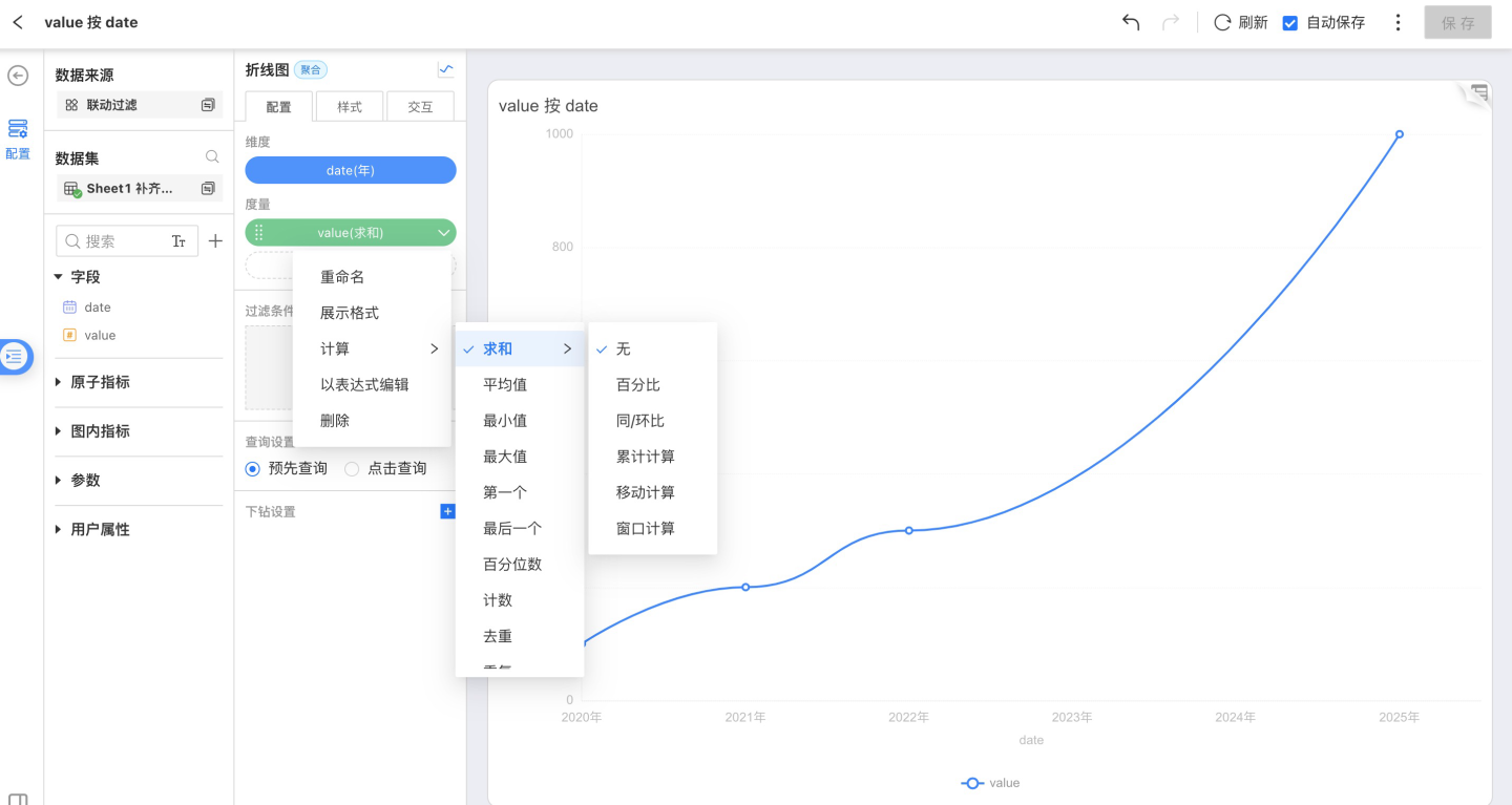
Calculation
Numeric measure aggregation methods:
- Sum
- Average
- Minimum
- Maximum
- Percentile
- Count
- Distinct
- Duplicate
- Retention
- Active
Non-numeric measure aggregation methods:
- Count
- Distinct
- Duplicate
- Retention
- Active
Filter
Drag a field from Fields & Metrics on the left into the Filters area under Chart Configuration to add a filter condition to the chart.
Fields & Metrics contains Original Fields, In-Chart Metrics, and Calculated Metrics, grouped by field type. Choose the filter condition that suits your needs.
- For text types, select
Exclude/Includeto filter. - For numeric types, select
Range/Comparisonto filter. - For date types, select
Time Period/By Year/By Quarter/By Month/Rangeto filter. - For all types, enter an expression in
Expressionto filter. Functions supported in expressions
Tip
Filter expressions do not allow mixing aggregate and non-aggregate expressions.
Drag a field into Configuration → Filters: 
Text field filtering: 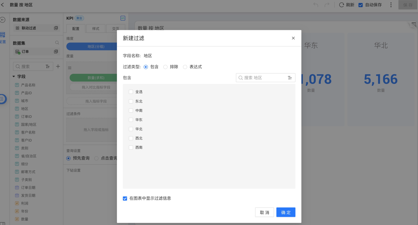
Numeric field filtering: 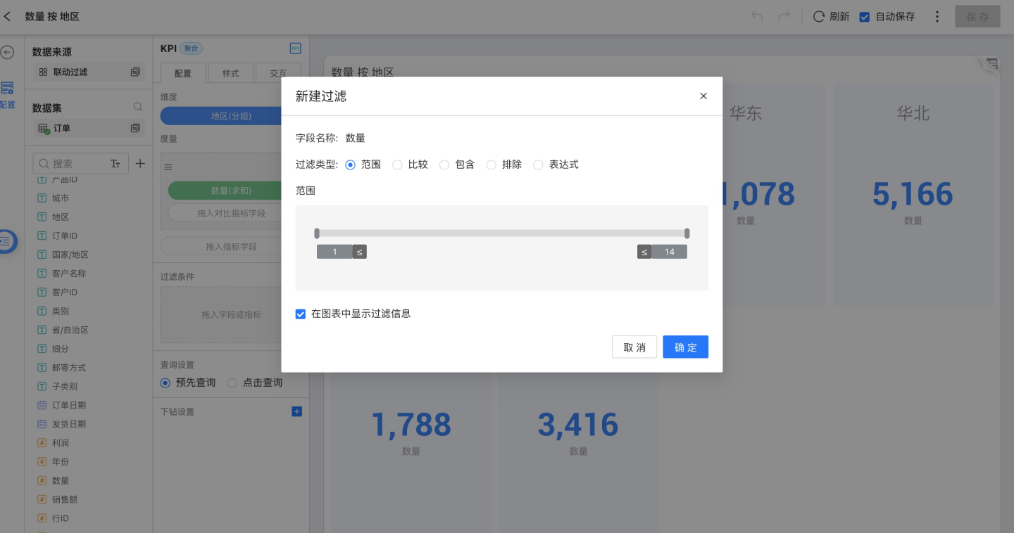
Date field filtering: 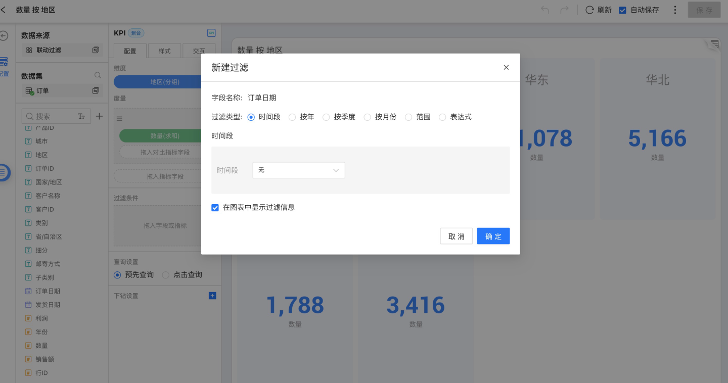
Expression filtering: 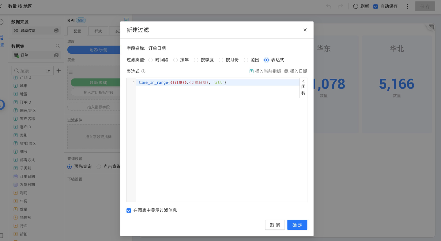
Choose whether to display filter information while filtering 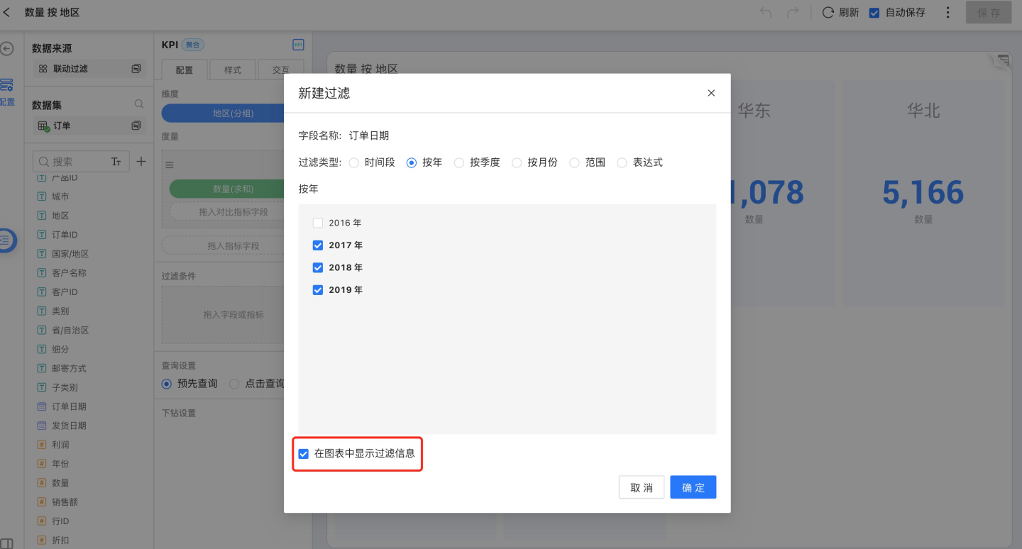
If you choose to display filter information, the filter conditions will appear below the chart title 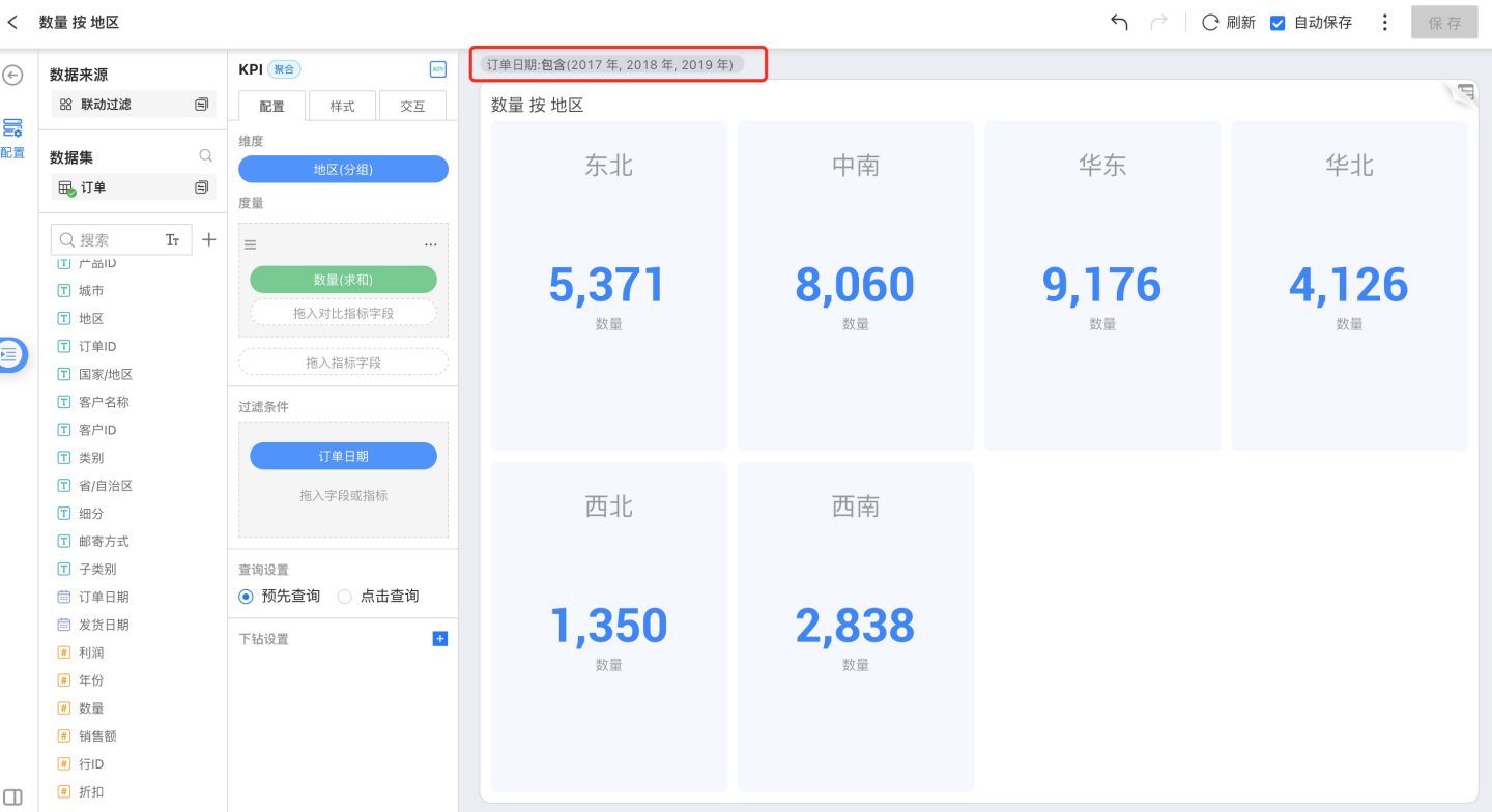
Style
Style includes the following parts:
- Title
- Chart Content
- Shadow
- X-Axis
- Y-Axis
- Legend
- Reference Line
- Padding
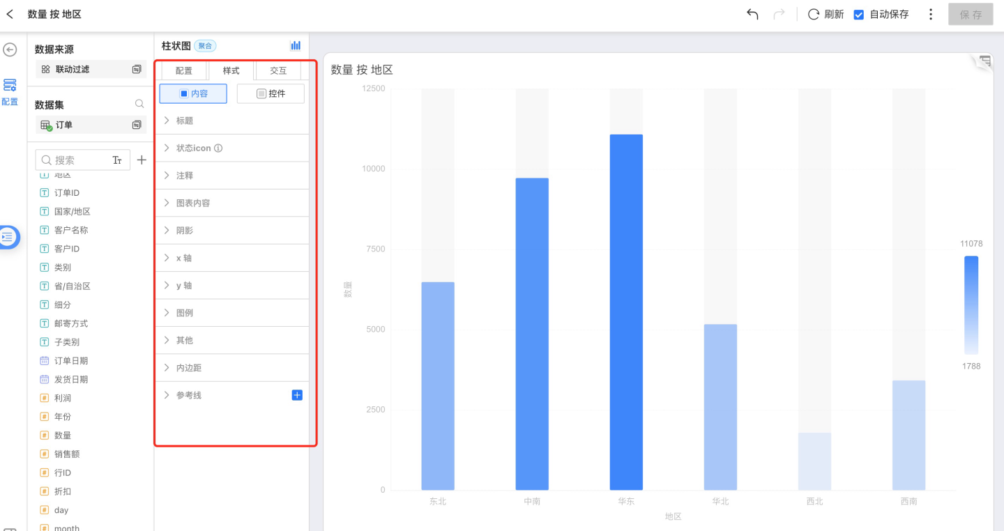
Title
You can customize the chart name
Status Icon
You can set the display state of icons on charts in a Dashboard, supporting both hover and fixed display.
Notes
- Chart notes: rich text, editable as needed
- Field notes: remarks and business definitions for field metrics defined in the Dataset
Chart Content
Chart content includes the following parts:
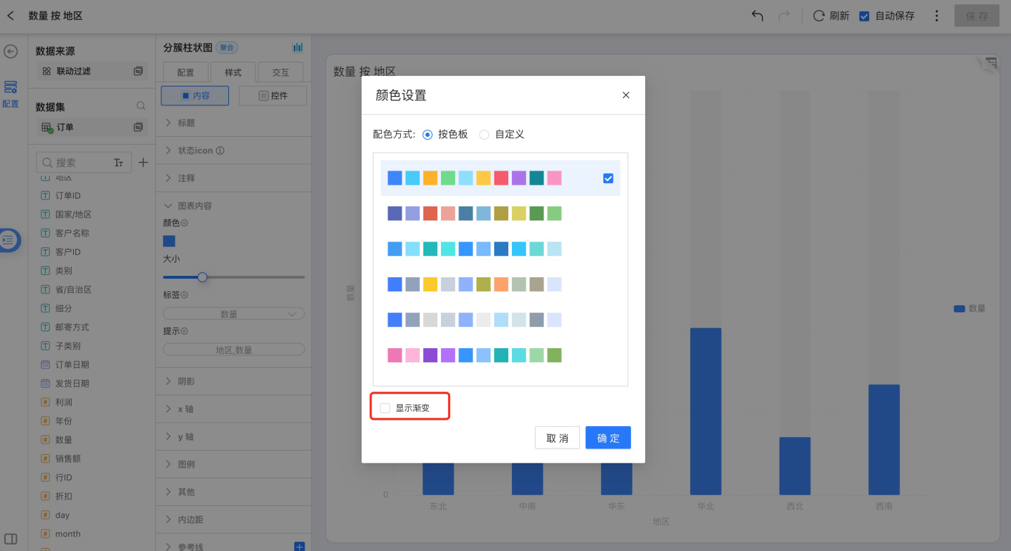
Color:
You can change the chart color scheme. Either select a predefined palette or customize the color for each dimensional grouping individually.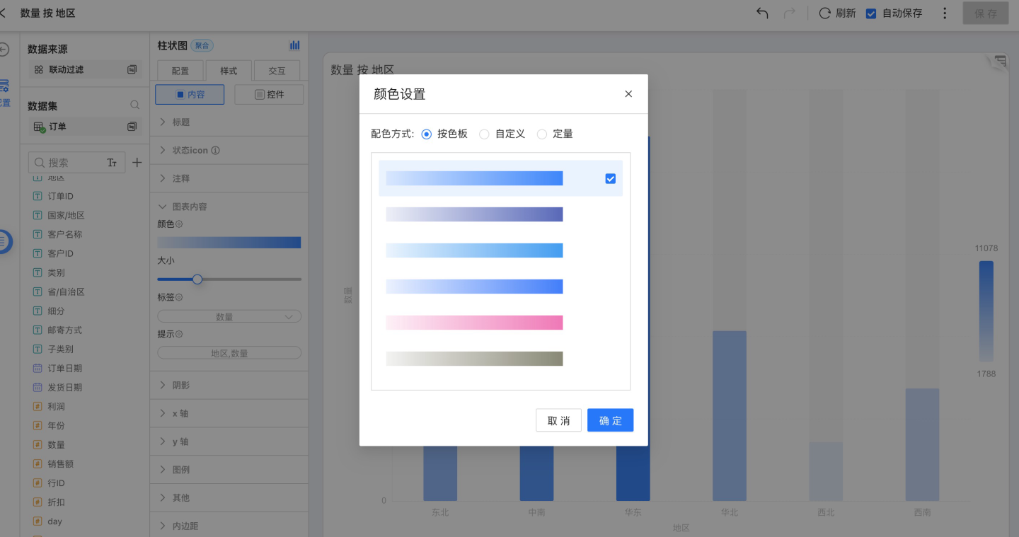
Below the color settings, a Show Gradient toggle appears; gradients can be applied to all non-gradient bar and area charts.
Size:
Adjust the chart size.Label:
Chart labels can display measure values, dimensional groupings, etc. You can modify the label font, color, weight, text angle, position, and offset.
Tooltip:
Tooltips can show measure values and dimensional groupings. You can change the tooltip font, color, weight, border color, weight, shape, and background color.
Shadow
Only charts under the Bar category can have shadows configured. Click Style → Shadow to toggle shadow visibility and set its color. 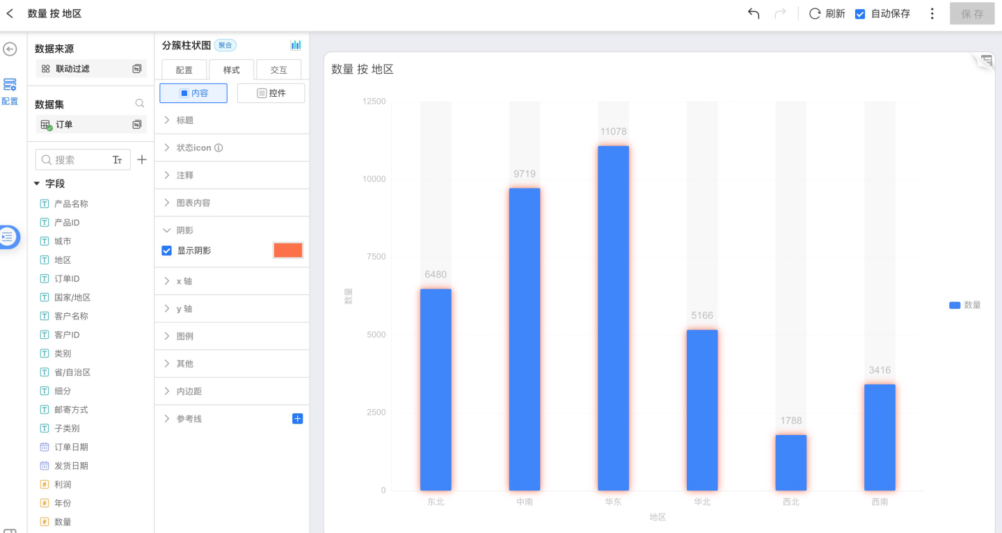
X-Axis
You can adjust font color, size, text angle, axis style, and toggle the display of the axis and tick labels. 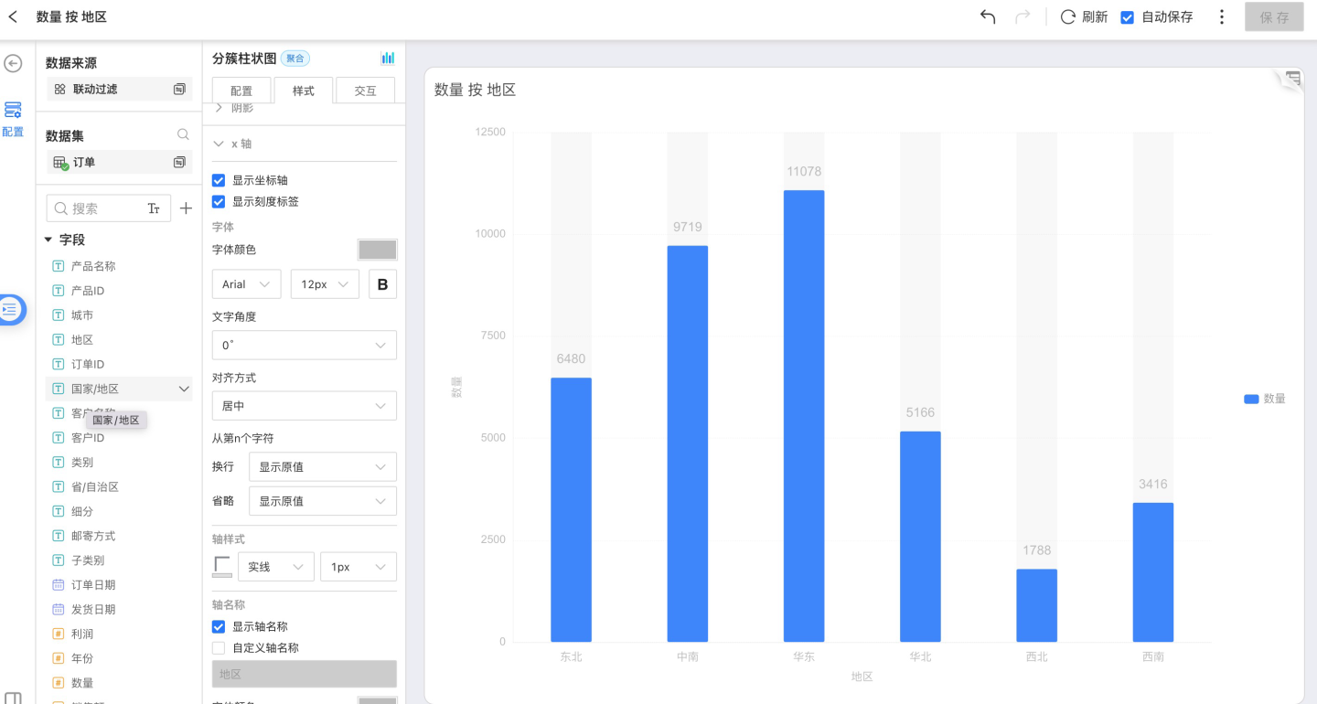
Y-Axis
You can adjust font color, size, text angle, axis style, show/hide the axis and tick labels, set the tick range, and configure tick marks. 
Show Legend
You can choose whether to display the legend and, when shown, position it on the left, right, or top. The legend’s font, color, size, and bold style can also be customized.
Full-select and inverse-select buttons are supported. When the display switch is on and the number of legend items meets the configured auto-display rule, the buttons appear.
Version 6.2 Update
Enhanced legends for Pie, Donut, and Nightingale charts: legends now flexibly combine “Name” with “Measure Value” and “Percentage”.
Configuration path: Style > Legend > check Show Measure / Show Percentage to view each category’s exact value and percentage directly in the legend area.
[!CAUTION] Note
After a group is hidden/grayed out in the legend, its percentage is not recalculated; this differs from the percentage logic shown in the chart itself.
Reference Line
See Reference Line for details.
Padding
Padding controls the position of the chart within the entire page.
Interaction
Interaction includes the following parts:
- Row Limit
- Auto Refresh
- Value Range Roaming
- Time Roaming
- Click Interaction Behavior in Chart
- Drill-down Settings
Row Limit
Users can set the number of rows displayed in a chart via Interaction → Row Limit; the default value is 1,000 rows.
CAUTION
Setting the limit too high may slow down both the database and the browser.
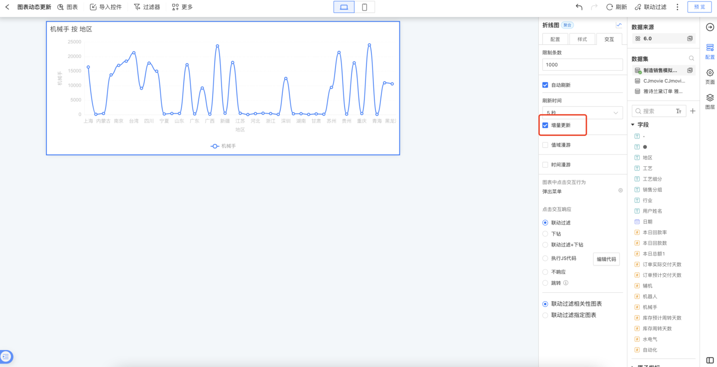
Auto Refresh
Just like the Refresh feature on a Dashboard, Auto Refresh periodically updates chart data automatically. After enabling Auto Refresh, you can set the refresh interval; the value is fully customizable.
Charts configured with Auto Refresh will also refresh automatically when placed on a Dashboard. 
To build a dashboard whose charts update in real time—displaying a dynamic, ECG-like effect on a large screen—data analysts can turn on Auto Refresh → Incremental Update.
Incremental Update is supported for the following chart types: Gauge, all Bar charts, all Ring charts, all Line & Area charts, all Relationship charts, Simple Map, and Combo charts.
Value Range Roaming
When Value Range Roaming is enabled, a slider appears on the dimension axis. Dragging the slider adjusts the currently displayed dimensions, and all dimensions are re-rendered in the chart proportionally. As shown below, the gray scroll bar under the dimension axis: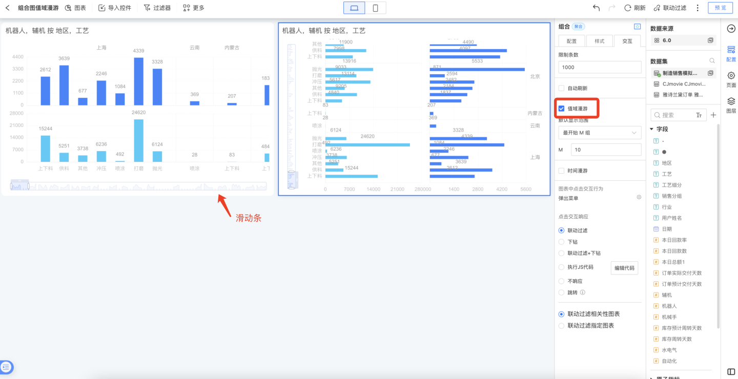
When a chart contains many data groups (e.g., a bar chart) but you do not want to display all groups by default, you can configure the default display range of Data Zoom. Four options are provided: “All, First M Groups, Last N Groups, Custom”, covering a variety of setup scenarios.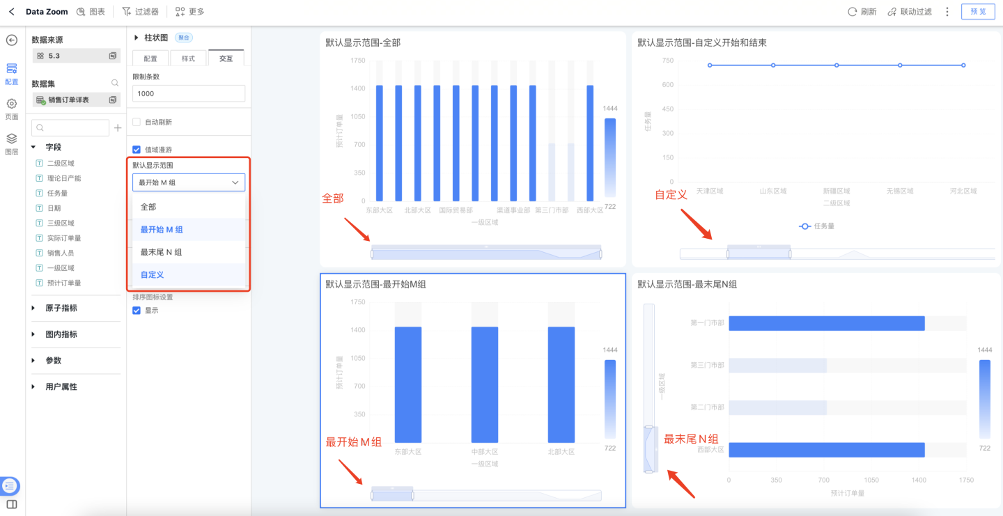
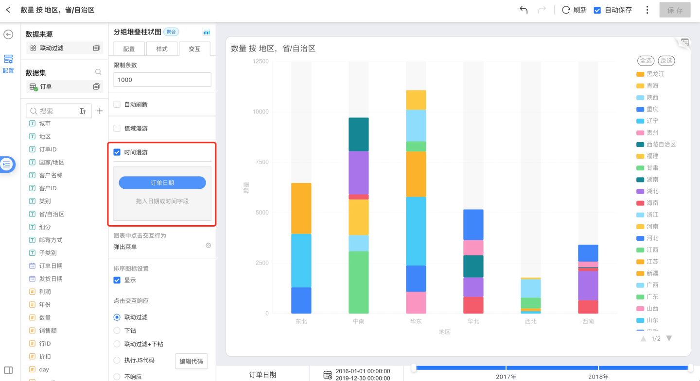
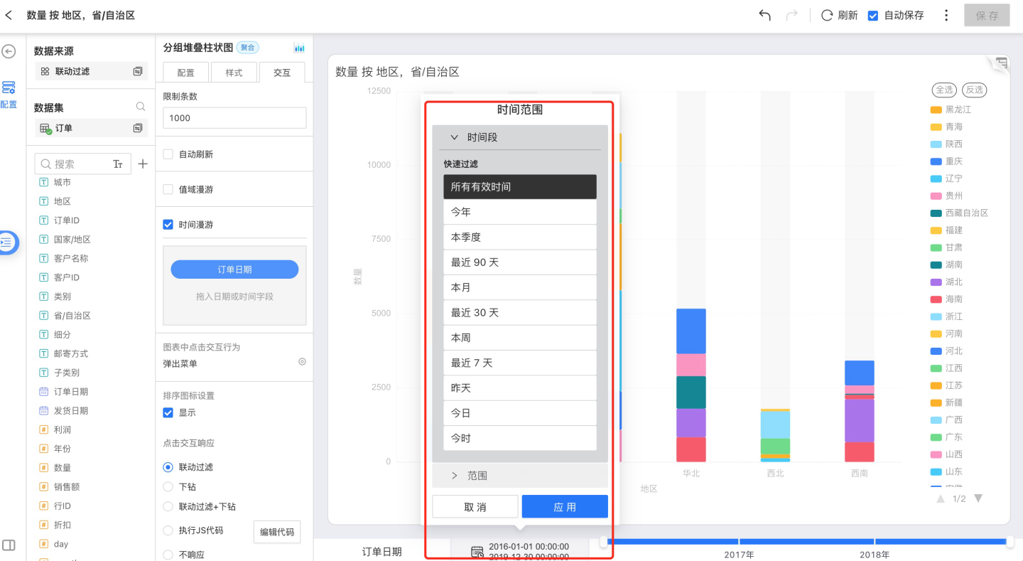
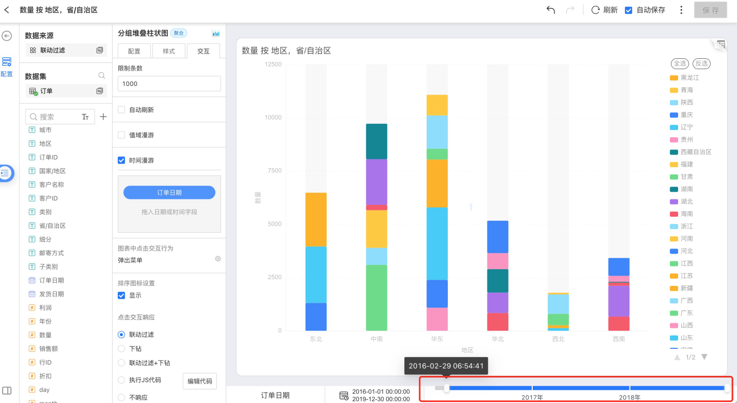
Time Roaming
Turn on Show Time Roaming, drag the time field from the field list into the box, and a timeline will appear on the chart interface, allowing you to drag and view data within different time ranges.
The timeline can filter data in three ways:
- Drag the timeline to filter data
- Select an out-of-the-box time period to filter data
- Select a custom time range to filter data
You can set a time range
You can drag the timeline to easily change the displayed interval
You can choose a preset time period
- All valid time
- This year
- This quarter
- Last 90 days
- This month
- Last 30 days
- This week
- Last 7 days
- Yesterday
- Today
- This hour
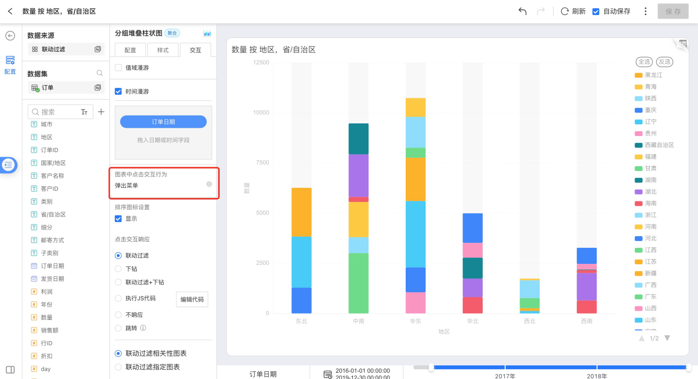
Click Interactions in Charts
For chart types that support drill-down and exclude actions, see Appendix: Chart Types Summary.
You can configure one of three behaviors when clicking a dimension group:
- No response
- Show menu
- Drill down
No Response
Open the chart and click on the chart area—there is no response.
Pop-up Menu
Open a chart and click on the chart area. The Tooltip menu that appears offers three actions: Drill-down, Exclude, and Details. 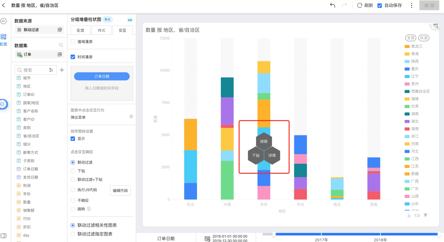
Drill-down
In charts that support drill-down, click on a dimension and select Drill-down in the pop-up Tooltip. If a drill-down path has been configured, the chart will filter by the selected dimension and redraw using the newly chosen field as the dimension. Drill-down can be performed consecutively. If no drill-down path is set, the Drill-down option will be unavailable.
Exclude
Click a dimension in the chart and select Exclude in the pop-up Tooltip; the chart will exclude the corresponding dimension group and keep the others for rendering.
Details
Click a dimension in the chart, select Details in the pop-up Tooltip, and the detailed data for that dimension group will be displayed in a new window.
Drill-down
If a drill-down path is configured, opening the chart and clicking anywhere within the chart area will automatically filter the data by the selected dimension and redraw the chart using the newly chosen field as the dimension. If no drill-down path is set, nothing happens.
Drill-Down Settings
In a chart that supports drill-down, drag a field into Interaction → Drill-Down Settings. Click a dimension in the chart, then choose Drill Down in the Tooltip menu. The chart will redraw, filtering by the selected dimension and using the newly chosen field as its new dimension. Drill-down can be repeated in succession.
Drill-down is only a temporary action; it does not alter the chart’s original dimensions. When you exit and reopen the chart, it will revert to its initial state.
You can also restore the chart by clicking the first field in the drill-down path. 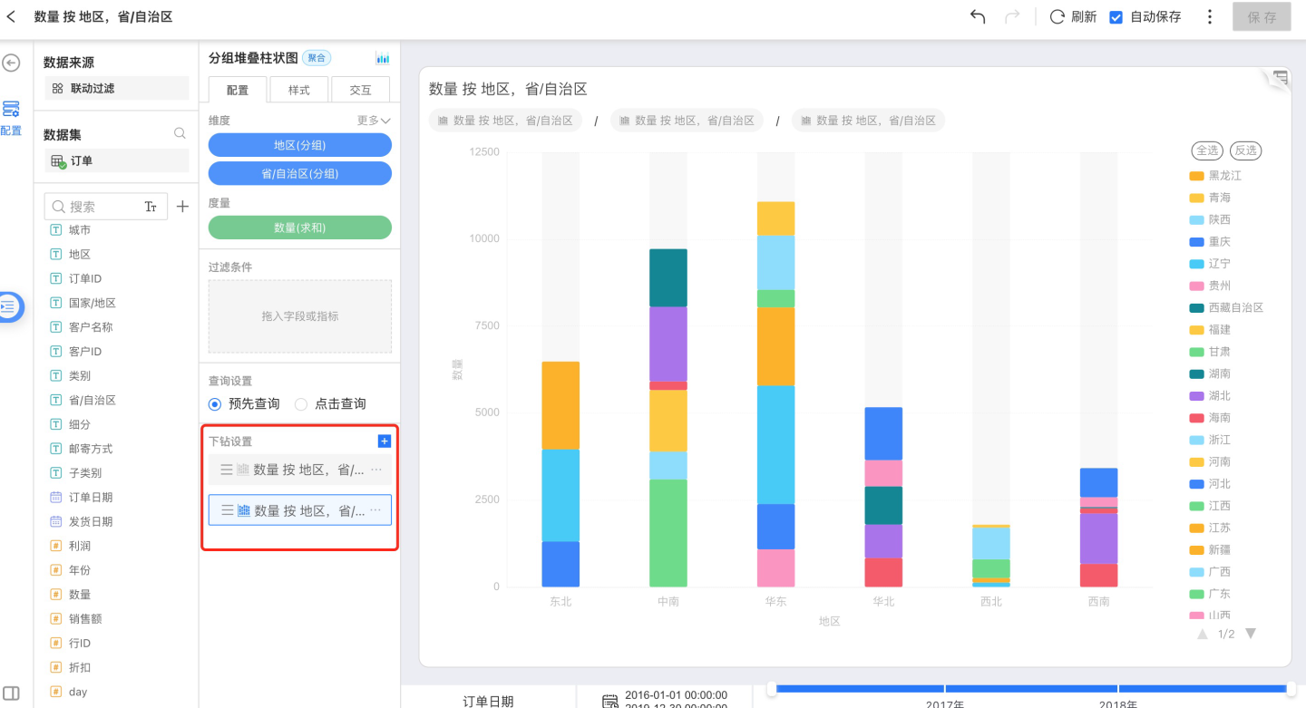
Configure a Drill-Down Chart
It can be configured in both Configuration and Style, the same as for any other chart.
Appendix: Chart Gallery
- For every chart type 📈—pie, line, dot, area, bar, etc.—you usually need to assign fields for different dimensions, set sort/limit options, apply filters, and so on. The common settings are summarized below:
| Chart Type | Dimensions | Measures | Dimension Sort | Drill-down | Legend | Legend Interaction | Chart Label | Cross-filter | Reference Line | Scale Range | Exclude |
|---|---|---|---|---|---|---|---|---|---|---|---|
| Bar | 1 | 1 | Data Source/Alphabetical/Field/Manual | Allowed | Measure Range | None | Measure Value | Dimension Group | Fixed/Calculated | Allowed | Dimension Group |
| Clustered Bar | 1 | 1–N | Data Source/Alphabetical/Field/Manual | Allowed | Each Measure | Single/Multi-select | Measure Value | Dimension Group | Fixed/Calculated | Allowed | Dimension Group |
| Grouped Clustered Bar | 2 | 1 | Data Source/Alphabetical/Field/Manual | Allowed | Secondary-dimension Groups | Single/Multi-select | Measure Value | Primary-dimension Group | Fixed/Calculated | Allowed | Primary-dimension Group |
| Grouped Stacked Bar | 2 | 1 | Data Source/Alphabetical/Field/Manual | Allowed | Secondary-dimension Groups | Single/Multi-select | Measure Value | Primary-dimension Group | Fixed/Calculated | Allowed | Primary-dimension Group |
| Percent Grouped Stacked Bar | 2 | 1 | Data Source/Alphabetical/Field/Manual | Allowed | Secondary-dimension Groups | Single/Multi-select | Measure Value | Primary-dimension Group | Fixed/Calculated | Allowed | Primary-dimension Group |
| Horizontal Bar | 1 | 1 | Data Source/Alphabetical/Field/Manual | Allowed | Measure Range | None | Measure Value | Dimension Group | Fixed/Calculated | Allowed | Dimension Group |
| Horizontal Clustered Bar | 1 | 1–N | Data Source/Alphabetical/Field/Manual | Allowed | Each Measure | Single/Multi-select | Measure Value | Dimension Group | Fixed/Calculated | Allowed | Dimension Group |
| Horizontal Stacked Bar | 1 | 1–N | Data Source/Alphabetical/Field/Manual | Allowed | Each Measure | Single/Multi-select | Measure Value | Dimension Group | Fixed/Calculated | Allowed | Dimension Group |
| Horizontal Percent Stacked Bar | 1 | 1–N | Data Source/Alphabetical/Field/Manual | Allowed | Each Measure | Single/Multi-select | Measure Value | Dimension Group | Fixed/Calculated | Allowed | Dimension Group |
| Radial Bar | 1 | 1 | None | Allowed | Dimension Groups | Single/Multi-select | Measure Value | Dimension Group | Not supported | Allowed | Dimension Group |
| Stacked Bar | 1 | 1–N | Data Source/Alphabetical/Field/Manual | Allowed | Each Measure | Single/Multi-select | Measure Value | Dimension Group | Fixed/Calculated | Allowed | Dimension Group |
| Percent Stacked Bar | 1 | 1–N | Data Source/Alphabetical/Field/Manual | Allowed | Each Measure | Single/Multi-select | Measure Value | Dimension Group | Fixed/Calculated | Allowed | Dimension Group |
| Box Plot | 1 | 1 | Data Source/Alphabetical/Field/Manual | Allowed | Dimension Groups | Single/Multi-select | None | Dimension Group | None | Allowed | Dimension Group |
| Waterfall | 1 | 1 | Data Source/Alphabetical/Field/Manual | Allowed | Increase/Decrease | Single/Multi-select | Measure Value | Dimension Group | Fixed | Not allowed | Dimension Group |
| Word Cloud | 1 | 1 | None | Allowed | Measure Range | None | None | Dimension Group | None | Not allowed | Dimension Group |
| Donut | 1 | 1 | Data Source/Alphabetical/Field/Manual | Allowed | Dimension Groups | Single/Multi-select | Dimension Group Percentage | Dimension Group | None | Not allowed | Dimension Group |
| Funnel | 1 | 1 | Data Source/Alphabetical/Field/Manual | Allowed | Dimension Groups | Single/Multi-select | Dimension Group / Measure Value / Conversion Rate | Dimension Group | None | Not allowed | Dimension Group |
| Bubble | 1–N | 1 | None | Allowed | Measure Range | None | Dimension Group / Group Percentage | Dimension-group Combination | None | Not allowed | Dimension-group Combination |
| Pie | 1 | 1 | Data Source/Alphabetical/Field/Manual | Allowed | Dimension Groups | Single/Multi-select | Dimension Group Percentage | Dimension Group | None | Not allowed | Dimension Group |
| Nightingale | 1 | 1 | Data Source/Alphabetical/Field/Manual | Allowed | Dimension Groups | Single/Multi-select | Dimension Group Percentage | Dimension Group | None | Not allowed | Dimension Group |
| Sunburst | 1–N | 1 | None | Allowed | None | Single/Multi-select | Each Dimension Group | Dimension-group Combination | None | Not allowed | Dimension-group Combination |
| Treemap | 1–N | 1 | None | Allowed | Measure Range | None | Dimension Group | Dimension-group Combination | None | Not allowed | Dimension-group Combination |
| Area | 1 | 1–N | Data Source/Alphabetical/Field/Manual | Allowed | Each Measure | Single/Multi-select | Measure Value | Dimension Group | Fixed/Calculated | Allowed | Dimension Group |
| Grouped Area | 2 | 1 | Data Source/Alphabetical/Field/Manual | Allowed | Secondary-dimension Groups | Single/Multi-select | None | Primary-dimension Group | Fixed/Calculated | Allowed | Primary-dimension Group |
| Grouped Stacked Area | 2 | 1 | Data Source/Alphabetical/Field/Manual | Allowed | Secondary-dimension Groups | Single/Multi-select | Measure Value | Primary-dimension Group | Fixed/Calculated | Allowed | Primary-dimension Group |
| Percent Grouped Stacked Area | 2 | 1 | Data Source/Alphabetical/Field/Manual | Allowed | Secondary-dimension Groups | Single/Multi-select | Measure Value | Primary-dimension Group | Fixed/Calculated | Allowed | Primary-dimension Group |
| Stacked Area | 1 | 1–N | Data Source/Alphabetical/Field/Manual | Allowed | Each Measure | Single/Multi-select | None | Dimension Group | Fixed | Not allowed | Dimension Group |
| Percent Stacked Area | 1 | 1–N | Data Source/Alphabetical/Field/Manual | Allowed | Each Measure | Single/Multi-select | None | Dimension Group | Fixed | Not allowed | Dimension Group |
| Line | 1 | 1–N | Data Source/Alphabetical/Field/Manual | Allowed | Each Measure | Single/Multi-select | Measure Value | Dimension Group | Fixed/Calculated | Allowed | Dimension Group |
| Line-Bar Combo | 1 | 1–N | Data Source/Alphabetical/Field/Manual | Allowed | Each Measure | Single/Multi-select | Measure Value | Dimension Group | Fixed/Calculated | Allowed | Dimension Group |
| Grouped Line | 2 | 1 | Data Source/Alphabetical/Field/Manual | Allowed | Secondary-dimension Groups | Single/Multi-select | Measure Value | Primary-dimension Group | Fixed/Calculated | Allowed | Primary-dimension Group |
| Pareto | 1 | 1 | None | Allowed | Frequency / Cumulative Frequency | Single/Multi-select | Measure Value | Dimension Group | Fixed/Calculated | Not allowed | Dimension Group |
| Arc Diagram | 2 | 0 | Data Source/Alphabetical/Field/Manual | Allowed | Secondary-dimension Groups | None | None | None | None | Not allowed | None |
| Chord | 2 | 1 | Data Source/Alphabetical/Field/Manual | Allowed | Each Dimension Group | Hover only | Each Dimension Group | None | None | Not allowed | None |
| Heatmap | 2 | 1 | Data Source/Alphabetical/Field/Manual | Allowed | Measure Range | None | Measure Value | Dimension-group Combination | None | Not allowed | Dimension-group Combination |
| Radar | 1 | 1–N | Data Source/Alphabetical/Field/Manual | Allowed | Each Measure | Single/Multi-select | Dimension Group / Measure Value | Dimension Group | None | Allowed | None |
| Sankey | 1–N | 1 | Data Source/Alphabetical/Field/Manual | Allowed | None | None | Each Dimension Group | None | None | Not allowed | None |
| Scatter | 1 | 3 | None | Allowed | Size Measure Range | None | Dimension Groups | Dimension Group | Fixed/Calculated | Scale allowed, merge not | Dimension Group |
| Gauge | 0 | 2 | None | Not allowed | None | None | Ratio Measure Name / Number / Percentage | None | Fixed | Not allowed | None |
| KPI | 0 | 1–N | None | Not allowed | None | None | None | None | None | Not allowed | None |
| Metric Trend Card | 1 | 1–N | None | Not allowed | None | None | None | None | None | Not allowed | None |
| Table | 0–N | 0–N | Data Source/Alphabetical/Field/Manual | Not allowed | None | None | None | None | None | Not allowed | None |