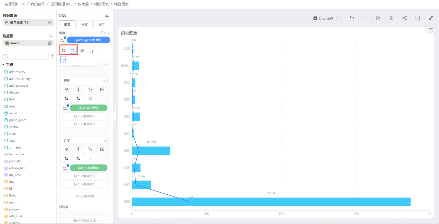
Combo Chart
The Combo Chart is a new chart type introduced in HENGSHI SENSE 3.2. In a Combo Chart, you can:
- Add any number of axes
- Set the position and orientation of each axis
- Freely add Cartesian-series marks
- Stack lines, bars, and areas independently with custom settings
- Control chart labels and tooltips with measures outside the marks
- Color the chart using any dimension or measure
X-Axis / Y-Axis
In a combo chart, you can specify which metric controls the X-axis and which controls the Y-axis, allowing you to create horizontal or vertical charts as needed.
Shape
In a combo chart, you can choose the rendering shape for each measure above its measure area. The following shapes are currently supported:
- Bar
- Line
- Area
- Circle
- Ring
- Shape
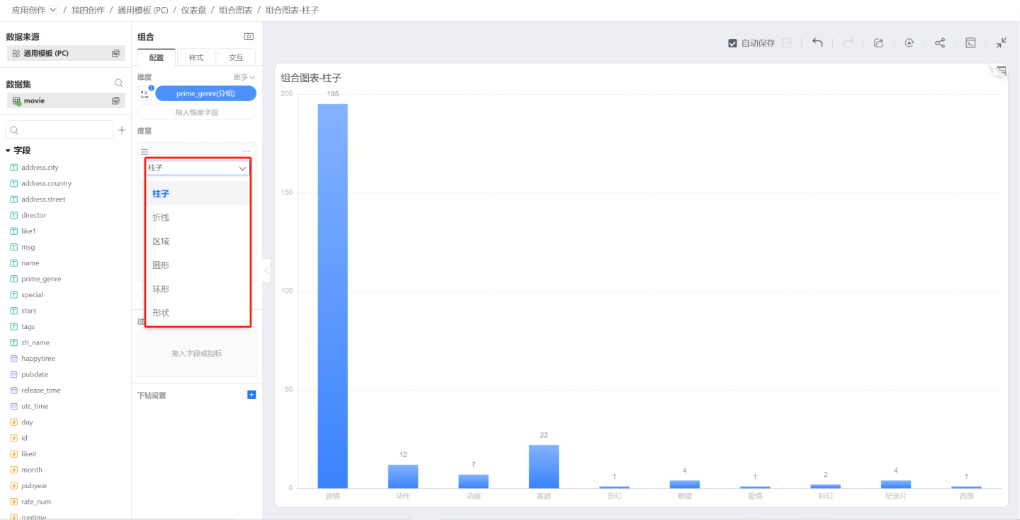
In a combo chart, each measure can be assigned a different shape, allowing multiple shapes to appear in a single chart. The shape setting is displayed within the measure area because, during rendering, the mark is drawn based on the measure’s value.
Bar
Bar is the default chart type.
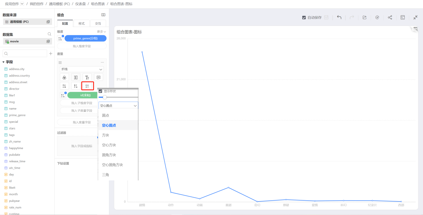
Line
When the shape is set to Line, the symbol control becomes available. Click the symbol icon to choose the shape and size of each data point.
Version 6.2 Update
Lines now support dashed styles. Configuration path: Shape -> Line Type, allowing you to set the line to a dashed style.
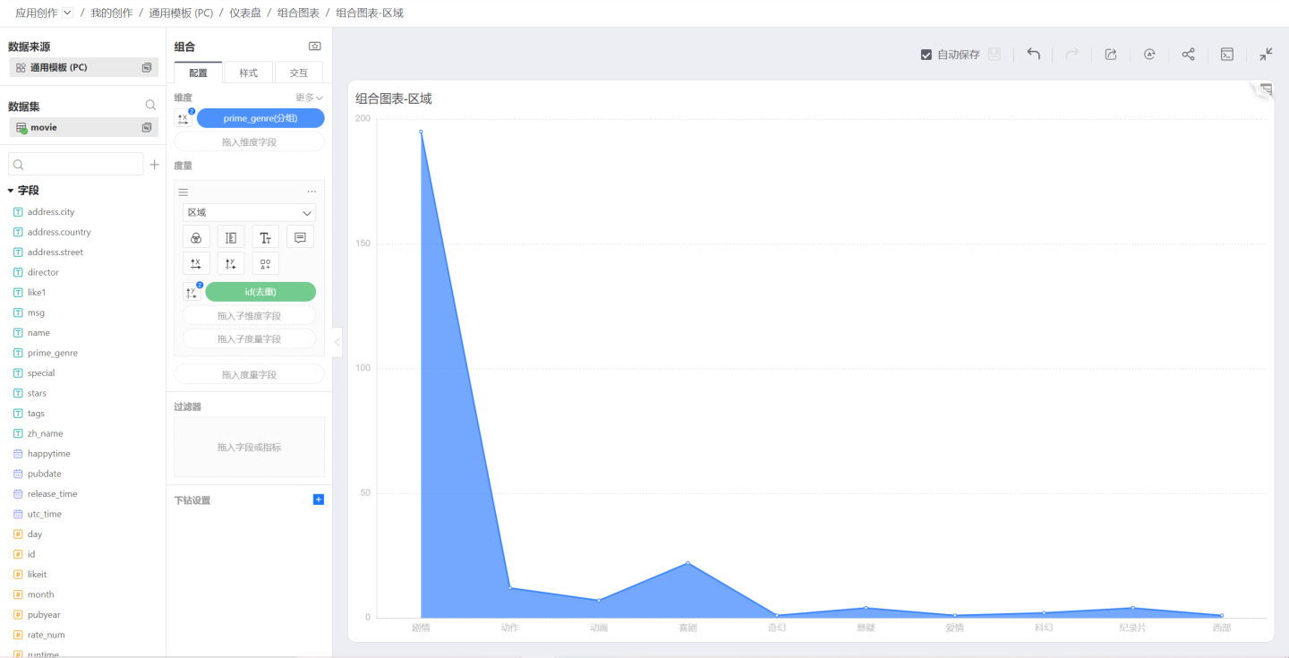
Area
Select Area in Shape:
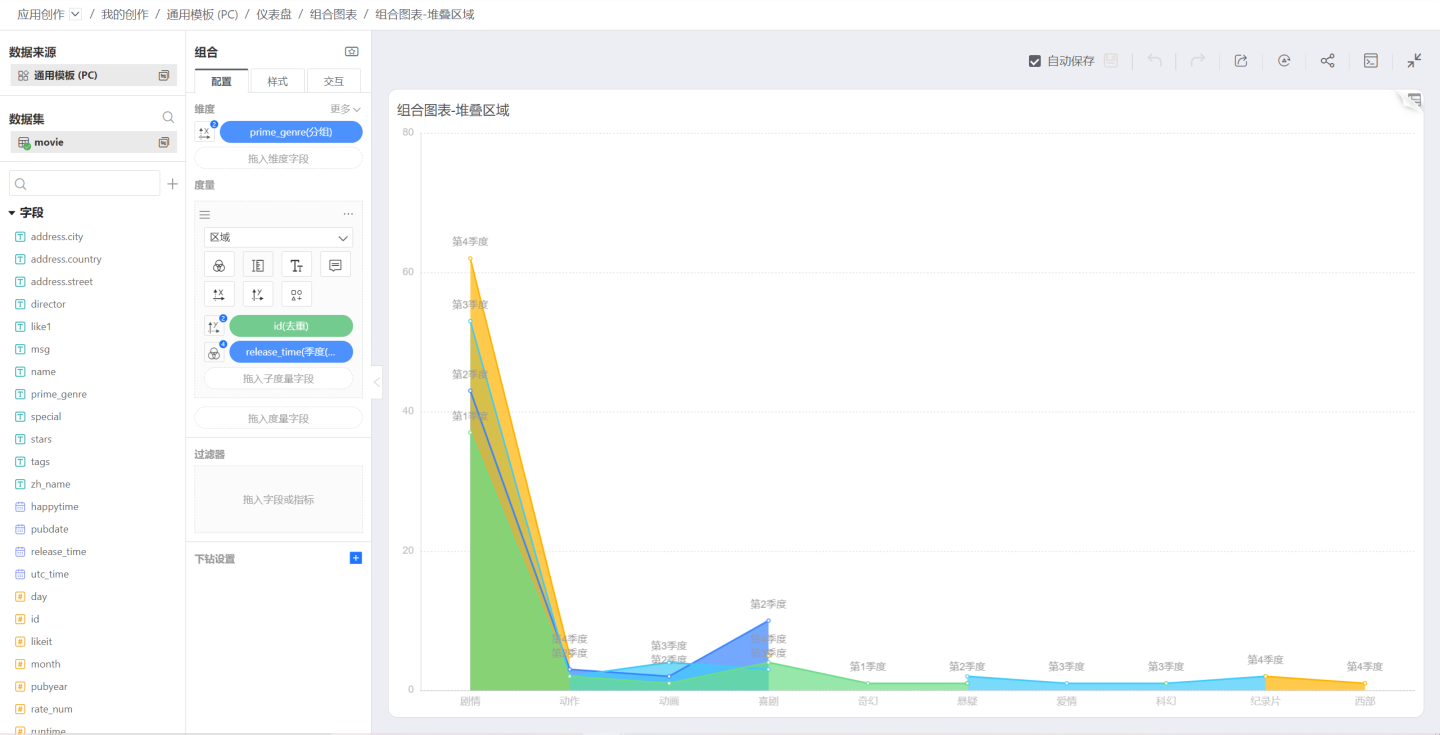
Drag a sub-dimension into Measure; the area chart becomes a stacked area chart, then use the sub-dimension to control color, label, and tooltip:
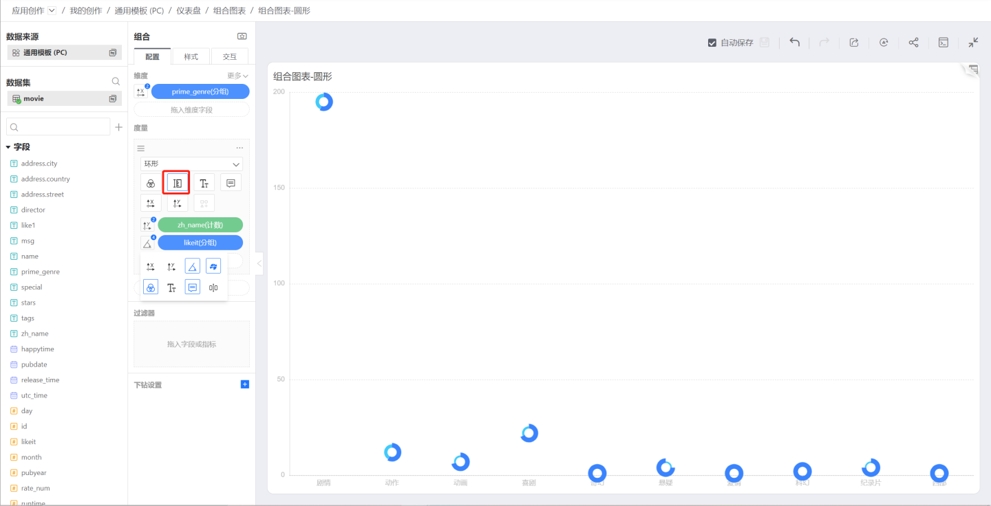
Circle
On the basis of the previous image, change the shape to Circle; the resulting chart is shown below. You can control the circle size with the Size icon:
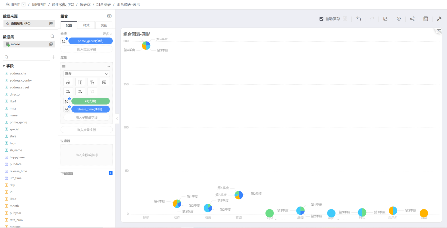
You can use Circle to draw a pie chart when:
- Neither the dimension nor the measure controls the X or Y axis
- The dimension controls Color, Label, and Tooltip
- The measure controls Label and Tooltip
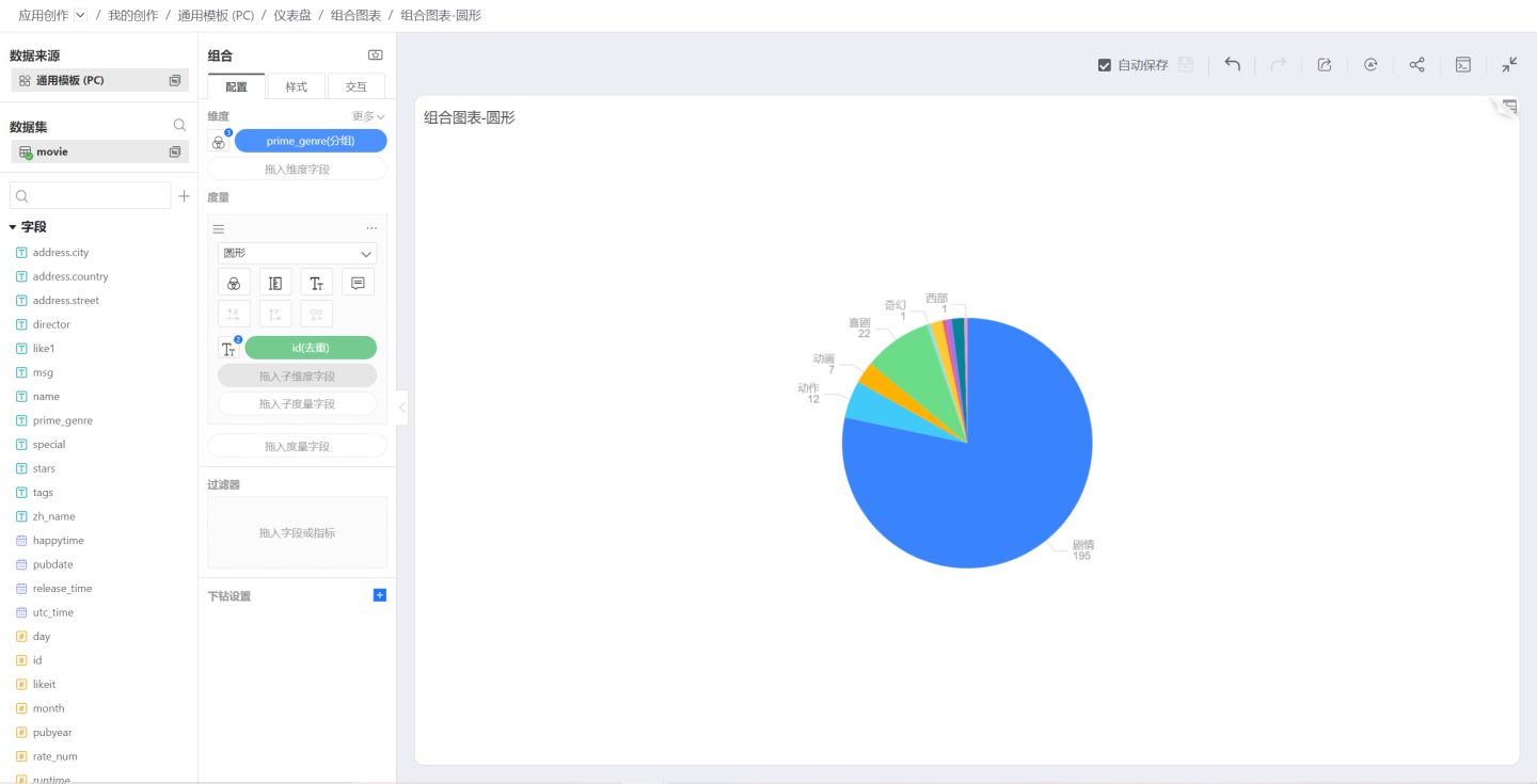
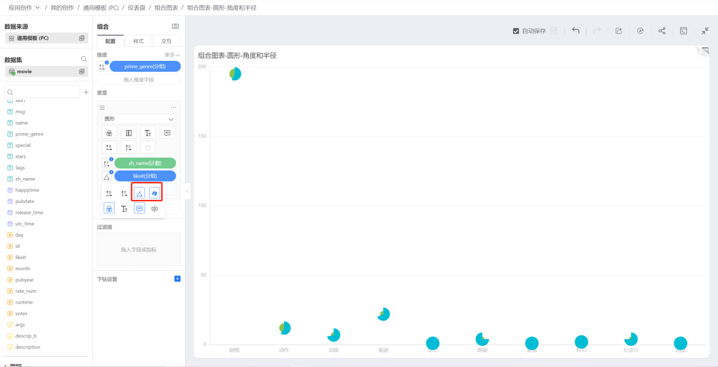
Angle and Radius
When the shape is a circle, dragging in a sub-dimension allows that sub-dimension to control the circle’s Angle and Radius.
Angle determines the angular size of each sub-dimension’s corresponding value. If this option is not selected, every sector will have the same angle.
Radius determines the radial size of each sub-dimension’s corresponding value. If this option is not selected, the result is a pie chart; if it is selected, the result is a Nightingale chart.
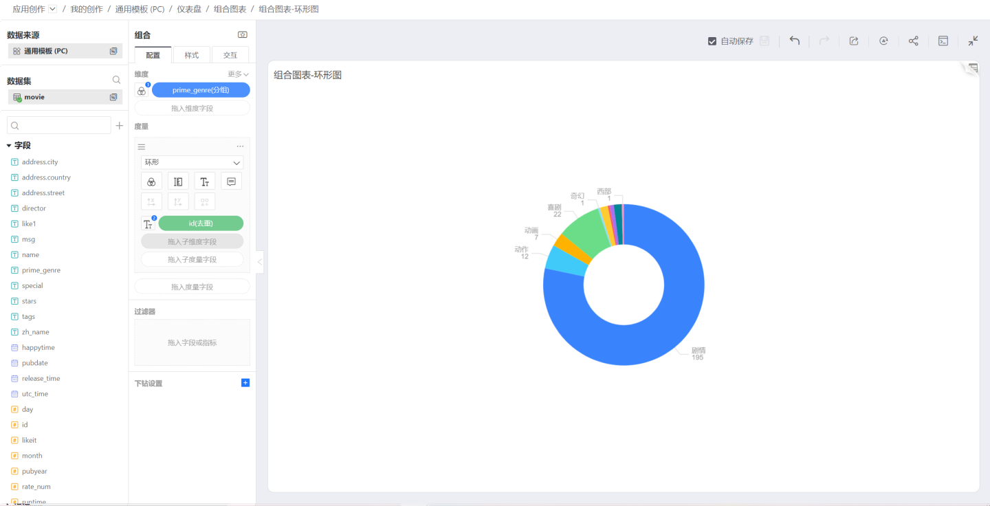
Donut
When the Donut shape is selected, the chart is rendered as a donut chart.
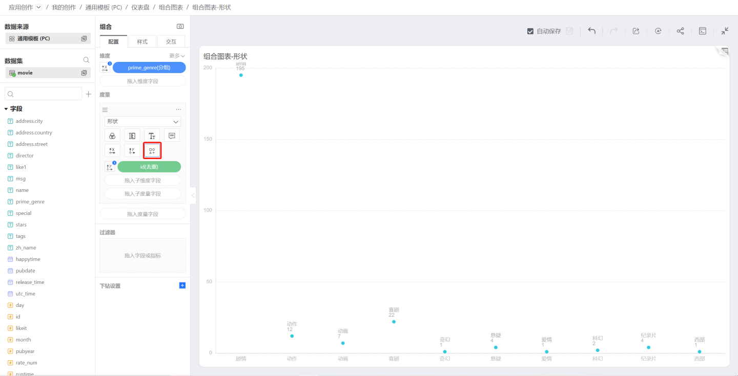
Shape
When Shape is set to Shape, the data points are rendered as the selected symbol. You can pick the desired symbol through the symbol pop-up window:
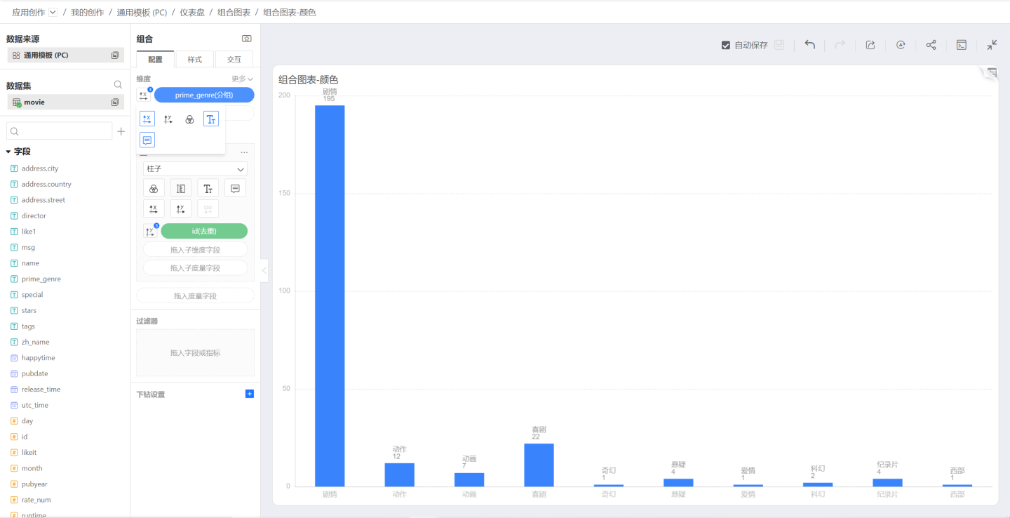
Color
Single Color
When a chart is first created, no dimensions or measures control its color, so the chart appears in a single color, as shown below:
Discrete Colors
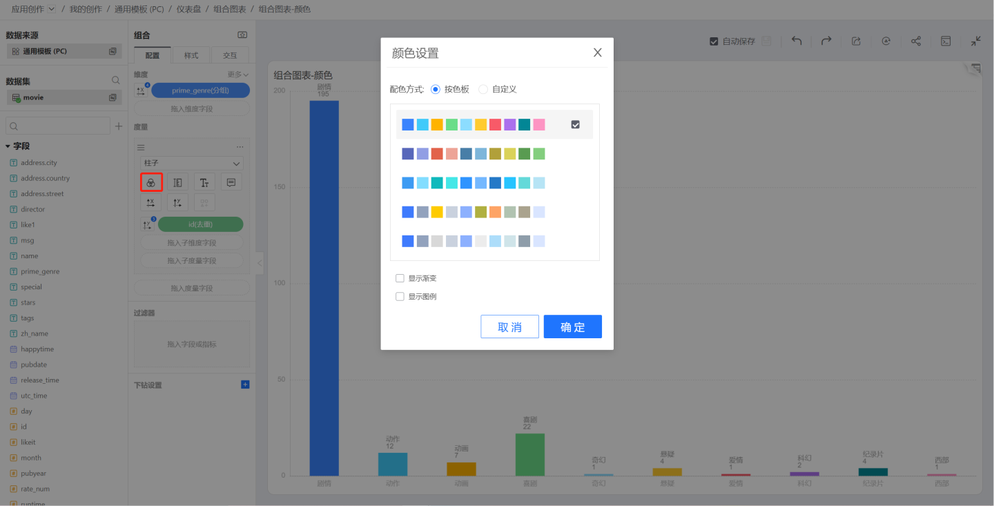
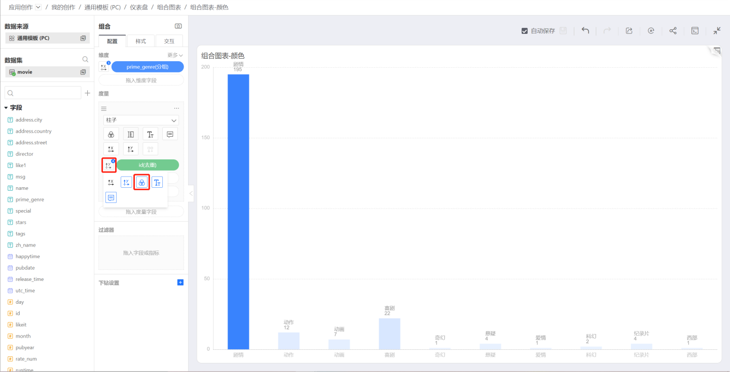
To control chart colors with a dimension, click the icon to the left of the dimension to open the control menu and select the color icon. The chart will then use discrete colors—one color per dimension value.
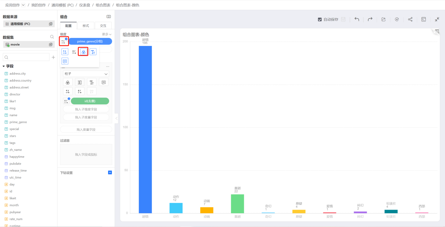
To change the color scheme, click the color icon below the chart to open the discrete color palette.
If you check Show Gradient in the palette, each bar will display a gradient effect.
Continuous Color
To control chart colors with a measure, click the icon to the left of the measure to open the control menu and select the color icon. The chart will then display a continuous gradient based on the measure’s values.
Size
The Size icon controls the dimensions of various shapes, such as the thickness of bars or the size of circles and rings.
Label
Label is used to configure the display of labels. In addition, you can drag in various measures to control label content.
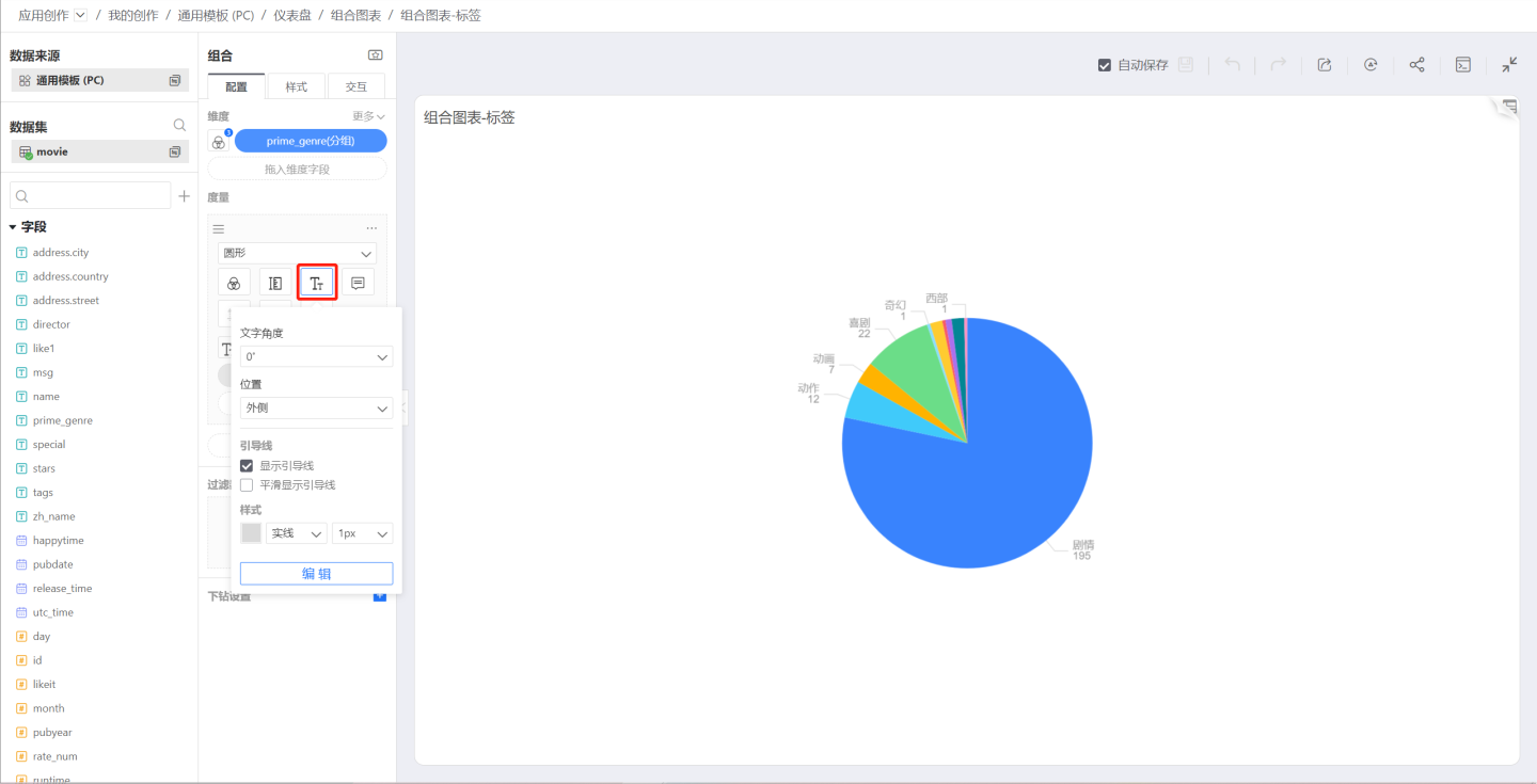
For example, in a pie chart, drag in a sub-measure; the sub-measure is Count -> Percentage. The sub-measure does not control the mark display, only the Label and Tooltip, so both the measure and its percentage can be seen in the chart at the same time.

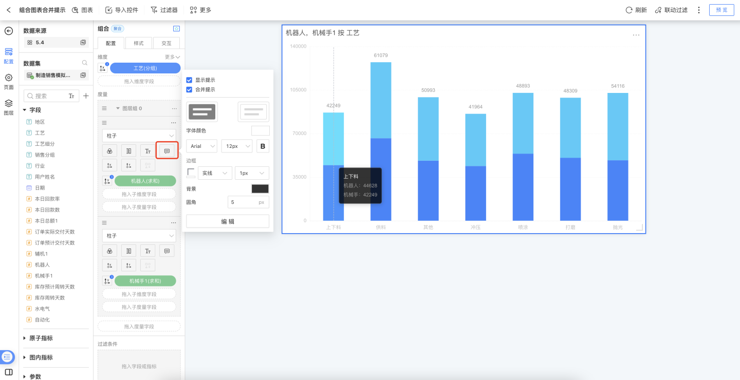
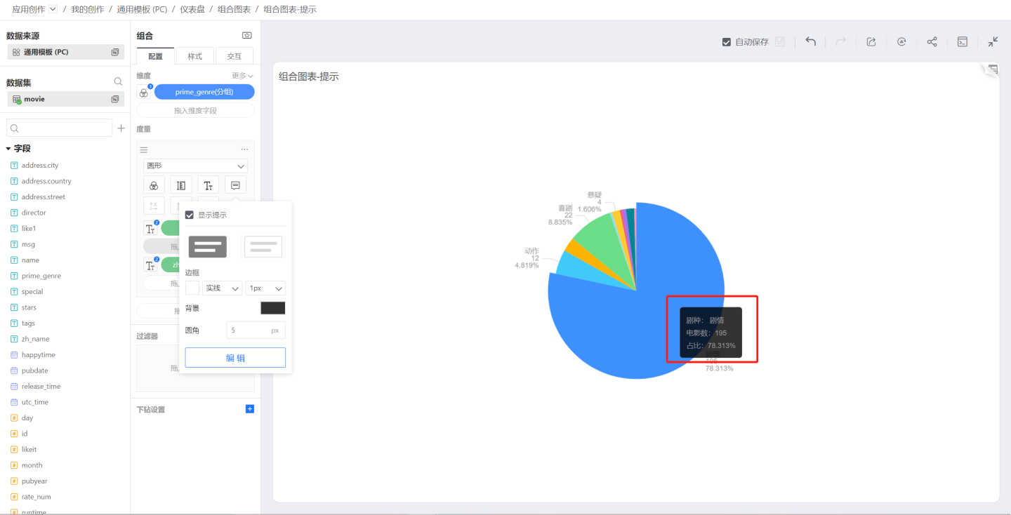
Tooltip
The Tooltip controls what appears when you hover over the chart. Like the Label, you can drag sub-measures into it to add extra tooltip information.
Updated in v6.2
Combo-chart tooltips now display dimension field names by default, eliminating the ambiguity of dimension information. When you change a field’s “Display Name”, the name in the tooltip updates automatically.
- Existing charts: remain unchanged unless re-edited
- Partial update: newly added fields in old charts follow the new logic
- Merged tooltip: when “Merge Tooltip” is enabled, dimension fields are not shown in the rich-text area (current rule unchanged)
Tooltips inside a measure group can be merged. Configuration path: Configure > Measures in Group > Tooltip > Merge Tooltip.
Note: after enabling Merge Tooltip, the tooltips of multiple measures are initialized into a single block; any manually edited content before merging is discarded. Disabling the merge will also re-initialize the Tooltip content.
Symbol
When the chart type is set to Bar, Area, or Shape, the Symbol icon becomes active.
Symbols control the shape of each data point. In the symbol list, you can set a custom symbol.
The size of the symbol is controlled by the Size setting mentioned earlier.
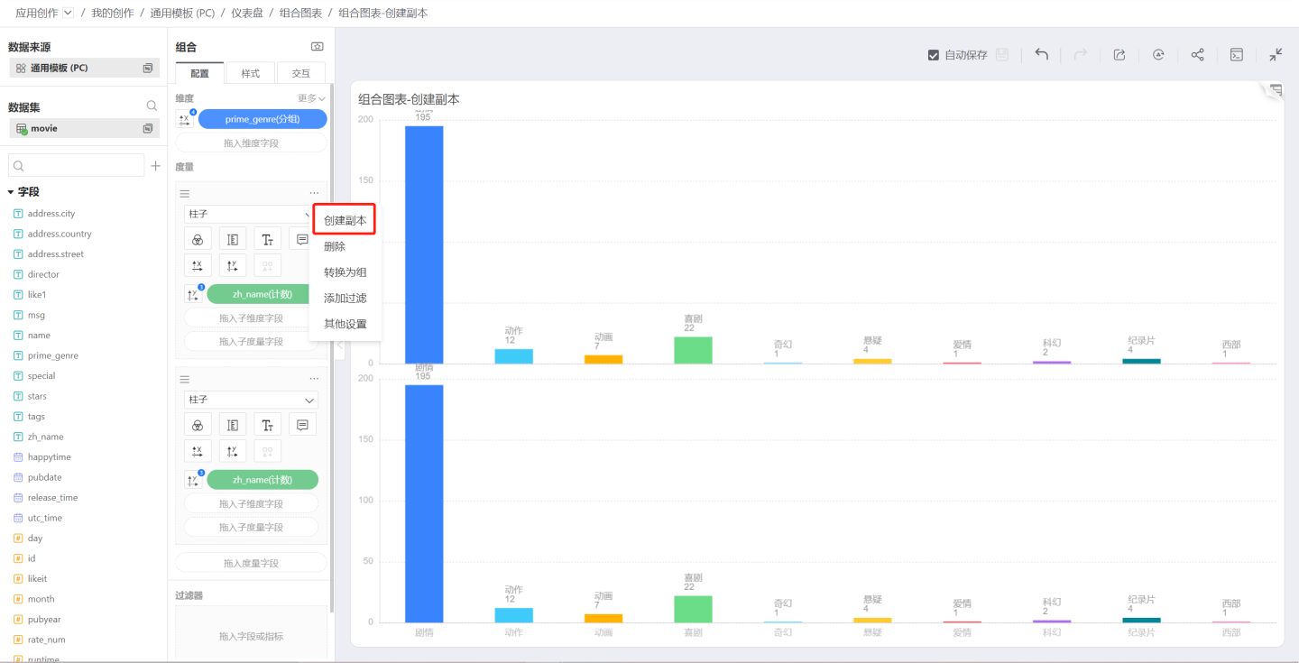
Measure Actions
Click the three-dot menu in the upper-right corner of the measure area to open the measure menu, which includes Duplicate, Convert to Group, Delete, Add Filter, and more.
Create Duplicate
Create Duplicate creates an exact copy of the measure, sharing the same dimension settings as the original.
Convert to Group
Click Convert to Group in the measure menu to turn the measure into a group; the default group name is Layer Group 0.
Join Group
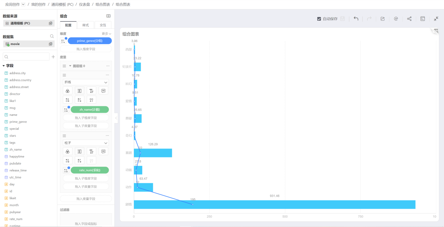
After converting a measure into a group, click the menu of another measure and the Join Group option will appear, allowing you to select the previously created group Layer Group 0. 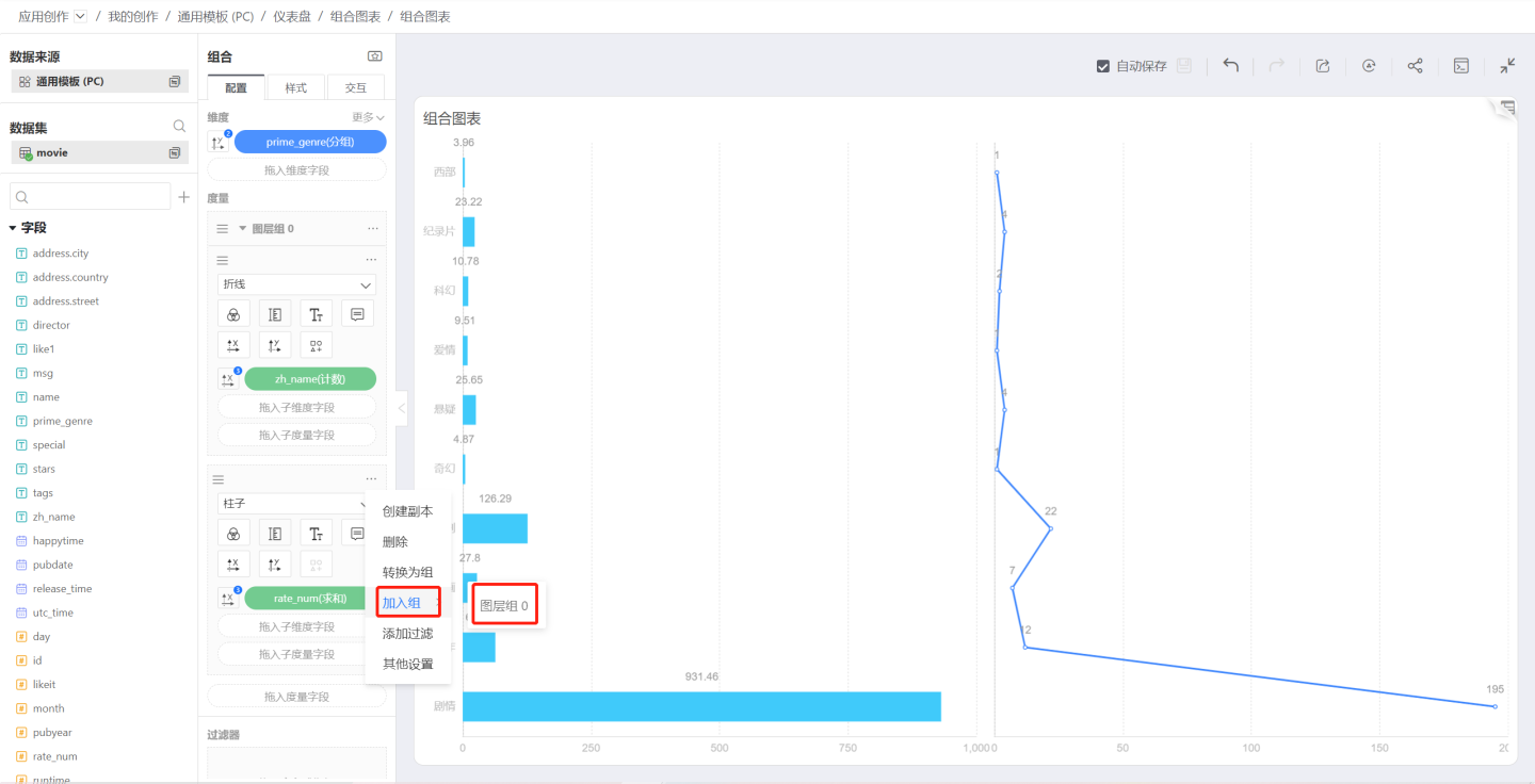
After joining the group.
Leave Group
In a layer group, click the three-dot menu on a joined measure and select Leave Group. After leaving the group, the measure becomes an independent measure and is plotted separately.
Add Filter
This feature works the same as other chart measure filters, allowing you to filter a single measure.
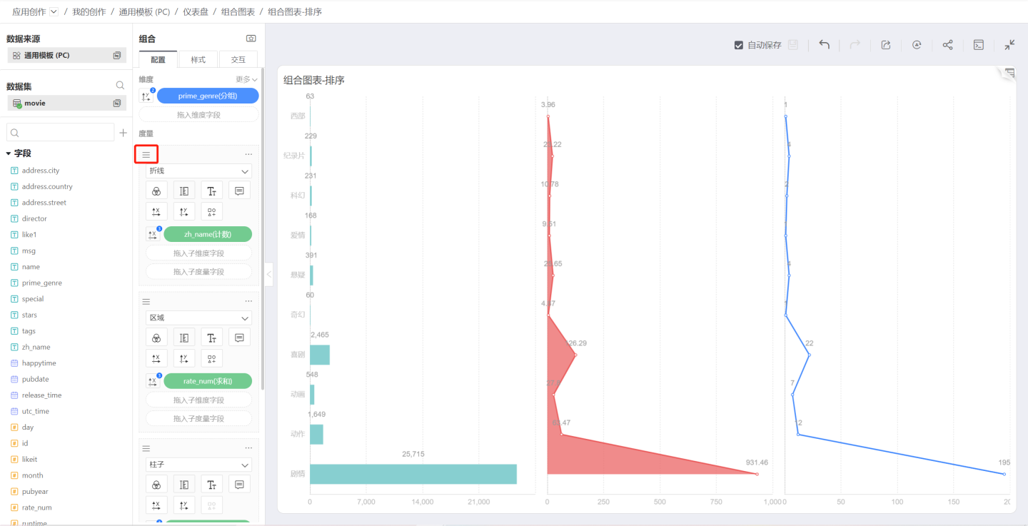
Measure Sorting
Drag the sort icon in the upper-left corner of each measure to reorder the measure visuals.
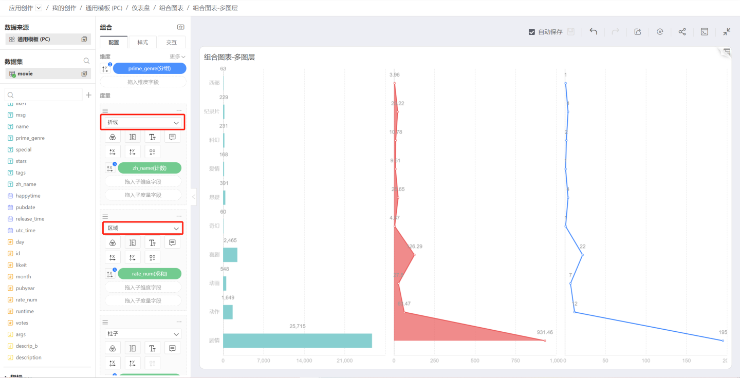
Sub-dimension
Dragging a sub-dimension into a measure splits the measure and, depending on the chart settings, produces stacked bar charts, stacked area charts, and similar visualizations.
Sub-Measure
Drag a sub-measure into the measure to control Color, Label, or Tooltip. You can also use a sub-measure to control the X-axis or Y-axis; however, once a sub-measure is used for an axis, no other measure within the same measure group can control that axis. In other words, only one measure—either the main measure or a sub-measure—can drive the charting.
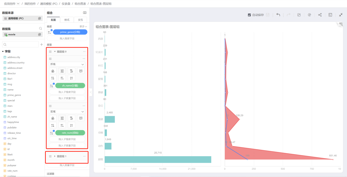
Layer Group Menu
Rename
You can change the layer group name to something more user-friendly.
Create Duplicate
Creates a layer group that is identical to the original layer group.
Merge Mode
Click the three-dot menu of a layer group to open the Merge Mode menu, which controls how the measure graphics within the group are merged.
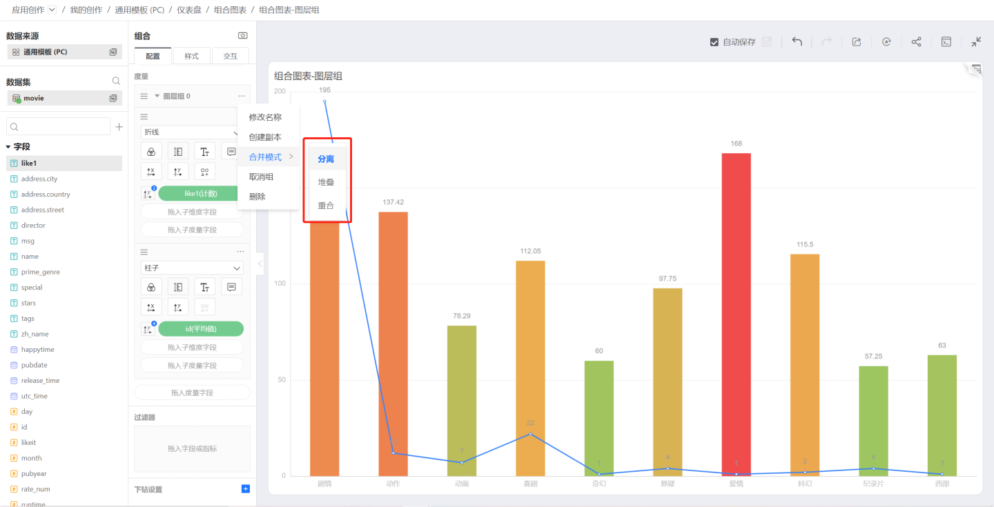
Separation
After joining a group, the default merge mode is Separation; when two bar charts are merged, they become a clustered bar chart: 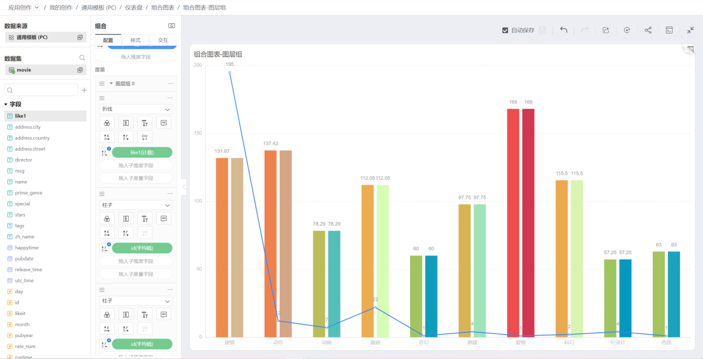
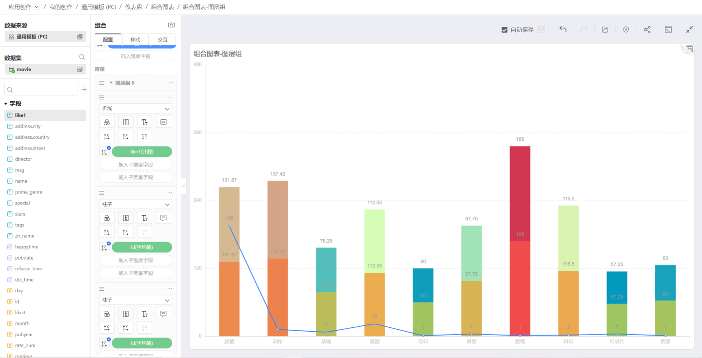
Stack
When the merge mode is set to Stack, the two bar charts are combined into a stacked bar chart. At this point, you need to disable dimension-based coloring and let each measure control its own color:
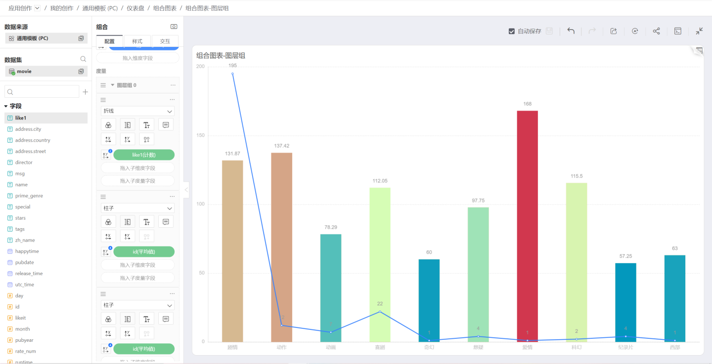
Overlap
When the merge mode is set to Overlap, the measures will be stacked on top of each other. Below is the effect of two area charts overlapping:
Version 6.2 Update
When the multi-measure merge mode is set to Overlap, bar charts are now displayed with center alignment instead of the previous "left alignment", delivering a more visually appealing effect. This enhancement is a system-level visual upgrade that takes effect automatically without manual configuration.
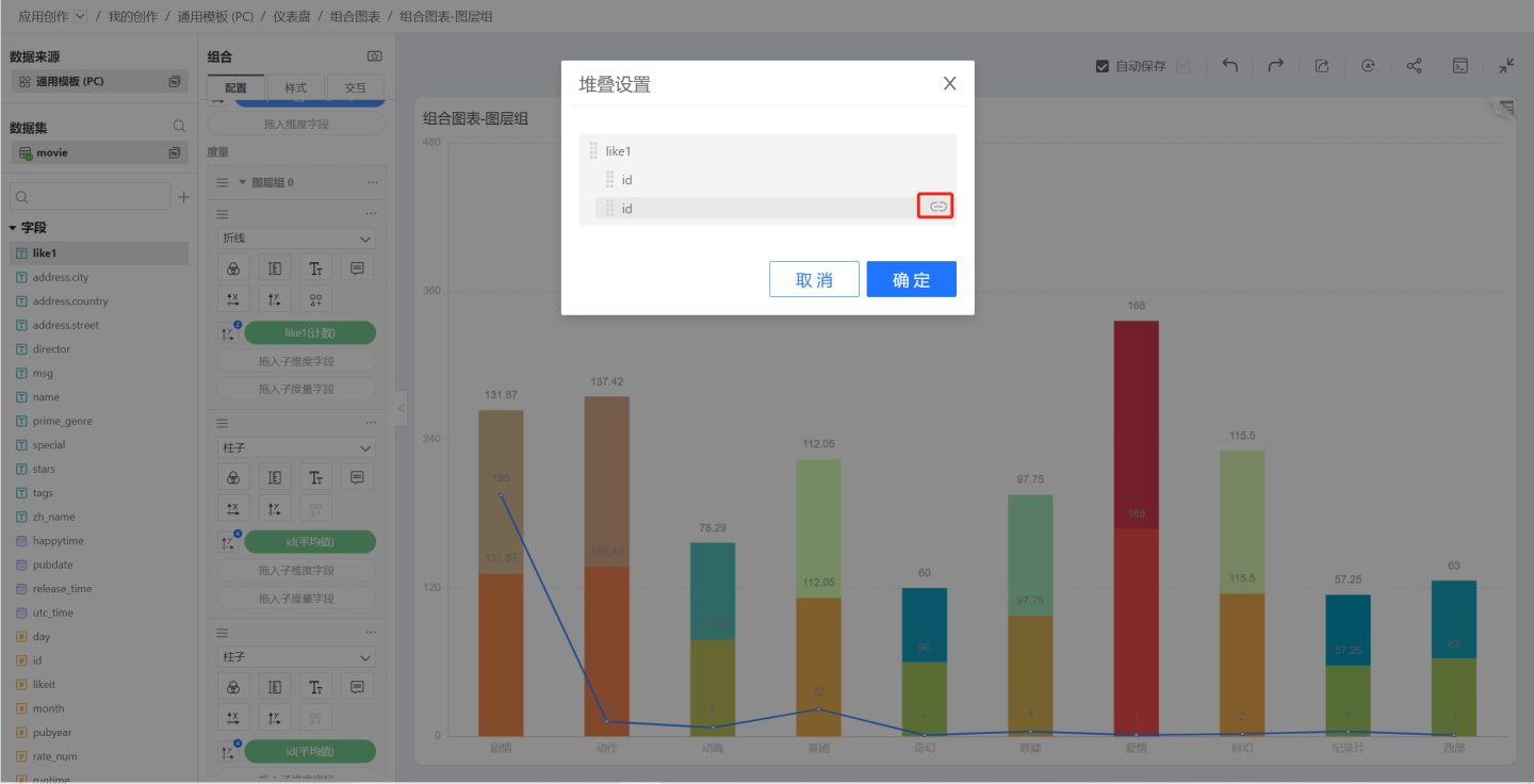
Stacking Settings
When the merge mode among the measures inside a layer group is Stack, the Stacking Settings option appears in the layer-group menu. These settings govern how the individual layers stack—for example, with five bars you can stack the first onto the second and the third and fourth onto the fifth.
Click the layer group’s Stacking Settings menu to open the Stacking Settings dialog; clicking the indent icon toggles whether stacking is enabled.
In the image below, the bars of two IDs are stacked.
Join Group
If multiple layer groups exist, Join Group will appear in the layer-group menu. Selecting any listed group appends everything in the current group to the chosen layer group.
Ungroup
Click the three-dot menu of a layer group and select Ungroup; the entire group will be disbanded, all measures revert to independent measures, and the Merge Mode will no longer apply.
Delete
Deletes all content in the selected group. After deletion, you can click the chart’s Back button to restore it.
Reordering Layer Groups
Drag the sort icon in the upper-left corner of a layer group to reorder layer groups.