Gauge Chart
The gauge chart control is a common type of data chart that can be seen on various devices, such as the various gauge charts on car display panels, heat meters, water meters, etc.
Gauge charts are often used to display project progress completion, proportion, etc. As shown in the figure below, a dashboard is used to display the completion of annual sales targets.
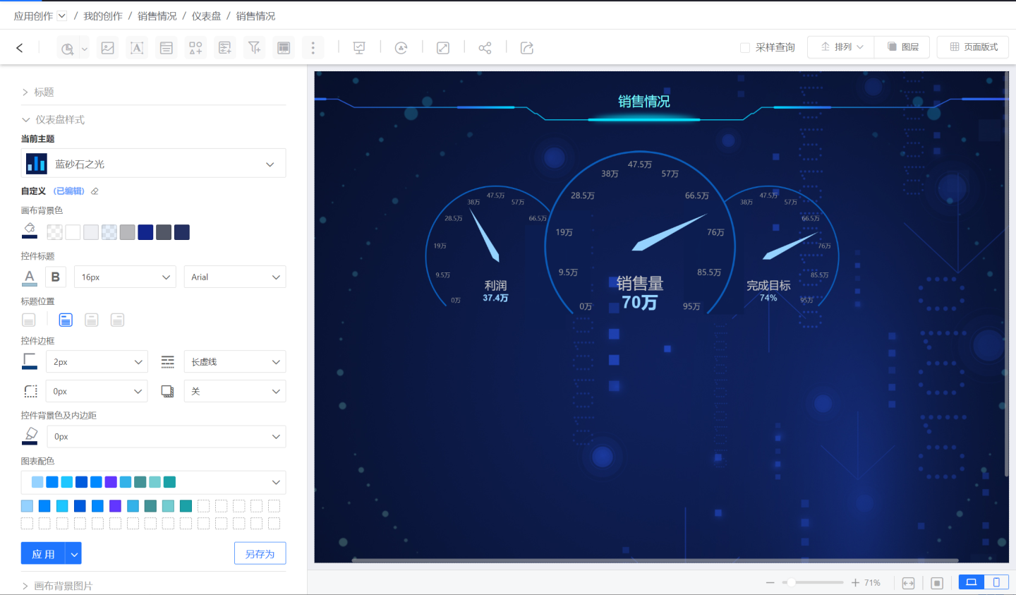
Dashboard Creation
The following introduces the process of building a dashboard, covering dashboard configuration, style settings, and interactions within the chart.
Configuring Gauge Charts
Follow the steps below to configure a gauge chart.
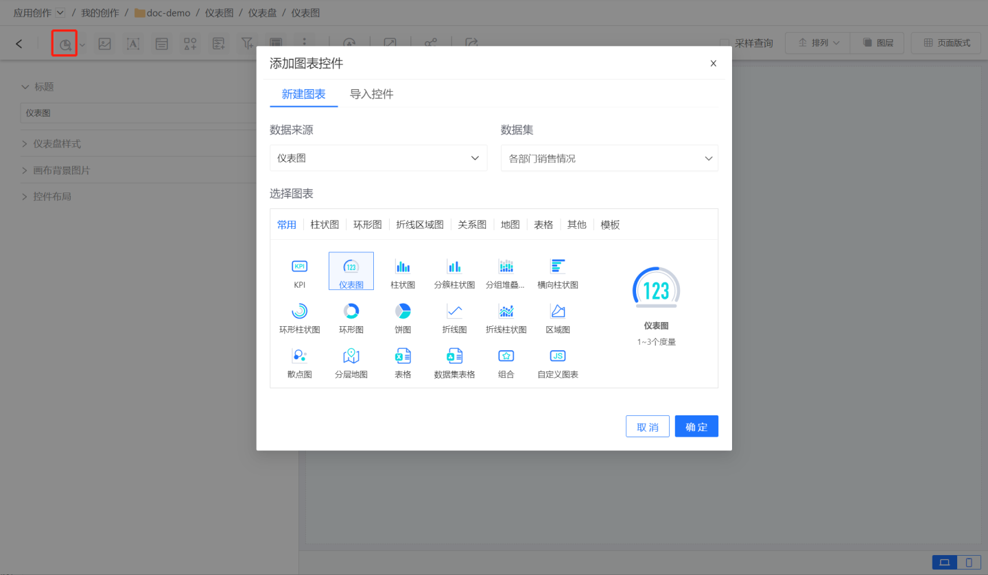
Create a new gauge chart. Click the add chart control button, select the gauge chart, and configure the dataset used by the gauge chart.
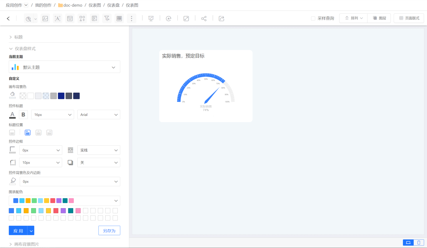
Enter the gauge chart configuration page. Configure the percentage field and range field of the gauge chart. The percentage field represents the current progress, while the range field defines the minimum and maximum values of the gauge chart. The minimum value defaults to 0 and can be left blank. In the example, it shows the progress of sales target completion. The percentage field is sales amount, and the range field is the expected sales target.
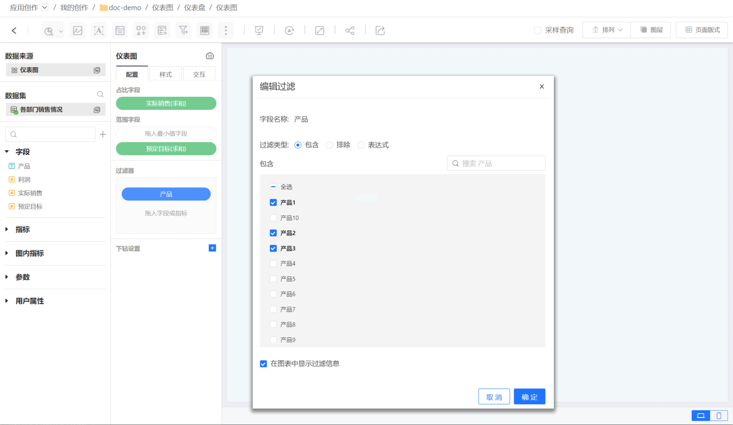
Add an in-chart filter to filter the data of the gauge chart. As shown in the figure, use the filter to display only the data related to 3 products.
The above three steps complete the data configuration process of the gauge chart. Next, proceed with the style settings of the gauge chart.
Setting Gauge Chart Styles
Gauge chart style settings include title, chart style, chart content, pointer, center indicator, scale, and padding.
Title
The title of the dashboard chart can be set as follows:
- Show or hide the title.
- Customize the title.
- Set the title color and font size.
- Set the title position.
Chart Styles
The dashboard supports four styles, each with three angle settings, defaulting to 12 dashboard styles. 
Tip
The default style includes settings for chart content, pointers, central indicators, and scales. Restoring the default style will reset all the above settings to the system default state.
Chart Content
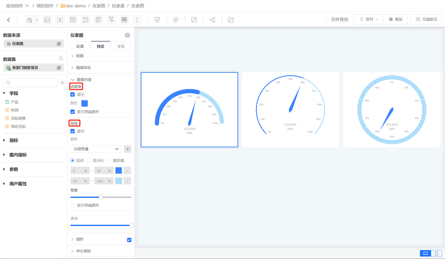
The chart content includes progress bars, backgrounds, and gauge sizes.
Progress Bar The gauge uses a progress bar to indicate the current progress, as shown in the left chart in the example, where the progress bar covers the scale values.
Background The gauge background settings include background color and background width.
- Background color can be set to a uniform color value or segmented settings. In the example, the left and middle charts use segmented settings, while the right chart uses a uniform color value.
- Background Width Background width refers to the display width of the gauge. In the example, the background width of the left and right charts is larger than that of the middle chart.
Gauge Size Gauge size refers to the radius size of the circular gauge. In the example, the sizes of the three gauges are the same.
Pointer
The pointer of the gauge chart can be set for length, width, and color. In the example, the left chart uses the default pointer mode, while the middle and right charts use custom pointers. The gauge chart can also be displayed without a pointer. 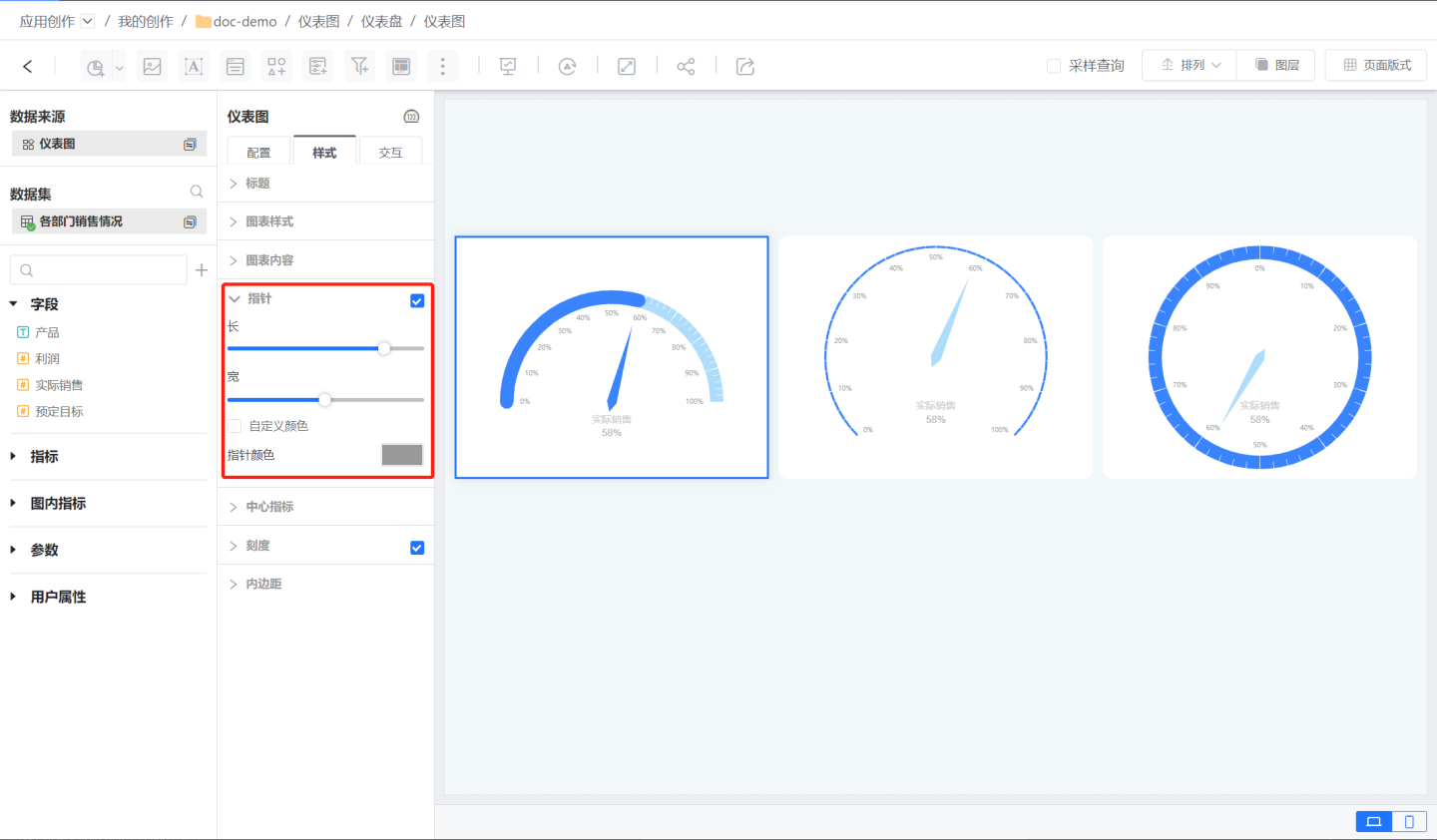
Central Metrics
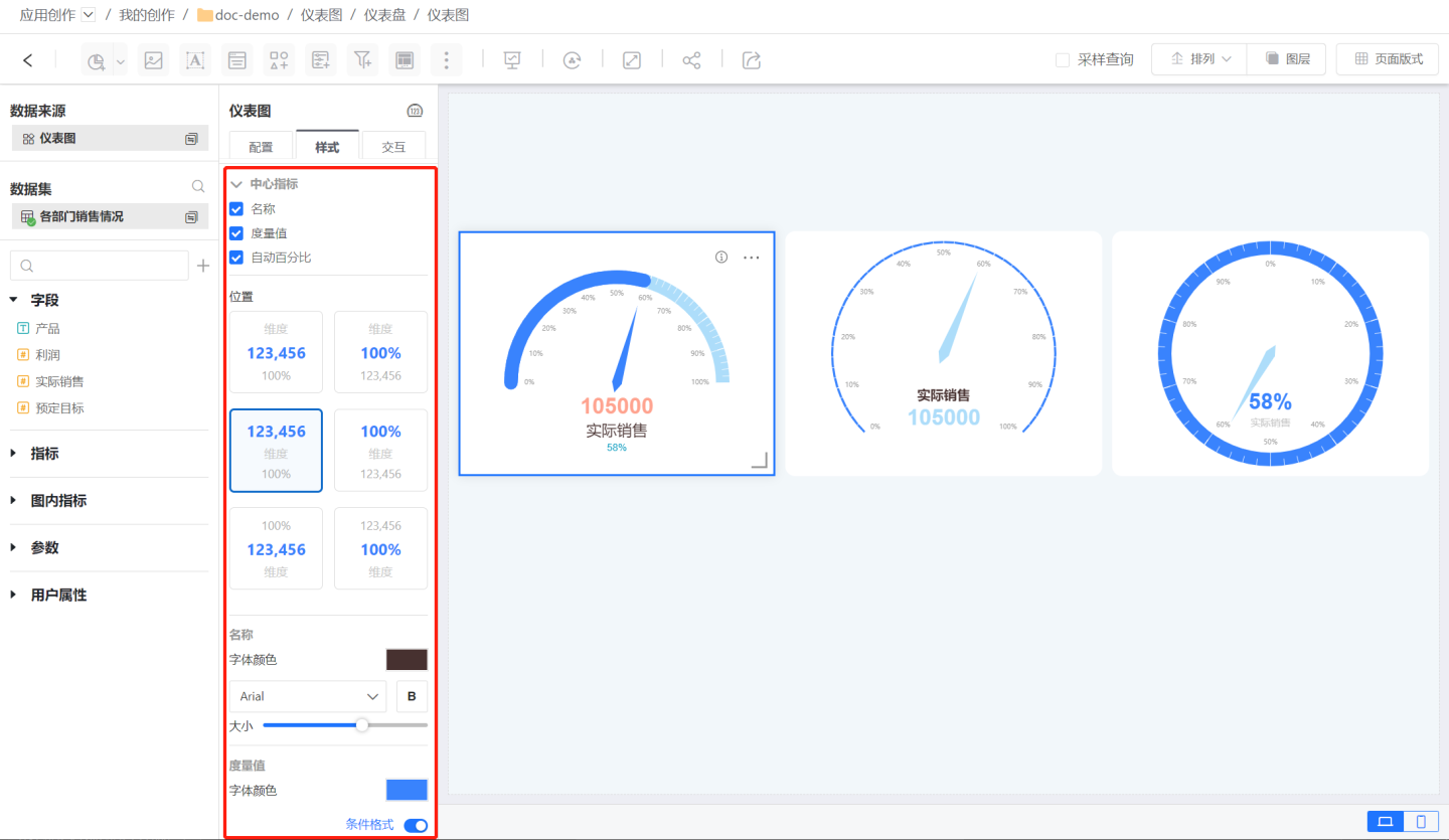
Central metrics include name, measure, and automatic percentage. Their position and color can be set.
- Position: Refers to the relative vertical position of the name, measure, and automatic percentage.
- Color and Size: The color and size of the name, measure, and automatic percentage can be set separately.
The percentage display value in the central metrics of the dashboard chart shows the actual achievement rate when it exceeds 100%. 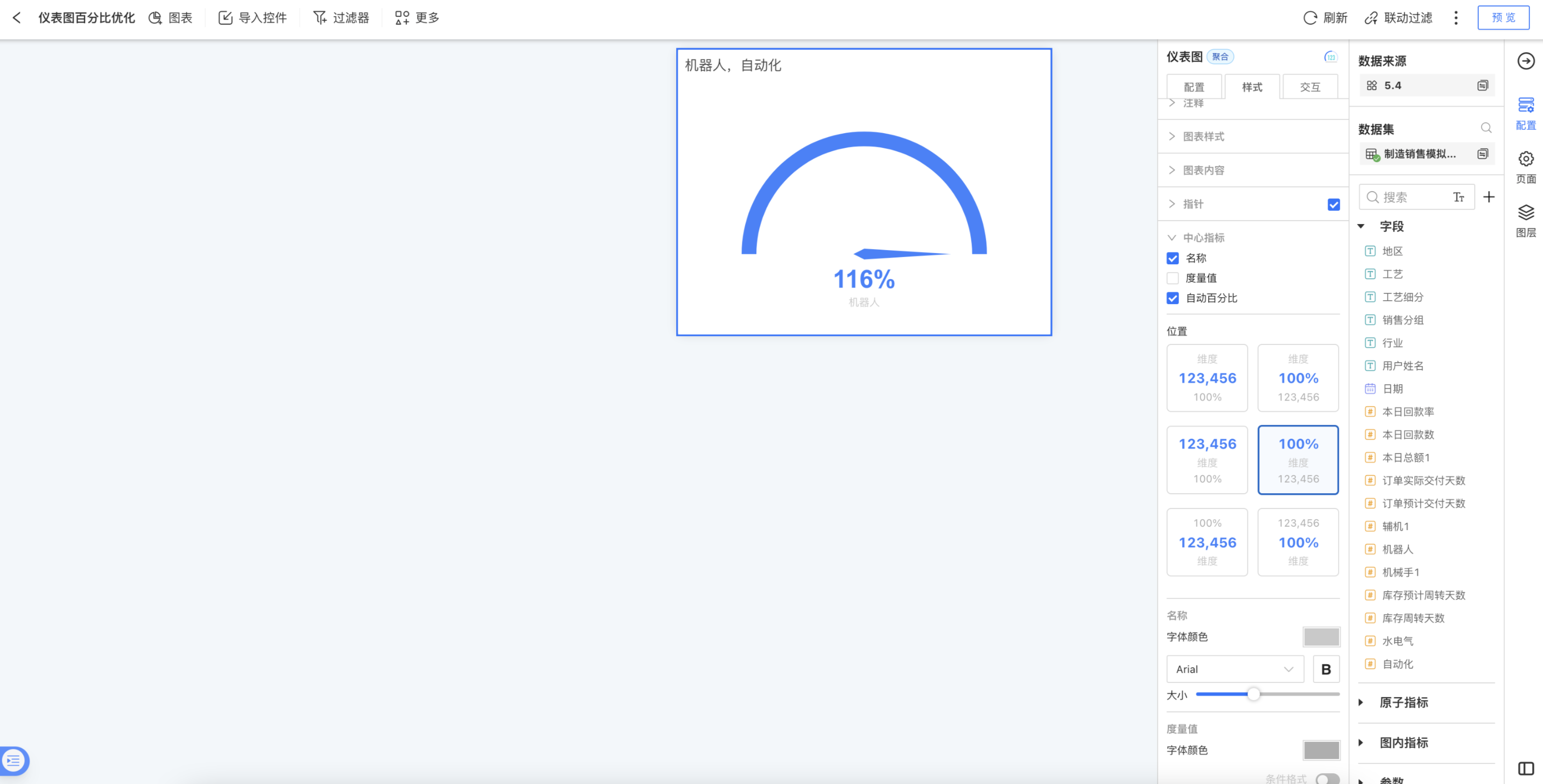
Scale
The scale supports setting the scale position, minimum and maximum values, scale intervals, the length, width, line type, and color of the interval scale lines, scale label display, interval scales, and the length, width, line type, and color of the interval scale lines.
- Scale positions include outer, top, and inner. As shown in the figure.
- The minimum and maximum values of the scale can be automatically obtained from the field, and manual modification is also supported.
- The scale interval refers to the number of intervals divided between the maximum and minimum values of the dashboard. The length, width, line type, and color of the interval scale lines can be set.
- Scale labels refer to the scale values displayed in each interval, which can display numerical values or percentages. The color and size of the label values can be set.
- Interval scales are scale lines marked within each interval, subdividing each interval. The length, width, line type, and color of the interval scale lines can be set.
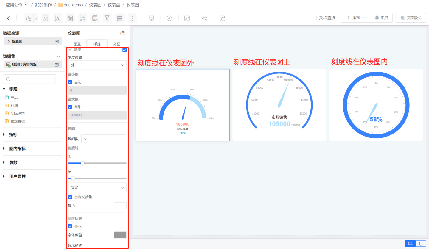
Chart Interaction
Within the chart interaction, you can set the number of interaction bars, automatic refresh, time travel, and click interaction behaviors within the chart.
Gauge Chart Control Settings
The appearance of the gauge chart can be set in the control settings. For detailed settings, refer to Control Appearance.
The gauge chart supports the following interactive operations:
- Linkage
- Drill-down
- Linkage + Drill-down
- Jump
- Execute JS Code
- No Response
- Jump
For related instructions and setting methods of interactive operations, please click here to view.