Integration via React JS SDK
The React JS SDK, similar to any third-party library on GitHub/NPM, provides the Completion UI component and the useProvider hook, enabling the integration of HENGSHI ChatBI capabilities and charts into your own React project.
React Version
The supported React version is 18, and the SDK we provide does not include react/react-dom/core-js.
Additionally, the SDK includes dependencies on the following third-party libraries:
- zrender v5
- lodash v4
- marked v15
- moment
- react-i18next
If your React project also uses the same dependency libraries, you can contact our support team for assistance. We can provide an SDK package that excludes duplicate dependencies to avoid unnecessary resource loading.
Note
The SDK package we provide is already a compressed version excluding React. When packaging your project, you should avoid compressing and obfuscating the SDK file again.
Quick Start
- Installation and Integration Download @hengshi/chatbi file, extract to get the
hengshifolder, and import it into your project.
Example Project Structure
<Your Project>/
├── src/
|   ├── hengshi/   <-- For example, place the SDK here within your project source code
│   ├── index.ejs
│   └── index.js
└── package.json- Render a Completion Component
Example index.js:
import React from "react";
import { createRoot } from "react-dom/client";

import Completion from "./hengshi";

function ReactApp() {
  const chat = { // This object structure comes from the HENGSHI ChatBI backend
    "meta": "refineQuestion,answer,chart,chartConfig", // The meta property controls which content the component renders
    "conversationId": 226,
    "uid": "00747081-9cc3-4c7c-b3de-735244498fd6",
    "prompt": "Module distribution of bug issues",
    "answer": "Bug issues are distributed relatively evenly across modules. The module with the most bugs has 4, while most other modules have 2-3 bugs.",
    "refineQuestion": "Please provide the module distribution of bug issues",
    "charts": [
      {
        "appId": 134683,
        "datasetId": 1,
        "options": {
          "axes": [
            {
              "op": "{{41}}.{title}",
              "uid": "uid1",
              "kind": "formula"
            },
            {
              "op": "count({{33}}.{issue_id})",
              "uid": "uid2",
              "kind": "formula"
            }
          ],
          "limit": 100
        }
      }
    ]
  };

  return <Completion {...chat} />;
}

const root = createRoot(document.getElementById("root"));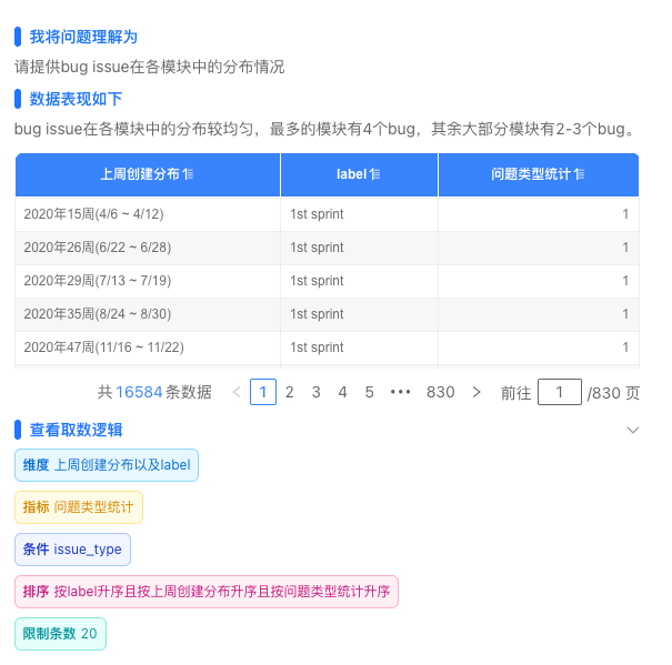
root.render(<ReactApp />);Rendered output as shown below:
useProvider hook
useProvider is a React Hook we provide, equivalent to the new Copilot(...) operation in the native JS SDK. This hook is designed to better suit React projects.
The return value of the useProvider hook refers to the copilot instance. Using this hook, you can create HENGSHI ChatBI conversations, render charts, and perform other functionalities within React projects.
Example:
import React from "react";
import { createRoot } from "react-dom/client";

import Completion, { useProvider } from "./hengshi";

function ReactApp() {
  const [chat, setChat] = React.useState();
  const [prompt, setPrompt] = React.useState('User input question');
  const [dataSources, setDataSources] = React.useState([{"dataAppId":134683,"datasetId":1}]); // Conversation data sources
  const provider = useProvider({
    baseUrl: 'http://localhost:8881', // HENGSHI service address
    pollingInterval: 1000, // Polling interval in milliseconds
  });
  const onSend = () => {
    provider.context.onCreateChat({
      prompt, // This is the user's question
      userConfig: {
        dataSources,
      },
    }, _chat => {
      setChat(_chat);
      provider.context.onWaitingChat(_chat.conversationId, _chat.uid, setChat);
    });
  };

  return (
    <div>
      <input onChange={e => setPrompt(e.target.value)} />
      <button onClick={onSend}>Send</button>
      {chat ? <Completion {...chat} /> : null}
    </div>
  );
}

const root = createRoot(document.getElementById("root"));
root.render(<ReactApp />);Shadow DOM Description
To avoid style conflicts, the component uses Shadow DOM for rendering, ensuring that the component's styles neither affect nor are affected by external applications.
SDK Directory Structure
hengshi/
├── index.css        # Stylesheet file
├── index.js         # Main SDK entry point
├── font/            # Font resources
│   ├── fontello.ttf
│   ├── fontello.woff
│   └── fontello.woff2
└── locales/         # Language packages
    ├── en-US.json
├── zh-CN.jsonComponent API Reference
As shown in the previous example, the Completion component accepts chat data as a parameter. This object represents the HENGSHI conversation round data and can be retrieved via the GET /api/conversations/${conversationId}/chats/${uid} API. For the data structure, refer to chat.
In addition to all the attributes of the chat object, the Completion component also accepts the following parameters:
| Parameter | Type | Description |
|---|---|---|
| meta | STRING | Any combination of strings such as 'refineQuestion', 'answer', 'chart', 'chartSwitcher', 'chartConfig', separated by commas (','), used to customize the display content |
| disableEllipsis | BOOL | When set to true, tags for answers and data-fetching logic will not be collapsed or omitted |
| showWhenNoData | BOOL | Whether to display the chart component when there is no data, default is false |
| chartTheme | STRING | Dashboard theme ID, refer to Theme Colors |
| stylesheets | STRING or STRING ARRAY | Stylesheet links or stylesheet content for custom styling |
| locale | STRING | Language setting, default is 'zh-CN', supports 'zh-CN', 'en-US', 'zh-TW', 'ja-JP' |
| onChangeChartType | FUNCTION | Callback function for switching chart types; when this parameter is provided, an icon button for switching chart types will appear above the chart |
| parser | OBJECT | Configuration options |
| parser.onSelect | FUNCTION | When this parameter is provided, a "+" icon button will appear in the upper-right corner of the chart, and clicking the button will trigger this function |
| parser.selectedText | STRING | The string will be used as the Tooltip content for the "+" icon button |
| onReady | FUNCTION | Callback function triggered upon initial rendering |
Frequently Asked Questions
Prompted Not Logged In, How to Resolve?
Refer to the Login Authentication section. Before rendering the component, login authentication must be completed.
How to Customize Styles?
Due to the use of Shadow DOM, you need to modify styles by passing parameters through stylesheets. The stylesheets parameter accepts a string or an array of strings, and supports both stylesheet links and stylesheet content. For example:
const stylesheets = [ // External constants can be used to avoid React component re-rendering
  'https://cdn.example.com/custom.css',
  `.custom-class { color: red; }`,
];

function ReactApp() {
  return <Completion
    {...chat}
    stylesheets={stylesheets} />;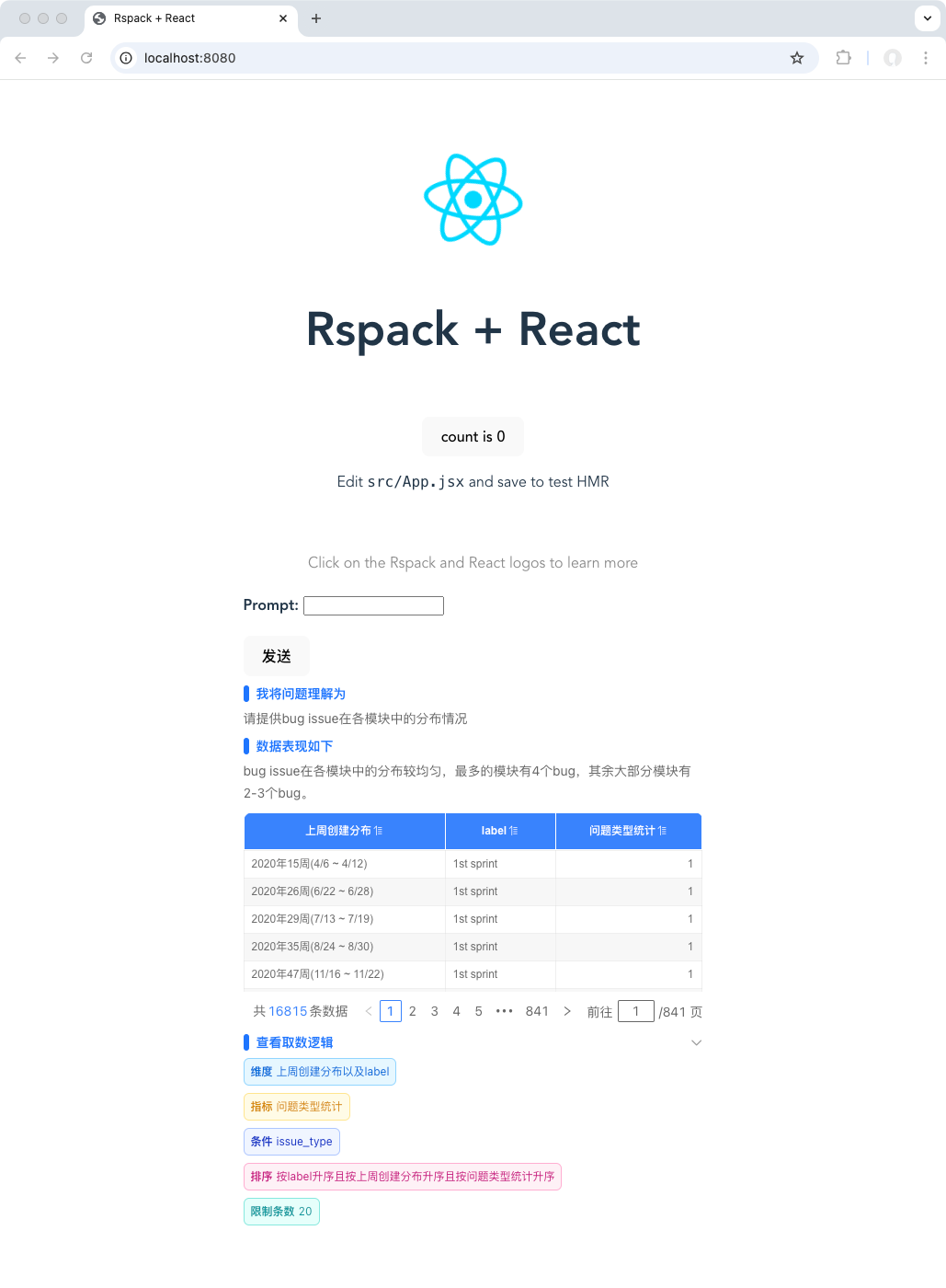
}How to use in the rspack project?
Contact after-sales support to obtain the SDK package. After extracting, you will get the hengshi folder. Place the hengshi directory into your project's public folder (since the SDK contains static resource files that need to be served by rspack devServer), and you can start the development mode of your project.
Then, you need to modify the rspack config file:
- In the
rspack.SwcJsMinimizerRspackPluginconfiguration under rspack config minimizer, addexclude: /hengshi/to avoid the SDK JS files being compressed again (as double compression is meaningless and wastes packaging time). - Add
rspack.CopyRspackPluginto the rspack config plugins to copy thehengshidirectory to the output directory, for example:
export default defineConfig({
  // ...
  optimization: {
    minimizer: [
      // ...
      new rspack.SwcJsMinimizerRspackPlugin({
        exclude: /hengshi/,
      }),
    ],
  },
  plugins: [
    // ...
    new rspack.CopyRspackPlugin({
      patterns: [
        { from: 'public/hengshi', to: 'hengshi' },
      ],
    }),
  ],
});Example:
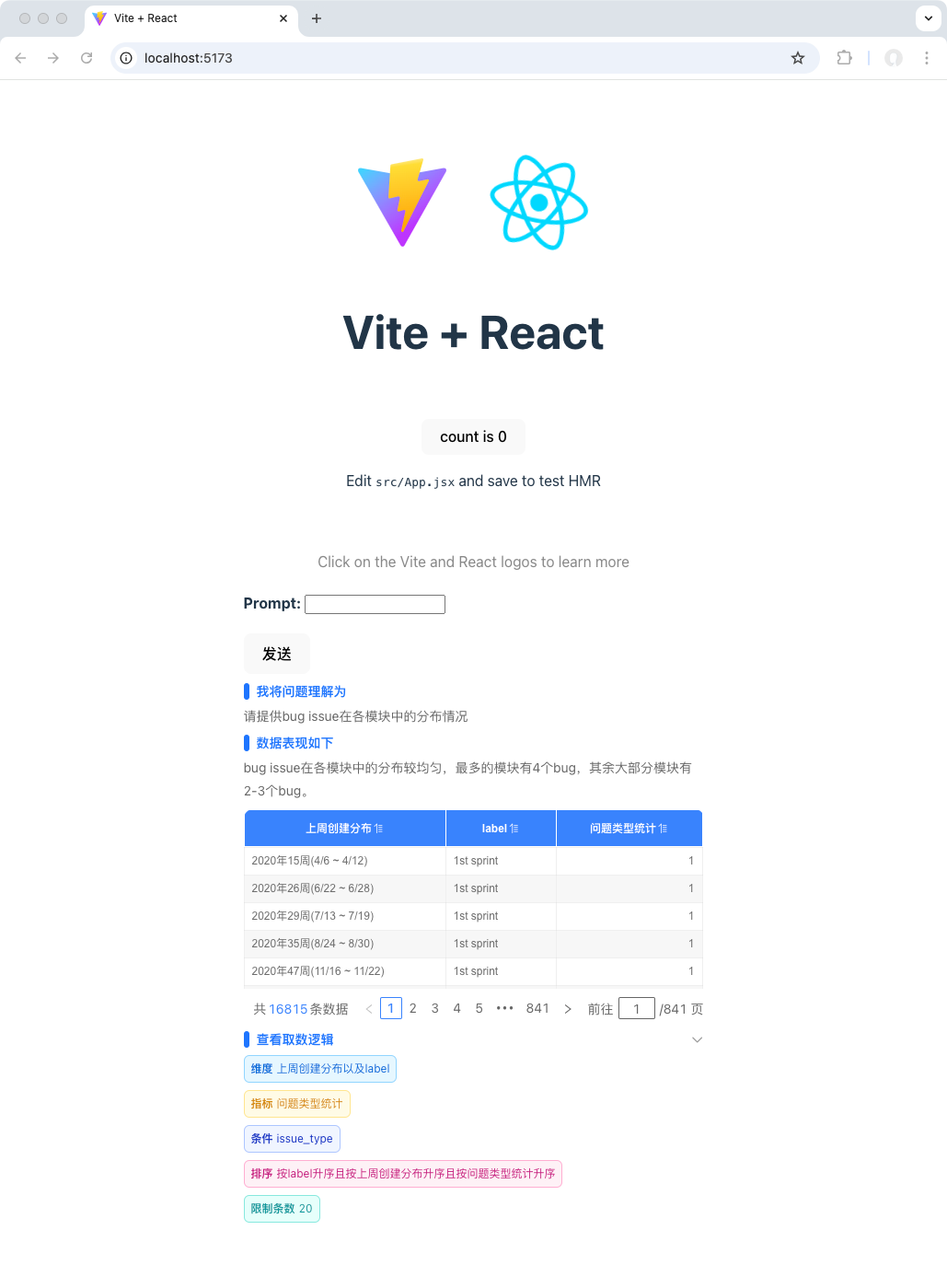
How to use in a Vite project?
Contact customer support to obtain the SDK package. After extracting, you will get the hengshi folder. Place the hengshi directory into your project's src folder, and you can start the development mode of your project.
Then, you need to modify the Vite config file:
- Add
exclude: ['hengshi']to theoptimizeDepsconfiguration in the Vite config file to prevent the SDK JS files from being optimized by Vite (as Vite optimization is unnecessary and wastes packaging time). - Install the
vite-plugin-static-copyplugin, and then add the following to thepluginsconfiguration in the Vite config file:
import { defineConfig } from 'vite'
import react from '@vitejs/plugin-react'
import { viteStaticCopy } from 'vite-plugin-static-copy'

// https://vite.dev/config/
export default defineConfig({
  optimizeDeps: {
    exclude: ['hengshi'],
  },
  plugins: [
    react(),
    viteStaticCopy({
      targets: [
        {
          src: 'src/hengshi',
          dest: 'assets',
        },
      ],
    }),
  ],
});Example:
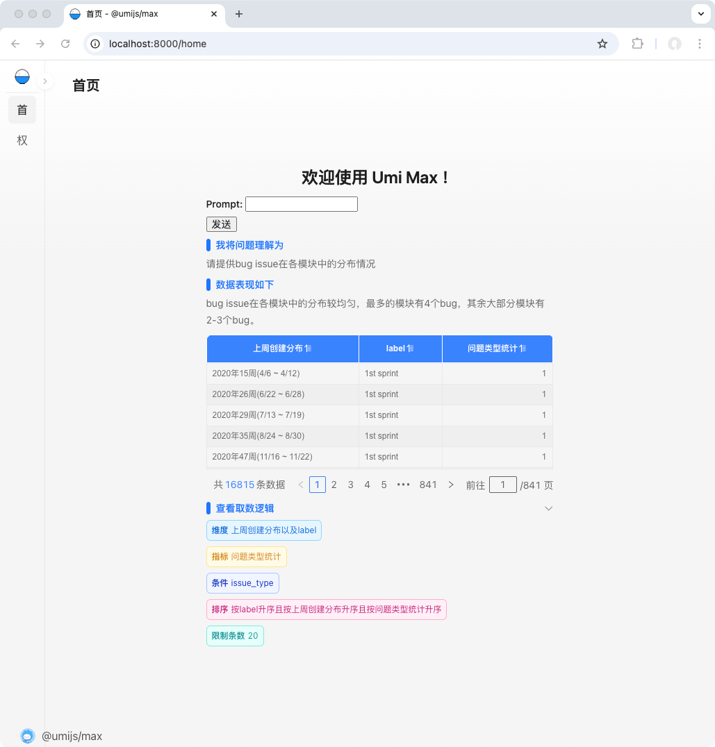
How to use it in an umi project?
Contact customer support to obtain the SDK package. After extracting, you will get the hengshi folder. Place the hengshi directory in both the public and src folders of your project.
Example: