Table Style Settings
In table-type controls, you can set the styles for table headers, cells, fields, and more to make the table display more visually appealing and allow users to access data more intuitively and conveniently.
The table supports settings for title, serial number, table header, cell, field styles, subtotals, collapsible dimensions, and other auxiliary functions. Below is a detailed introduction to the functionality and display effects of each style.
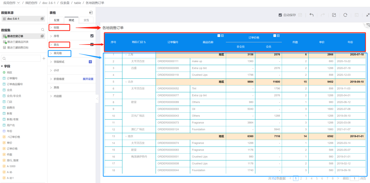
Title
The table supports setting display title, custom title, title color, and title position.
Table Serial Number
Tables support adding serial numbers to facilitate users in locating data.
Data scientists use tables to create data charts. To achieve a leaderboard display effect, they can set serial number styles for the top 3 data items. Configuration path: Style > Content > Serial Number > Top 3 Serial Number Style.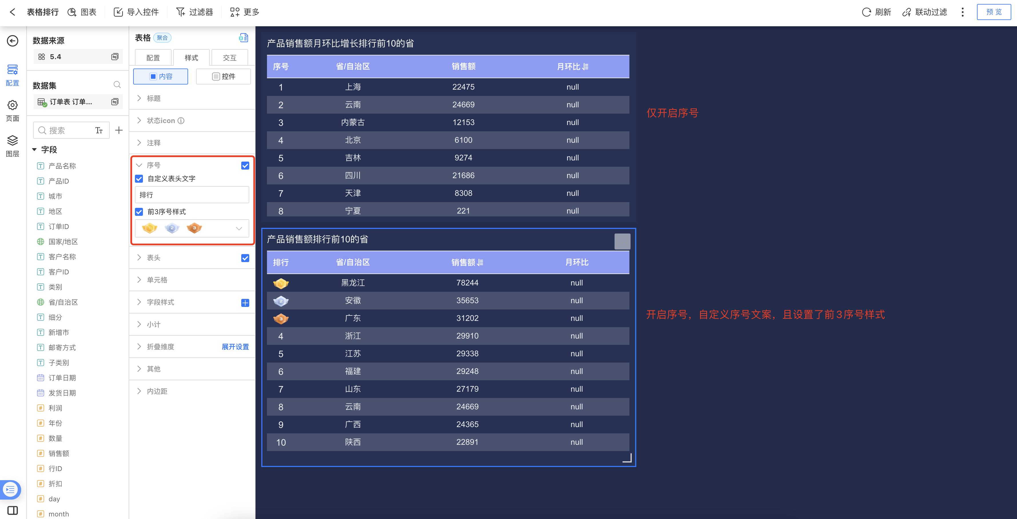
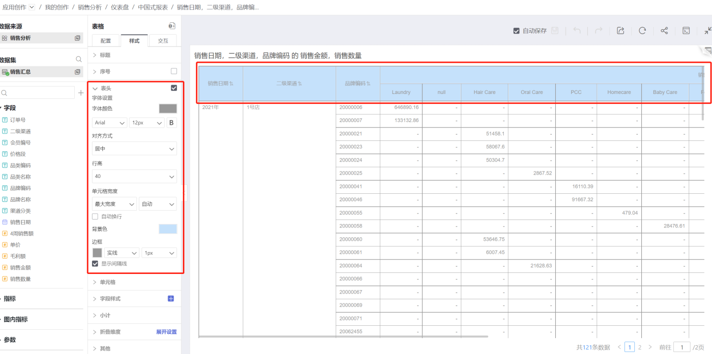
Table Header
The table supports settings for the display, font, color, border, etc., of the table header.
Display Table Header
The table can be set to show or hide the table header. By default, the table header is displayed. If it is not needed, uncheck the option.Text Settings
Supports settings for font color, font type, font size, bold, etc.Alignment
Refers to the horizontal alignment of text within the table header cell. The default alignment for header text is centered.Row Height
The height of a single table header can be set, with a range of 30-120px.Cell Width
To uniformly set the width of table cells, configure the cell width in the table header.Auto Mode: When set to auto, the cell width adjusts based on the content length.
Maximum Width: If the cell content exceeds the set range, it maintains the maximum width. If it is less than the maximum width setting, it adapts to the content. A specific value must be set for the maximum width.
Fixed Width: Displays the cell according to the set fixed width. A specific value must be set for the fixed width.
Auto Wrap: When the content is too long to be fully displayed, the auto-wrap function can be enabled. This feature only works under maximum width or fixed width settings and does not apply in auto mode.
Background Color
The table header background color supports only single solid colors without transparency.Display Separator Line
By default, this option is checked. If unchecked, the separator line will be hidden.
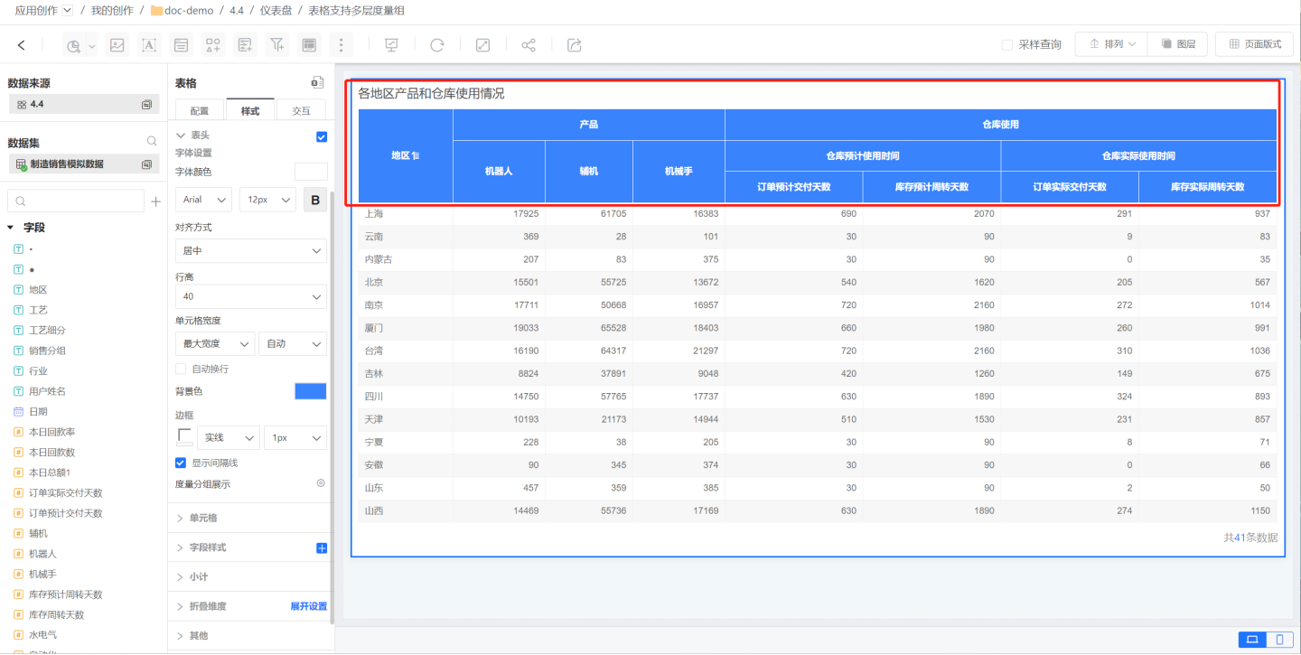
Metric Group Display
The table header can use the metric group feature to display the relationships and grouping among metric fields.
Click on the metric group display to open the metric group editing box. Click "Add Group" to display the newly created metric group at the bottom.
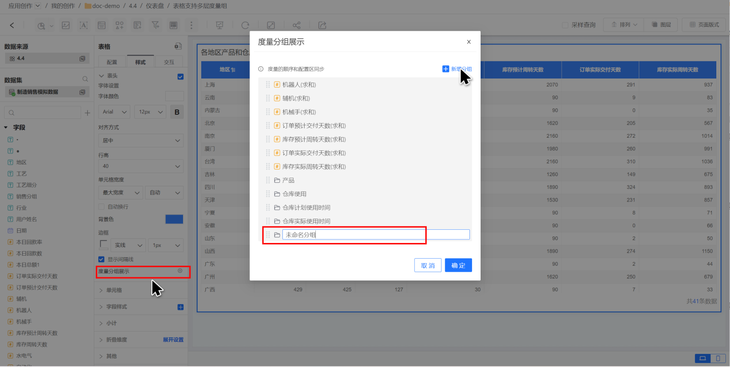
In the editing box, adjust the display hierarchy of the metric group by dragging and dropping metric information, showcasing the multi-level relationships between fields.
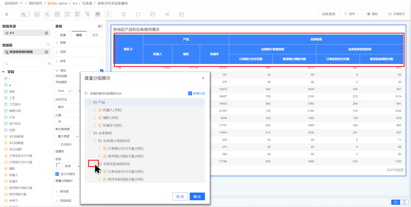
After setting up the metric group, if the order of metric fields is adjusted, the metric group information will also be automatically updated, and the display in the table header will change accordingly. 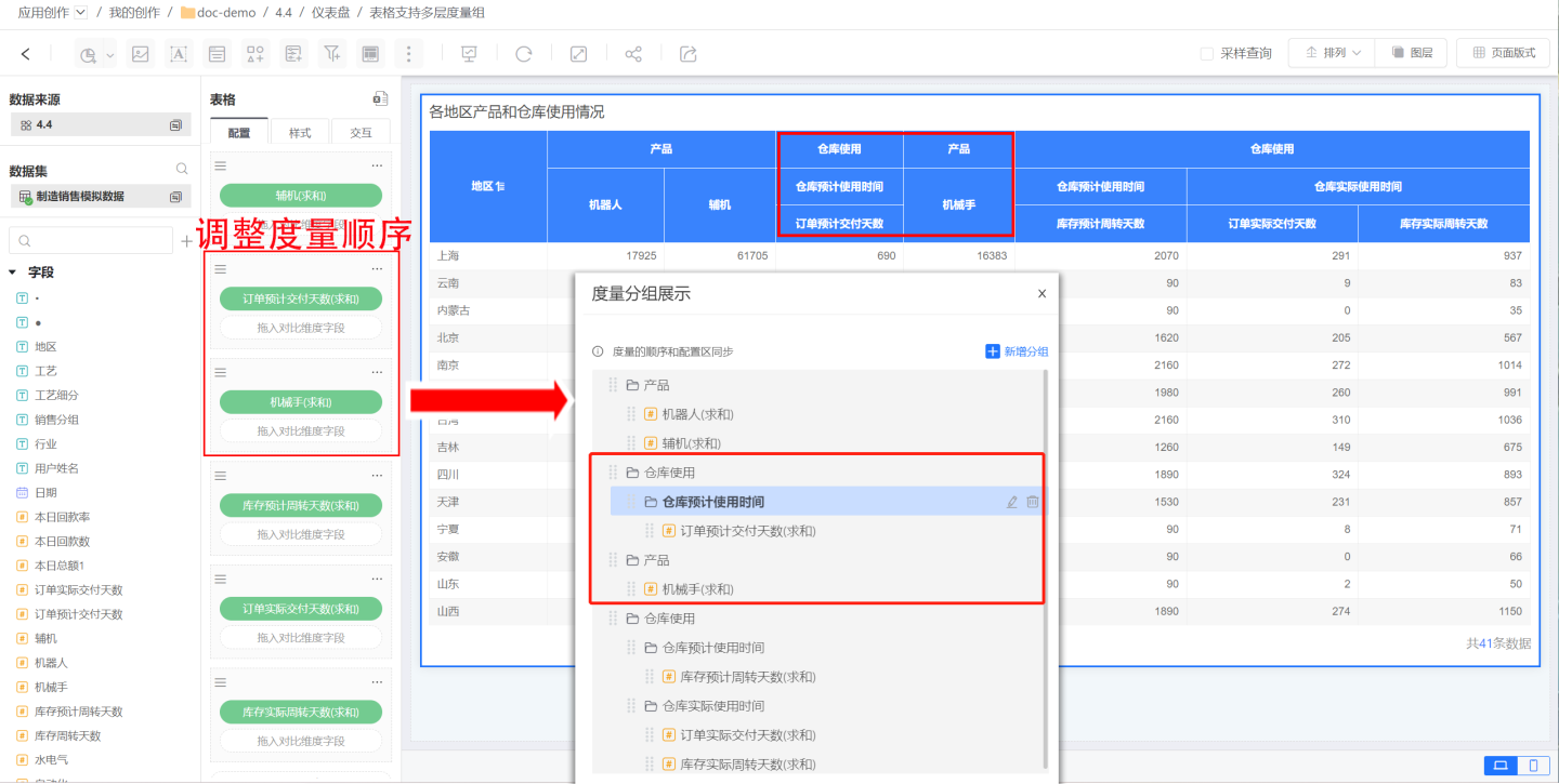
Note
- Metric groups are different from metric sets. Metric groups only have a display function, while metric sets not only have a display function but also support merging comparison dimensions within the metric set.
- Metric groups can display multi-level relationships among metrics, whereas metric sets only support displaying a single level.
Cell
You can set the background color, text color, row height, border, etc., of a cell.
Background Color
You can set the background of the cell, supporting same-color rows (left card) and alternating-color rows (right card). The default setting is same-color rows.- Same-color rows: The rows in the table are uniformly set without differences. Color settings support single color and transparency adjustments.
- Alternating-color rows: Two background color values need to be set, and they will alternate row by row when displayed. Color settings support single color and transparency adjustments.
Text Settings
Supports settings for font color, font type, font size, bold, etc.Alignment
Refers to the horizontal alignment of text within the cell. Includes Auto, Left, Center, and Right.
The default alignment is Auto. Auto alignment means automatic alignment based on the field type, such as text being left-aligned and numbers being right-aligned.Row Height
Sets the height of the cell, ranging from 30-120px.Merge Cells
Merges cells with the same data in the same column.Show Interval Lines
By default, this option is checked. If unchecked, interval lines will be hidden.
Field Style
The cell settings apply to all cells in the entire table. If you need to apply special settings to a specific column or several columns, you can configure them in the field style.
In addition to basic cell settings, the field style also supports setting up hyperlinks.
Add Field Style
Click the "+" sign on the right side of Field Style to open the field selection popup. Select the fields for which you want to set column styles. You can select multiple fields.
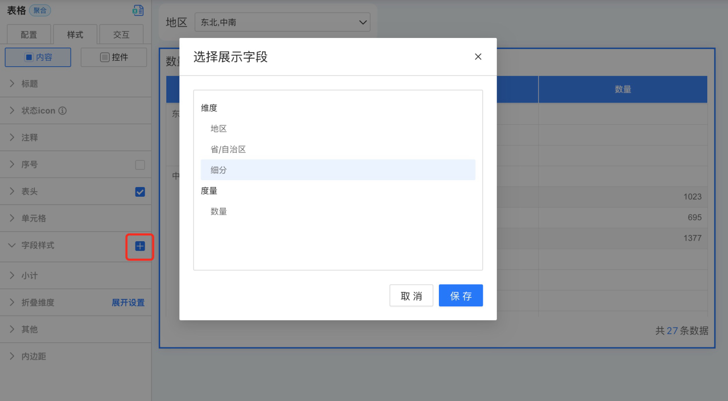
After clicking save, a field style will be generated under Field Style.
Set Field Styles
After adding field styles, click to configure the following style settings.
Background Color
In addition to supporting same-color and alternating-color row settings, background color also supports conditional formatting.Text Settings
Supports font, font color, font size, bold settings, and font color supports conditional formatting.Horizontal Alignment
Refers to the horizontal alignment of text within a cell. Options include Auto, Left, Center, and Right.
The default alignment is Auto. Auto alignment adjusts based on the field type, such as text aligning to the left and numbers aligning to the right.Vertical Alignment
Refers to the vertical alignment of text within a cell, including Top, Center, and Bottom.Cell Width
To uniformly set the width of table cells, configure the cell width in the header.- Auto Mode: When set to Auto, the cell width adjusts based on the content length.
- Maximum Width: If the cell content exceeds the set range, it maintains the maximum width. If it is less than the maximum width, it adapts to the content. A specific value must be set for the maximum width.
- Fixed Width: Displays the cell with a fixed width as configured. A specific value must be set for the fixed width.
- Word Wrap: When the content is too long to display fully, you can enable the word wrap feature. This feature is only effective under Maximum Width and Fixed Width settings and does not apply in Auto Mode.
Column Navigation
Configure navigation actions for field styles. The specific operations are the same as the navigation settings in Table -> Control Settings -> Navigation.Note
- After setting navigation for the table, clicking a cell will execute the navigation action, but clicking the header will not trigger navigation.
- The navigation settings in Table -> Control Settings apply to the entire table. When navigation is set for a field style, clicking the field style will only trigger the navigation settings for that specific field style.
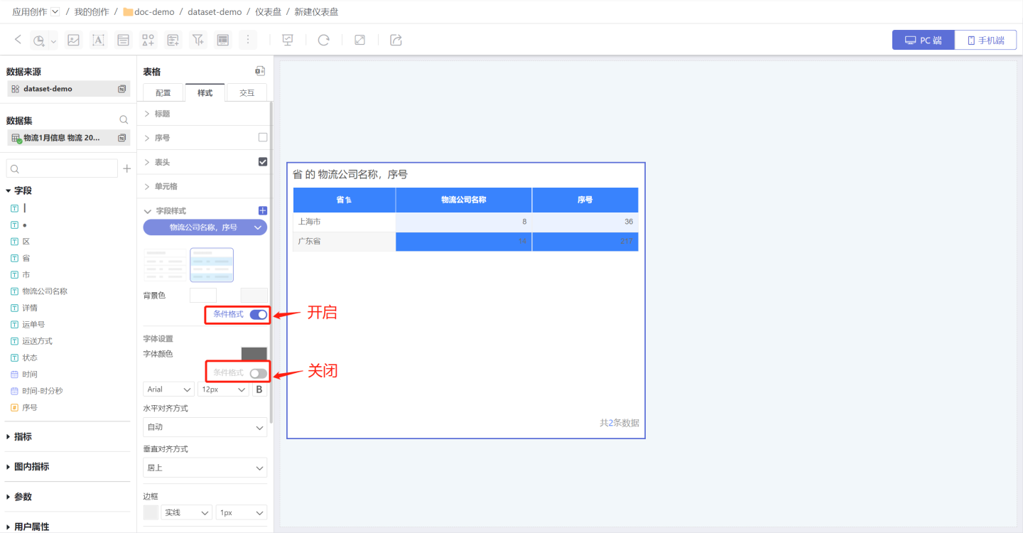
Conditional Formatting Settings
Conditional formatting refers to rendering the cell's color by setting conditions. Both the background and font of a cell support conditional formatting, making the cell more prominent so users can identify data that meets the conditions through color. For example, in a student report card, green indicates scores above 90, and blue indicates scores above 80. Conditional formatting can control the display of a specific field or the display of a specific row of data. Below is an introduction to the relevant configurations for conditional formatting. 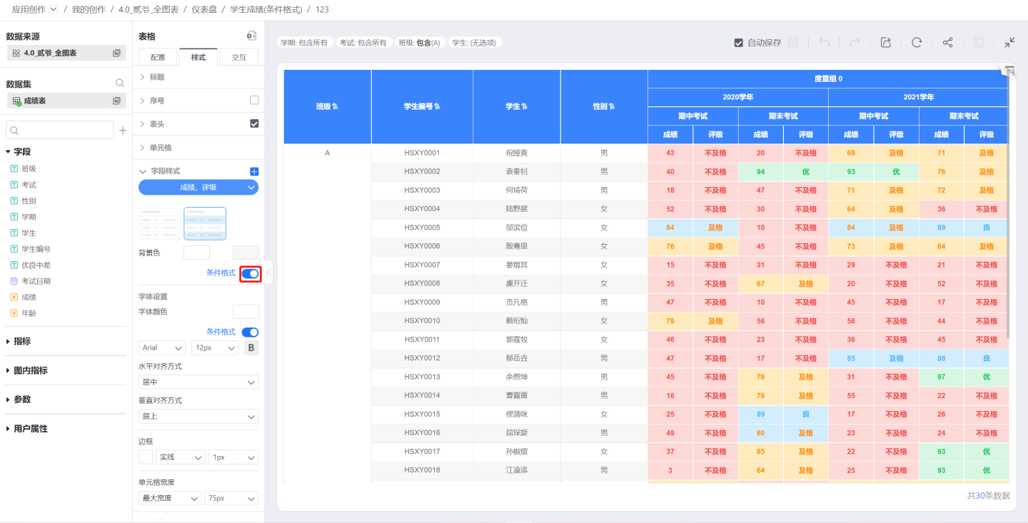
The toggle switch for conditional formatting. Once enabled, you can proceed with setting up conditional formatting.
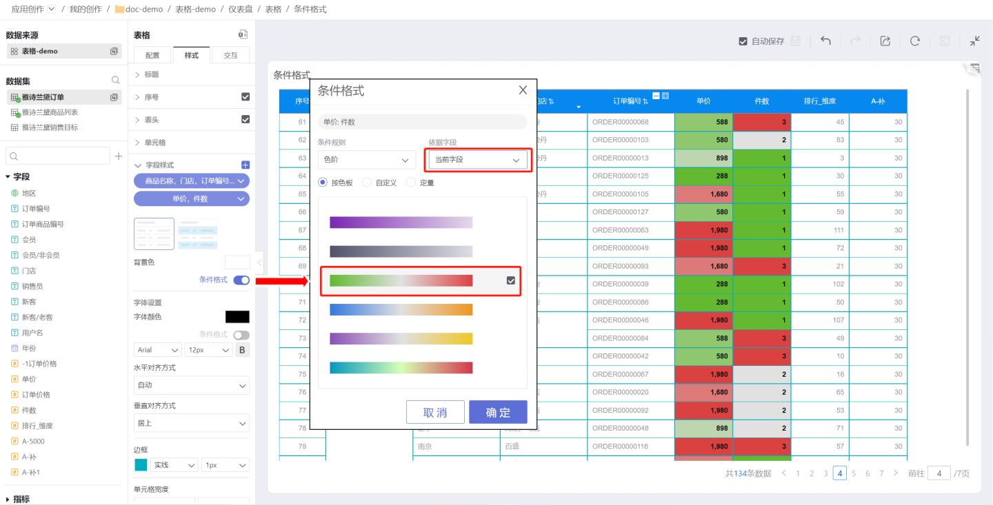
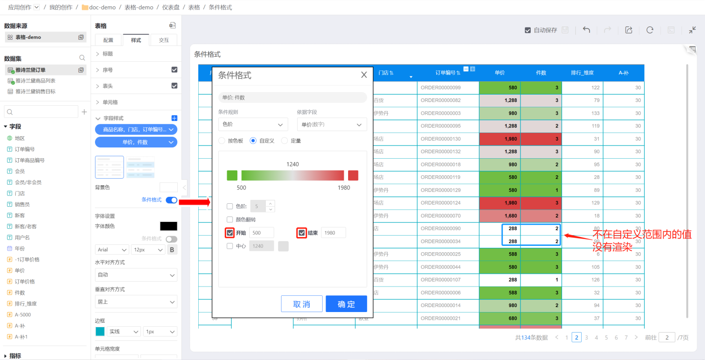
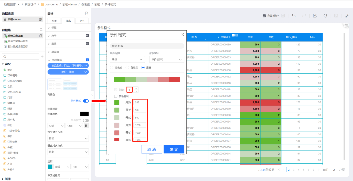
Conditional formatting rules are divided into color scales, maximum/minimum, and rules, and are based on fields categorized as current field and specified field.
Current Field: When the reference field is set to the current field, it means that each field in the field style is rendered with conditional formatting based on its own value. For example, in the sample, the field style uses the current field as the reference field, so each field uses its own value as the basis. The color scale values for the unit price field range from 288 to 1980, and the quantity field ranges from 1 to 3. It can be observed that the highest value (red) in the unit price field is 1980, and the maximum value (red) in the quantity field is 3.
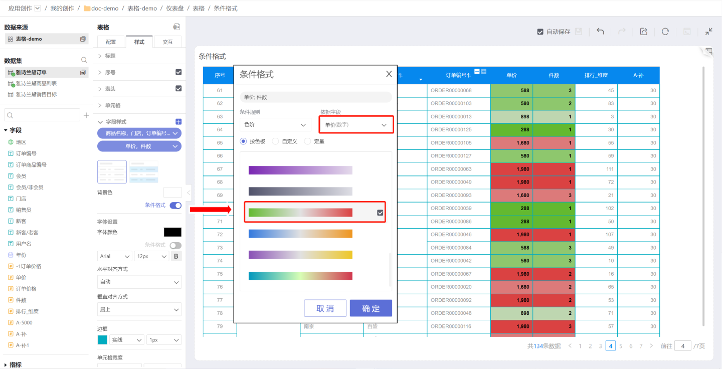
Specified Field: A specified field refers to a specific field in the table. When the reference field is set to a specified field, it means that all fields in the field style are rendered with conditional formatting based on the value of the specified field. For example, in the sample, the field style uses the unit price field as the reference field, so all fields in the field style are based on the unit price value of the corresponding row. The color scale values range from 288 to 1980, and it can be observed that the highest unit price (red) corresponds to the related information of the product.
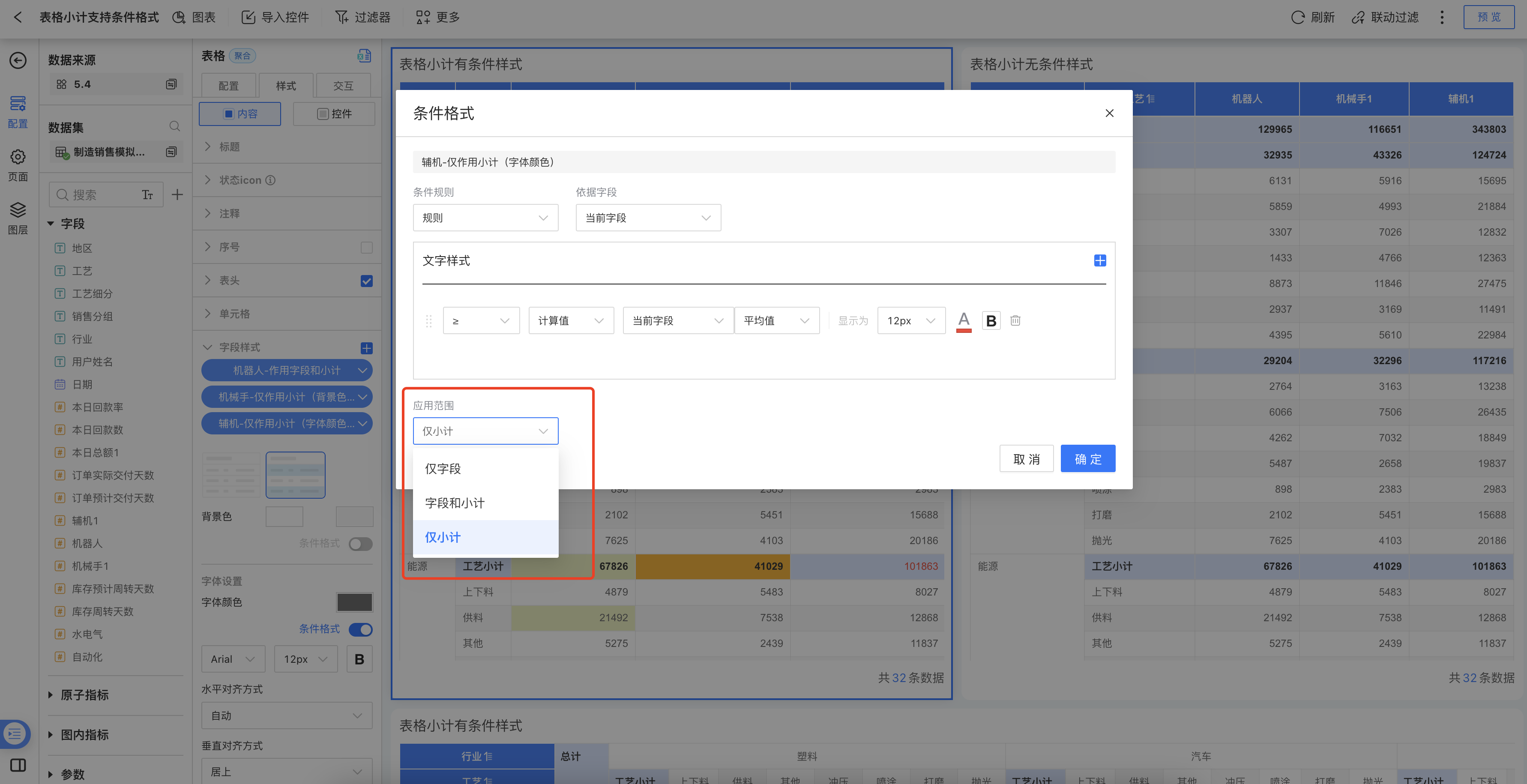
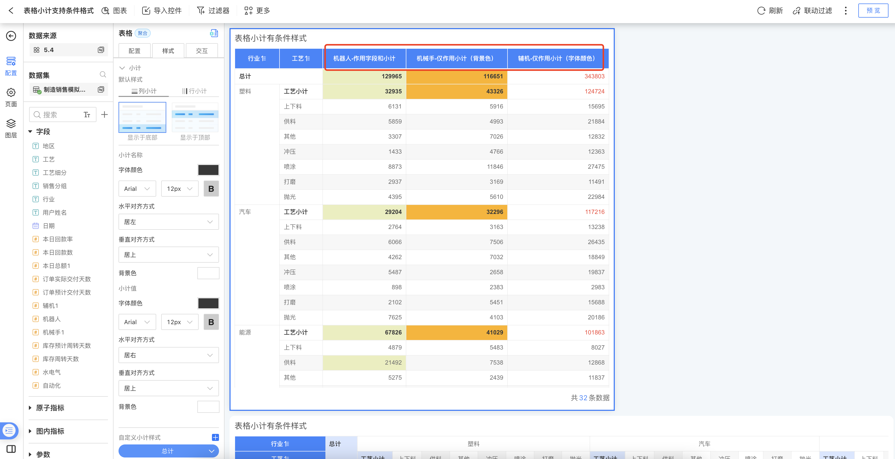
- When data scientists create tables and want to set conditional formatting for subtotal values, version 5.4 supports configuring conditional formatting for the data and subtotal values of the selected field in "Field Style." Configuration path: Style > Content > Field Style > Conditional Formatting > Application Scope.
Select "Field Only": Selected by default, conditional formatting applies only to field data and does not affect subtotal values.
Select "Field and Subtotal": Conditional formatting applies to both field data and subtotal values.
Select "Subtotal Only": Conditional formatting applies only to subtotal values and does not affect field data.
Tip
The table serial number indicates the order of data display and does not have actual business significance, so the table cannot be used as a reference field.
Gradient Scale
Use gradient scale to set conditional formatting, including by color palette, custom, and quantitative.
By Color Palette: Select a preset color palette for rendering. The example shows the rendering result using a system preset color palette.
Custom: Customize the gradient scale for rendering. You can set the number of gradient levels, reverse colors, and specify the start, end, and center values along with their corresponding color values. As shown in the example, the start and end values are set in the custom gradient scale for rendering. Values outside the range will not be rendered.
Quantitative: Set the number of gradient levels, with each level corresponding to a specific value and color. In the example, 5 gradient levels are set along with their corresponding color values and numeric values. If a value is not within the defined range of the gradient scale, the cell will not be rendered.
Note
- If the value in a cell is not within the defined range of the gradient scale, the cell will not be rendered.
- For custom gradient scales, if the start, center, and end values are not set, the system will default to using the minimum, center, and maximum values of the first field in the field style as the start, center, and end values of the gradient scale.
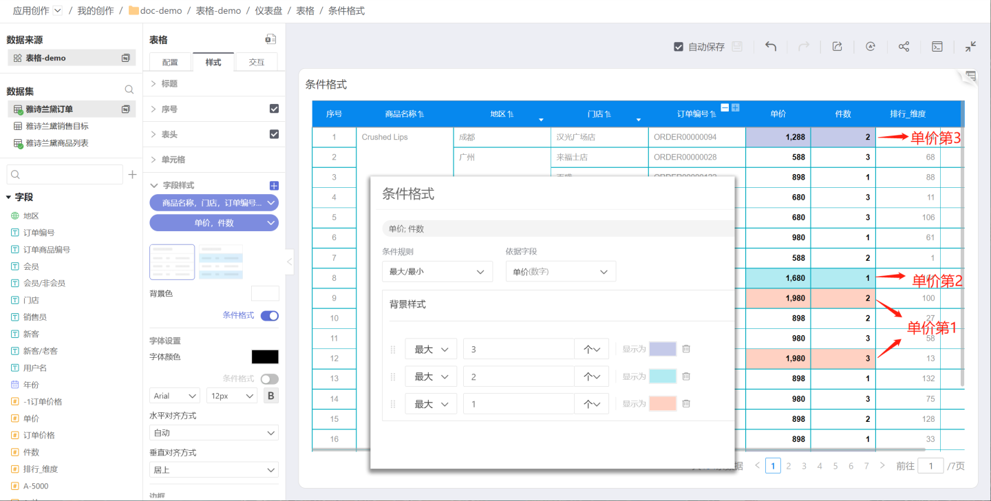
Maximum/Minimum
Use the maximum/minimum settings for conditional formatting to render the fields with the highest or lowest values. Conditions can be set using "count" or "%". Multiple conditions can be configured, with later conditions overriding the rendering effects of earlier ones.
In the example, the goal is to highlight the products with the top three unit prices. Conditional formatting is set sequentially: display color for the top 3, display color for the top 2, and display color for the top 1. As shown in the example, the conditional formatting applied later overrides the earlier formatting. The final result is that the 1st, 2nd, and 3rd positions are rendered with different colors.
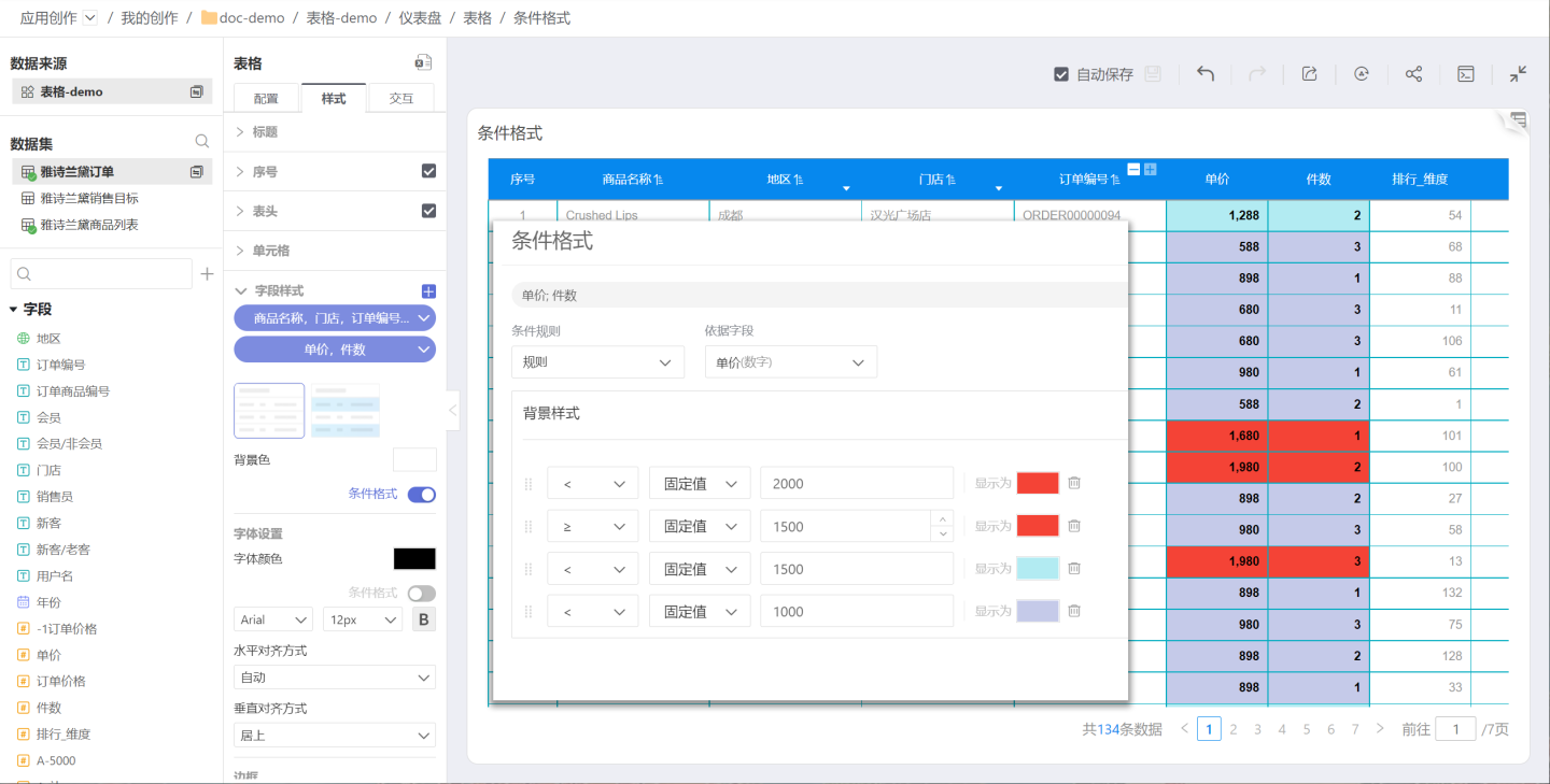
Rules
Use rules to set conditional formatting, which involves applying conditional styles based on logical judgments such as >, ≥, <, ≤, =, !=, contains, does not contain, between, not between, empty, NULL, etc. Multiple conditions can be set, and the latter conditions will override the rendering effects of the former ones.
For example, annotate different price ranges: 0~1000, 1000~1500, 1500~2000. The example uses comparison operations, where the latter rules override the former ones, forming price ranges. Users can try using between in the rules to achieve price range rendering.
The conditional formatting of fields in tables and canvas tables supports cell value comparisons between two measure fields. To configure this, select "In-Chart Measure Comparison" in the conditional rules and choose the fields to compare. This is suitable for scenarios such as comparing expected targets with actual achieved values. 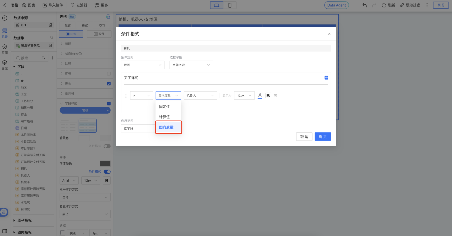
Note:
- When setting maximum/minimum or rules, the rendering results of later conditions will override those of earlier conditions, so the order of conditions is crucial.
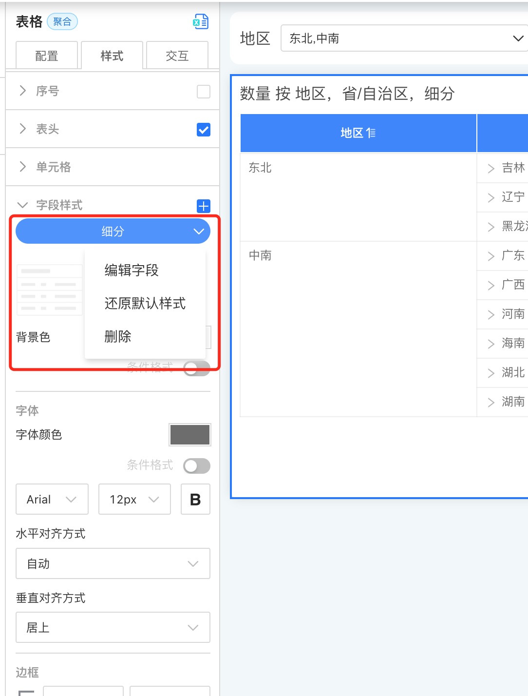
Edit Field Style
After creating each field style, you can re-edit the fields within it. Click the "dropdown arrow" on the right side of the label and select Edit Field to reselect the fields.
Please Note
If a field is grayed out when selecting fields, it means that the field style has already been set for that field. A field cannot exist in two field styles simultaneously.
Restore Default Style
Restore the settings in the field style to the default style.
Delete
After a field style is deleted, all settings become invalid.
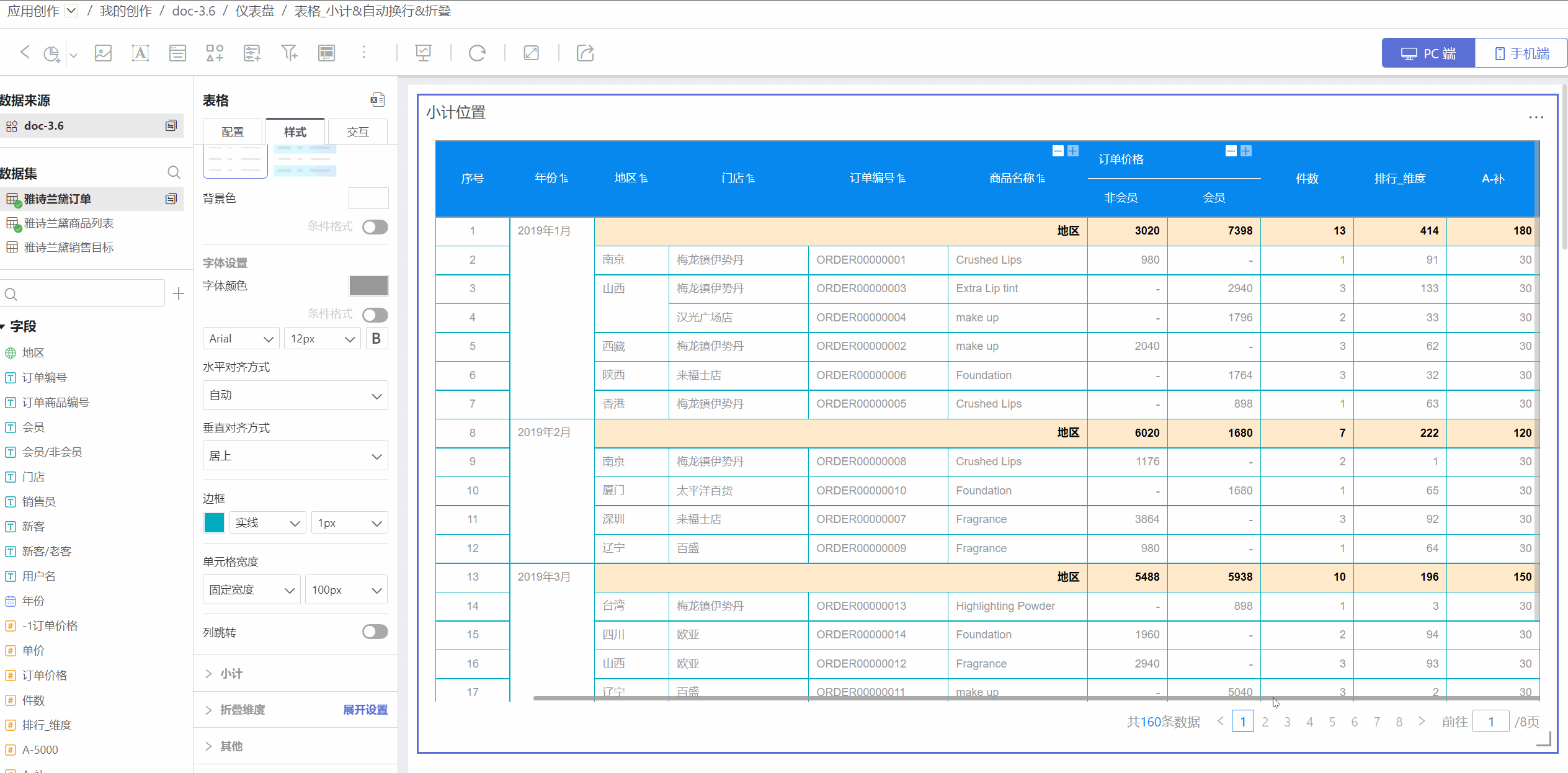
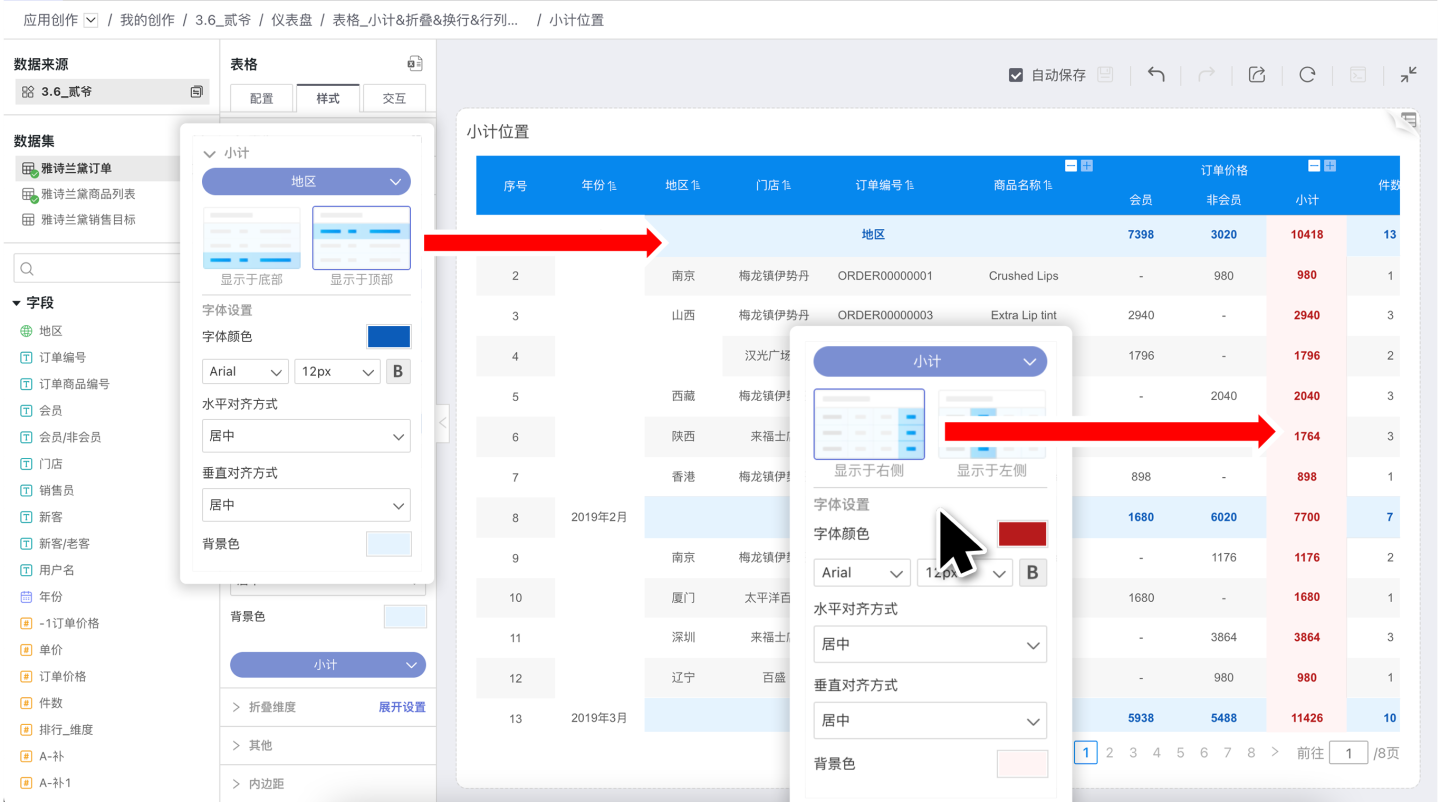
Subtotal
The table supports subtotals including position, font color, alignment, background color, etc., and each subtotal can be set individually. Subtotals occupy one row in table statistics.
- The position of dimension subtotals can be set at the top or bottom. In the example, the subtotal for the region is a dimension subtotal, and its position is set at the top.
- The comparison dimension subtotal for measures can be set on the left or right.
Collapsible Dimensions
The table supports collapsible settings for dimensions. As shown in the figure: after selecting the region in the collapsible dimensions, the table will collapse the region information.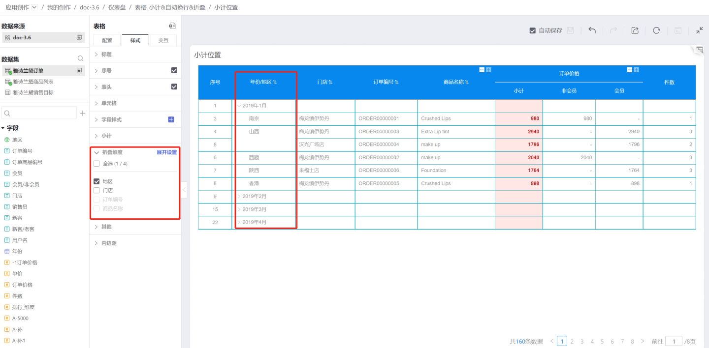
The expand settings allow users to freely configure the expansion state of each level of dimensions, enabling the table to display in different appearances.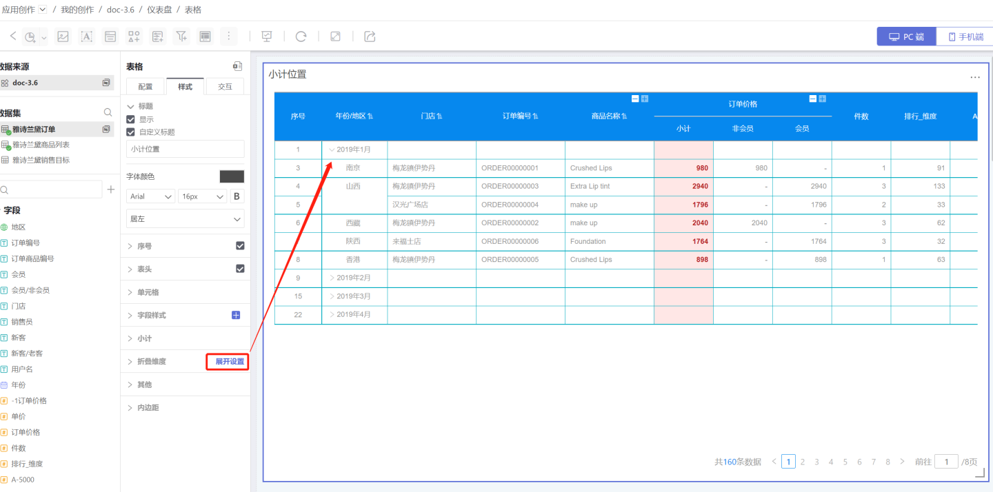
Tip
Combined with the subtotal feature, you can add data to the collapsed layers.
Others
- Fill Empty Rows: Fill in when there are empty rows in the table.
- Enable Virtual Scrolling: When enabled, the table rendering will use virtual scrolling, rendering only the visible range to improve performance. It is enabled by default. When disabled, all data will be rendered, which has poorer performance but is more friendly for auto-scrolling scenarios.
- Lock Dimension Columns: After locking dimensions, the dimension columns remain unchanged during horizontal scrolling. Specific dimension columns can be locked.